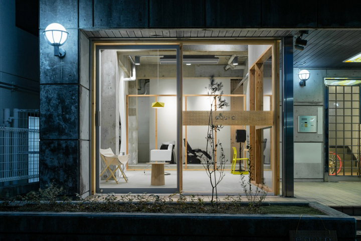

There is room for just one customer at a time in this minimally furnished Osaka hair salon, which Japanese studio Sides Core claims was inspired by the principles of mountain climbing.
Sohei Arao and his team at Sides Core hoped to reflect the unpredictable nature of mountaineering with the Equip salon, by installing elements that allow the owner to configure and personalise the space at a moment’s notice. “The owner, an avid mountain climber, told us that part of the appeal with climbing a mountain is that you never really know what will happen until you get there, and how soothing it is to experience something new every time out,” said Arao.
Sides Core previously designed a salon that features mirrors hanging from cables.
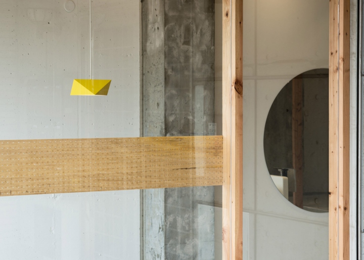
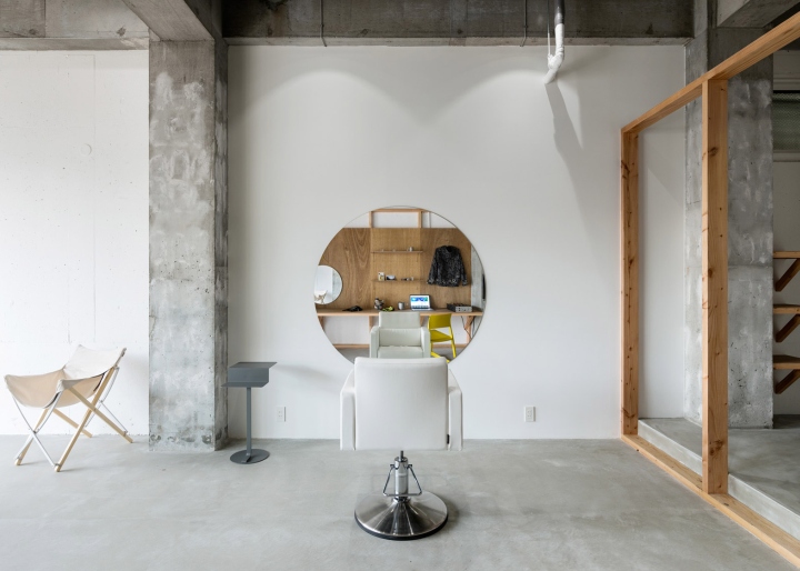
For Equip, the team applied panels of wooden pegboard behind a desk area to allow for changeable wall-mounted storage. “Perforated board has a function that allows the owner to be able to change the shop’s atmosphere,” Arao told Dezeen. “I also wanted to create contrast with the concrete texture of the building frame.”

Oak frames divide the space into three zones: a waiting area towards the front, a cutting area and desk space in the middle, and a washing area at the back. But the salon only allows one customer at a time. During styling, the individual takes a seat in a single leather chair placed in the middle of the space, in front of a circular wall-mounted mirror.
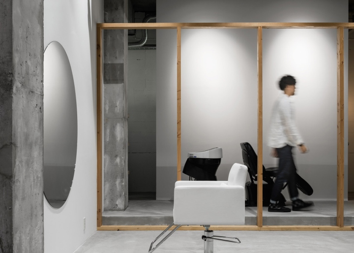
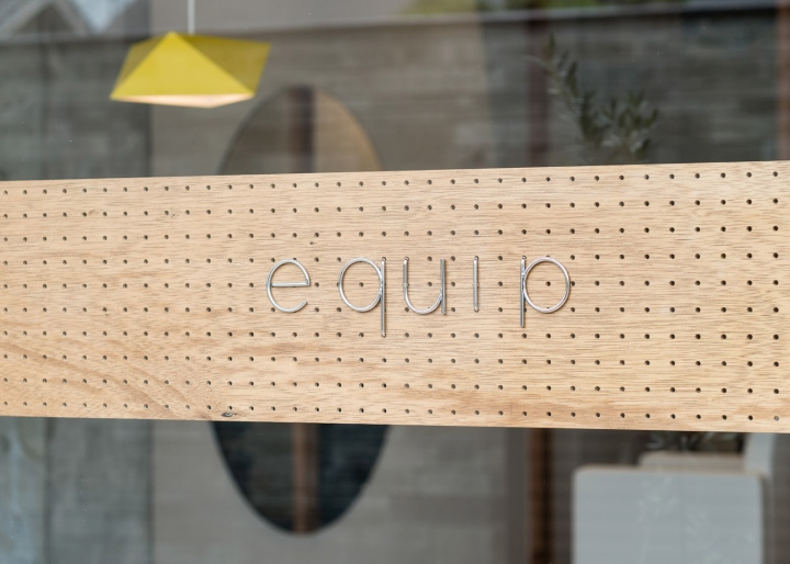
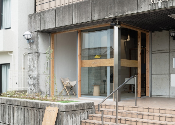
“The owner chose to only have one guest at a time to make sure that they can have time without having to concentrate on other people,” said Arao. “We carefully selected the chair, sound equipment, large mirror and other station details which will come in physical contact with guests to create an experience.” A completely glazed facade allows natural light to flood the interior. A strip of pegboard runs along the width of the window, and features the Equip logo in metal lettering.
Design: Sides Core
Photography: Yoshiro Masuda

via Dezeen


Add to collection
