
Customer experience design agency Household has created a new experience design concept for Irish convenience retailer Centra, giving customers fresh reasons to visit its high-convenience format stores.

Launched at O’Connell Street in Limerick, Ireland on November 16th 2015, the new concept drives reappraisal. The concept is designed to make Centra the first place customers think of when it comes to convenient eating – whilst retaining the retailer’s brilliant service basics. The franchisee-operated store in Limerick features the new look & feel designed for Centra by Household. The new brand palette is cleaner and more ordered and contemporary, to give the store a ‘Scandinavian deli’ feel that reflects grown-up convenience.

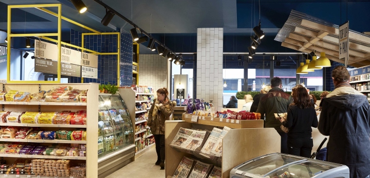
The store concept unifies Centra’s offer – which includes food for now, grocery top-up shop and newsagent – to create the ultimate convenience experience. There is a new focus on food, and a holistic feel across the store that demonstrates that Centra is a handy destination at each time of the day – whether grabbing breakfast to go, sitting down for lunch or picking up milk or a package on the way home.

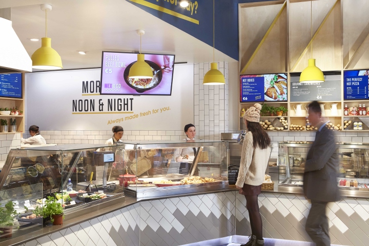
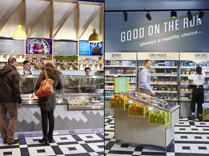
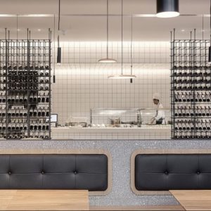
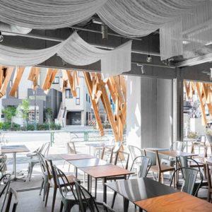
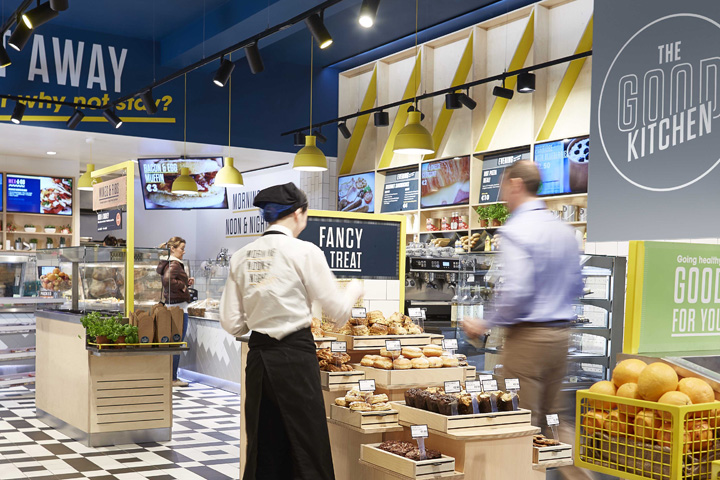
The hero area of the store is The Good Kitchen, a new food-for-now sub-brand for Centra, recommended and created by Household to dial up the retailer’s authority around food. This new focus on healthy, fresh food-for-now helps Centra deliver more in Ireland’s increasingly innovative food market. The Good Kitchen features a barista and deli counters, grab-and-go packaged food and a seating area with a buzzy café feel. The seating area features generous service gestures like phone chargers and free wifi for extra convenience while customers eat.

The Good Kitchen’s branding is designed to be synonymous with delicious meals eaten right there in-store. With this new sub-branding rolled out across serving elements, digital menus and packaging, the result is a branded food experience with an inviting tone of voice that makes it totally irresistible. Now grab-and-go has also been given a new focus of ‘good food on the run’, to make packaged food feel as well prepared as food from Centra’s fresh counters.

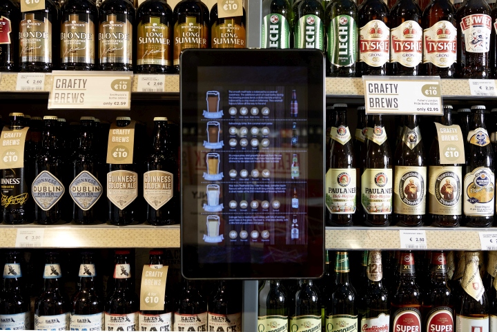
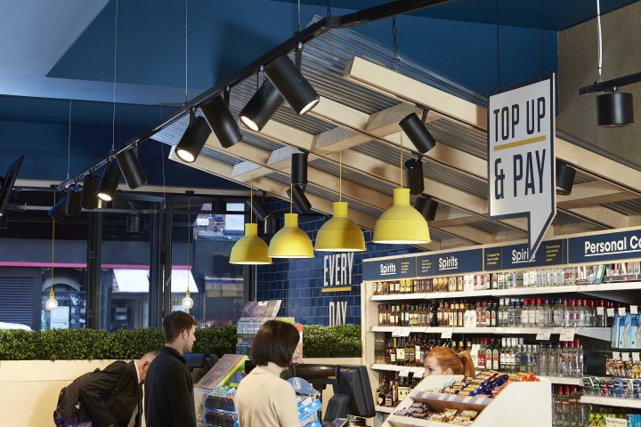
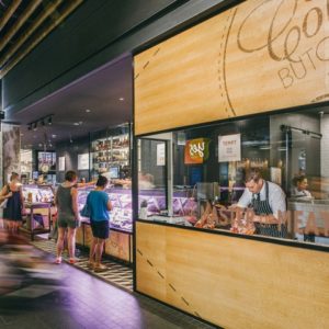
The new store design has also refreshed the brilliant basics of convenience shopping that Centra offers as a newsagent and top-up grocer. These areas feature a new curated tone of voice (‘Crafty Brews’) and a quicker pace (‘Top Up & Pay’). Craft beer is now a focus of the off license in the grocery area, with gold used to emanate a pub feel. This creates a mini destination that has a sense of permanence compared to the quick, changeable messages of the food counters.

The new concept encourages customers to make Centra part of their regular shopping routines. Initial trading results are very strong, with a 25% increase in sales store-wide and some bestselling products selling x4 more. Coffee sales have quadrupled, and there are also 30% more customers coming through the door. Following this success, the concept will be further rolled out to more of the Centra estate in 2016.
Photography by Malcolm Menzies

