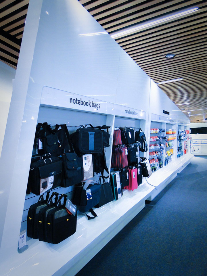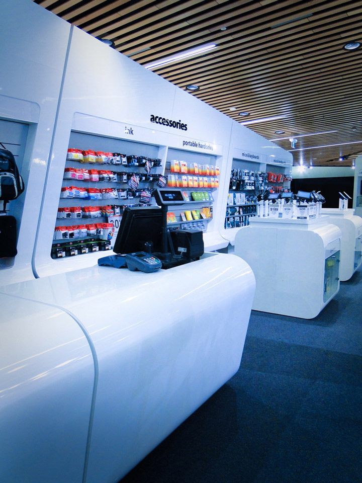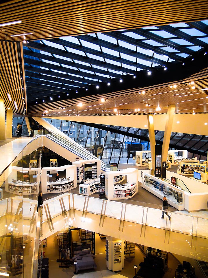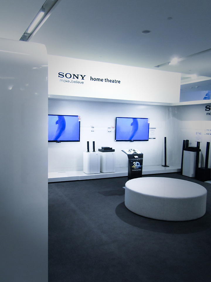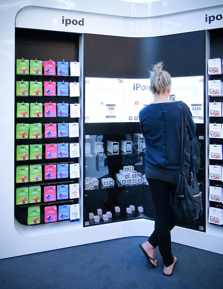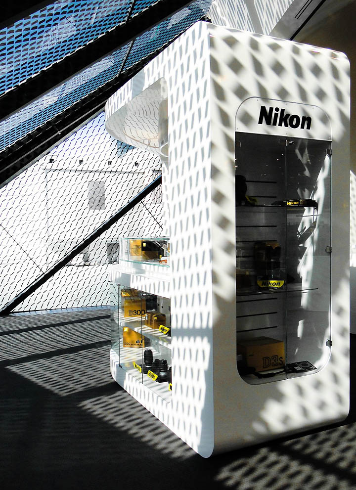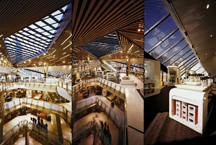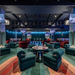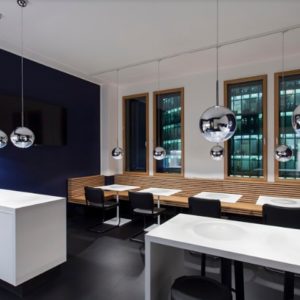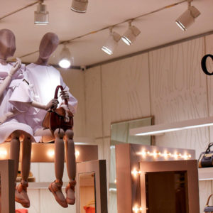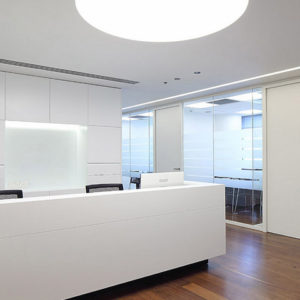


Peddle Thorp Architects undertook the interior store planning and fixture design of the 3 top floors in the newly refurbished flagship MYER store in Melbourne. This department store receives the “Store Design of the Year Award” at the 2011 Oracle World Retail Awards.

Myer is Australia’s largest department store group and has been a market leader in Australian retailing for the past 100 years. Myer offers the largest range and the latest national and international brands across a number of categories including: women’s and men’s apparel; fashion accessories; children’s-wear; cosmetics; home-wares; furniture; toys and electrical goods.

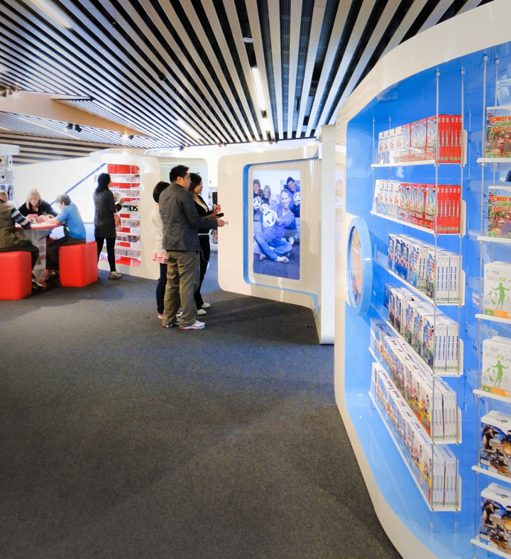
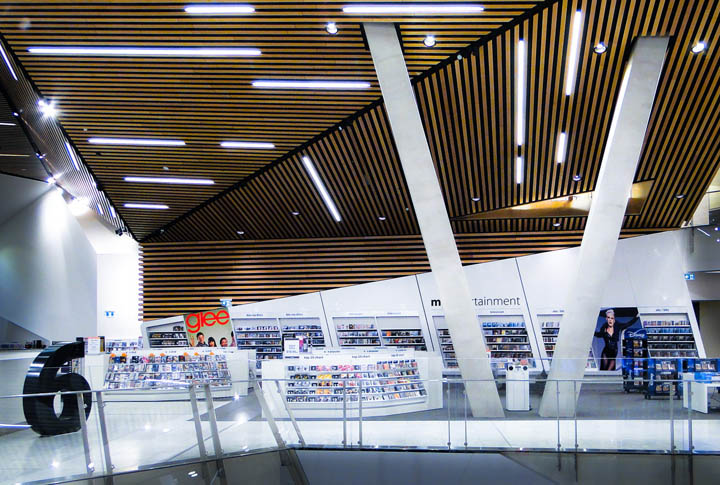
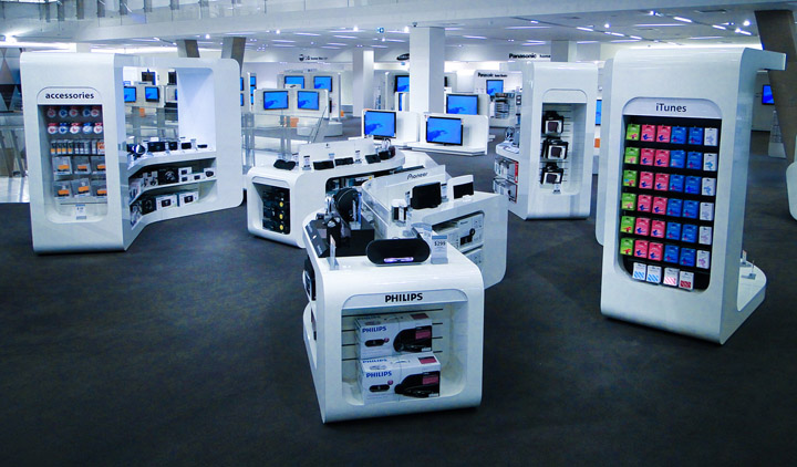
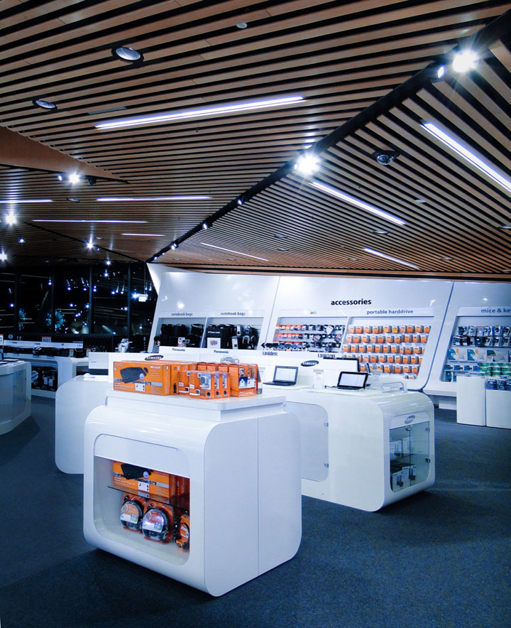
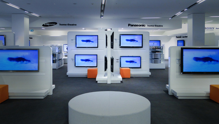
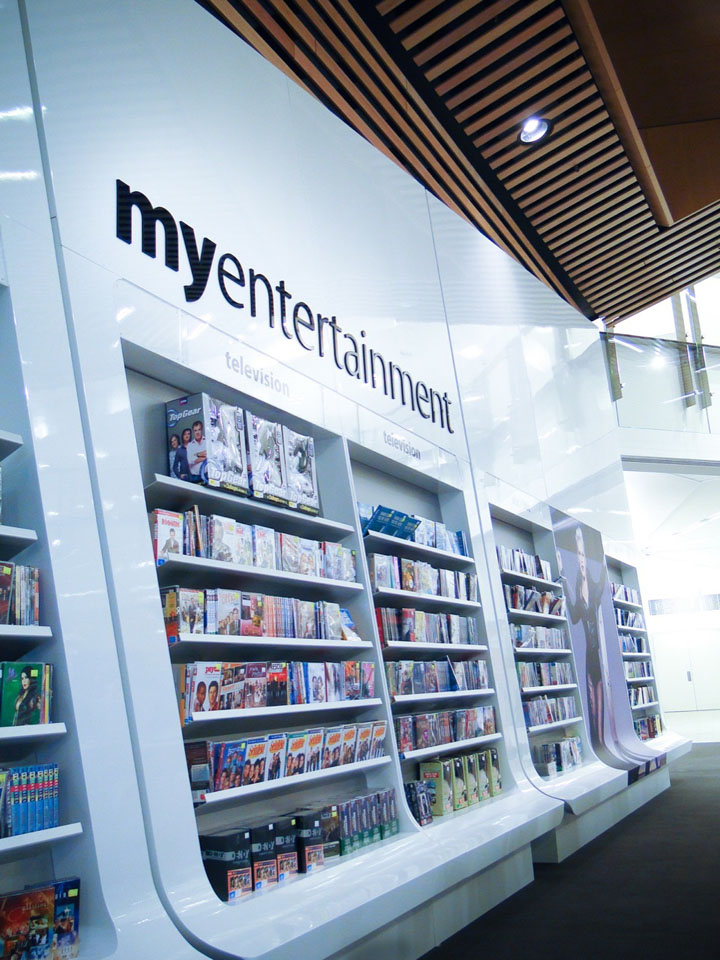
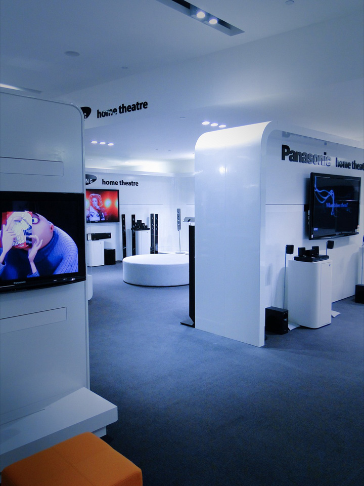
The project included the design and implementation of level 5, 6 and 7 floors layout. Level 5 showcases the home-ware products including beddings, cookware, and wedding registry. Levels 6 and 7 showcase electronics, home entertainment and the gaming collection.

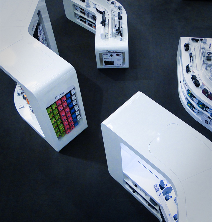
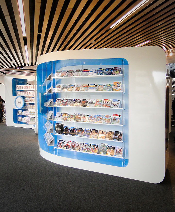
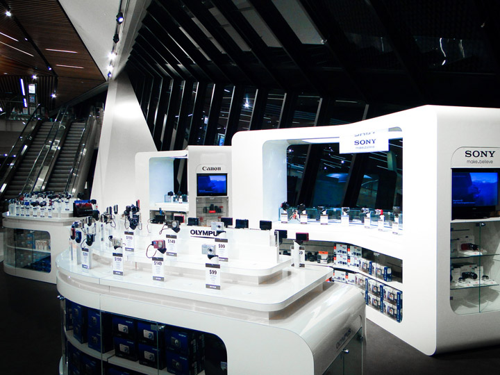
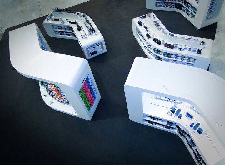
Through a collaborative design process involving Myer Design, and shop-fitters, our challenge was to create a unique retail experience for each environment, developing specific design theme on each floors. The organic contemporary level 6 and 7 have been design as interactive futuristic spaces. The designer introduces the notion of path and discovery into the planning strategy to enhance the consumer experience.

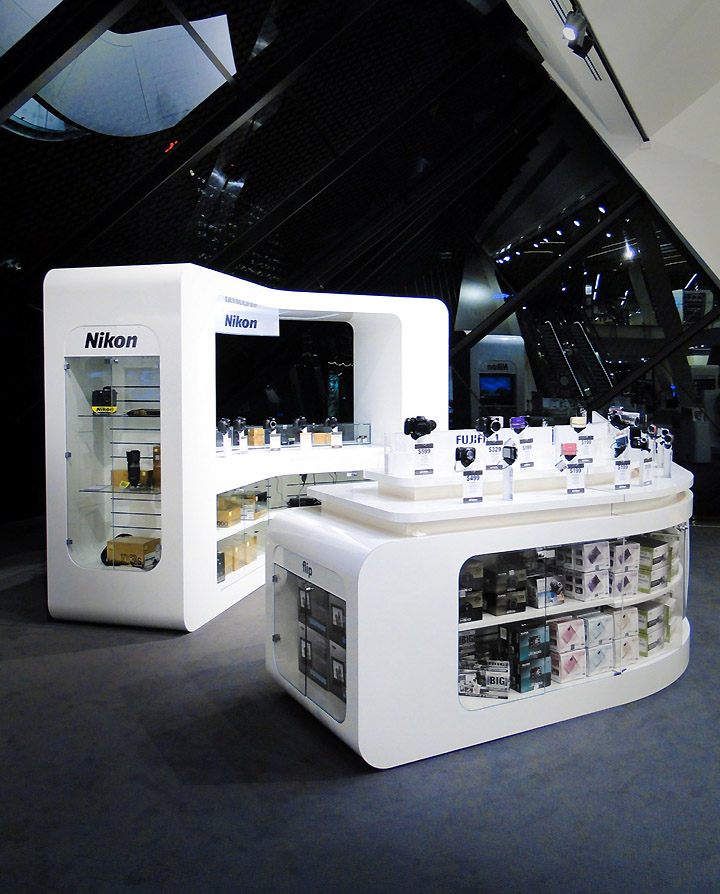
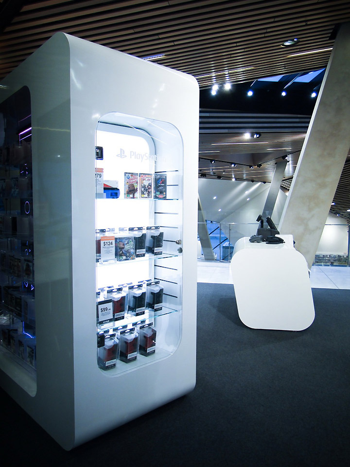
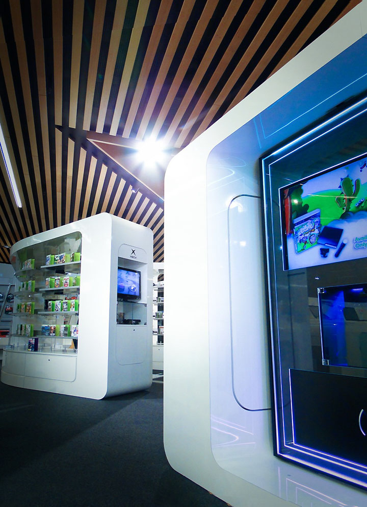
Through the design of winding gondolas, display tables and curved shell cabinet, products are revealed along curved and intersecting alleys multiplying showcase and merchandising opportunities. Gondolas and table have been design to optimize product showcase toward consumers as they’re walking down the main alleys making secondary path attractive and inviting visitor’s to explore multiple pads.

Fixture design and planning also adapt to the striking and complex base built environment. The gaming shell units following in heights the tilted faceted timber ceiling introduce therefore movement and create a playful gaming space. Wall unit designs respond to dynamic tilted wall cladding lines. And the curved shell fixtures create intimate sub retail space, controlling daylight from the multiple skylights and window atriums.

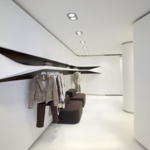
For level 5 design, Peddle Thorp introduced simplicity and neutrality as key element for effective home-ware product presentation. White and black have been used as primary color for the fixture and environment design, referring to Myer branding code. The concept of “frame” runs across the entire floor as a key geometry structuring and binding the multiple pads together. This simple approach emphases the focus on the brands, by introducing an appealing and modernist discreet design.


http://www.archdaily.com/179934/myer-department-store-peddle-thorp-architects/
