
Shed, interior architects and designers, were commissioned by The Office Group (TOG) to create a 4000 square metre flexible work space in Islington, London. The Office Group provides flexible spaces to meet and work across the UK. Shed wanted to reflect the progressive spirit of the Office Group movement and it’s new-start-up residents, which led to a desire for a new aesthetic. ‘Not another mid-century modern interior’ was much the starting point as was the challenge of transforming a 1980’s office block. We explored ‘Work In Progress’ – the workspace members involved in the making-of, and also an under-construction design approach, inspired by makeshift art and construction sites. The building displays its heritage in all its postmodern glory. There are Italianate clock towers and turrets, and harshly punched shapes on the façade. It has the blocky nature of a Lego model. Postmodern architecture led to a postmodern-influenced interior.

Given a dreary office block, the solution was to install pastel coloured ‘trays’ in high gloss mosaic resin, to define the clubroom and lounge areas and contain the new design within the existing building. The ply backed resin floor finish runs up the walls to form a low datum. Coloured paint chips layer with clear resin, like a new kind of terrazzo. The resin trays set new rules for the space, and create a new architecture within, without being precious of the building’s features. There were parallels with 80s art, particularly the Memphis movement, where colour, texture and shape clash in curiously wrong ways. This inspired a multi layered graphic approach yet the overall effect is timeless and contemporary. We battled tedium with a riot of immersive colour and texture, clean lines and graphic pattern.

Dividing the site into component parts allowed each to have a signature palette of colours and finishes. Lounge, Workroom and Meeting Room spaces pop with their own energising colour, in pastel peach, mint and yellow, while circulation spaces allow a respite in monochrome. The palettes show a duality in feeling. In the Lounge, playful pink glossy resin is matched with an industrial exposed ceiling. In the Workroom, natural cork and specialist timbers balance tech-inspired colours. In meeting rooms, textured blue resin surrounds the room, balanced by simple white walls. Through imaginative use of colour and pattern, cost effective methods are given personality. High-level design meets low cost materials. Basic white tiles line the walls of the tea points, lifted with grout in yellow and pink. Carpet tiles in offices take alternate stripes diagonally across the floor. Even in the post room, a simple pink edging costs little but brings a smile. The value lies in an idea, not what it costs.

The lounge space begins with our reception desk, a layering of metal finishes. Tactile perforated aluminium meets brushed stainless steel. Partitions follow the Work In Progress idea – end grain plywood frames filled with glass, referencing half built stud partitions. The huge corner sofa was imagined as a stack of mattresses, in shades of pink, with playfully oversized bolster cushions. It’s of a size to generate collaboration between the pools of people side by side. Sitting centrally is the ‘Pivot’, a large coloured disc seemingly dropped from above, forming the tea point, where visitors make drinks with instant hot water. Above, tubes of light create graphic movement in the exposed ceiling. Each office floor features a pocket of ‘Lounge’ – a breakout space for eating and meeting. Carved into the walls, the phone booths shut off the buzz for just a moment. A low-hanging globe pendant illuminates felt lining and a colour-speckled worktop.

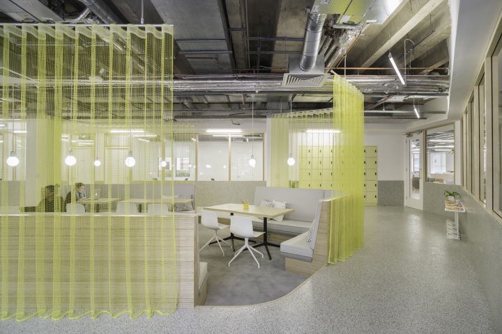
The Clubroom is a more focused, members-only room, surrounded by sought-after ‘studio’ offices. An open mesh curtain circles a generous sunken banquette, to create an intimate working environment without putting up walls and blocking natural light. Cutting into the raised floor system allows a step down to the concrete slab, exposing more structure and defining a space. End grain tables add a subtle graphic layer. Feature pendants, like stars in space, are a uniform glowing white. Members can choose the pace of work that suits them best. Personal booths are more private, an intersection of planes of cork and specialist timber. Guests can pin their ideas to the cork through the day. With over 30 sites and growing, Shed thought it was about time The Office Group had a desk they could call their own – ‘the perfect co-working desk’. The dual finish and fold up cable trays are designed around sharing and owning space. A lifted lid shows the desk is in use.
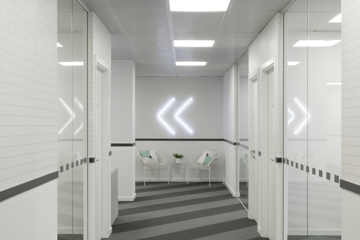
Meeting rooms range in size. The resin tray transforms to create mini rooms sets, running high up the walls and folding down to create shelves, and cutting in to house monitors. Meeting tables are custom designed to be part of the furniture family. Chairs include Tom Dixon Y in yellow. Routes from A to B are lined with custom-designed grid wallpaper, evoking memories of graph paper in maths lessons. Layers of graphic finishes break up long corridors, concluding with graphic chevrons drawn on the wall with light tubes. There is a high level of re-use throughout the project. The office ceilings are reused, and all office lighting is reused – modified with a simple diffuser.

Charlie Green, Co CEO of The Office Group, said: “Each of our buildings has its own unique identity and, with the bold aesthetic of the Memphis movement as our inspiration Angel Square is certainly no exception. The design draws on the shapes, colours and textures of this post-modern style to create a workspace which captures the creativity spirit Islington is known for.”
Photography by James Medcraft


Add to collection
