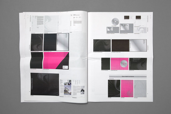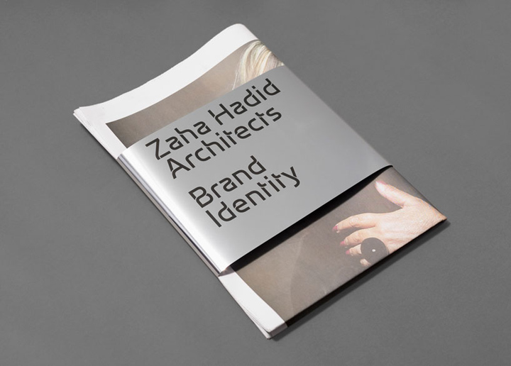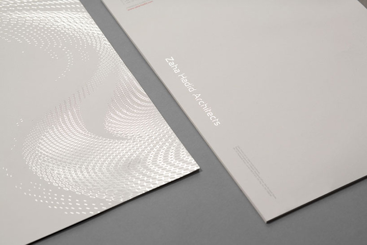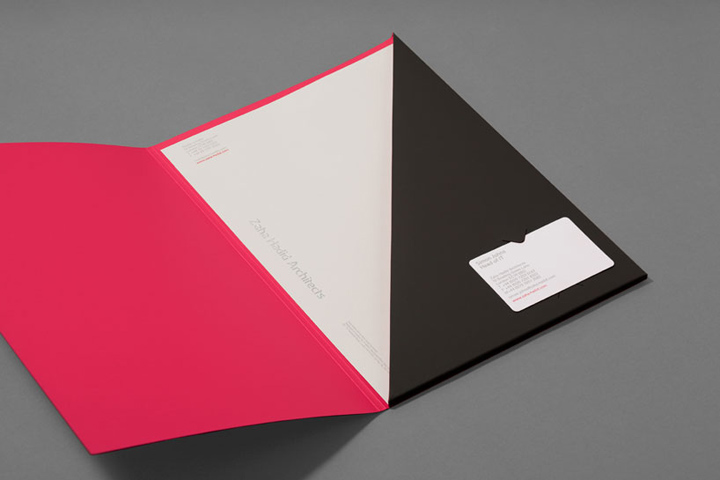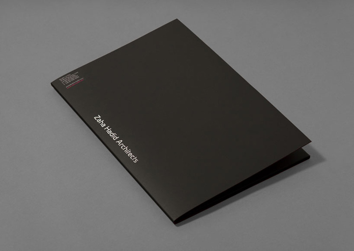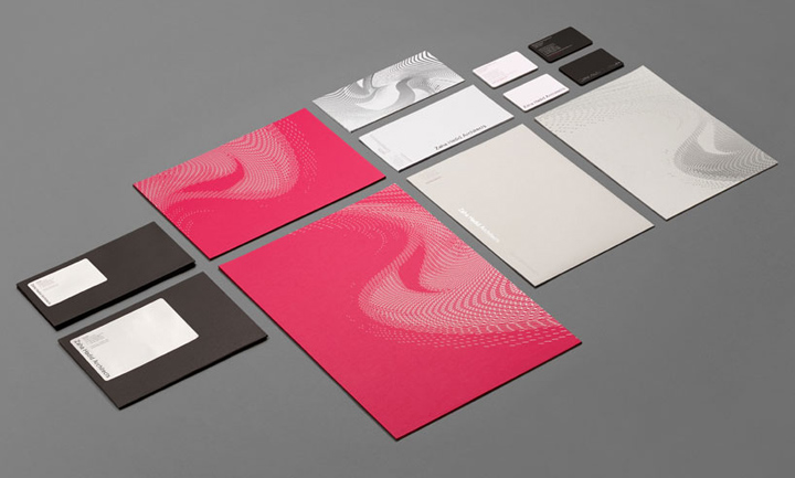
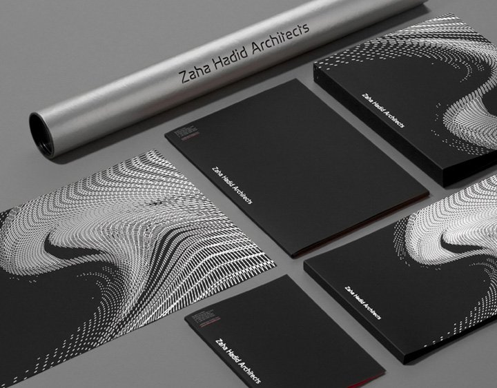

Collaborating closely with Zaha’s senior partner, Patrik Schumacher, Greenspace and designer Miles Newlyn have developed a brand identity that has a minimal feel. It is inspired by the contemporary material and construction choices employed by ZHA, visualised through the use of varying paper stocks, simple highlight colours and carefully chosen print techniques.

‘We deliberately didn’t want to create a brand identity that would be a pastiche of any of the ZHA created works. We wanted the work to speak for itself, not be over-powered by its brand’ Adrian Caddy of greenspace.

Dynamic Patterns
ZHA use a wide range of computer program scripts combined with parametric theory when creating buildings and designs. Greenspace took inspiration from these to create a set of patterns that can be used graphically across communication collateral and to which future patterns can be added as new structures, shapes and forms are developed.

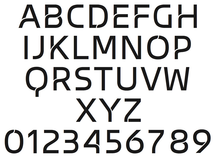
Bespoke and unique typeface
As part of the brand revamp, Greenspace and ZHA’s Patrik Schumacher worked closely to develop a bespoke typeface, called Zaha Hadid Sans. ‘The typeface uses two unique features: there is the folded detail, in which joins that are usually truncated are divided by a slim gap to give the appearance of layering. The other feature is a carefully stressed curve that flows from vertical to near horizontal and back again.’ – Miles Newlyn


http://www.urukia.com/zaha-hadid-architects-brand-identity/
