
The nature is the origin of human beings, while they have begun to attain conscious, what they have noticed first are the land and water around them, as these elements hold the essence to the life of human beings. Many designs that is inspired by nature are also inevitably related to the visible elements called water and earth. From survival to design, humans can never separate from the link and balance between elements.
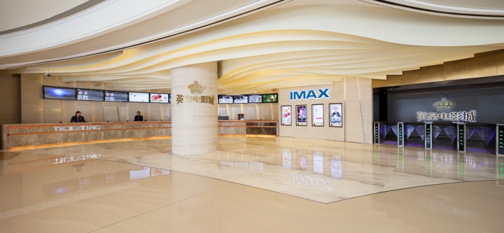
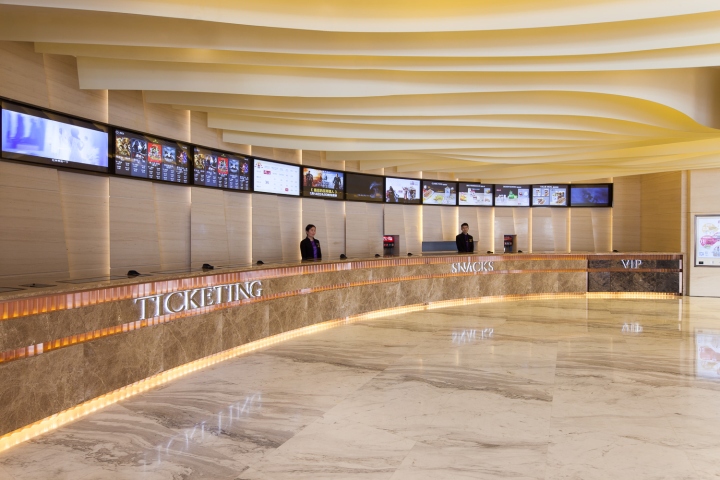
The water and earth elements are exactly the media that lead us into the nature themed cinema in Hefei. To impress in the first place, the massive false ceiling ornamented by metal strips finish and concealed light troughs has lighted up the design theme, just as a dense series of contours on a map, mapping out a beautiful system of mountainous landscape. Yet the landscape is not randomly formed, if observes carefully, one may find the contours are escorting customers to the ticket office by their density (which represents gradient of slope); the corridor to theatres and large LCD screens for movie trailers act as the river channel that flows along mountain spurs, in order to express the main theme. Within these interlocking spurs here stand some columns, with the package of white coloured finish and large champagne coloured stainless steel signage, these columns will be no more obstacle but representative visual focus.
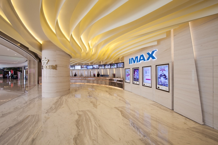
Along the hills and streams, we land on the ticket box eventually. The sector shaped lengthy counter is made of light grey marble finish with reticular pattern, distributing decent ambient that is found in the nature, while the light trough decoration with copper toned metal finish on its front has add a touch of nobility into the air of nature. And in order to be considerate about different groups of customers, there is another counter finished with mainly brownish hued marble thus the VIP customers shall be accommodated as well. Meanwhile, the portal fixture that is formed with dark grey marble finish comes with a simple and clean design, which is built to present the main aim of the basic design theme, elegant and exotic, yet functionalistic. The ATMs next to the counter are proving that.
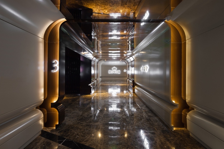
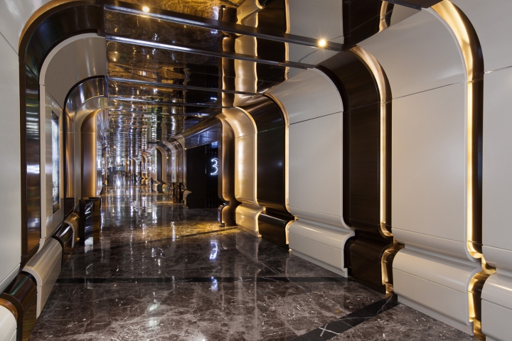
Contrast with the warm welcome of the ticket office lobby, the corridor area to theatres represents the brewing of ambient, as well as a stage of the expression of the main theme, which tells that “movies are lights within darkness” by mixing design styles of natural and artificial. The mixture of elegance and nature is expressed in the corridor area as continuation of the style outside, but with the aid of colours, adding a touch of history into the space. On every wall of the corridor, white fiberglass and dark timber finishes are applied one after another along the walls, white and black materials are facing each of their reversed counterparts with orderliness; and each of these different surfaces are split and defined by LED light troughs, both materials are being emphasized as well. Such a symmetric space simply embodies neatness. There are more to be found here, all the materials above combined altogether and formed a massive pair of bucket marks, which warp up the movies showing in cinema, as well as warp up the audiences that go towards these movies. Movies and their audiences are logically bonded together through this. In order to maximize the outcome mentioned above, numbers of long black floor tiles are meshing each other while all of them are actually connecting the light troughs on both sides of walls, as the incredible relationship between the light and darkness inside movies is being emphasized here; then the ceiling with grey mirror finish is applied to amplify the mentioned effects above, thus the functions of corridor is being intensified here.
No doubt dark and calming environment is the most suitable surroundings for interior of cinemas, therefore materials with soft timber colours are being chosen to be applied in the corridor area. The massive brown tubular feature walls with LED wall washer on top is covering the three sides of the room, and there are a series of LED light troughs illuminating another set of feature wall below, making the view here becomes soft but not dull, as well as adding sense of layers into the features. The cinema’s logo is often being projected onto one of the feature walls in the space, which not only strengthen the sense of existence of the interior but also the vibrancies here. The vivid characteristic is also been shown on the floor finish, the carpet is assembled with several kinds of geometrical patterns with brownish colours, and the seats here are responding to the colour scheme by their brownish fabrics, the outcome can be real fun when all of these are combined with the feature wall in the area.
Meanwhile, white tone, the colour tone that is used in corridor, is now being applied in the washrooms for the relaxing purpose. White floor tiles are marked with golden diamond shaped pattern thus the elegance of the lobby is present in here as well. Partitions and doors of cubicles are distinguished by metallic plastic laminates with mirror and matt finished, these are the finishing that are capable to emphasise the white atmosphere in the interior.
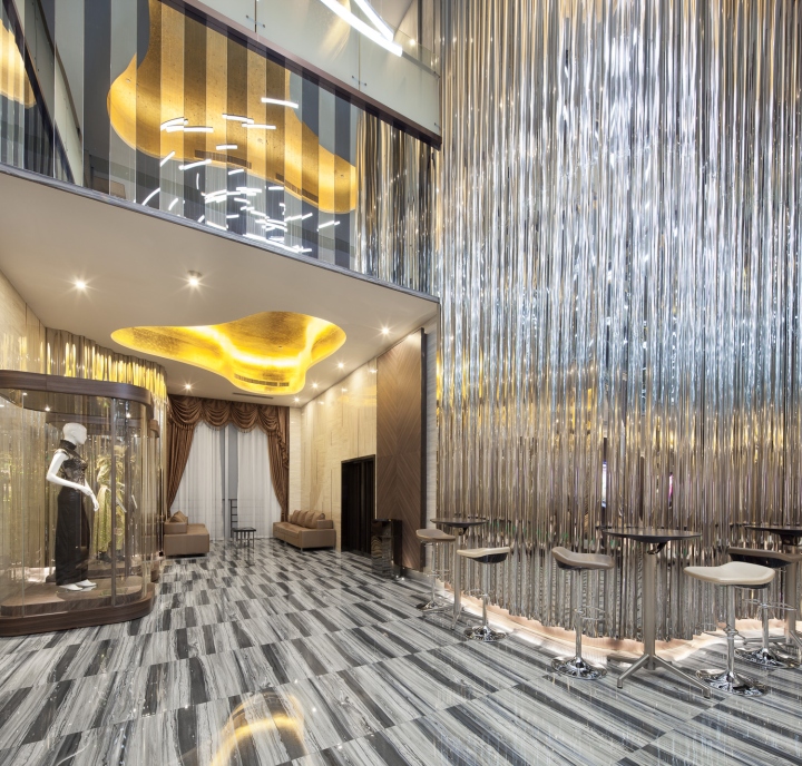
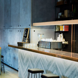
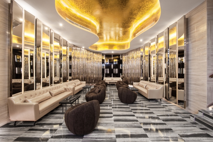
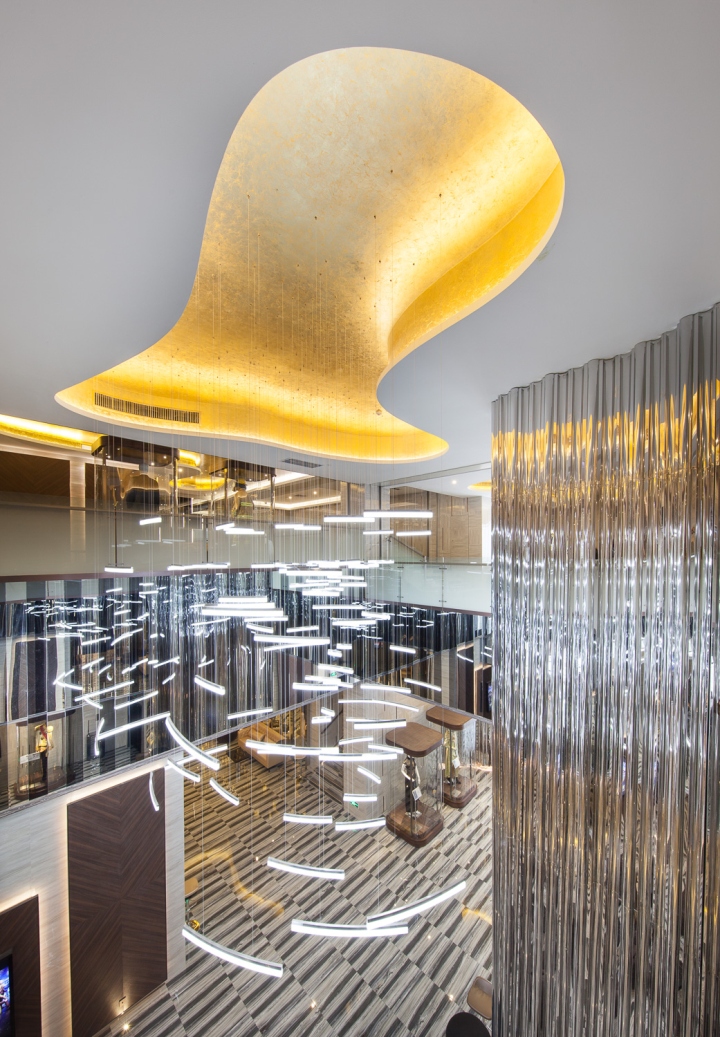
Another great checkpoint of the cinema is the VIP room on the 4th floor that is an ideal place for movie lovers to chill out and maximize their enjoyment. Getting in here after movies, the feeling is just like letting the sunset to precipitate into one’s heart after a long day of a fascinating journey. VIP room is where visitors sense the dusk and share their feelings. The theme of this space is brought out by the ceiling features at the entrance of the lounge, the orange feature false ceiling that is ornamented by the surrounding light troughs has become a heart-warming sunset. As well as the chandelier hanged beneath resembles the system of constellation, which informs that stargazing time starts after dusk. Spontaneously a journey in the cinema is also a journey for stargazing. The second checkpoint is the bar counter area, as the background the mirror finished stainless steel strips feature wall has formed a wave of tides vertically, hence the wall has turned into a screen of water with millions of sparkles, the counter echoes back to the screen by the form and backdrop under the same theme, the consequence is that the spectacular sunset scene is reflected and scattered all over the interior.
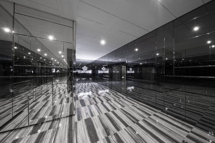
The features above are being reinforced by a wall with grey web-patterned marble finish, and there are a variety of copper-coloured metal strips placed within marbles in an imperceptible order. As same as the features mentioned above, elegance is the result of the collision of materials with natural ambience and those with artificial ambience. This mood has also spread to the floor finish as grey web-patterned marbles has showed up as the floor finish here, which also reflect the stunning dusk scene above and add weight to atmosphere. When entering from the main entrance towards the door inside the VIP lounge, visitors are escorted by various sets of timber finish with symmetric patterns, along with rows of lightings under the mezzanine balustrade, the thoughtful mindset of the decorators can be found within the natural aurora in this space, and the concern about audiences is what they can get by the way they enter this place.

The “sunset” feature ceiling and the dark grey marble flooring have injected the natural theme well into the whole lounge, however their roles here are just auxiliary, to become the backdrop of the main feature wall in front of audiences; black mirrors with clear and frosted finish are well assembled in the same manner of the marble feature wall at main entrance; and in order to enhance visual attraction and splendor of the feature, the role the was originally appointed to metal strips is now taken by LED strips, they joint closely with the mirrors like scales of fishes, visitors will be fascinated at the moment they step in. the stainless steel “curtains” are dangled on the both sides of the staircase at the counter block, with their non-natural stylishness they express that when the curtains are opened, one can find the staircase that is decorated by tidily arrayed mirrors with clear and frosted finish, straight to upstairs; from the trace of changing design styles along this location, visitors found clues about the brave new world that awaits upstairs.
Designed by Oft Interiors


Add to collection


