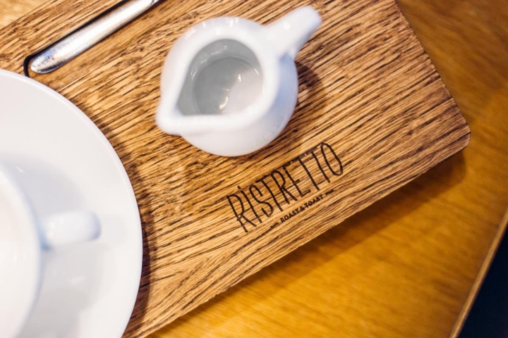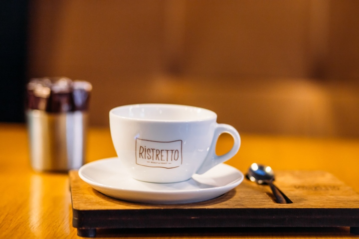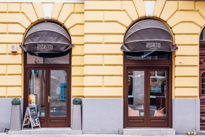

Ristretto cafe is located in the heart of the historic center of Oradea, a city in the North-Western part of Romania, on a pedestrian street flourishing with activity especially during summer evenings.

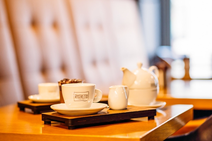
We wanted to create something that would stand out from the rest, yet that was simple and elegant at the same time. The design concept as well as the branding of the coffee shop are intertwined and revolve around the idea of “small”: the tiny interior, as well as “ristretto” (a short, “small”, concentrated shot of espresso).

We had to work with what we had at hand – a very small, empty space in one of the most expensive areas of the city – and get the best out of it, but we were very lucky to have an open-minded and passionate client, that not only trusted us in everything, but also brought valuable input along the way in the design and branding process.

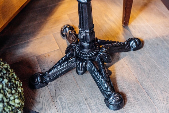
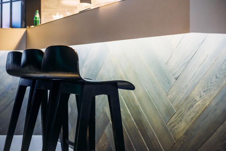
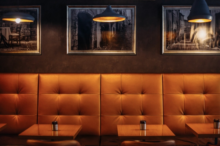
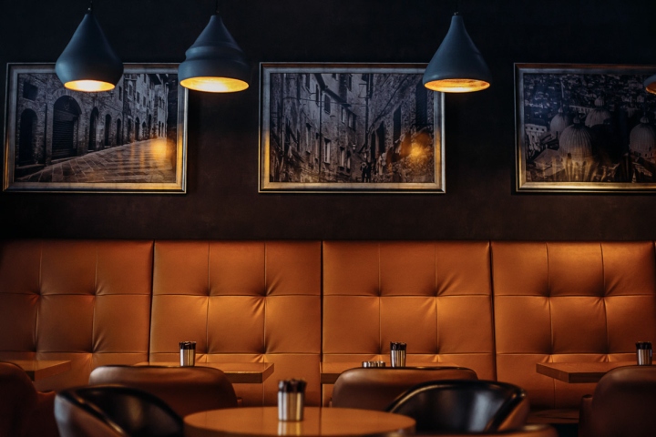
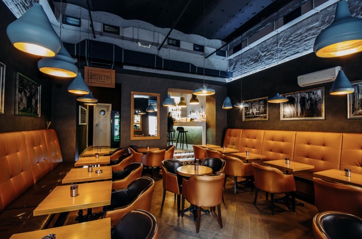
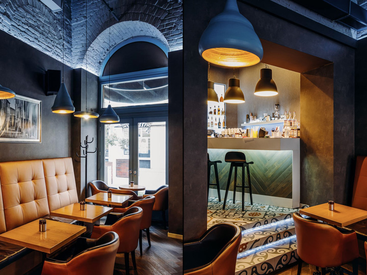
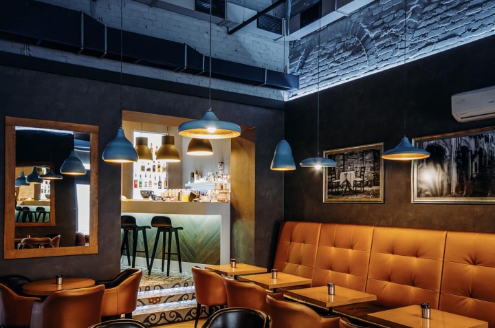
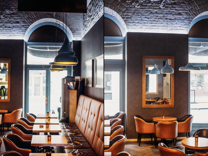
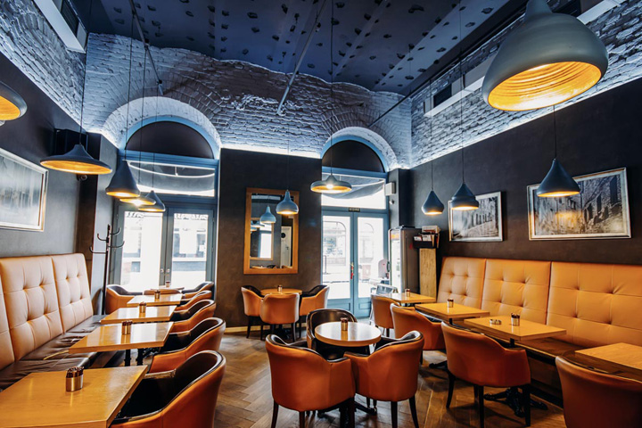
As we mentioned before, our approach revolves around the idea of “simple” and “elegant”, without being too pretentious. We aimed for a cozy, intimate and welcoming interior, hence the use of wood (floor, tables, other accents or details) and a warm chromatic overall. The wooden floor we picked ages beautifully in time, having a vintage feel without being damaged or overused. The geometric patterned tiles from the bar area remind of the building’s first days, decades ago.

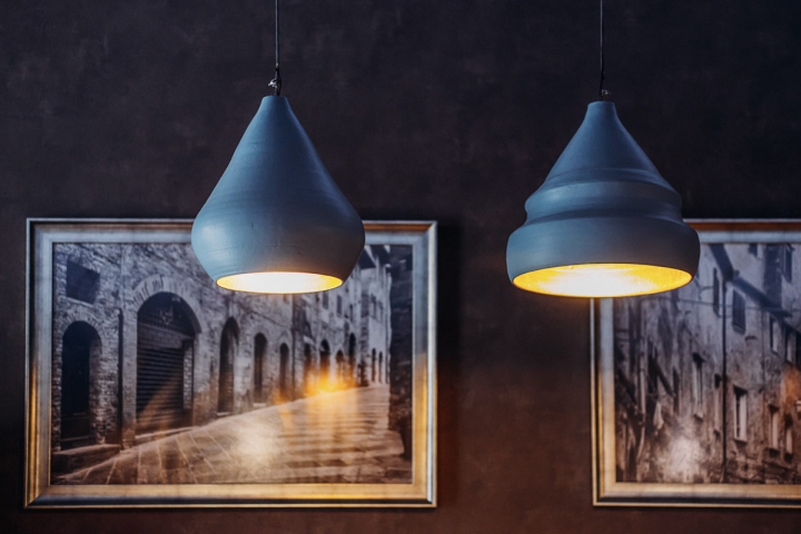
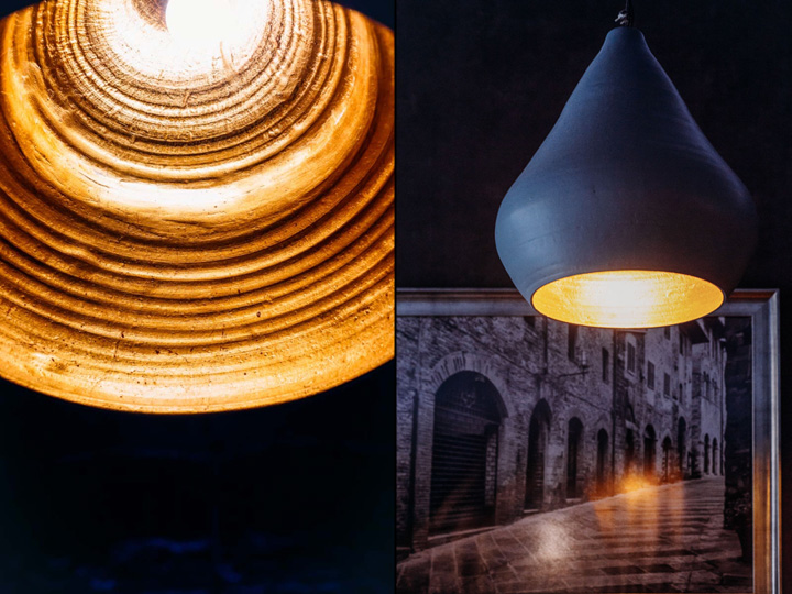
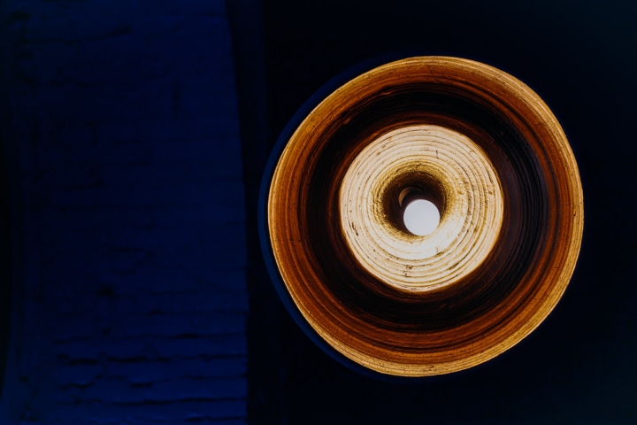
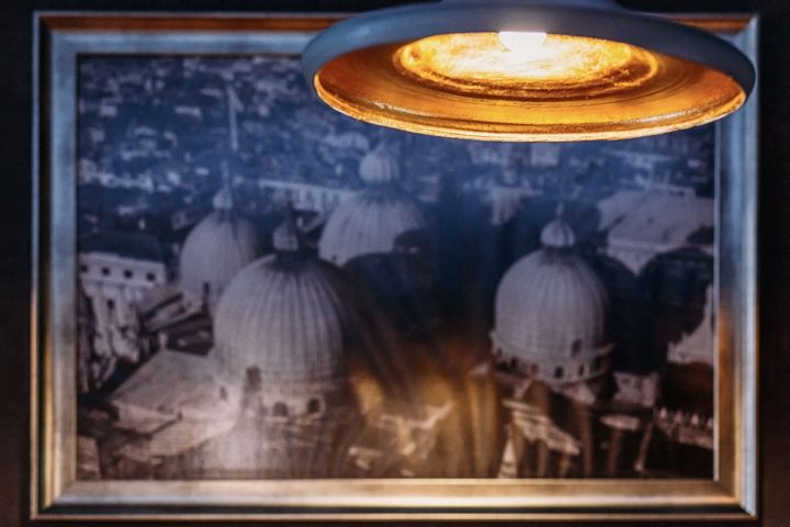
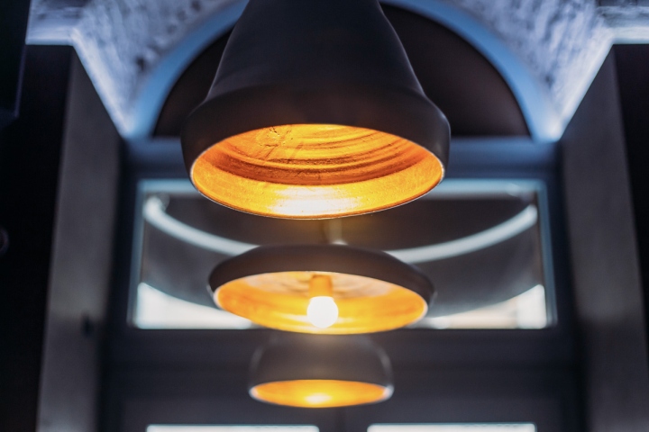
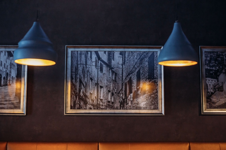
The cafe being situated in a historic building from the beginning of XXth century, we also benefitted from the high ceilings that gave us enough space to play with pendant lights (each and every one of them being unique and custom made by Raul Bocse – a pottery master from Leheceni, Romania).

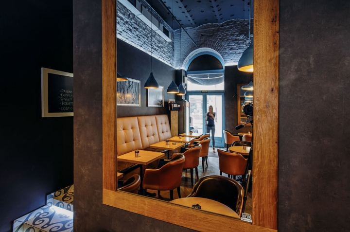
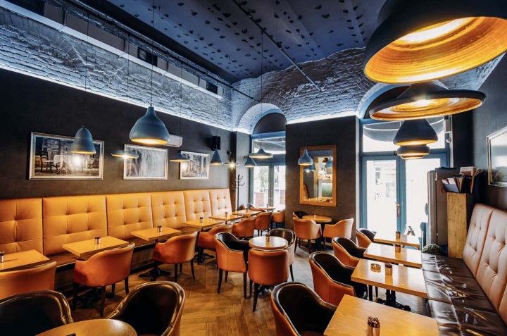
The crowded interior was a bet and we’re happy to see that we won it. The layout was inspired by the tiny, cramped cafes in Paris, a characteristic that doesn’t represent our local environment where people want to have their “safety space” as large as possible.

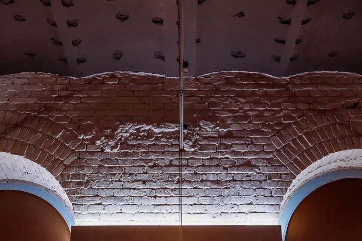
We decided to keep the upper part of the space more “raw” to add some interest and contrast to the whole design. Therefore, we kept the brick walls apparent and painted them in a light shade of grey for protection, but also to have them as a neutral background. We left the ventilation pipes visible to add a touch of industrial feeling, plus the dark old ceiling that was previously covered with gypsum boards. We helped our purpose with accent lighting to emphasize interesting details or areas.

Ristretto is the kind of place that shows off its hidden details over time: each time you enjoy your coffee here you might just notice another interesting element that previously escaped your attention – and that’s why we’re so proud of it!
Designed by Catalin David, Radu Zetea / Davidsign
Photography by Andreea Iancu, Catalin David

