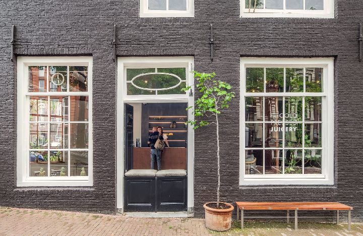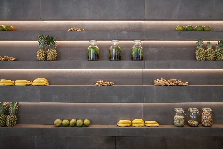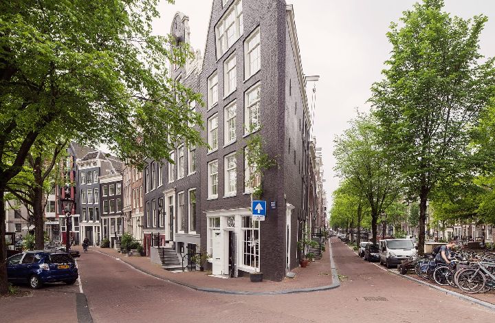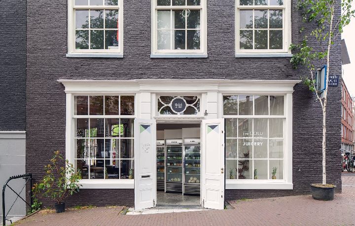


After the successful completion of the first and second design for the Cold Pressed Juicery at the Willemsparkweg and the Herengracht, Standard Studio got asked to create their third store. Located opposite the Anne Frank Museum, right in the corner where the busy Prinsengracht meets the calm and peaceful Bloemengracht.

Every morning the street is full of cyclists rushing to work and during the day the tourists will appear, trying to find their way around or simply enjoying the beautiful city. Either way, this store is located right in the center where everyone can enjoy a healthy tasty juice.

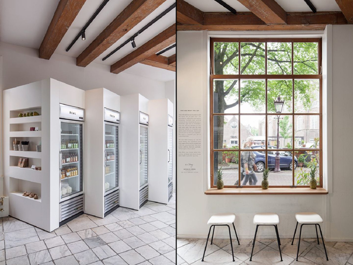
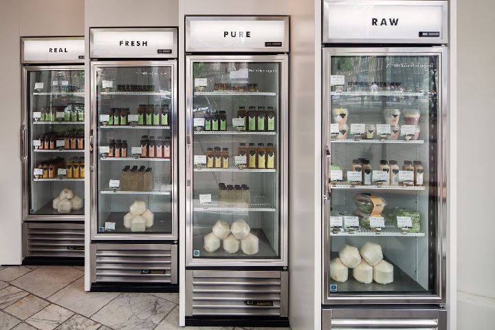
The layout has made it possible to create two different worlds. As the front we have the entrance to the Prinsengracht, a canal with so much happening that life never stops. As you enter you will notice how Standard Studio has kept the monumental characteristic of the marble floors, where the fridges are located, containing the “take away” products.

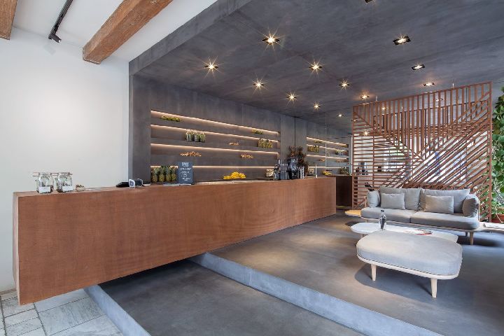
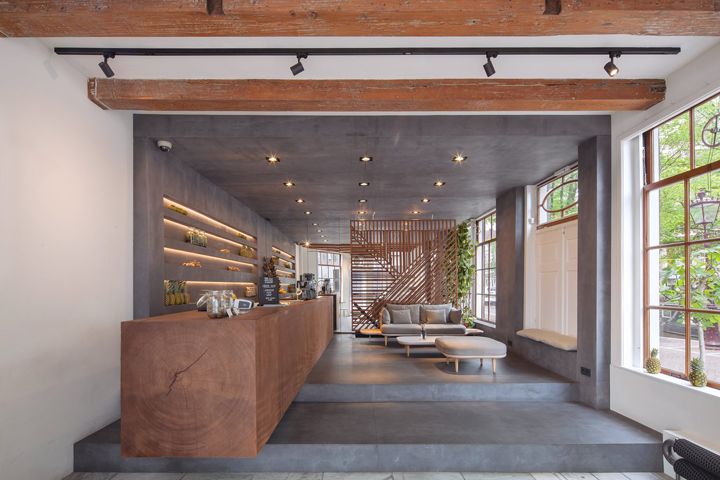
The fridges are set up in a way that has been inspired by the intersection of both canals following two different directions. Commuters in the morning pop in for a few minutes, go straight to the fridges, grab their juices, and off they go to work. The calmer world is at the back of the store. This area is elevated by a few steps and is designed as a concrete box. The contrast in material and in height creates the division between both worlds. A very calming and relaxing atmosphere has been created thanks to the possibility of having the space for cosy living room setting, the addition of some plants and the pretty view onto the Bloemengracht.

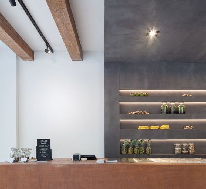
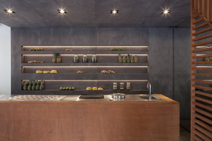
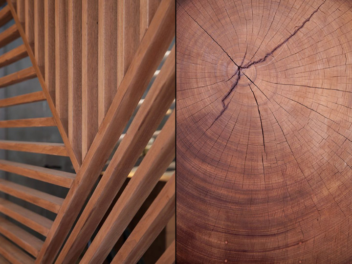
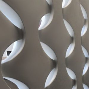
Both worlds are connected with a huge tree trunk that was cut to create the counter that houses a smoothie station and the cash desk. This counter was made entirely out of a solid wooden beam weighting over 4 tons. The wood that came out of the beam was used to create a screen that refers to the graphic identity of the brand which was made by Build Amsterdam. The wood was also used to create windowsills and benches outside. For a strong spatial effect a mirror is used in the back to make the space look bigger.

If you find yourself in the center of Amsterdam, stop by and grab a juice at The Cold Pressed Juicery, and if you need to take a break just pop into the back of the store where you will find enough space to relax and enjoy the beautiful sight both of the inside and outside world.
Architects: Standard Studio
Photography: Wouter van der Sar Photography


http://www.archdaily.com/797039/cold-pressed-juicery-shop-prinsengracht-standard-studio

