

Jewelry brand Pianegonda recently unveiled the new collection at the last VIcenzaOro trade fair in Vicenza, Italy. The brand has been lately acquired by Bros Manifatture Group, an Italian manufacturer, leader in the jewelry industry.

For this launch the Bros Retail Interior Design office conceived a 55 sqm stand, characterised by a strong and clean geometrical approach. Both the external structure and the interior environment were featured by recurring contrasts: black and white surfaces, sharp and sinuous shapes, lit and dark areas. These themes stood out distinctly even from afar: approaching the booth, visitors’ sight was caught by a big lit gable, leant on black-mirrored lateral walls, which seemed to surround the stand on both sides.

The stand had two main purposes: presenting the new Pianegonda collection and offering a welcoming/lounge area for visitors. This double function was reflected on the plan layout, so that the area that overlooked the pavilion’s hallway was devised for jewels exhibition, whilst a screen wall separated the lounge area.

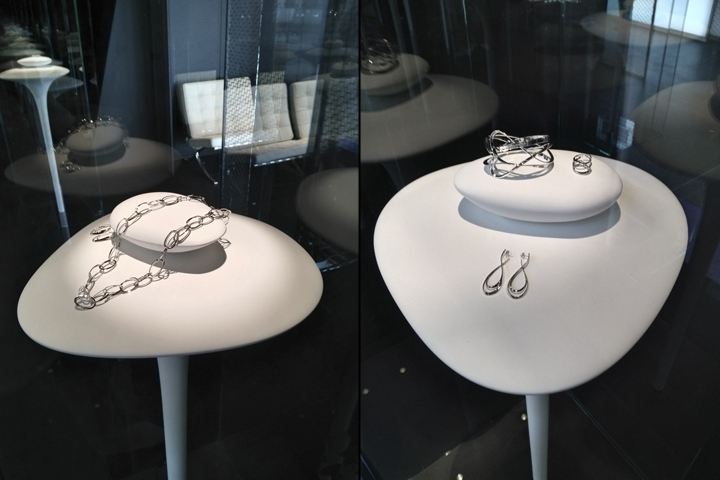
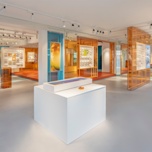
Jewels found space in a museum-looking environment, characterised by glazed showcases, inside which white, free standing stem-shape displays were located. Each stem was enriched by a sort of stone, softly leant on its surface. This detail gave the illusory feeling of an equilibrium. The soft, sinuous and white shapes of these objects wanted to recall the “rebirth” of the brand, giving a feminine touch to the cold surrounding environment.

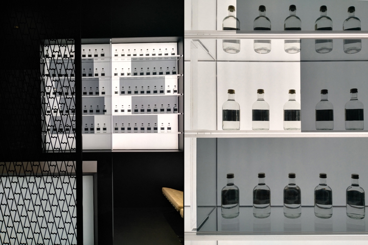
The contrast of the white displays’ stem, which seemed to emerge from the floor, and the black-mirrored walls, helped to drive visitors’ attention on nothing but the jewels. Smoked-glass panels and branded logo-patterned, metallic screen walls divided this zone from the lounge area, where backlit bottles, supported by transparent shelves, aimed to give to the environment the elegance and prestige required.

