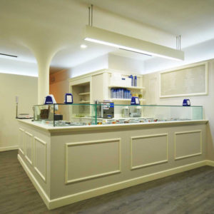


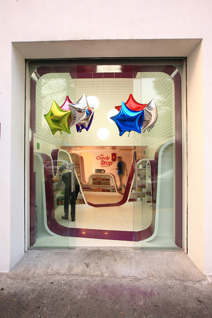
The Candy Stop Coyoacan is the first branch of a new candy store’s brand in Mexico. Located in a traditional neighborhood in southern Mexico City the design stands between the straight-forwardness and familiarity of the product and the desire of an eye catching proposal that would attract customers; the middle ground between the traditional vibe of the area and the contemporary feel of a new brand.
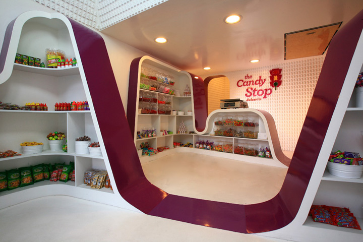
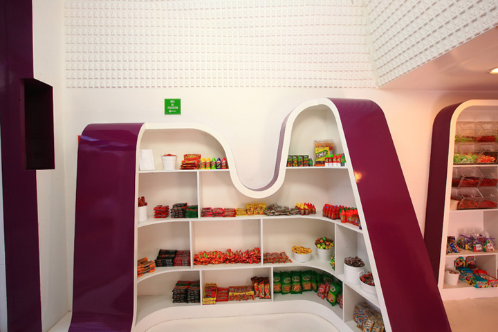
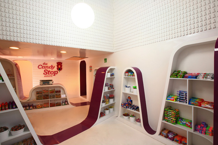
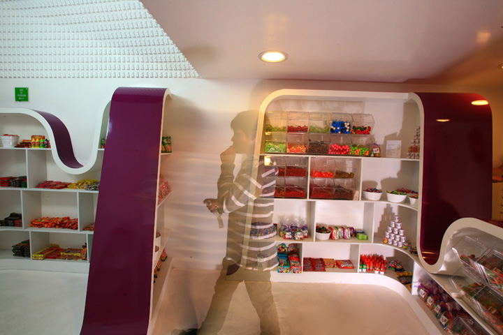
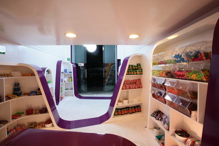
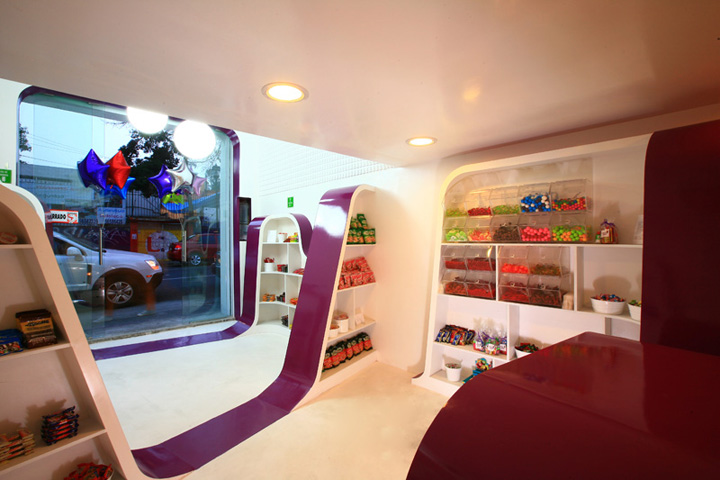
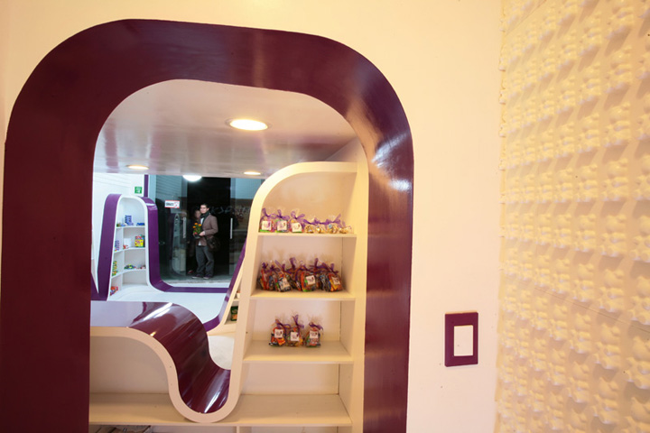
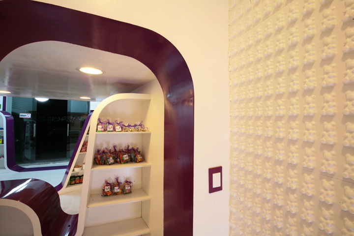
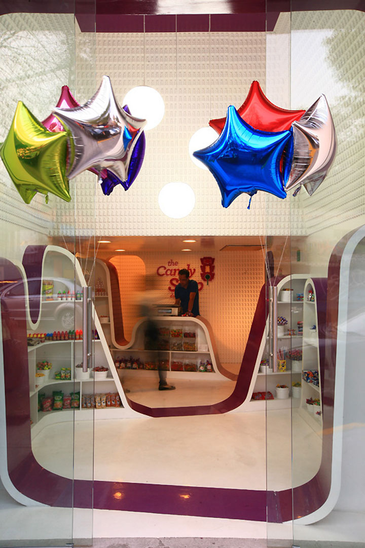
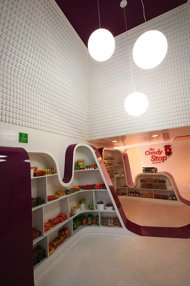
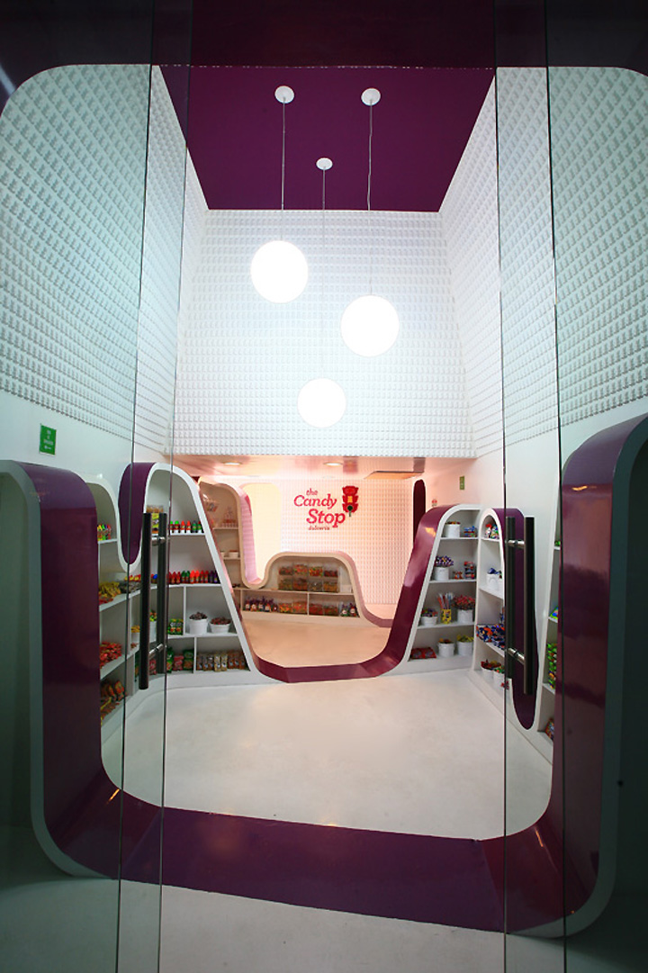
The entire exhibition is contained in an undulated rack that becomes a continuous purple ribbon that fuses with the floor and main desk in different moments. The same color is used to frame the transitions between spaces and at the main entry to the store.
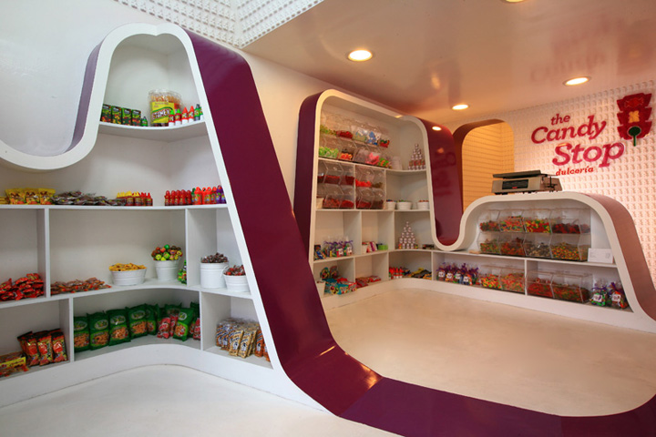
An existing second floor was partially demolished to create a double height area at the entrance enhancing a much needed sense of spatiality to the storefront. The upper surfaces of the walls are tilted to the inside in a quasi pyramidal shape, sharpening even more the perceivable height by elongating the visuals. This surfaces are completely covered by a repetitive pattern of abstracted gummy bears designed by industrial designer Ariel Rojo acting as a loose reference to the patterns and textures common in traditional architecture.

The materials remind of the nature of the product: solid, reflective and continuous surfaces that are both easy to clean and strikingly vibrant. An eye candy for sweets.
Designed by ROW Studio










Add to collection
