
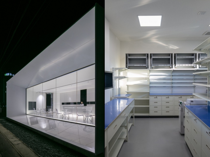
In Japan, two major types of pharmacies can be found. The first is the drug store, or what can be described as retail pharmacies. This type offers services related to basic medicines as well as parapharmaceutical products. The second type is the dispensing pharmacies, usually related to a nearby clinic or hospital. In this type of pharmacies, the products are prepared in the backyard after the customer presents prescription issued by his doctor. Once prepared, the pharmacist has to explain to the customer about the prescription.
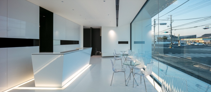
This dispensing pharmacy is located nearby a general hospital and owned by its president. The Idea behind this pharmacy is to promote the hospital by giving it a new image as it is subject to a strong competitiveness. The starting point of this design was to question the criteria that customers use to select a pharmacy, beside the geographical location. What would make a pharmacy better than another one? The purpose of visiting a pharmacy is the same, purchasing medicines and seeking healing.
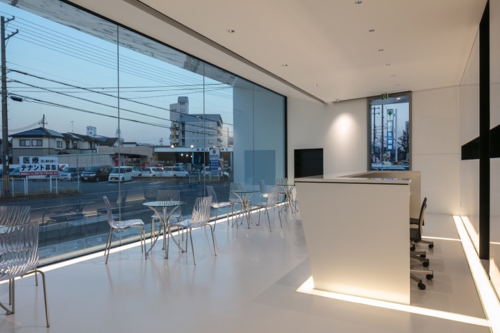
The keyword for medical related design is healing, commonly associated with peaceful nature. Subsequently, this type of design traditionally tries to incorporate natural elements like trees, green walls and flowers. Nature is undoubtedly a source of healing, nonetheless, the simple fact of coming to a medical institution lays on the trust that the patient puts on modern medicine. The more advanced medicine is the more trustworthy it becomes; true peace of mind is reached when the medical care is at its “Cutting Edge”.
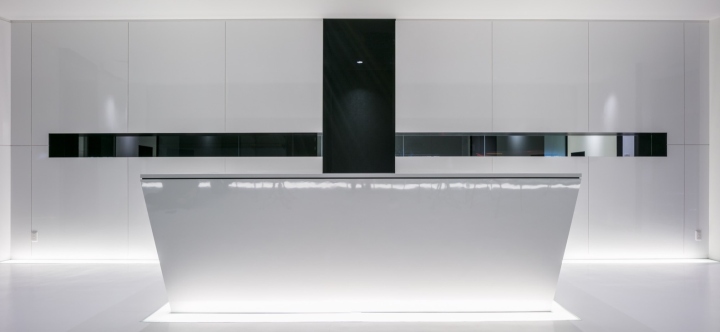
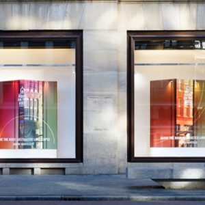
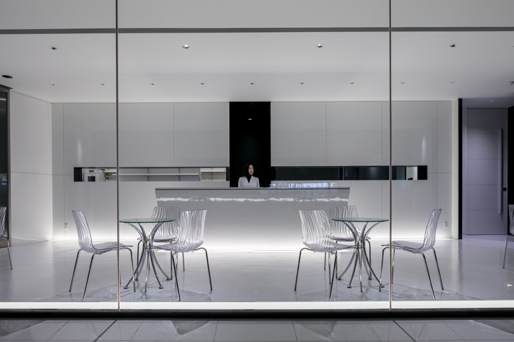
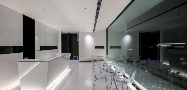
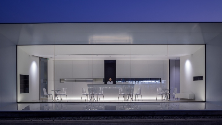
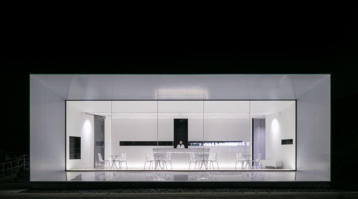
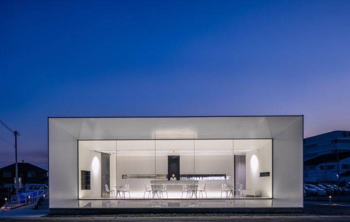
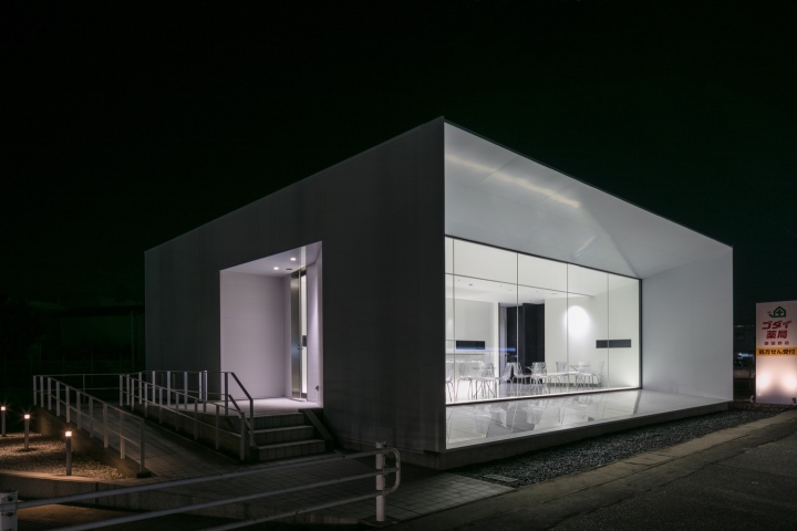
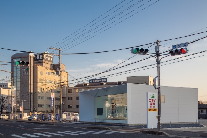
The pharmacy is situated along one of the most important streets in the region. The façade is totally glazed and contoured by protracted sharp edges. The edges are also projected into the minimalist white interior demarcated by a black cross. The vertical line of the cross is the gate towards the backyard where the prescriptions are prepared. The horizontal line is a console for exhibiting key products. The entrance is on the left side of the building in the direction of the hospital liberating the glazed façade from unnecessary additional lines.
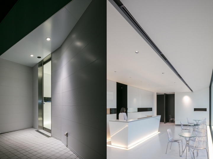
This minimalistic space designed in clean straight lines and enhanced with indirect lighting slits creates the High-Tech sharp image that the patient expects from an advanced medical care. Additionally to the appearance, the quality of service is a major criterion for selecting a dispensing pharmacy, and this is not without affecting the design. Traditionally, the patient handles his prescription at the reception counter; the pharmacist will then prepare the medicines in the backyard whilst the patient is sitting in the waiting space.
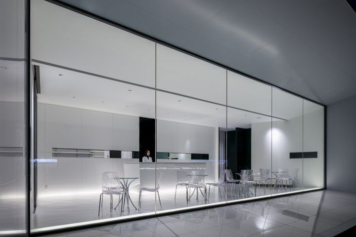
Once done, the patient will be called again to the counter to get explanations about the prescription. This pharmacy differs in that the patient will not be called to the counter again. Instead, the pharmacist will meet him at his waiting space furnished in chairs and tables. These small attentions can make a big difference by providing an image of High Quality services inducing the process of healing.
Design: KTX archiLAB
Photography: Stirling Elmendorf
http://www.archdaily.com/802512/the-cutting-edge-pharmacy-ktx-archilab


Add to collection

