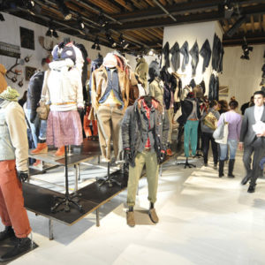


Objects are crystalized ideas, the better the interconnection of ideas the better the object and most pertinent it is. Sometimes is functionality is so pertinent that the aesthetic value gets forgotten. Here at the office we like good ideas and like do value them. Recover these design “Cinderella’s” and bring them back, so that people can understand their aesthetic value. As such we explored some potential object that could help us to built an appealing environment and that preferentially was in those conditions, and we found it, The hanger.
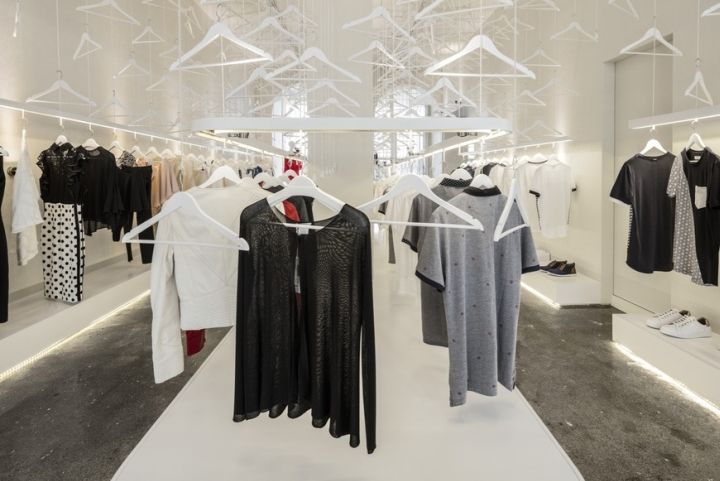
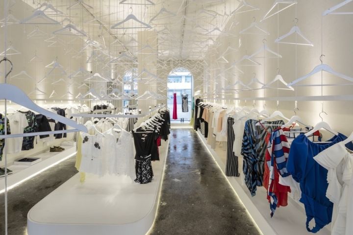
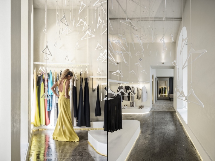
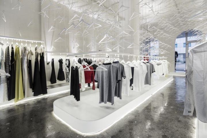
We flooded the space with more than a thousand hangers that, because of their intrinsique aesthetic value involves the user in a unique ambient. Hangers are almost renegade in the store design, their functional pertinence is such that they’re almost always thrown backstage. The same characteristic that made them a global success made them follow into banality. A victim of their own success. We distributed the hangers all over the space, divided in equidistant points.
When viewed from above it seems a pixelated screen with four hundred points distributed over 80.00sq/m. By working with the threads altimetry we understood we could recreate any space throw the negative of the original space. We wanted one that for his cultural relevance could become immediately recognizable and above all was able to valorize cloths and our base element. We´ve studied innumerous forms and realized that the formal power of the naves of a cathedral was all we wanted.
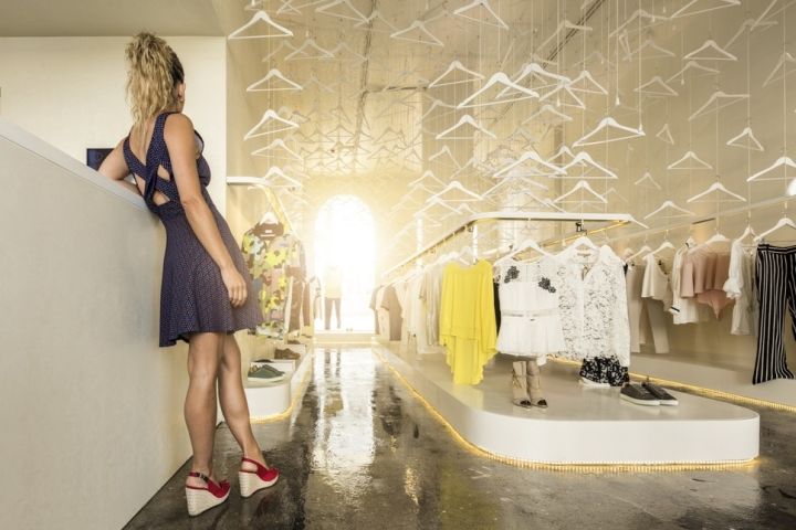
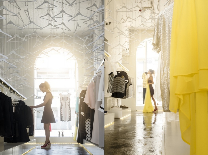
For one it had the recognizable force, and on the other hand it is a space drawn for dignify an valorize, it would automatically throw the observer into an aura of contemplation. So, when the observer enters, it´s automaticly involved by the naves silouete, the threads tension caused by the clothes weight makes gravity force almost palpable, directing our eyes up. Cloths flow throw space, their the elements that give consistency to the intervention. Their the foundations of the cathedral.
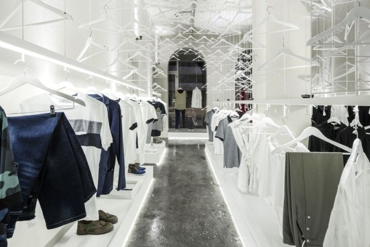
If empty space defines the archetype of a cathedral nave, the rest is awash with light. A serie of equidistant lights project light up making it more vertical and defining the space rythmics. Light is reflected in the threads white colour and give light a sense of materiality. We wanted a very desaturated space in order to highlight clothes colour, making them the lead actor. One other particularity is that the client can hang a specific cloth wherever he want in order to evidenciate.
Design: Paulo Merlini Arquitetos
Photography: Fernando Guerra

http://www.archdaily.com/801734/mr-and-mrs-white-store-paulo-merlini-arquitetos



Add to collection
