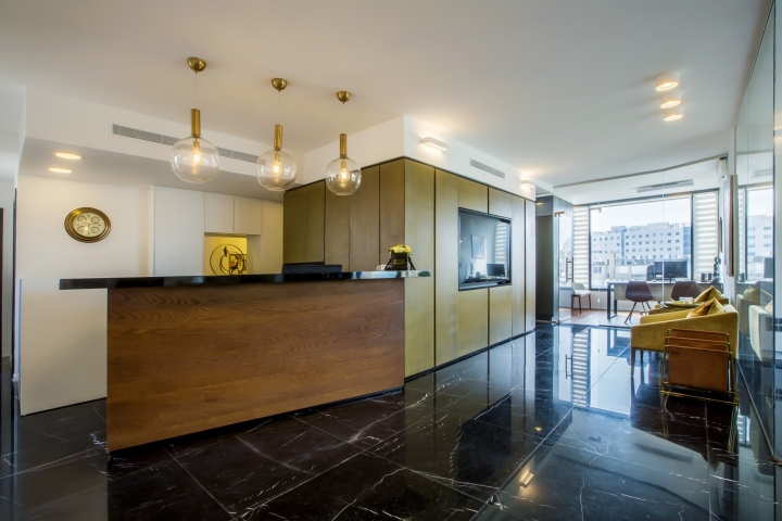

We were assigned to plan an office of a leading law firm. The firm’s practice in torts was established by advocate, Anat Cohen – Kaufman and includes six lawyers, two interns and two office managers. The firm’s new office is located in a high-rise building overlooking Netanya’s beautiful beach shore. When we first saw the new place, we immediately fell in love with it. The open space is about 140 sq. meters and has extremely large windows with a perfect view of the city and sea.
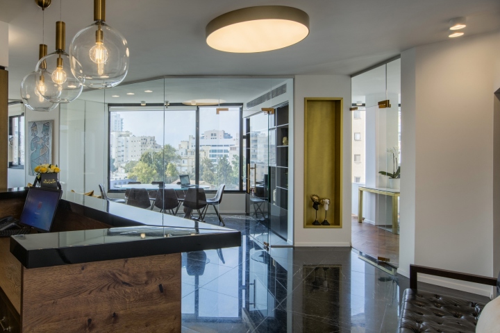
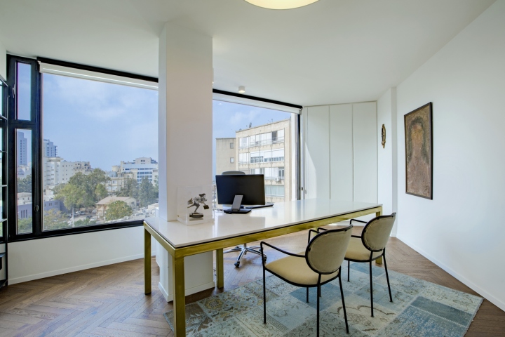
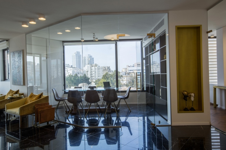
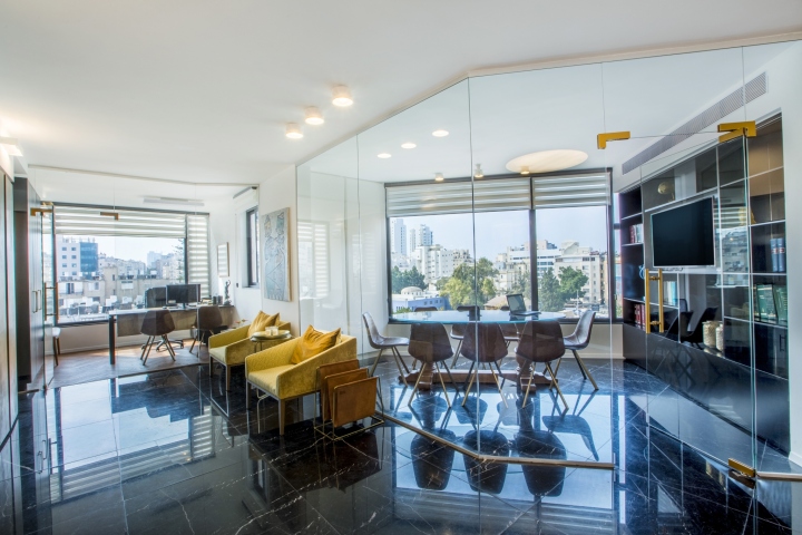
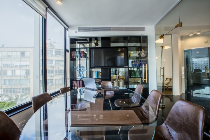
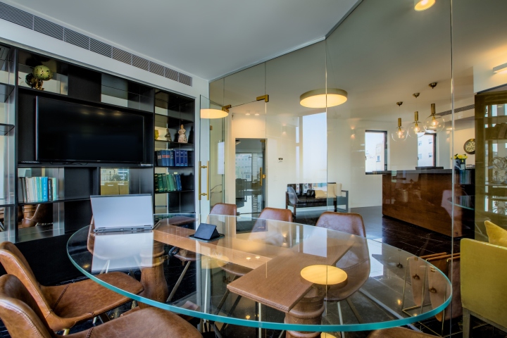
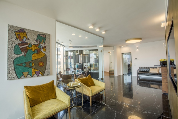
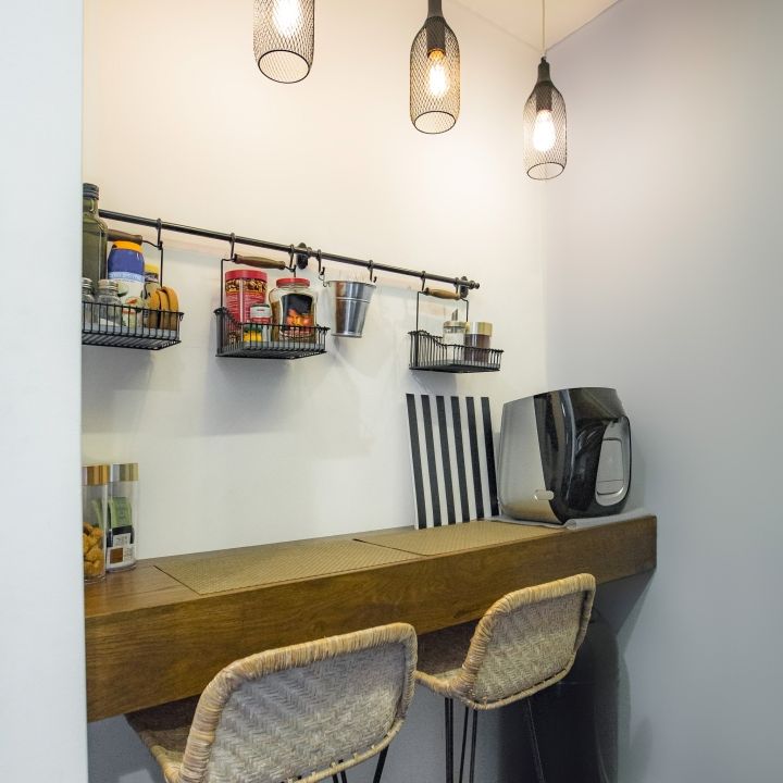
Our first design choice was to use maximum glass walls that enable dividing the space without blocking the view. The challenge was to try and fit all required functions into the available space: a conference room, the owners’ office, seven lawyers’ rooms, interns’ room, an archive, a kitchenette, restrooms, a front desk and a lobby. It was a difficult assignment given the specific space. In order to make an interesting area and avoid long corridors, we chose planning the rooms in a circular form, like a core and its peel.
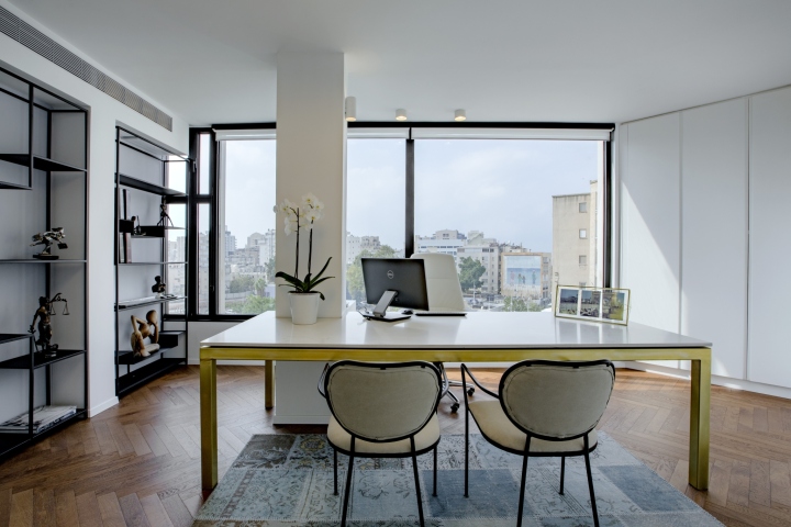
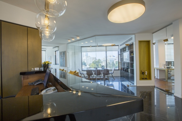
The core itself has an inner part and an outer one. The outer part is the reception desk, the secretaries’ desks and a screen wall that contains lots of paperwork. The inner part is the office’s archive, the copy machines and paperwork storage. In the outer peel we located the conference room, the owner’s office, the lawyers’ offices, the kitchenette and the rest rooms. The architectural structure we created enables the staff only to be able to use the inner core and walk through it.
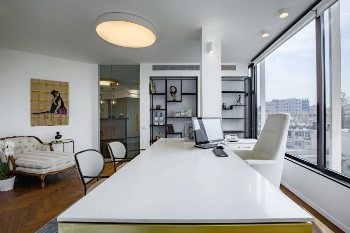
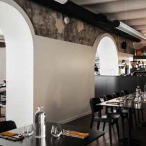
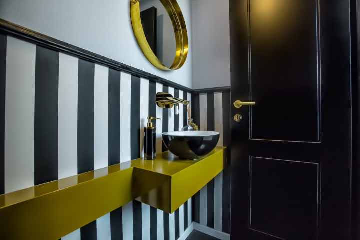
Our design concept was to create a unique space with lots of contrasts. We wanted the space to be fascinating by using a combination of warm and cold materials. We used contrasting colors like black and white, with glimpses of gold and brown. Creating harmony is very important to us in all of our projects. In this project it was more challenging because of the delicate balance between contrasting materials, colors and the layout.
Design: Halel Architecture


Add to collection
