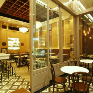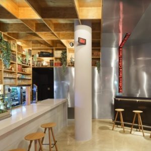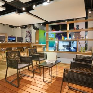


Late March this year Jensen Retail Group created a groundbreaking concept for boozt.com’s very first physical customer universe. It was our intention to create a total experience that completely separates itself from all the other beauty concepts on the market. An experience where boozt.com’s high standards, when it comes to service, are translated into a whole new platform, where they can actually meet their customers.

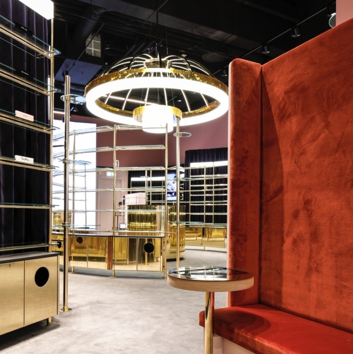
Since it is their first physical shop, we have had the opportunity to translate boozt.com’s values and develop an identity which can lead the way forward. When it comes to style, the design clearly carries references to the art deco-period’s decadent universe, where materials like brass, glass and velour are in dialogue with a sharp geometric design language.

The colors are deep, and along with the soft fabrics on the floors and walls, they create a pronounced sensuality and a feminine expression which is a sharp contrast to the rest of the shopping center outside Beauty by boozt.com. We have aimed for an undefined feeling that you enter into an exquisite hotel.

It has been a clear goal for us in relation to the shape and depth of the shop that you can not overcome it all at once, and instead we have created a visual division, where you move into small exclusive coupons you feel comfortable in.

By creating these different experience zones and ‘spaces’ in the shop, where there is time to think and to sense the products better, we have created a feeling of being in an exclusive walk-in-closet. It is the intention that you forget the fact that you are in a shop and start feeling like an appreciated guest in an exquisite home.
Design: Jensen Retail Group
Photography: Magnus Omme

