

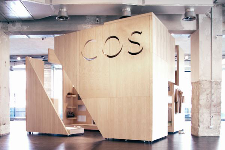
COS are launching in Italy this July. To promote their impending arrival the guys at COS asked me to design and build them a pop up store in Milan to coincide with the prestigious Salone del Mobile furniture fair.
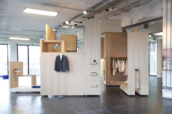
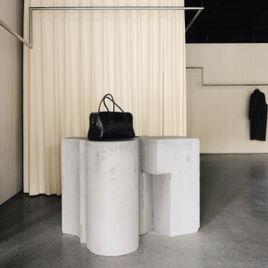
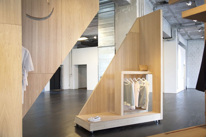
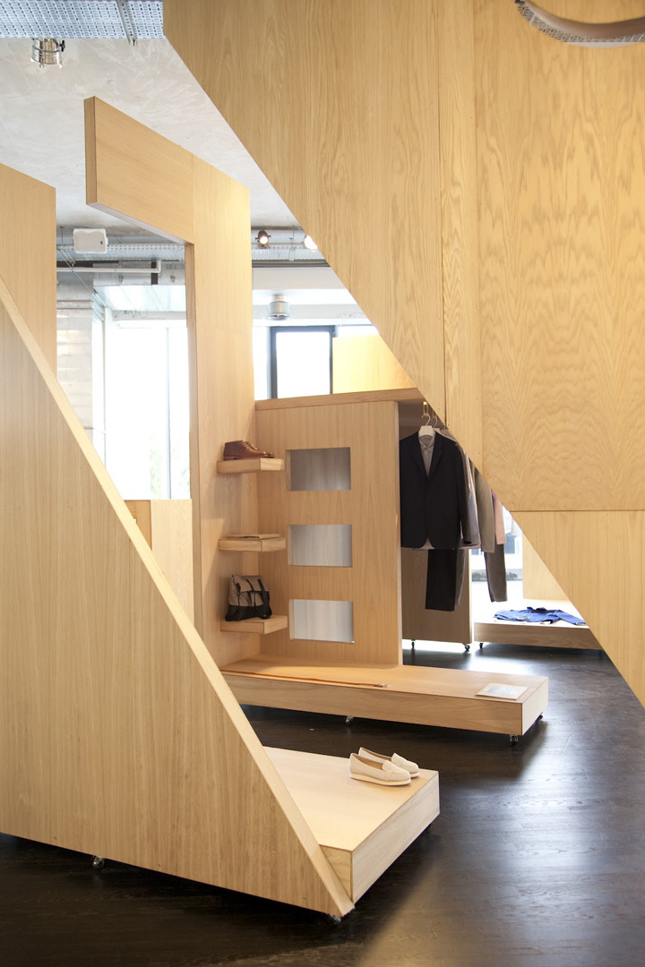
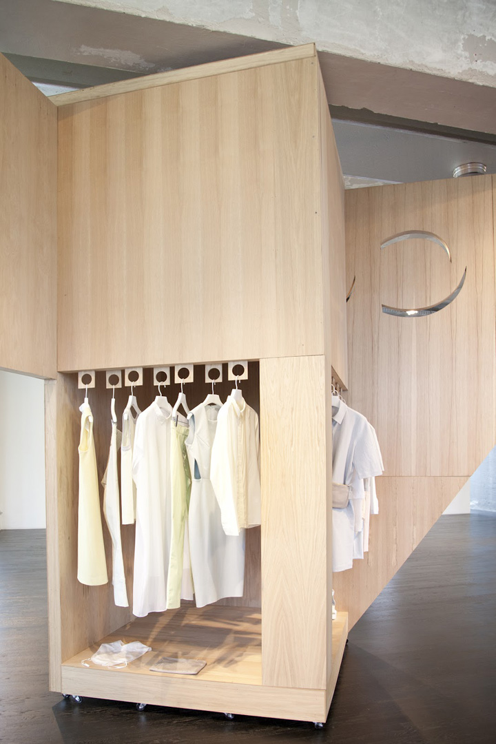
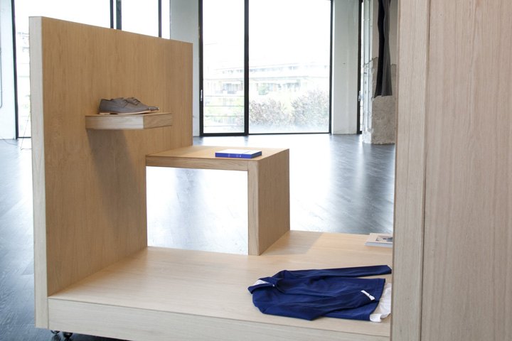
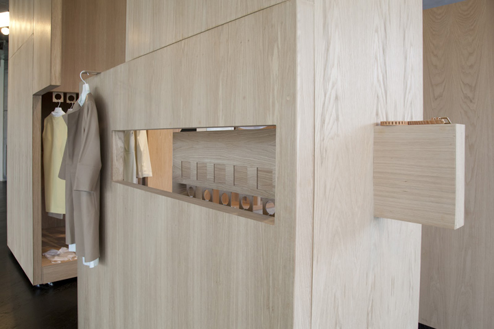
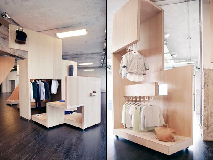
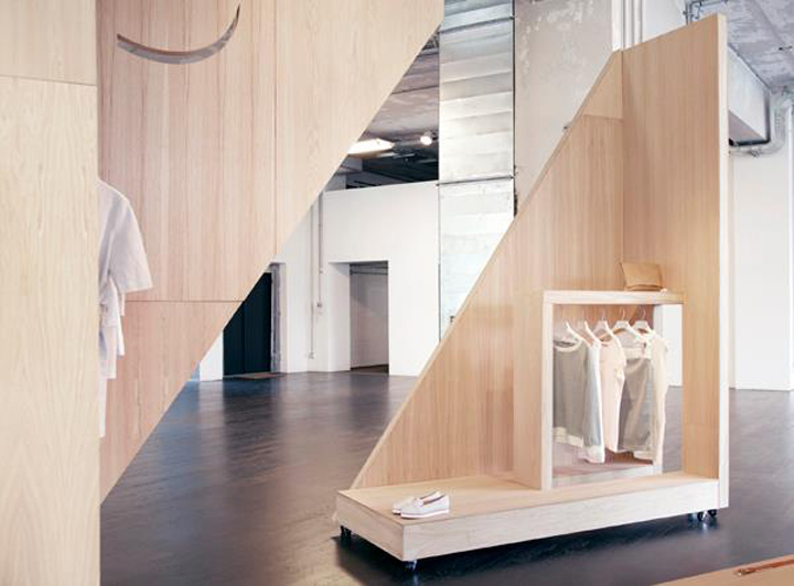
I felt like the pop up store should embody the COS ethos, simple yet witty design that doesn’t overpower or distract. This made me think of classic Swiss interior design and the idea of no unnecessary extras. I thought about a perfect wooden box and how every part of that boxes material could be reconfigured and used, this became the design philosophy for the instillation.
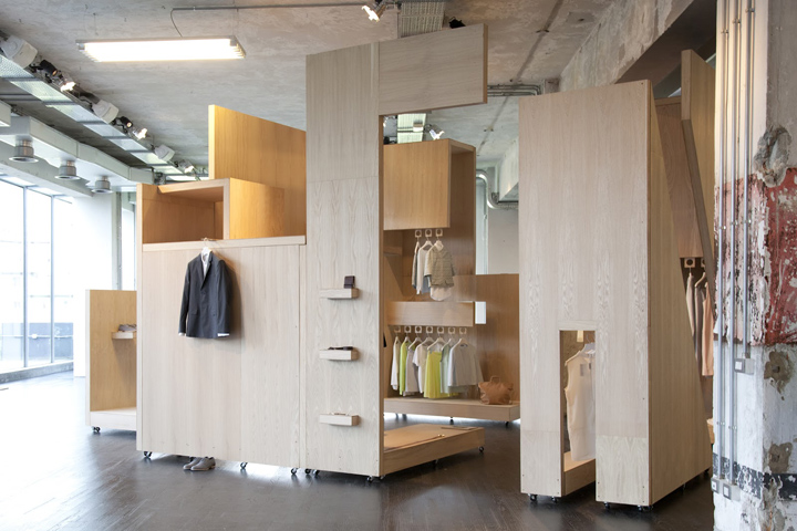
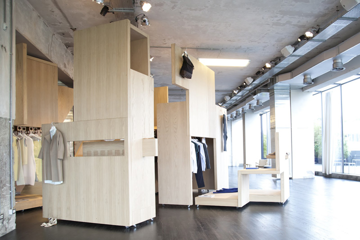
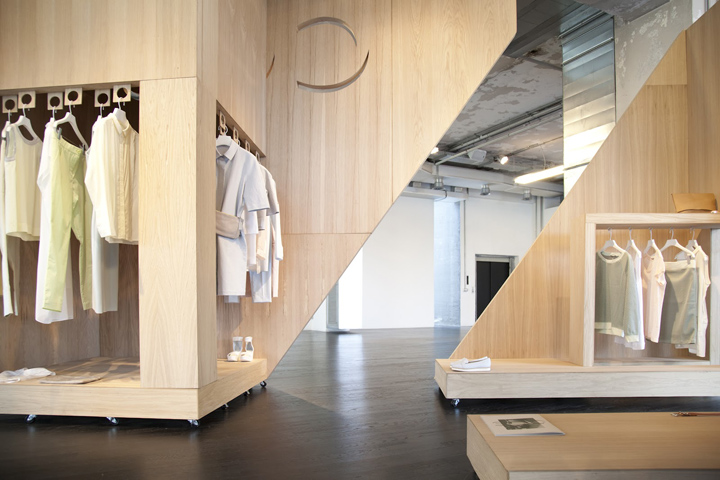
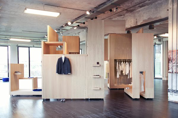
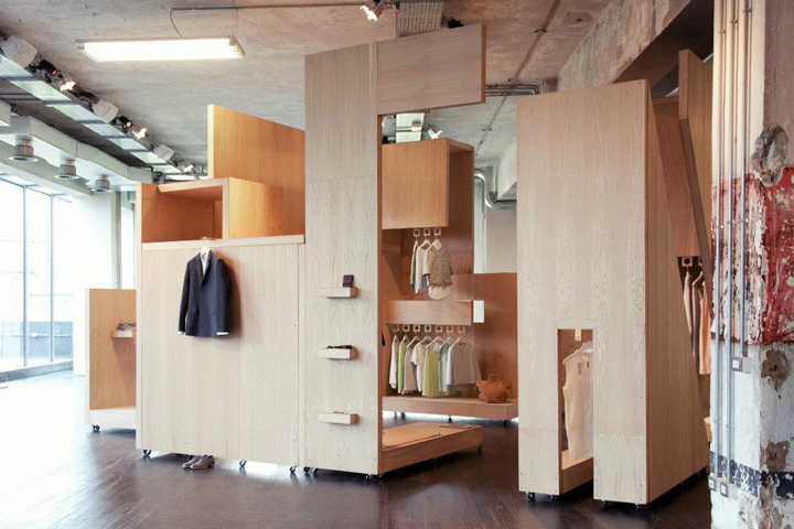
I used Mondrian as a starting for this project and thought about how he divided his paintings into sections, I considered how I could transpose this idea into an environment design. This led me to the concept of the box and how it could be fragmented and fold into itself to create a display space. I loved the idea that every part the cube would be used to make every part of the display areas and railing systems, nothing would be wasted.
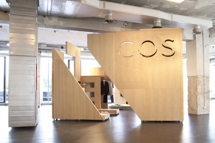
From roof to wall to floor, all would be cut away and re-assembled into all necessary display components. The process of designing this became a kind of elaborate puzzle, as every part that I changed had a knock-on affect to the rest of the structure, ultimately leading to a thoroughly considered piece of design that sits somewhere between retail space, instillation and furniture.


http://garycardiology.blogspot.com/2012/04/cos-pop-up-store-for-salone-del-mobile.html





Add to collection

