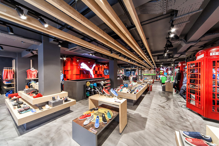

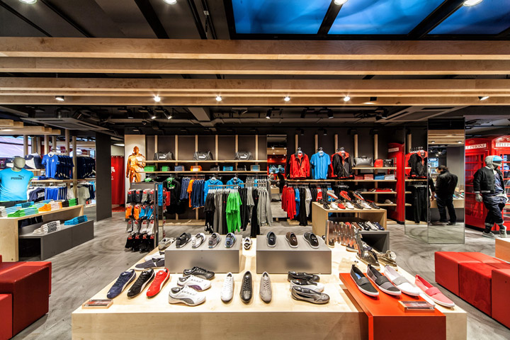
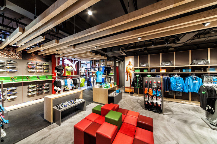
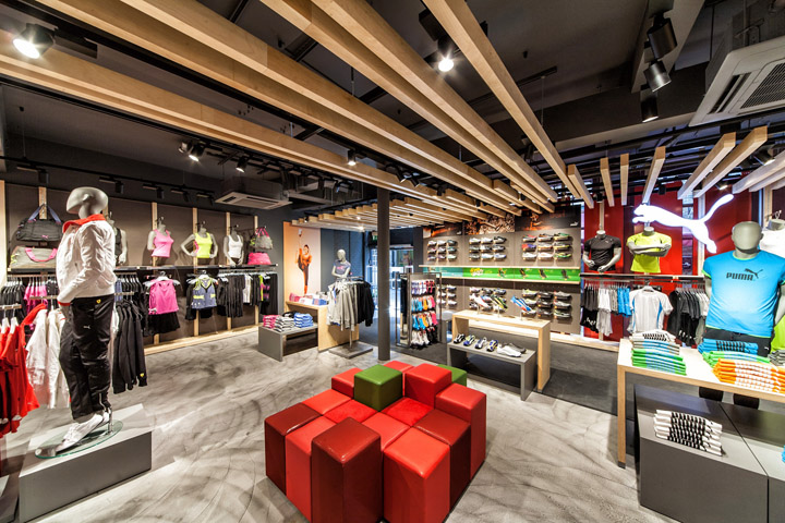
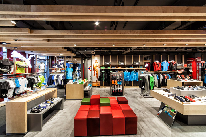
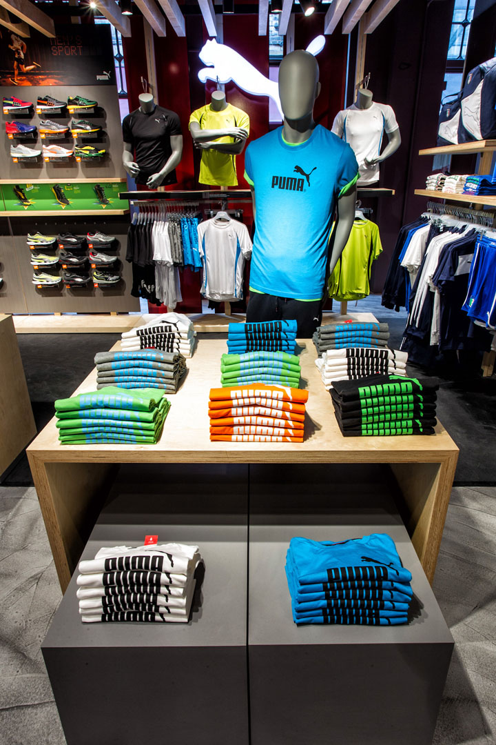
Re-designed Puma store back on London’s Carnaby street! After a complete makeover by Plajer & Franz Studio and under the direction of Ales Kernjak (head of global store concepts, Puma Retail ag) the Puma store on London’s Carnaby street re-opened on March 20th. In line with Puma’s 2.0 Retail Concept, the store design unifies joy, innovation, simplicity and a local relevance, while being constructed according to Puma’s sustainable guidelines.
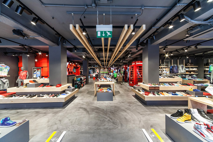
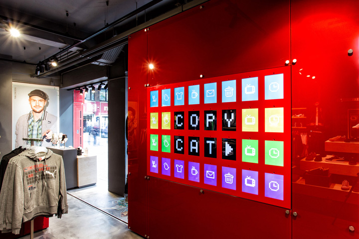
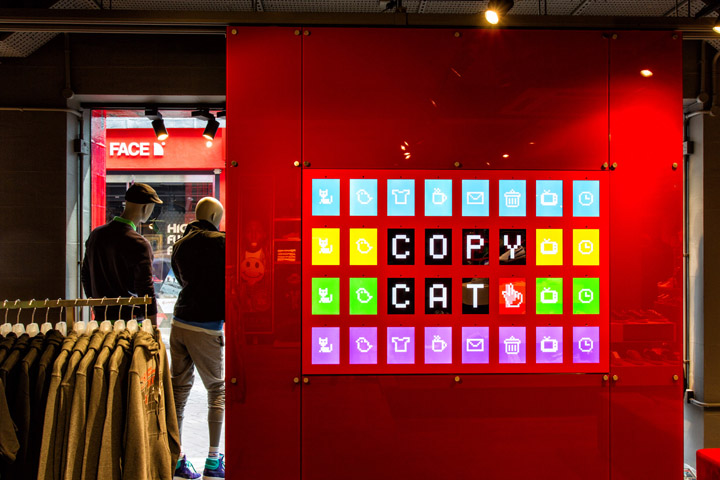
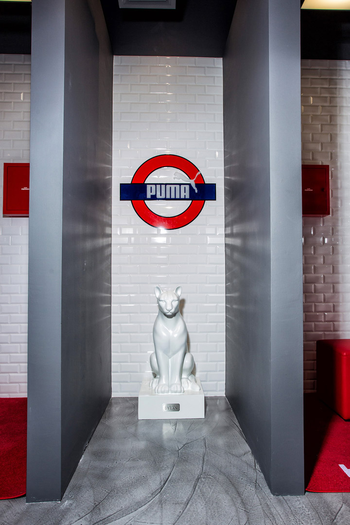
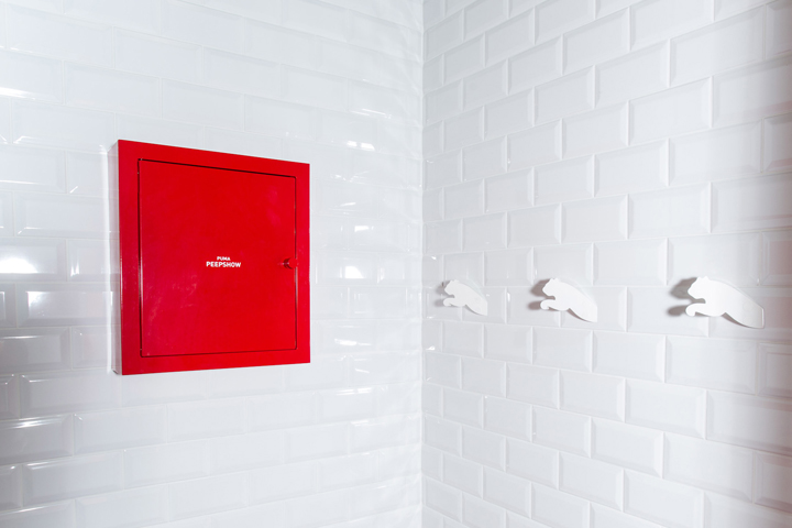
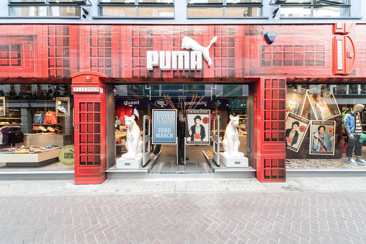
Numerous joyful elements and cutting-edge technology are scattered around the 302 sqm shopping space including life-size Puma cat sculptures greeting visitors at the entrance, ‘Puma Unsmart Phones’ ringing when approached, Puma’s ‘Peep-show’ displaying image movies when opened, or Puma’s moveable joy-pad wall – an assemblage of 32 synchronized digital touch screens featuring simple games for the customers to play and compete with friends.
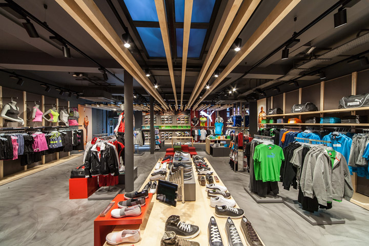
iPads placed in the store allow shoppers to purchase products from the european online store, which offers a wider merchandise assortment, complete size runs and alternative colors of items stocked in the store.
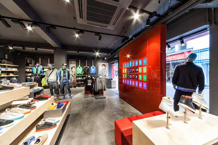
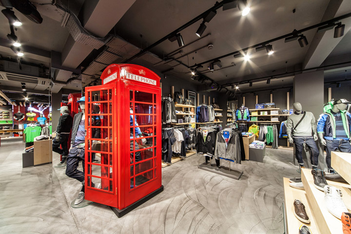
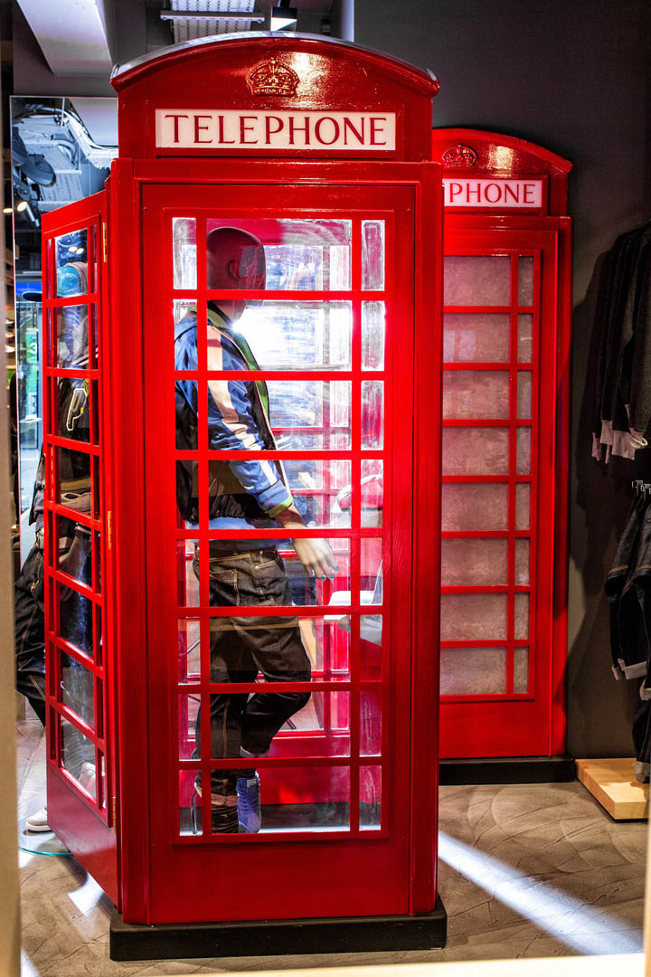
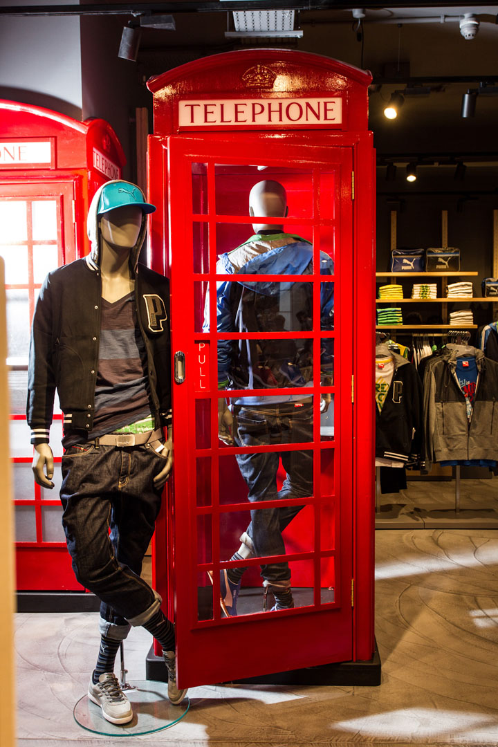
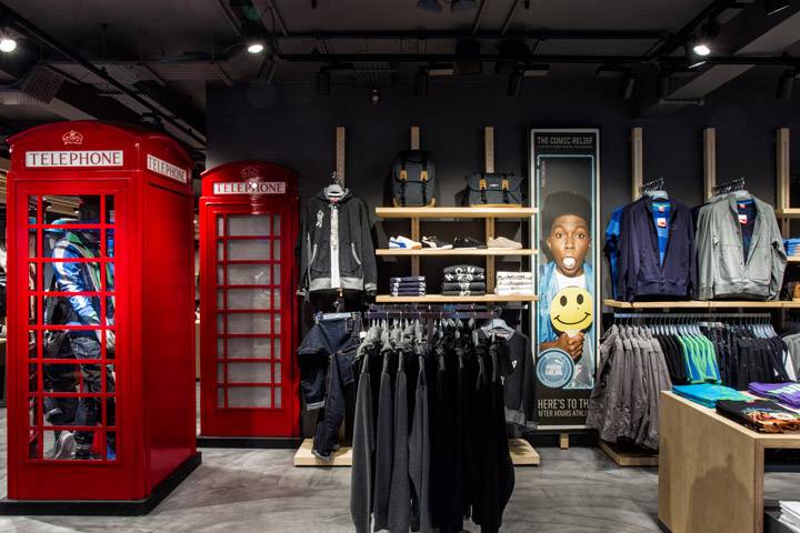
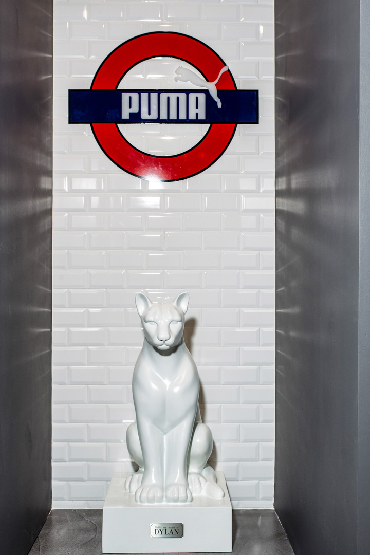
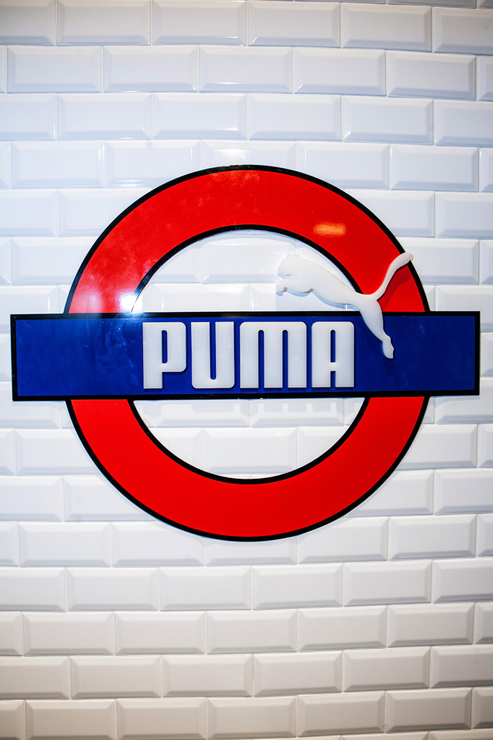
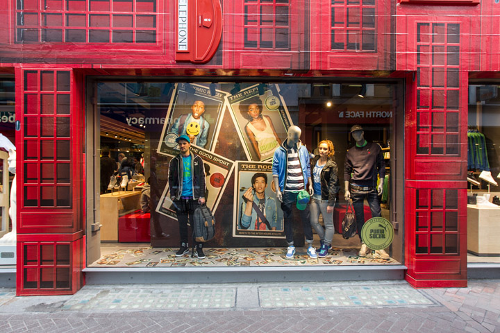
The factor ‘fun’ is further reflected in various regional elements, which give the store its local relevance. This begins with the facade covered in 3d images of the traditional London red cell booth and continues inside the store, where the ‘Pumarized’ cell booth reappears serving as display system and dumbwaiter cladding. Another London classic – the worldwide known metro sign – makes an appearance in the changing rooms. Here white metro tiles have been used turning the changing rooms into a ’Puma’ metro station.
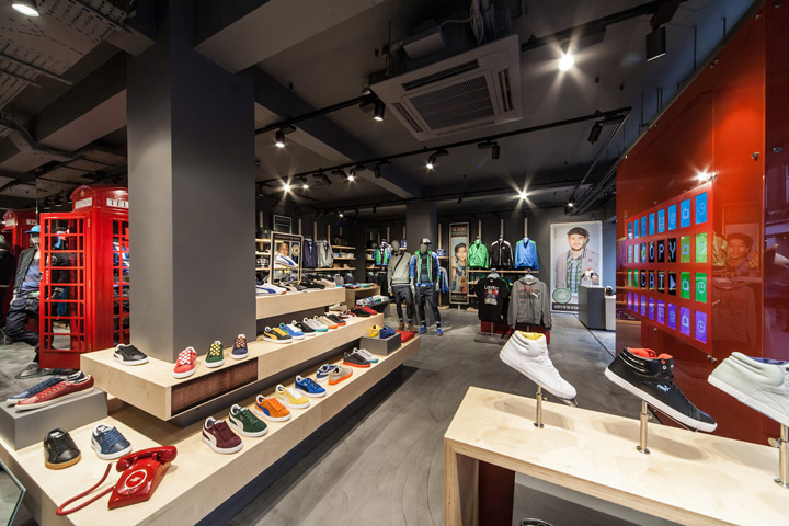
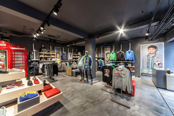
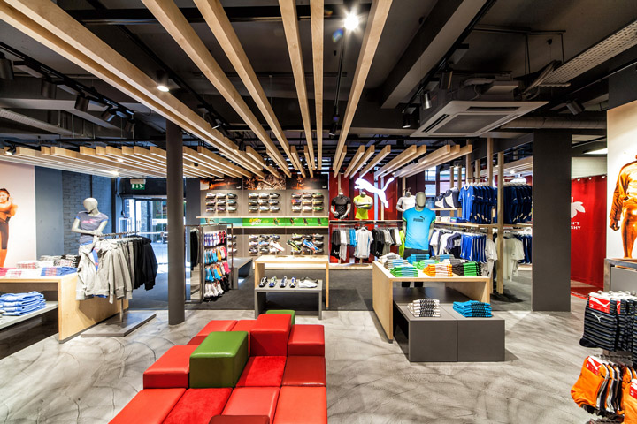
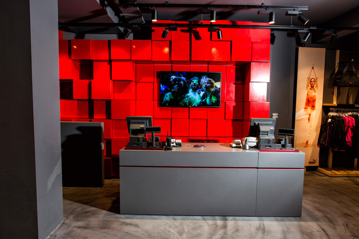
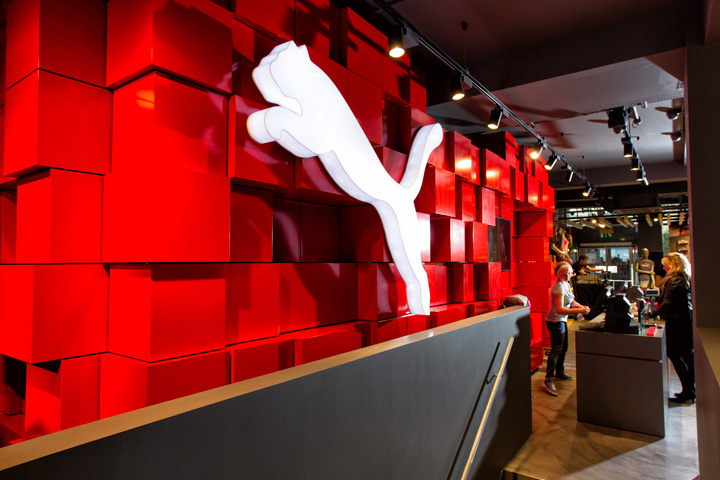
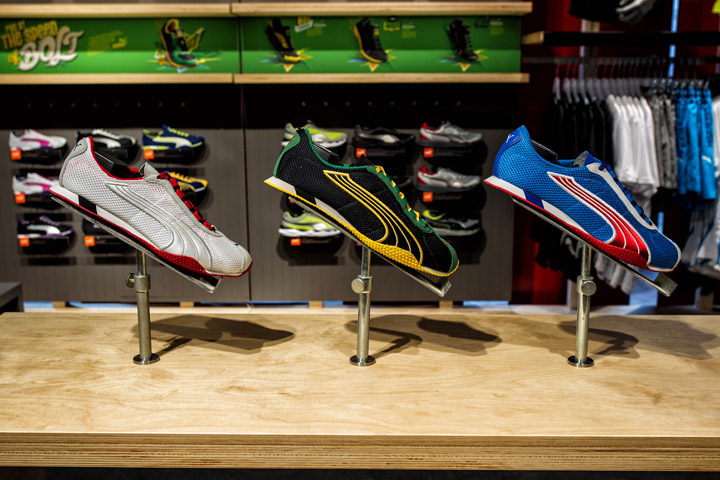
At the same time, the store design puts great emphasis on making it simple and clear. Focus points such as oversize logo signs or the striking red brand wall together with wooden ceiling beams serve as directory and navigate shoppers through the store. Hereby, footwear, still being Puma’s core competence, has been given the most prominent status and presents itself on a footwear catwalk leading from the store entrance to the focus wall as well as on two footwear tribunes. The store atmosphere is further enhanced by overhead screens featuring hypnotic, slow moving visuals of
scenarios from fluffy clouds to underwater scenes.
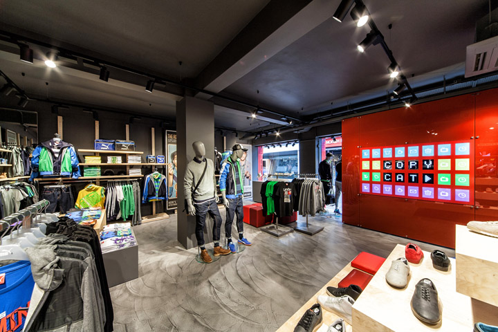
Despite numerous entertaining elements, the store design conforms to Puma’s sustainable guidelines. The general use of building materials in store has been reduced to the minimum, leaving the ceiling open and the brick walls untreated. Any materials used such as wood for the ceiling beams, the furniture or floor finishes are FSC certified. Above that, an efficient lighting system, using mainly HIT-lights, has been applied to save energy consumption of the store and thus further reducing its ecological footprint.
Designed by Plajer & Franz Studio
Erkelenzdamm 59-61
10999 Berlin
Project manager: Ms. Patricia Senft / Ms. Anne-Katherine Hahn
creative agencies: Studio 38 (graphic works façade & floor graphics) Rosenthaler str. 38, 10178 Berlin Germany, www.studio38.de
Spies & Assassins (Puma Pepshow / Un-smartphones) New York, www.spies.ws
local architect:p:six, Moulsoe Business Centre, Cranfield oad, Moulsoe, UK
shop fitting: new store europe polska sp. z.o.o. www.newstoreeurope.com
light: XAL Xenon Architectural Lighting gmbh, Rieder straße 1, 85229 markt indersdorf , www.xal.com
photo credits: Manuel Schlüter / copyright Puma ag www.manuel-schlueter.com


Add to collection
