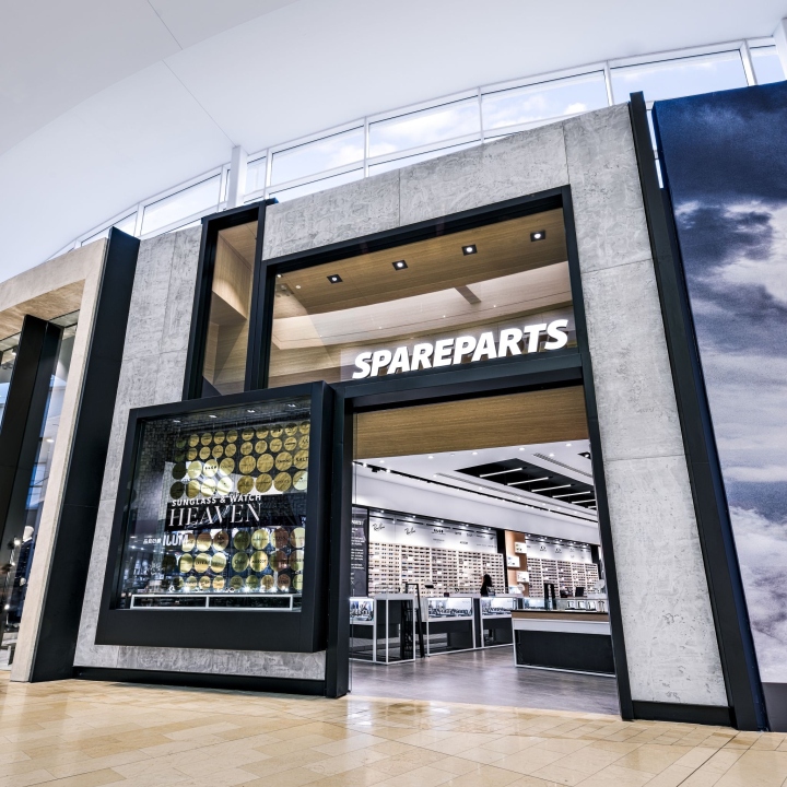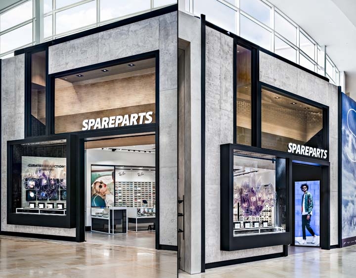

Spareparts is a trendsetting, industry leader in top-of-the-line sunglasses, watches and accessories. When it came time for Cutler, a Vancouver based interior design firm, to create a sunglass & watch heaven for Spareparts in Yorkdale Shopping Centre, it was important to carefully curate the design elements to suite their customer base and brand. The design team at Cutler drew inspiration from the lines and lights of a runway to further highlight the space as an opportunity for a memorable fashion moment. The aim was to create a look that would feel fresh, immediate and straight off the catwalk.

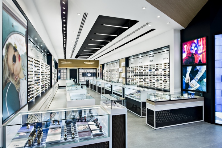
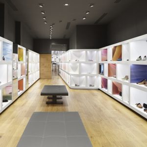
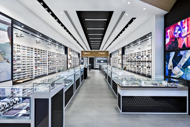
Cutler also wanted to capture the essence of the products – for the store itself to evoke the edginess and confidence you get when you put on a great pair of sunglasses. Using a contrasting black and white palette to serve as a blank canvas, the products add the embellishment, just as they will for the customers. The primary material palette consists of glass, powder coated and perforated metal, porcelain tiles and varying texture and sheens of laminate. The tops of the central showcases are enclosed with glass while the bases are constructed with white powder coated metal and black perforated metal inserts.

Additional oak wood accents on the ceiling and featured display softens and adds warmth to balance out the high-fashion bold black and white aesthetic. There is a mix of street style and high-fashion reflected in the exterior storefront and interior displays. Taking advantage of architectural elements that mimic a city scale, Cutler designed the storefront to be open and inviting. Impressively large glass panels give passersby a clear view into the store from the outside. This transparency also means the interior effectively becomes the exterior façade, which helps to create a seamless transition between coming in off the street and hitting the runway.

While style experts are always on hand to walk customers through each section and offer customized consultation, products are prominently displayed along both left and right walls, creating a clear path from the front all the way to the back. This arrangement caters to the natural flow of traffic. Perhaps one of the most valuable tools in our arsenal for this project was breathing room. By balancing the openness and rhythm of the space, we’ve given customers the opportunity to really take everything in. Whether someone is taking advantage of the personally tailored customer service, or just browsing on their own, they’ll be able to navigate through the store comfortably and easily.
Design: Cutler
Photography: Vincenzo Pistritto / Brandon Barré Photography
