

Due to the open, warm atmosphere, people feel welcome – no matter if a specific booking is intended or the visitors would only like to get inspired.
Personal guidance, inspirational atmosphere and interactive media are central point of the flagship concept. Here, the journey already starts with the booking. Room with a view: The travel agency as a window to the world. NEST ONE was responsible for concept and design. “It was our goal to develop the travel agency format further in its very basis and to create a platform on which we can experiment with new ideas.” – Michael Lambertz, Director Group Marketing at TUI AG.

The open café counter makes the visitors feel like a residential guest already before the actual holiday.
Personal guidance and inspirational atmosphere
At a time when some already consider travel agencies an obsolescent model, the “World of TUI” indicates new ways for a future of the travel agency. “We wanted to create a space that would spark the desire to travel.” – Holger Pütting, CEO of NEST ONE. Due to the open, warm atmosphere, people feel welcome – no matter if a specific booking is intended or the visitors would only like to get inspired.
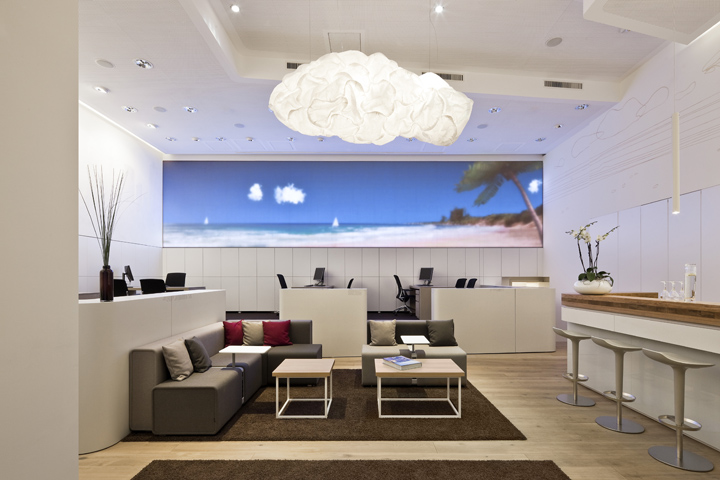
“Room with a view”: a 30m2 LED screen displaying calm film sequences selectively transforms the room into a vespertine savannah, a dreamlike South Seas beach or a pulsating metropolis and thereby enables the visitors to pre-experience their future holidays.
The travel agency as a window to the world
“Room with a view” is the central idea of the concept. Accordingly, the topics outlook and horizon are essential for the design. A 30m2 LED screen displaying calm film sequences selectively transforms the room into a vespertine savannah, a dreamlike South Seas beach or a pulsating metropolis. The furniture extend the digital landscape of the screen into the real space: a curled ribbon on the lower half of the walls picks up the horizontal line of the LED screen and serves for the zoning of the space.

One level up, there is a calm separate counselling area for customers of the TUI premium brand Airtours.
Various possibilities to strike up a conversation
The entrance area is designed to undisturbedly take a look around and make oneself comfortable: a small selected travel library invites people to browse, drinks from all over the world are available at the café counter and on the touch table visitors can virtually experience their next holiday – explore countries, cities and selected hotels and send postcards to their friends.
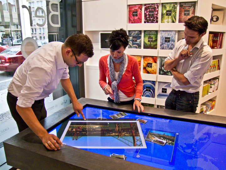
Centrepiece: the 65inch touch table. Its cover made of schist stands in interesting haptic contrast to the smooth surface of the screen. The stylized map of the world reveals on touch images and information on the corresponding destination and selected hotels.
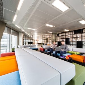
This rather public space fluently merges into the lounge area, which has been designed for counselling interviews in a laid-back atmosphere. In the rear area, a low stair top with four large desks can be found, which is shielded by a partition. One level up, there is a calm separate counselling area.
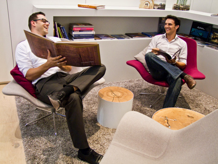
The lounge area has been designed for visitors to discover destinations themselves scanning the small selected travel library. Additionally, counselling interviews can be held in a laid-back atmosphere.
Round-the-world trip with the index finger
“Today, we need to integrate the advantages of the internet in the travel agency in order to generate true added value for customers.” – Michael Lambertz. One example of how to achieve this is the 65inch touch table. Its cover made of schist stands in interesting haptic contrast to the smooth surface of the screen. Here, the visitors can take a round-the-world trip with their index finger.

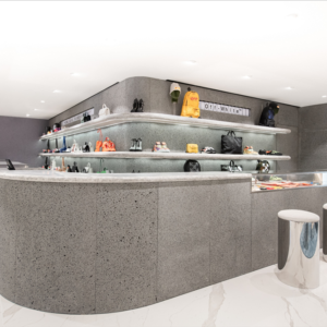
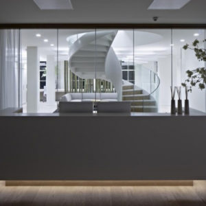
Smooth, white surfaces contrast with bright oak wood. The natural materials in use were especially picked to create a welcoming and friendly appearance of the store space.
The stylized map of the world reveals on touch images and information on the corresponding destination and selected hotels. Therefor, TUI’s proper content was enhanced with User Generated Content, e.g. Flickr photos, and linked to Facebook as well as to TUI’s online blog. Hence, the touch table enables an entirely new and intuitive discovery of the world.

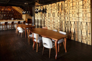
Hot and cold drinks from all over the world are served in a relaxed, hotel bar-like ambiance.
World of TUI: Brand and travel experience melt into a harmonious ensemble
Due to the sunny lighting atmosphere, natural materials and warm stresses of colour, the store space appears welcoming and friendly. Smooth, white surfaces contrast with bright oak wood, cosy carpets and rough wool fabrics. Two “Clouds” lighting objects from Frank Gehry carry the idea of outlook and horizon forward in the room.
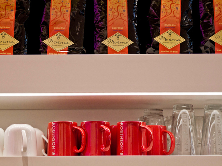
Specific foreign products and classy crockery transport authenticity and quality.
Shapes are clear and reduced without appearing too stiff due to the large radii. This principle is also adopted by the furniture concept. Design classics connect with individually produced pieces realized, as the entire store construction, by Panzer Concept.
Designed by NEST ONE
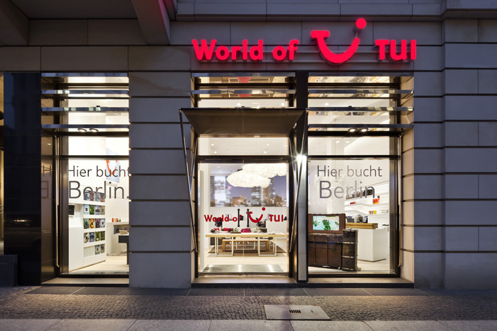
The new World of TUI travel agency is located right in the heart of Berlin.


Add to collection
