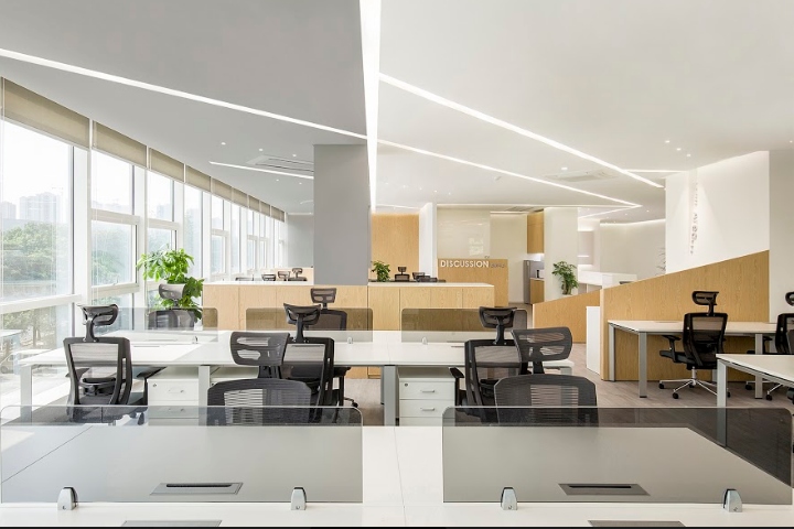

As soon as your eyes are open, your sensory organs get in touch with the light. In the morning, the light enters inside when you open the curtain, and this is the moment when you become excited. Biology has explicated that a sense of excitement can trigger the release of dopamine, and an enough amount of dopamine in the workplace could enable people to pleasantly finish their day’s work.

The owner of this project is a research company in medicine and health industry. It is well known that scientific research is a relatively boring and rigorous work, and people who do such work must maintain a highly focused state. Considering from the characteristics of this industry, we decided to combine the physiological reaction that excitement secretes dopamine into the design, and extend the excited feeling in the morning to the work space, therefore, our goal was to design a space cut by light.
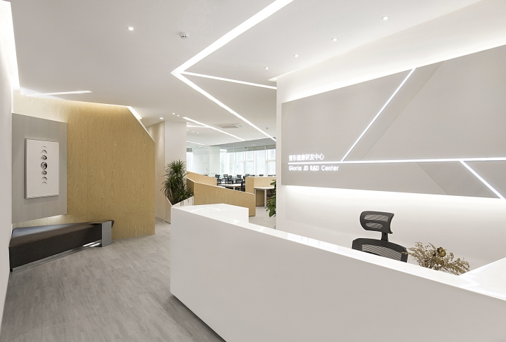
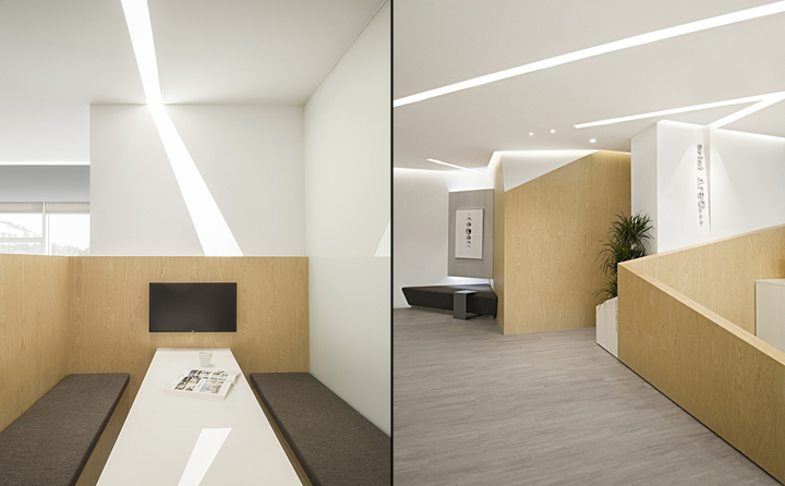
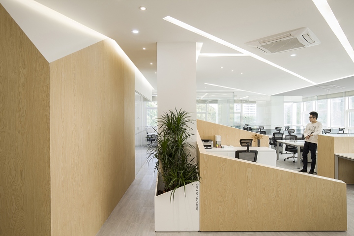
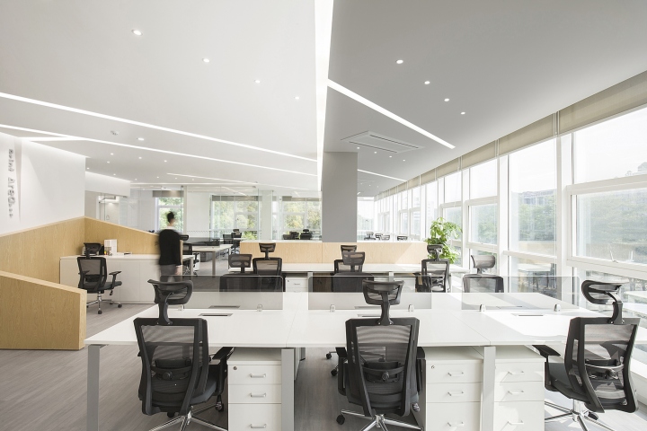
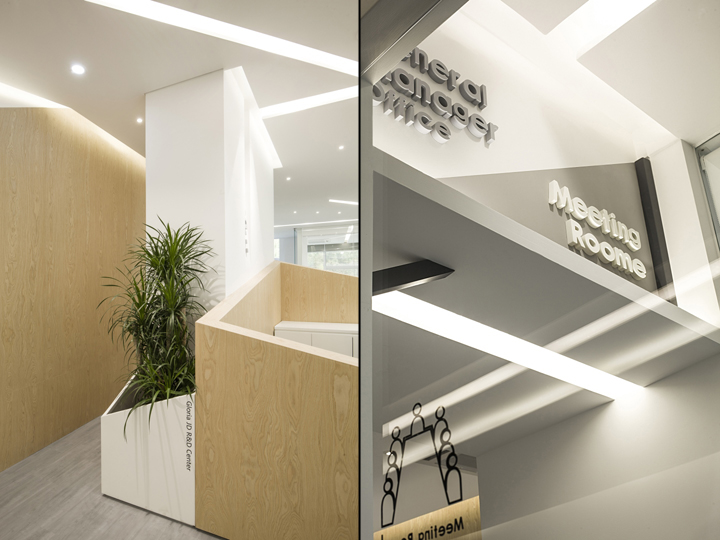
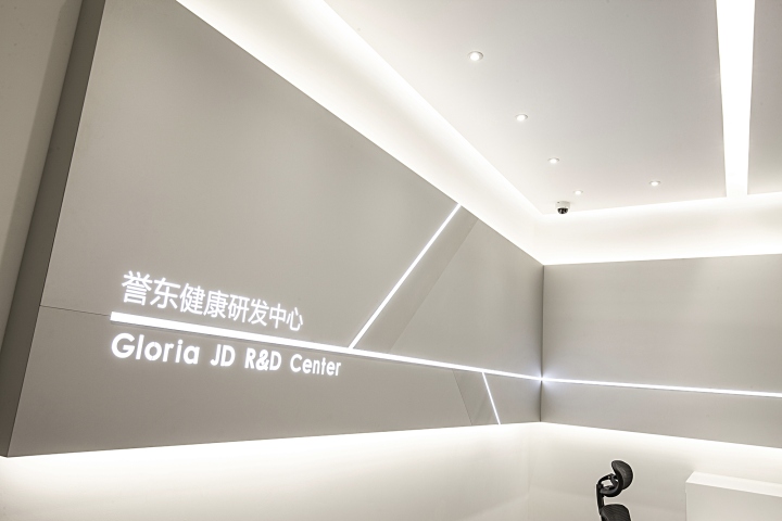
A space that is less than 250 square meters is very small for planning a multi-functional working environment, especially that the design task contains a number of open workspaces and independent offices. It’s clearly not enough if we achieve the goal only through the plane and elevation, so the ceiling became our core during the design. The lighting was cut in an angle of 45°, and now it connects each functional space and extends to the vertical surfaces, and the shadow which seems to be projected from the ceiling in discussion area is a kind of such extension. As a core of the design, the ceiling has gray and white colors.
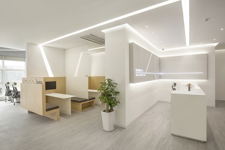
In sunny days, the outdoor sunlight is too strong, so that gray is used in the south and near the large floor windows. By doing so, the indoor reflected light is reduced, the brightness contrast of the hidden lamps is enhanced, and the space’s layering sense is increased. After completion, it’s beyond our common understanding that we found the white latex paint became gray, moreover, the hidden lamps became white, and this is also a surprise because we get one more level in the space.
Designed by feeling Design
Photography by Wu Wen





Add to collection
