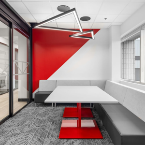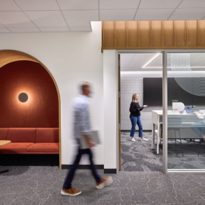
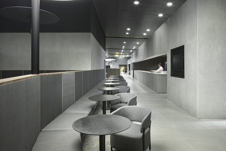

Conceived as a transitional space, the Avianca lounges project at El Dorado International Airport in Bogotá seeks to maximize the user’s experience through its layout and materiality. A balanced contrast between textures and volumes evokes the essence of the Colombian airline, providing aesthetic order to produce a calming atmosphere.
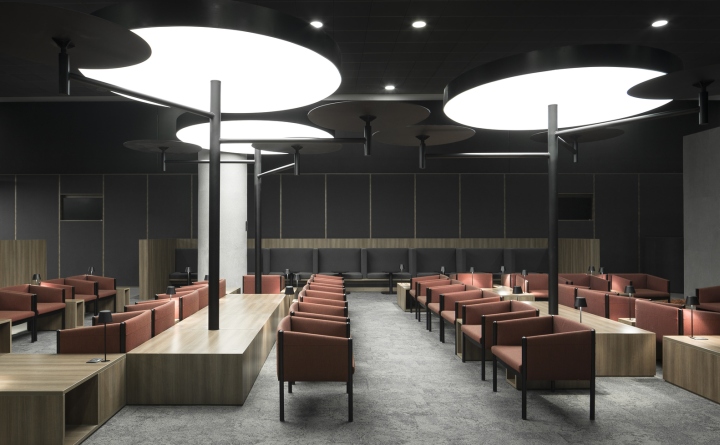
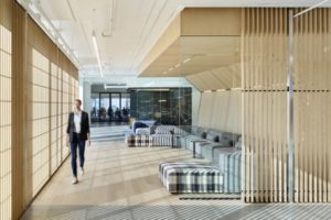
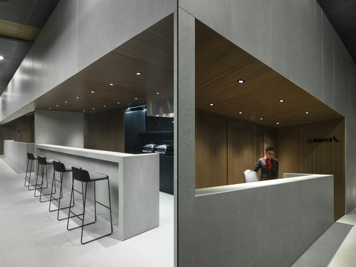
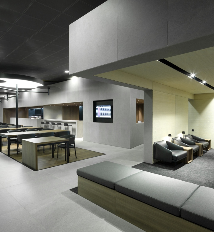
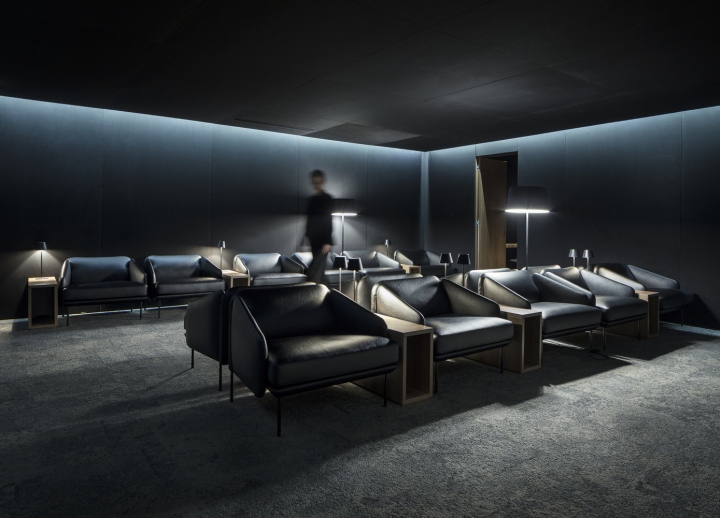
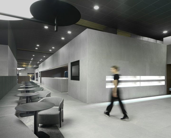
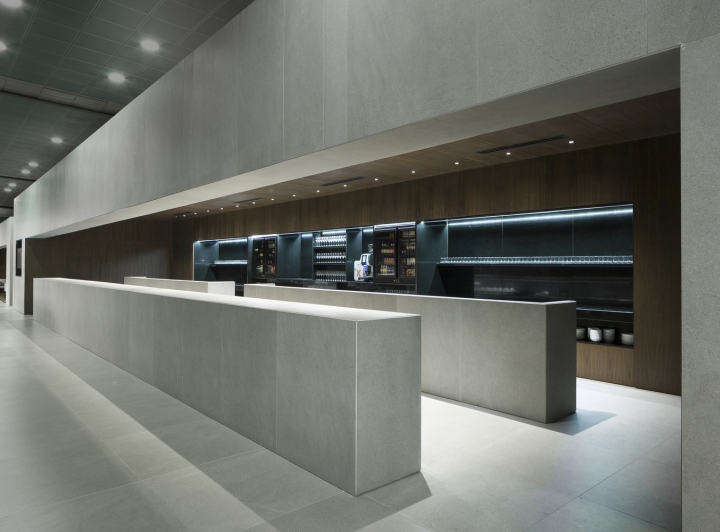
One of the main goals for the interior design has been to harmonize the potential for spaciousness vertically and horizontally offered by the floor plan. Divided into two main territories —Gold and Diamond—, the layout follows a warm design for open spaces without enclosures. As a result, the interior cladding of the space and semi-open screens further soundproof the environment, while the small architectures added defines the leisure areas such as “Reading Corners”, bars or TV.
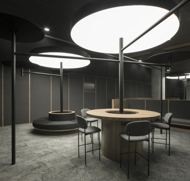
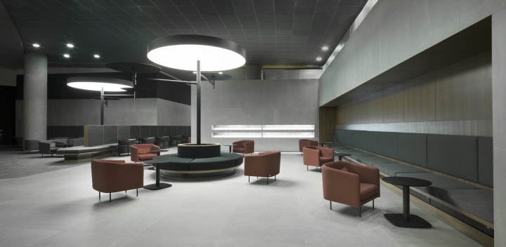
The space is distributed in the transition areas, from the common ones for the employees, to the private ones for the clients of the Gold and Diamond lounge. All these differentiate from each other through the change of pavement but not through enclosures. Special seating areas such as the continuous benches also help to separate certain spaces, as well as increase the number of seats. An innovative approach to an open interior designed for the constant movement of users.
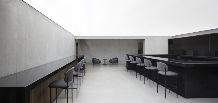
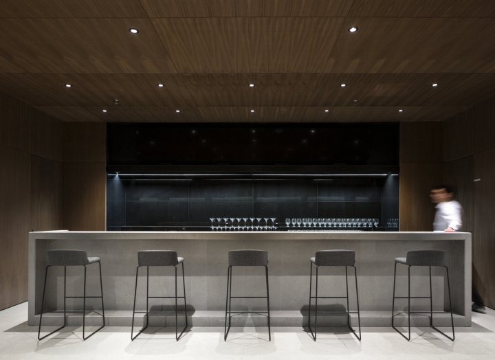
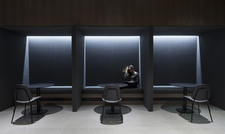
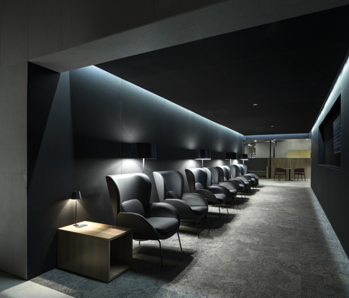
The neutral colour scheme is reinforced through the matt walnut wood, the grey carpets and ceramic tiles. Throughout the areas known as “Enjoy your meal”, “Stay connected” and “Resting Area”, tailored tables are designed with walnut and black surface; and chairs and armchairs both of metal structure and wood, in which the ergonomic shape emphasizes comfort for the users. The screens, equipped to accommodate private routines such as sleep, eat or work, are projected on canvas, upholstered on two sides, and include tables in the same finish.
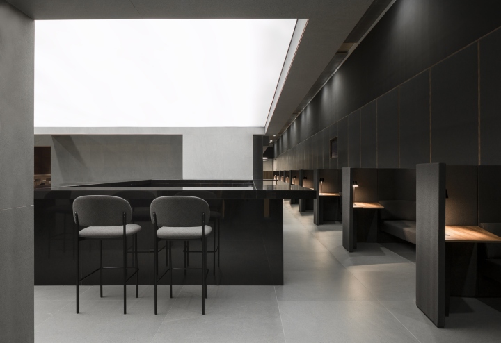
The linear simplicity of the surfaces is enriched by the presence of the geometric auxiliary lighting system that mimics the trees of a dense forest. It includes three types of customary designed lamps, with tubular steel structure composed of various circular light screens. Likewise, the Downlights will be responsible for a more general lighting of the space, aiming for a degree of luminosity more similar to natural lighting.
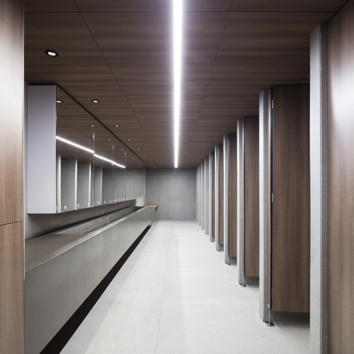
To be coherent with the concept, the rest of the great elements of the space, critical in size, shape or function, are projected with the same neutral materials, with the exception of the paraments which is covered with cane braid arrow. It acts as a nod to the tradition and history of the Colombian people. The interior of the central volume that houses the bathrooms follows the visual narrative of the project, being presented in the same porcelain. Particularly, it incorporates a vanity area integrated in the countertop that is complemented by low cylindrical poufs.
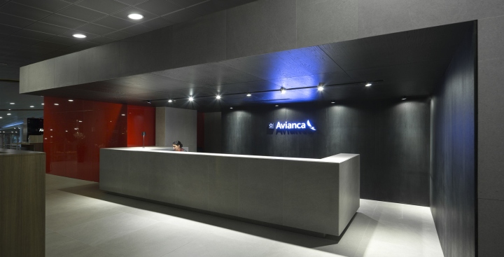
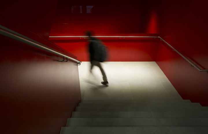
The different elements of the space incorporate the Avianca logo and is supported with either the corporate color of the company or backlit in white. A system with which signaling has also been worked on in key points to distribute to users. In the same way, certain areas such as the face of reception are presented in the corporate color through lacquered optical glass, thus achieving a main role that will define the beginning of the experience.
Architects: Francesc Rifé Studio
Architects in charge: Francesc Rifé
Design Team: Sandra de Nutte, Alberto Olmos, Sergio Alfonso, Bruno Benedito, Carlos Fernández Saracibar, Patricia Guridi, Carlos Olmos, Sònia Pellicer, Paola Noguera
Photographs: David Zarzoso
https://www.archdaily.com/896003/avianca-lounges-francesc-rife-studio


Add to collection
