The shopping experience through spatial and atmospheric parameters has always been the objective of all the projects we have carried out for this brand of sneakers: generating a memorable experience that fixes an identity in the memory of the user and ensures that the space and the brand belong to a particular imaginary.
These strategies are closely linked to the use of geometry and colour, on the one hand, and the dialogue with nostalgia, humour and recognizable imaginaries on the other, which ends up leading to the design of exceptional spaces in a retail world that is increasingly neglected and automatic.
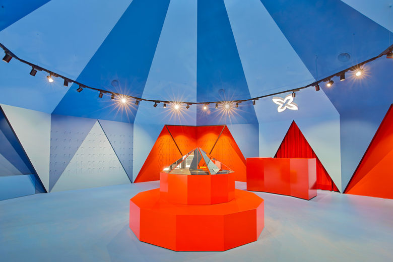
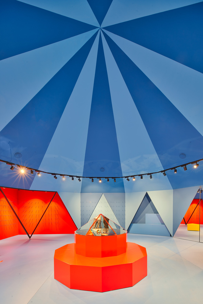
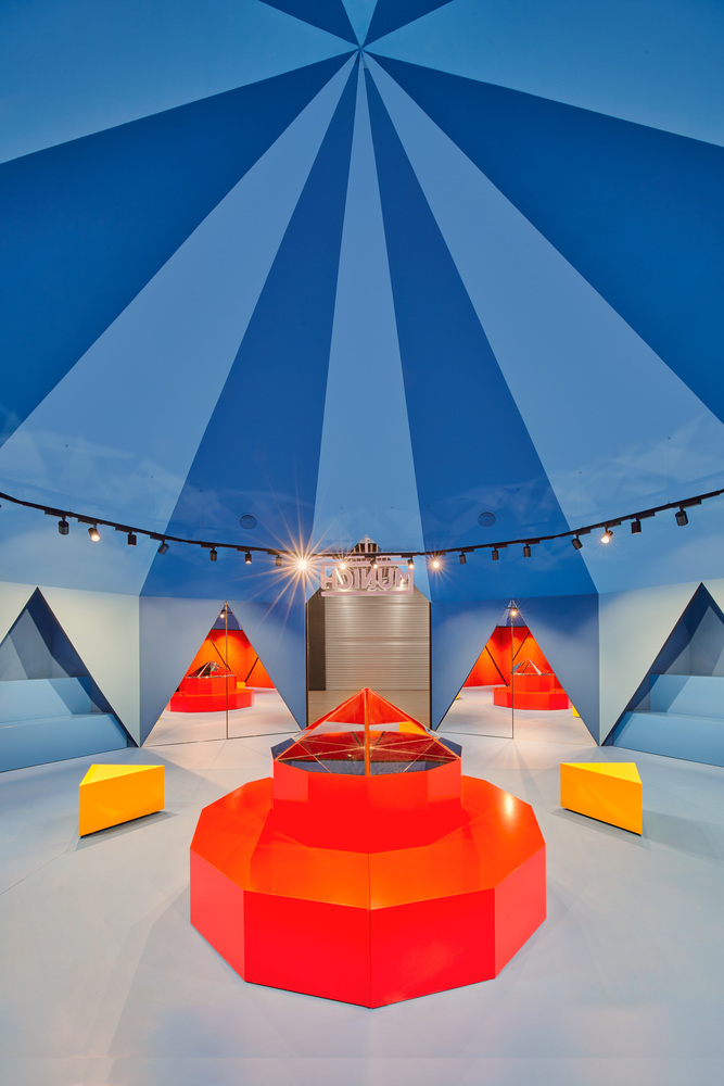
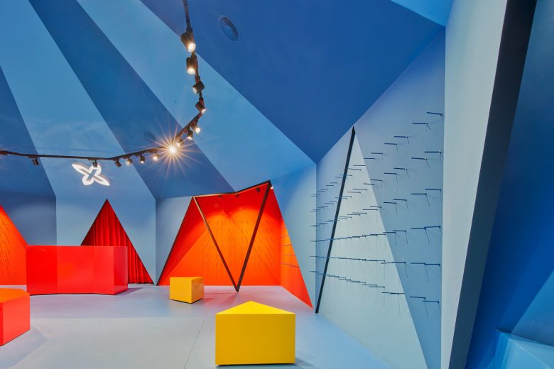
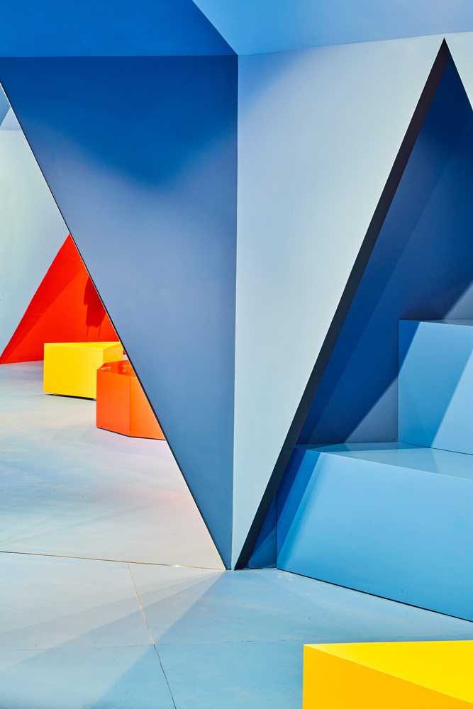
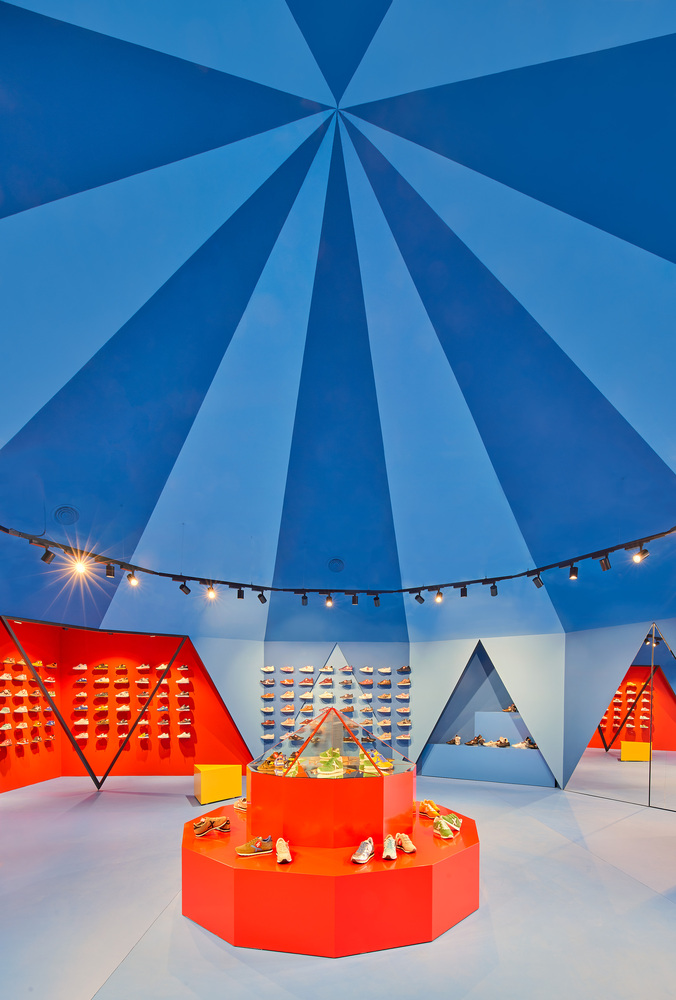
Tent is a geometric, faceted and symmetrical space. It is the inside of a twelve-sided pyramid and the volume of atmosphere it generates makes this place more than just a shoe store.
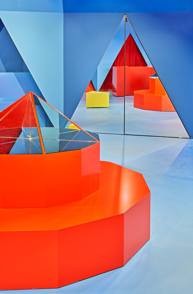
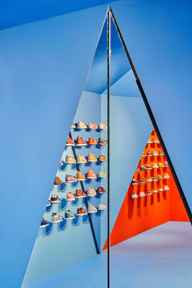
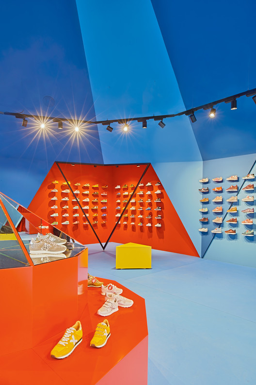
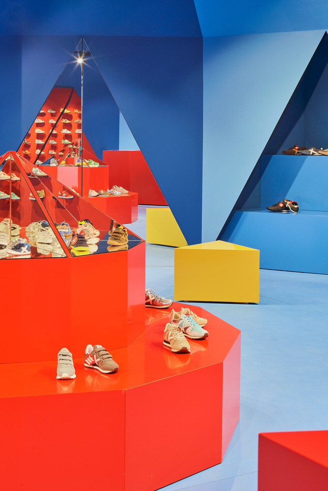
The premises in which the shop is built is a 10 x 10-meter square with a regular dodecagon crowned by this pyramid. Each of the sides is intended for a specific use and the spaces that remain between the perimeter of the pyramid become specialized areas of the store itself: two red corners dedicated to special discounts, two niches for bags and accessories and two shop windows on either side of the entrance. In the centre, a twelve-sided piece of furniture acts as a kaleidoscope showing the brand’s latest launches while simultaneously reflecting the pyramid that covers it in multiple ways.
Tent, the name, and its use are a play on words, like a joke: it is a tent and reminds of a marquee or a circus structure. Its appearance is taut and light but its construction is rigid and heavy. It is tremendously colourful but it is opaque. It’s overly naive but deliberately conceptual.
Architects: Studio Animal
Lead Architect:Javier Jiménez Iniesta
Design Team:Marta Muñoz







Add to collection
