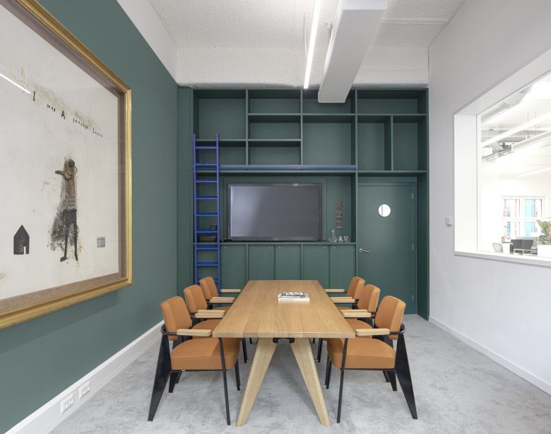
Located in Maastricht, The Bonnefanten Museum is housed in a world-renown monumental building designed by Aldo Rossi. Hollandse Nieuwe was asked to re-design the Bonnefanten Museum’s workspace and employee areas. These new areas consist of the director’s rooms, workspace for employees planning and curating exhibits, and a small restaurant.
Housed in architecture amongst curated art collections, the office occupies a unique and specific place. Taking this as inspiration, the workspace aims to bring these two worlds together in different ways, to create surprising, specific, and enjoyable spaces to work in and create and to create a workspace that feels uniquely part of the museum.
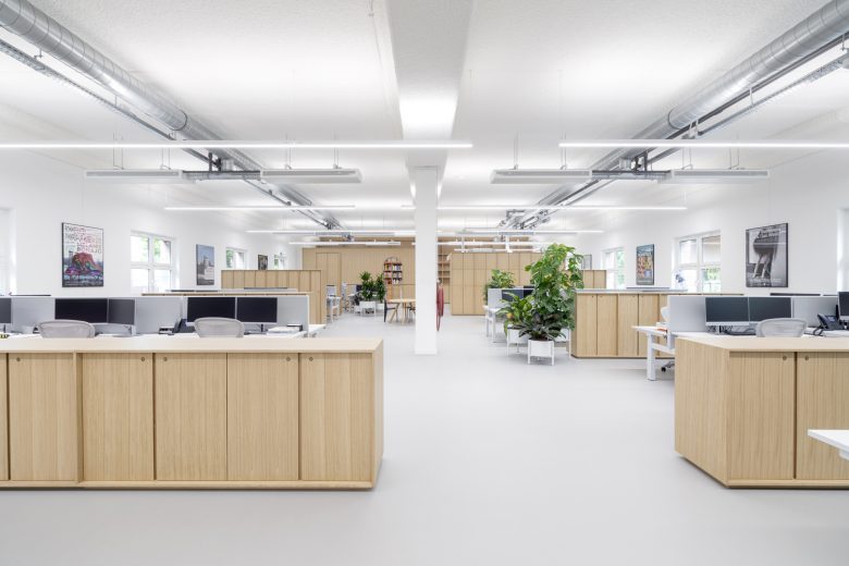
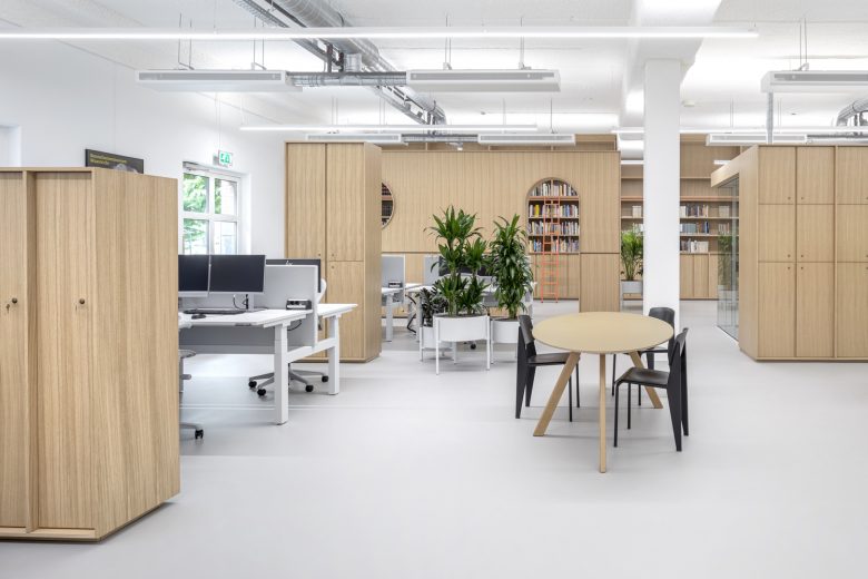
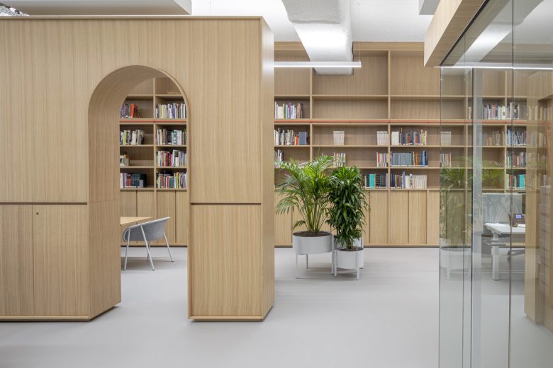
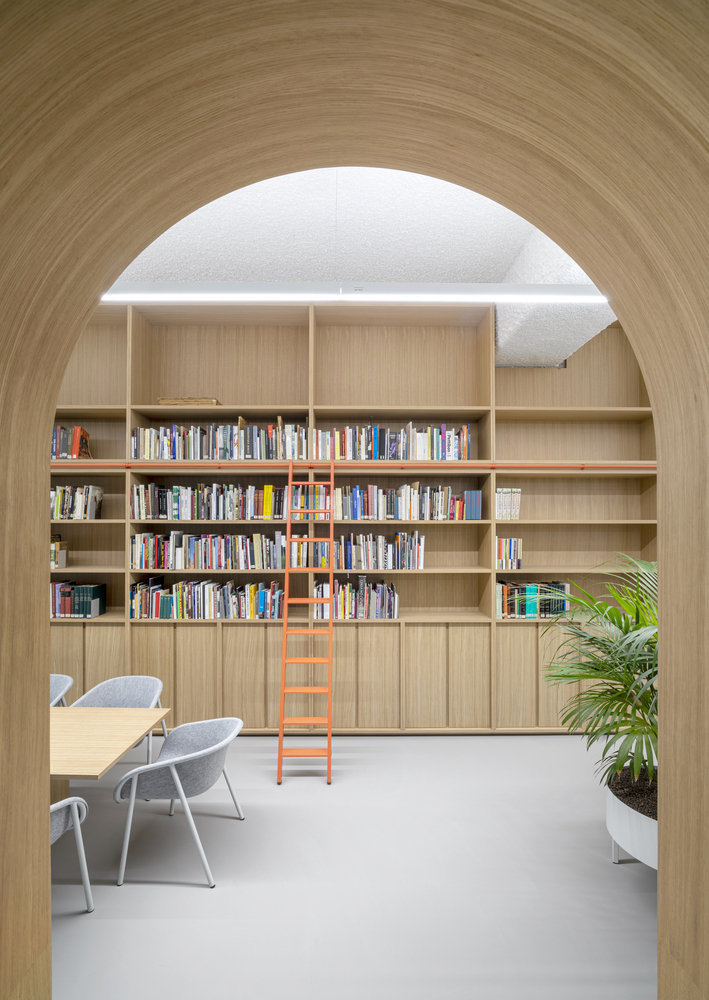
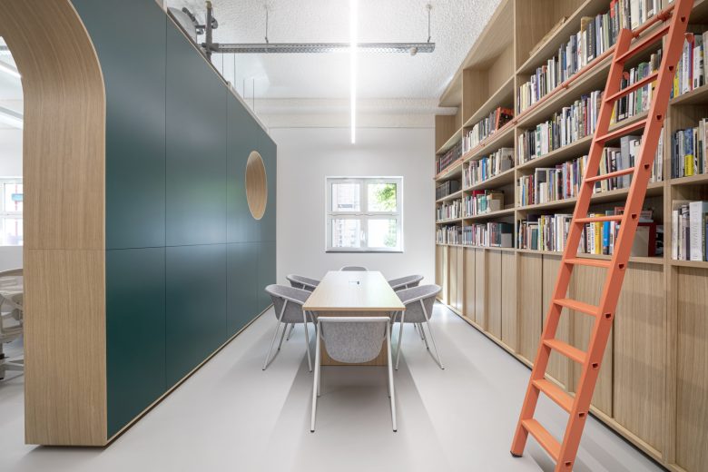
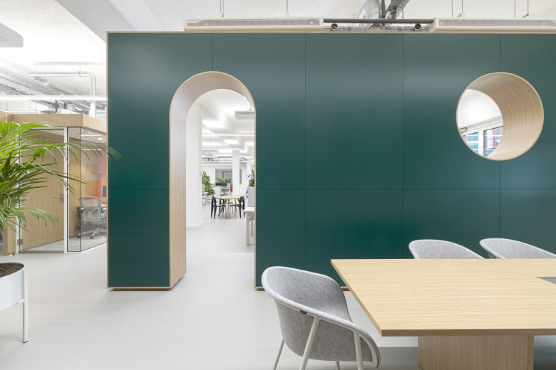
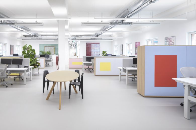
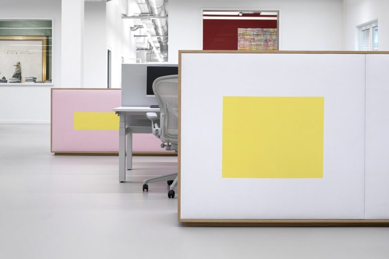
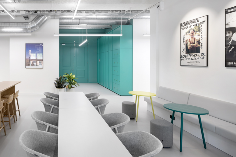
The workplace area is built around the idea of discovery and exploration, much like an exhibition or gallery layout. Rather than rows of desks or partitions, a family of furniture pieces defines different routes around the space. These furniture elements get progressively taller the further into space they are located, creating more open and informal spaces at the front and more closed, quieter spaces towards the back, culminating in the half-hidden library at the far end of the space. Here, the wall hiding the library is still considered a furniture element but plays with its architectural scale by having an arched opening and round window. The floor, ceiling, walls, desks, and chairs of the office space were kept light as a neutral base to allow for these wooden elements and to stand out.
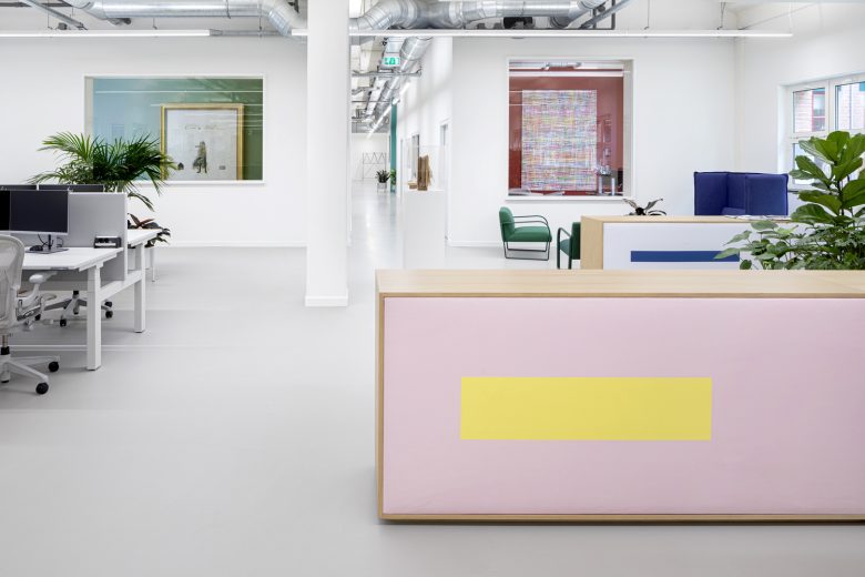
The furniture pieces carry the idea of the architecture and artistic nature of the space. The wooden furniture pieces were conceived to have a timeless, monumental simplicity, constructed from the same vertical ribs and recessed doors or openings. The spacing of the ribs and height of each furniture piece differs, creating a varied but related family of objects. The back face of each element is covered in fabric, each printed with its own colour combinations derived from colour theory and drawing on the new Bonnefanten graphic identity.
Entering the space, the wooden objects stand out and suggest routes, openings, and places to work but looking to the entrance from the back of the space, the collection of wooden objects is now transformed into a playful game of colour, which visually leads back to the entrance of the office and into the new rooms of the two directors. These two rooms were created with a large, prominent window each. The rooms’ walls were painted in colours from the same range as in the open office space so that from the back of the workspace the two windows continue the game of colour and scale.
The restaurant continues the combination of colour and simple wooden objects, the cupboards, and wall of the pantry are part of the workspace’s family of wooden furniture, while colours pop in the main entrance, in selected furniture pieces, and in the art pieces on the wall. As in the office, space is a neutral ground for the colour and wood to be seen against. The bathrooms were also a part of the transformation. Taking the existing tiled space as the neutral base, the sink areas became the place for the bold colour combinations that are also seen throughout the rest of the work floor spaces.
In an architectural monument amongst art collections, this workplace brings two worlds together, creating surprising spaces that feel part of the museum.
Architects: Hollandse Nieuwe
Design Team:Christel van der Hulst, Matthew Grace, Jordi Bos, Aïda Kalkman, Marianne Bindels
Photographs: Ewout Huibers
