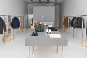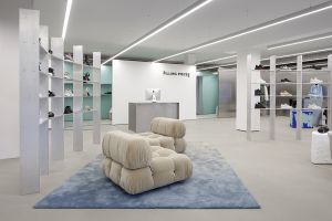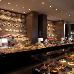
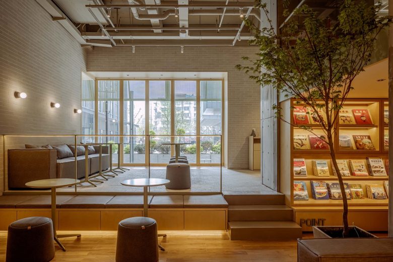
POINT is a tea-based integrated commercial experience space located on Hanzhong Road, Qinhuai District, Nanjing, adjacent to the business district and universities. In the design concept, it is hoped to convey a “tea field”-like spatial feeling, and at the same time to cater to the theme of “settlement” in the layout strategy. The interior environment of POINT is designed with staggered design to enhance the openness and experience of the space. Different from most other tea shops that focus on retail business, in addition to the construction of commercial formats, customers can feel the space itself in brand culture more abundantly, and the social functions of POINT are also intertwined in the space.
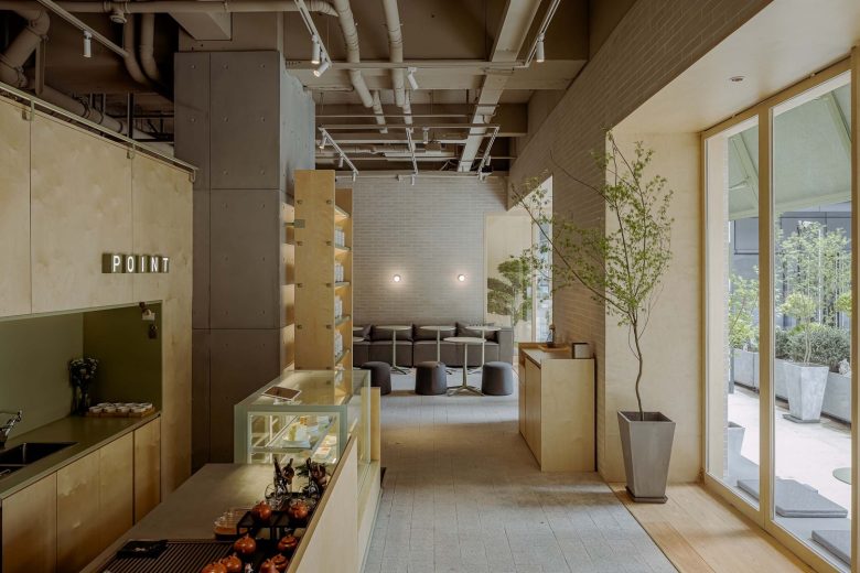
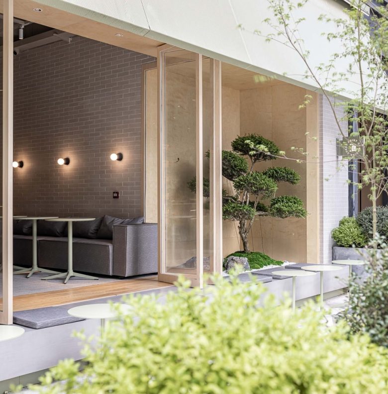
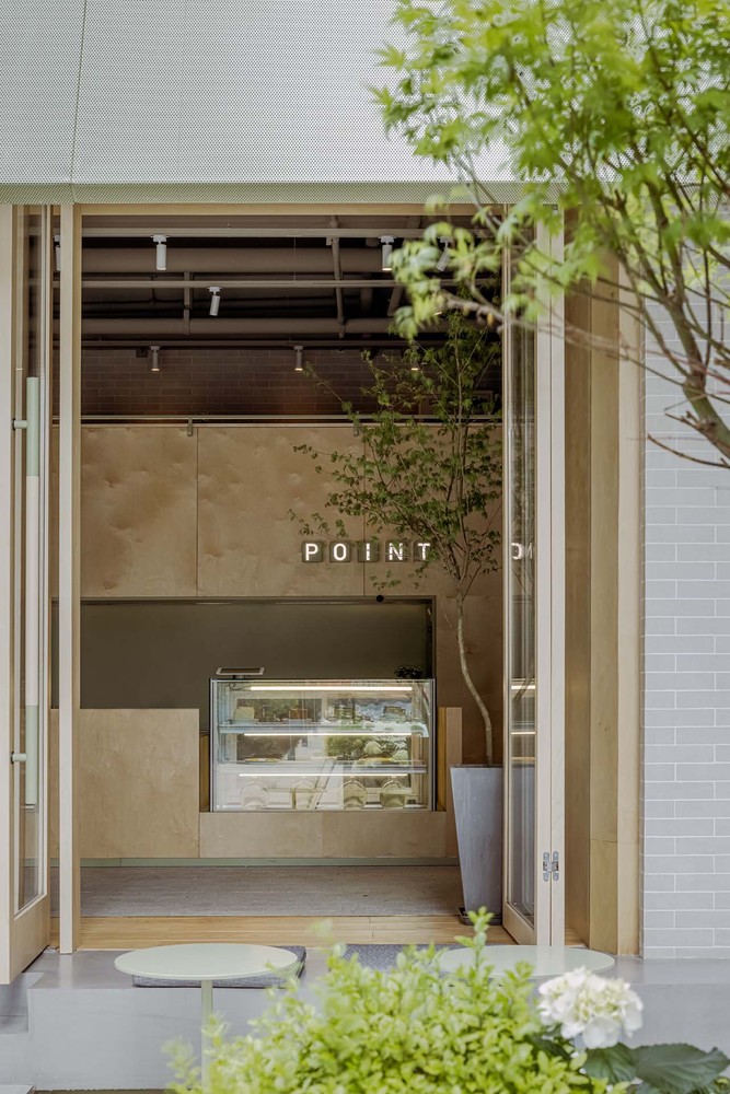
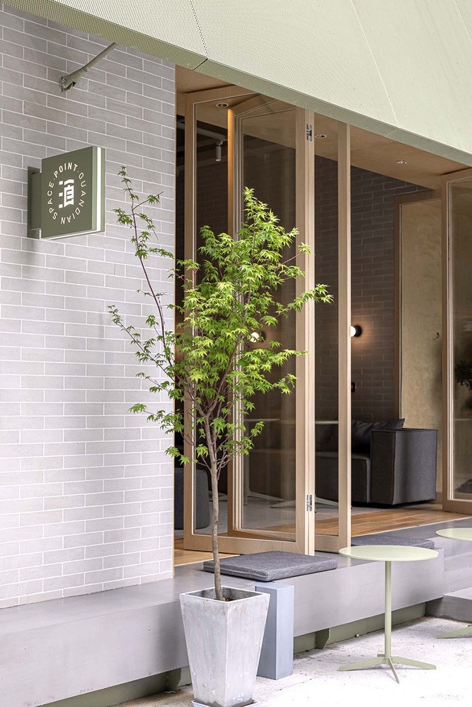
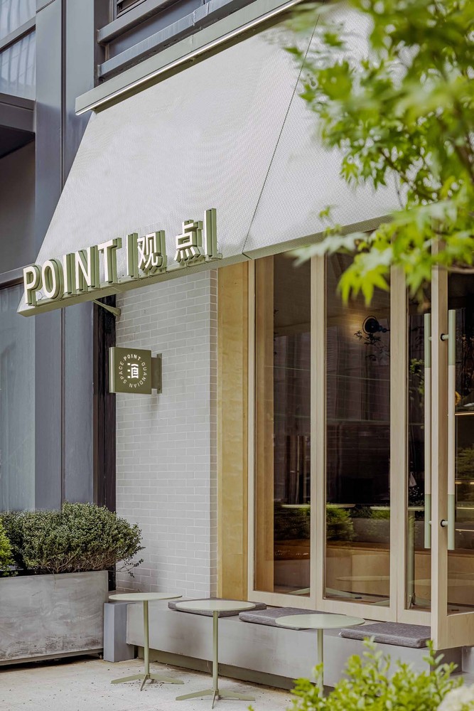
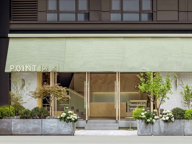
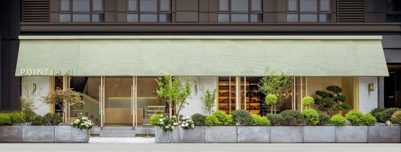
When people walk into the store from the outside, they will first pass through a courtyard. The clear and hearty landscape line outlines the space that will assume the transitional buffering properties of the space, bring emotional paving, and enrich the flow of entry. The transparent and comfortable large floor-to-ceiling doors and windows bring the outdoor landscape into the room to a greater extent, and the flow of light and wind also adds to the dignity brought by the concrete material in the indoor space.
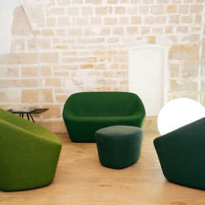
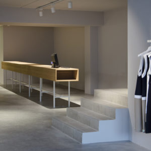
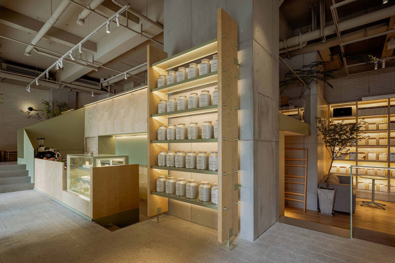
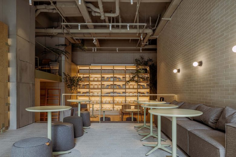
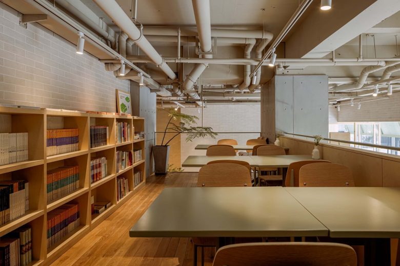
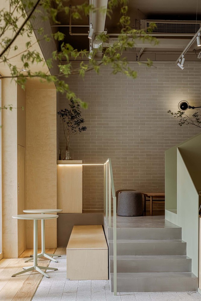
Precast concrete panels are selected as the main materials for the space materials to create a simple and lively space. With the introduction of solid wood furnishings and green landscapes, people can also be used as public social spaces full of intimacy between tea seats. POINT utilize the space into two-story high ceiling height Parsing and traffic area on the first floor and the second floor by the extension of a new transitional open area, enhanced time space availability, and enhance the sense of space settlements between the gap.
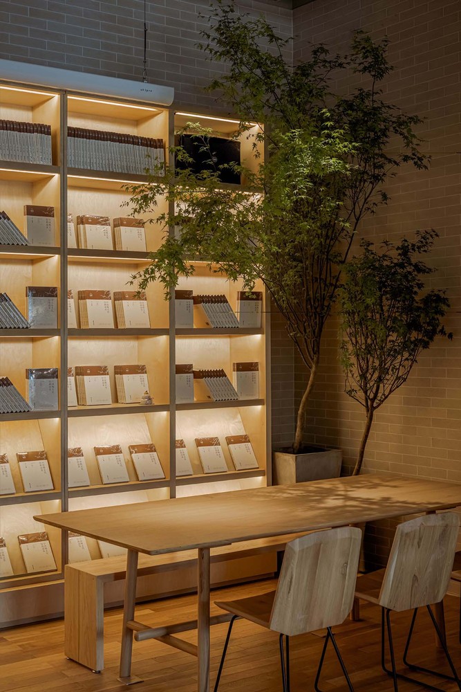
The warm-color lighting design blends with the solid wood texture. The brick wall texture, the exposed top shape and the concrete column are all preserved in the division of the space layout.
In the entire space creation process, while fully ensuring the usability and openness, every corner in the space is carefully polished, and the rich detail processing still maintains the simple quality and flexible aesthetics that POINT upholds. Encourage the guests staying in the store to gain more diversified feelings. In the reading and tasting tea room, chatting and laughing with friends, and wasting a quiet time is also our most true spatial desire.
Architects: triostudio
Photographs: EMMA

Add to collection
