Caribous – Roasted™
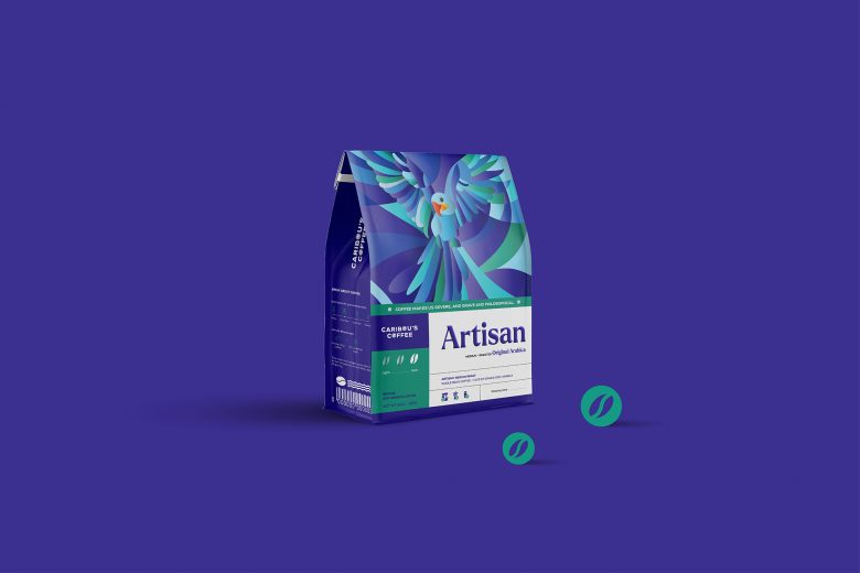
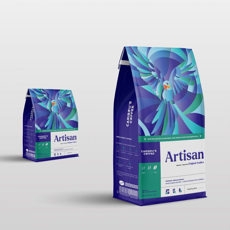
Limited Edition Packaging
TASK
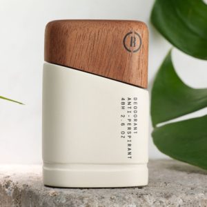
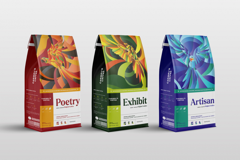
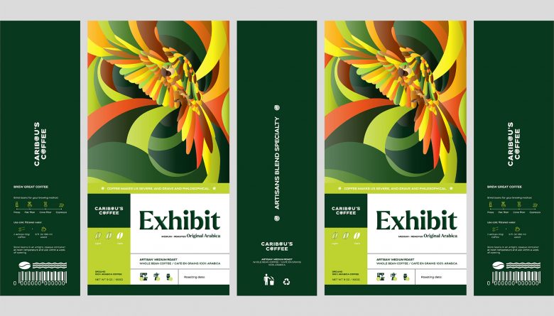
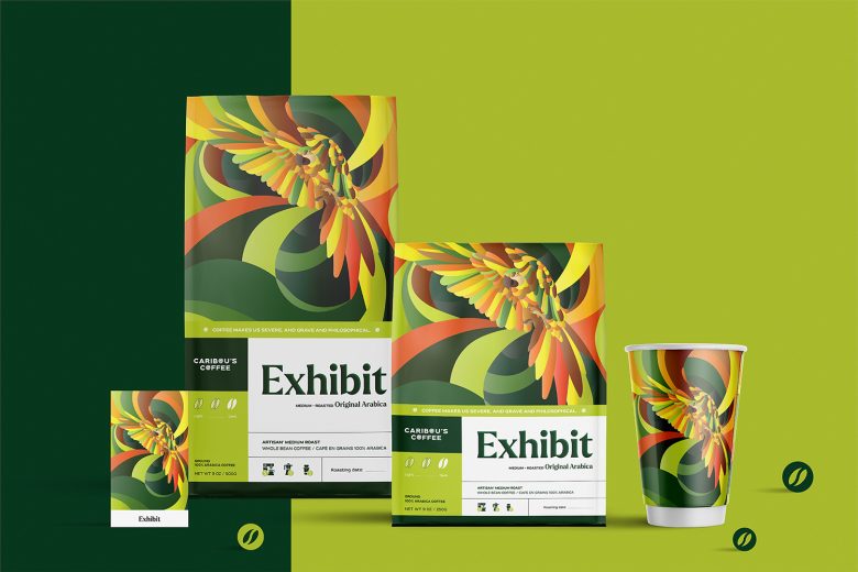
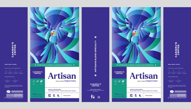
Our task was to develop the label design for Caribous – Roasted. It had to attract attention and make the product distinguishable within its range. Conceptually, the design solution had to bring the product closer to the “difference” category. At the same time, it was important to win the trust of the art lover consumers, whom the product targets.
PRODUCT DESCRIPTION
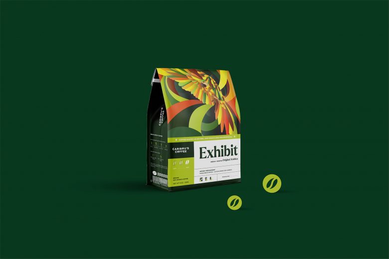
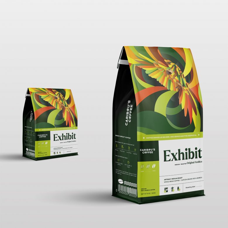
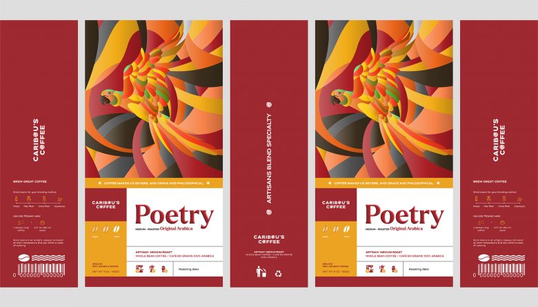
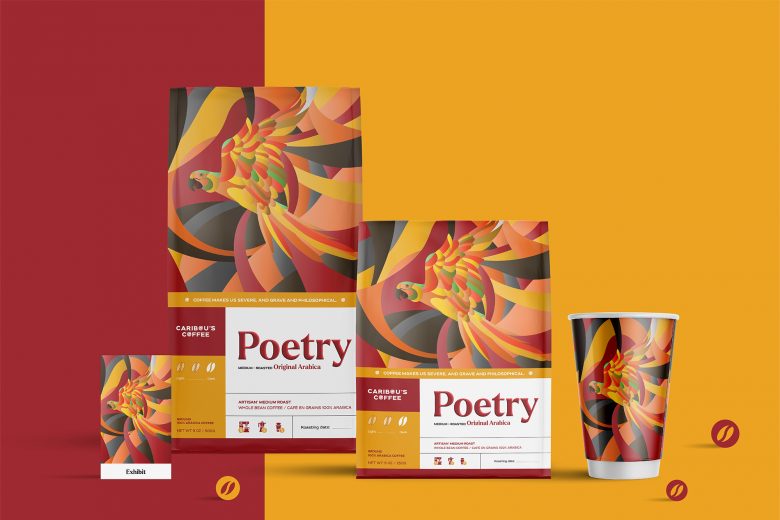
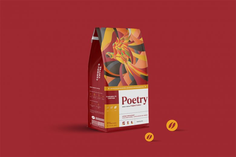
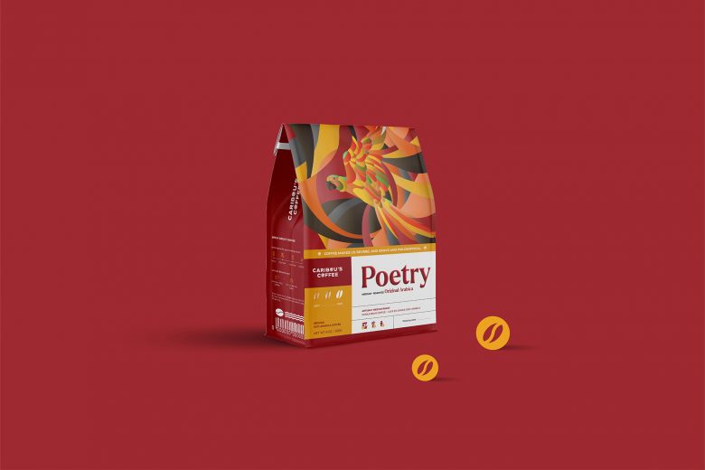
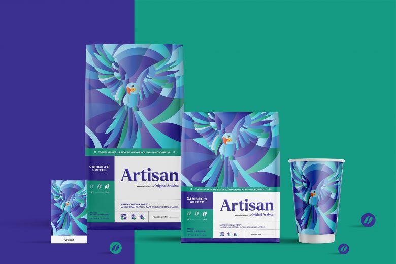
Packaging Caribous and Roasted collection include 3 main products are Artisan, Exhibit and Poetry, inspired from Macaw parrot (pronouns in Vietnamese as Maca parrot). Furthermore, it is called a long-tail parrot, it is the collection of all the parrots which have long- tail. From small to big, usually vivid colors and belong to the new world family of parrots, distributing most in the South of America.
VISUAL IDENTITY
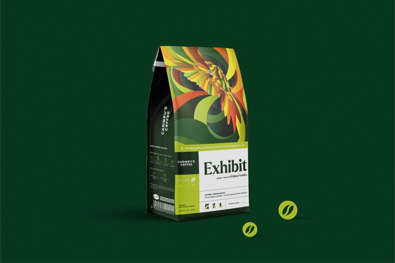
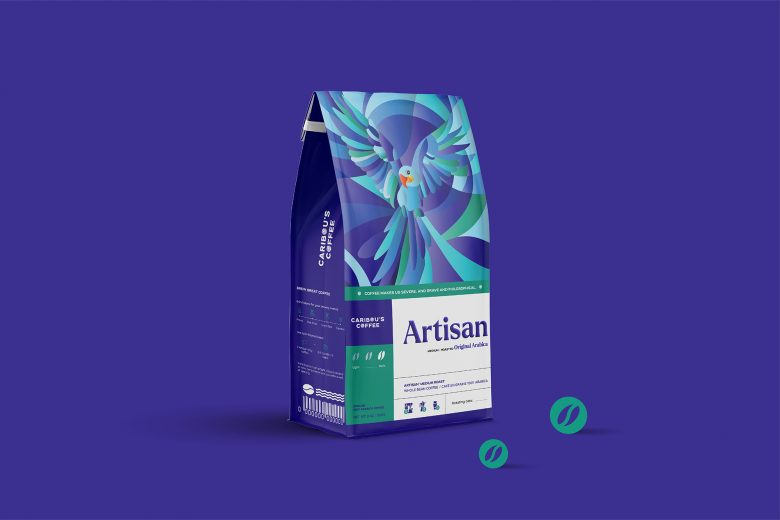
The brand’s visual identity is based on the label elements. Three main colors (blue, forest green & red) create a deep yet soft atmosphere of mysticism. The choice of natural and crafted materials emphasizes the art lover category of the product.
DESIGN SOLUTION
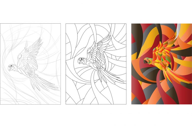
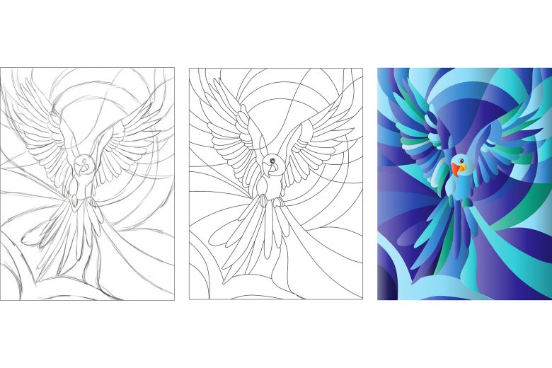
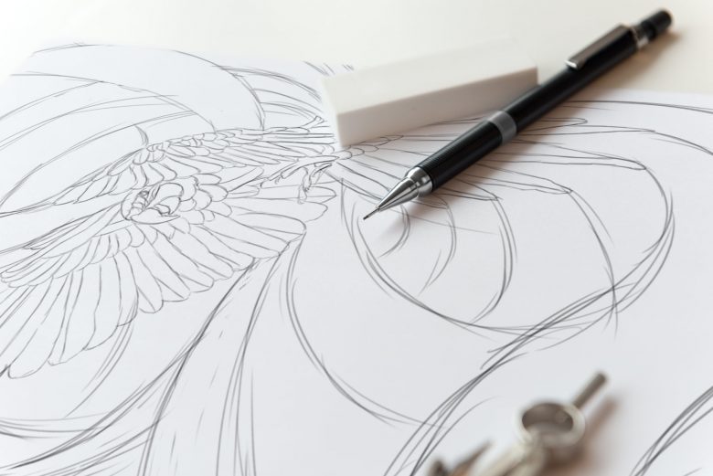
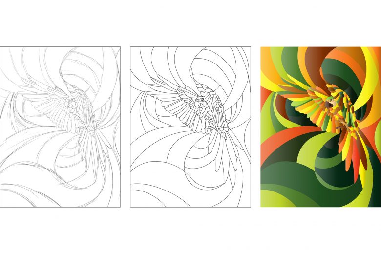
We had chosen to approach challenges, researching and experimenting with a wide range of styles. Various graphic factors, create a novelty linked with Artisan, Exhibit, and Poetry in outstanding and impressive ways. There are 18 species of Maca that we used for the main appearance and colors of the project (Ara ararauna, Aracanga and Ara ambiguus).
This art promotes user experiences, accommodating clients chill out and ready to begin a new adventure.
One of the most crucial things that we always follow when making a new packaging project is creating the inspiration for clients to keep the package after using these products.

Add to collection

