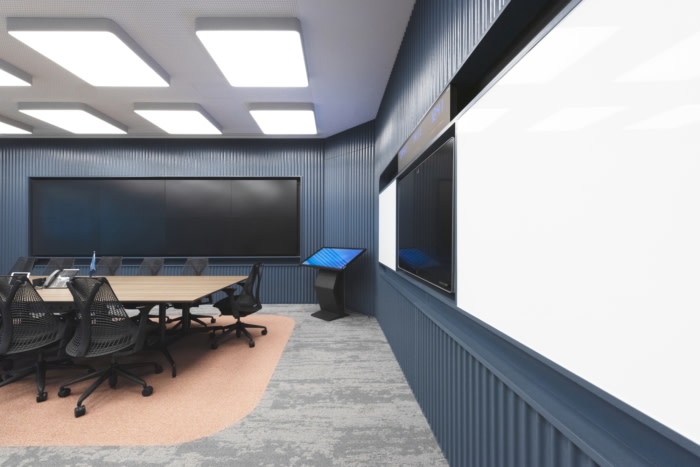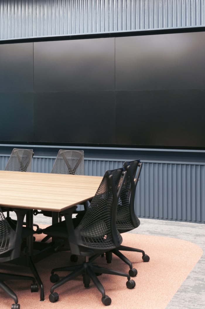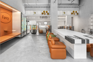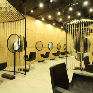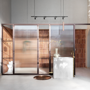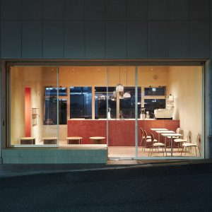
Bean Buro used the inspiration of the sea and ships when creating the design for the Anglo-Eastern offices in Hong Kong.
Envisioning the workplace as a large ship
The idea behind the design for this project stems from a photograph by Alastair Philip Wiper for his book ‘Unintended Beauty’. The photo depicted the cross section of a large ship, and we were particularly inspired by the horizontal and vertical relationships in the architecture, as it reminded us of a small city within a ship. Through the image, we began to envision this company as a very large ship with different levels and departments that interact with each other across the three floors.
Additionally, we were also very visually inspired by the Plimsoll Line on ships, a mark on the side of the hull used as a reference to indicate the maximum depth to which it can be safely loaded. The red area under the Plimsoll Line against the navy colour of the hull of the ship gave us the inspiration to convey the mood and feel in a manner that matches the sturdiness and robust identity of the company.
The Solution: A fluid staircase for chance encounters
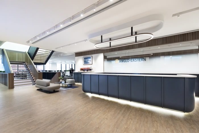
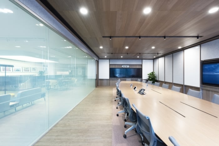
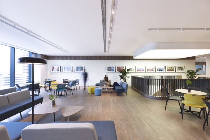
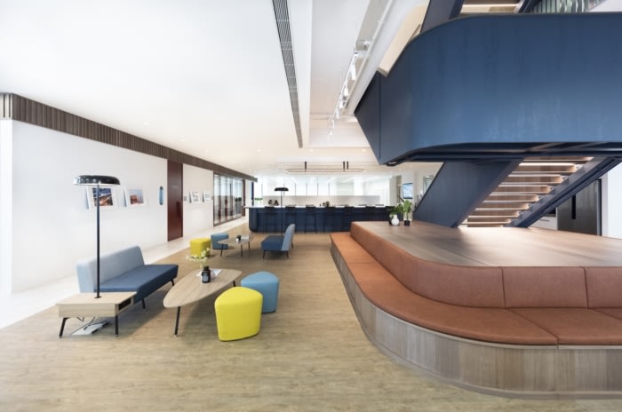
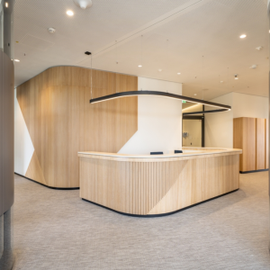
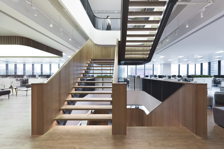
To improve connectivity, we proposed a structural opening to allow vertical interconnection across the floors. The reception would be stationed on the middle floor so that employees and visitors would be able to descend the staircase to the largest pantry and multifunctional event area or choose to go upstairs for the formal boardroom or executive lounge for co-working.
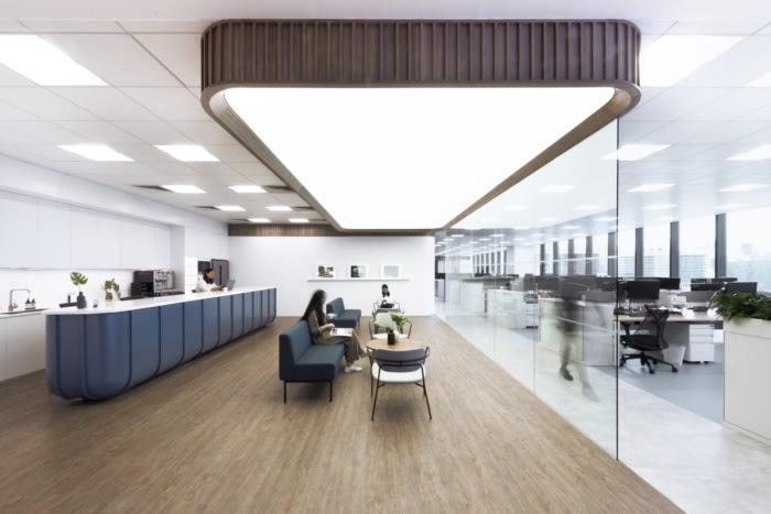
The concept was also to create as much agile co-working spaces as possible, particularly around the landings of the staircase on each floor where there is ample flexible seating equipped with power sockets and Wi-Fi to encourage a sociable and productive atmosphere for collaboration. For the multifunctional pantry area, all the furniture is loose and flexible, and the meeting rooms have operable partitions to further enlarge the space of the event area.
The Process: Nautical-inspired aesthetic for a robust company identity
We interpreted the structural rib of the ship to create the framework for the reception desk, pantry bar counter and construction of the staircase itself. We used the navy blue colour to represent a robust identity for these elements inspired by the hull of the ship. They are also rounded at the bottom, once again akin to the hull of a ship, allowing the joineries to feel elevated and lighter as a structural form. However, for the staircase, the inner surface is lined in timber to create a softer and more tactile experience for users. Each stair tread is also lit on the underside to create a fresh experience.
We used different floor finishes for the various zones of the open plan workplace. For example, in some of the hospitality areas we created a graphical floor with contour lines inspired by nautical maps. We also designed bespoke floor signages depicting arrows and compasses inspired by geographical maps while the rooms are named after different islands in Hong Kong to guide users across the space in a refreshing manner.
The Challenge: Articulating details for a large organisation
With a large workplace for so many employees, a major consideration was in creating a layout composition that would enable them to work flexibly with some fixed seating and to allow for potential expansion in the future.
The main challenge, as with many workplaces for such a large corporate organization, is using design to encourage employees to feel relaxed and engaged with the work environment. Our innovative design has achieved this objective successfully in the mood and feel with a large variety of flexible areas to work, allowing us to truly meet the brief in terms of creating a collaborative working culture.
Design: Bean Buro
Design Team: Lorène Faure, Kenny Kinugasa-Tsui, Kirk Kwok, Anny Teng, Linda Sze-To, Jay Jordan
Contractor: Winsmart Contracting
Photography: courtesy of Bean Buro
