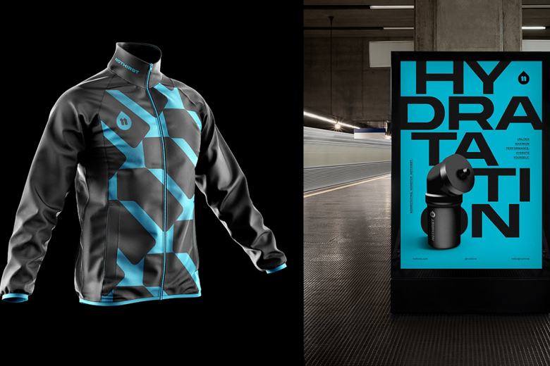
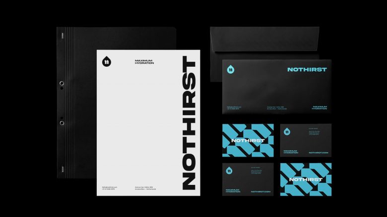
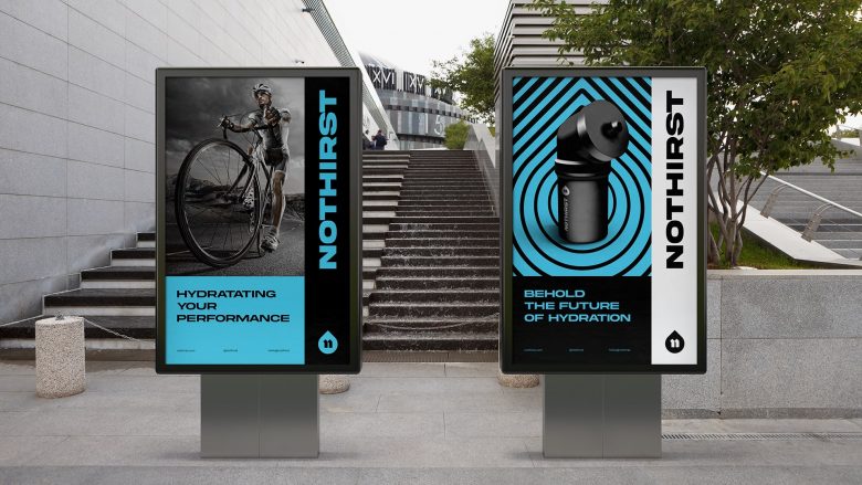
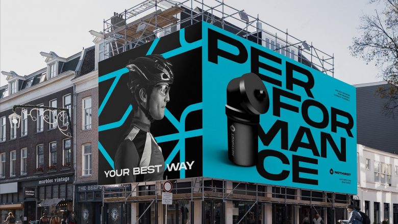
This work is a collab between John Dias + Chá de Bold Estúdio. This is a modern, innovative language with sustainable appeal (one of the brand’s pillars) in order to explore its greatest asset, that would bring a great long-term impact, creating for themselves and their community, an authentic and healthy lifestyle, establishing a solid bridge between the public and the brand. No Thirst is a active lifestyle brand from Netherlands, focused on improving performance through hydration and plans to kick off 2022 with its hydration packs for cycling athletes. These packs consist of sports bottles together with a set of supplements to increase the athlete’s performance avoiding distractions.
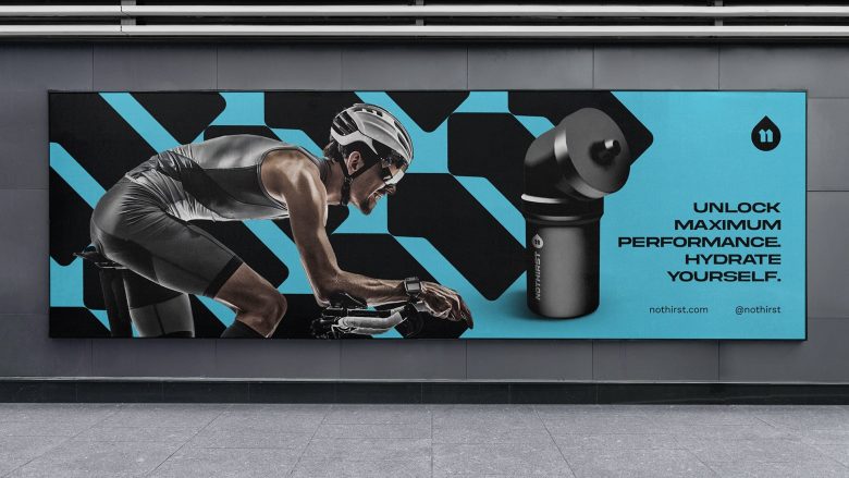
The big Idea is behind its flagship product, a sports bottle that allows athletes to drink without turning the bottle. This will especially help cyclists by letting them drink in an aerodynamic position, keeping their eyes on the road, creating a safe and efficient form of hydration.
We use a combination of fonts that add weight and boldness to the brand, without losing its modern and technological essence.
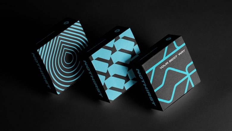
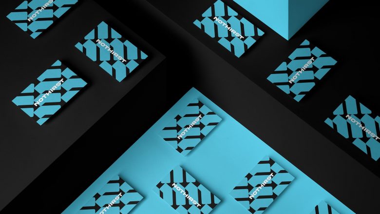
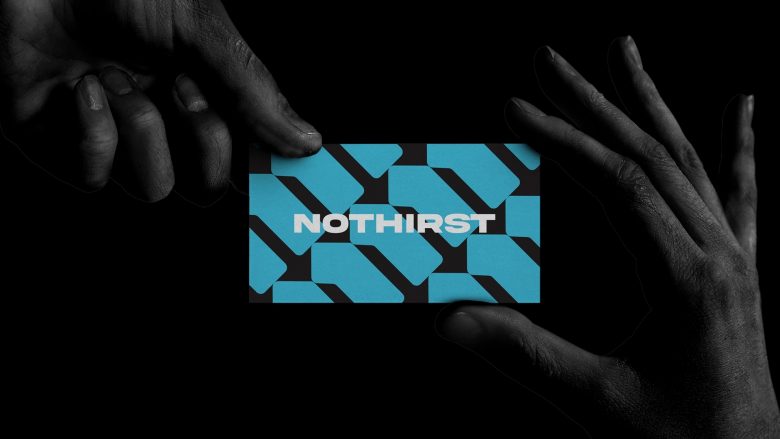
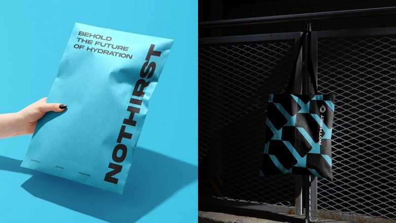
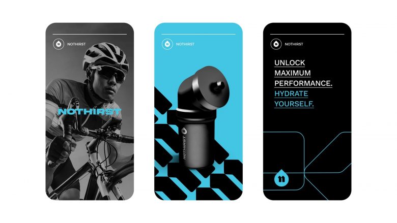
On the other hand, we use a specific font for subtitles and general texts, transmitting more lightness and smoothness, enabling an excellent readability of these texts. A group of different style patterns that were associated with the project was also used, creating an intricate and complete universe around itself, helping to identify to its target audience the positioning of the NoThirst brand for a competitive market, demonstrating attitude, modernity and sustainability with your product.
Add to collection

