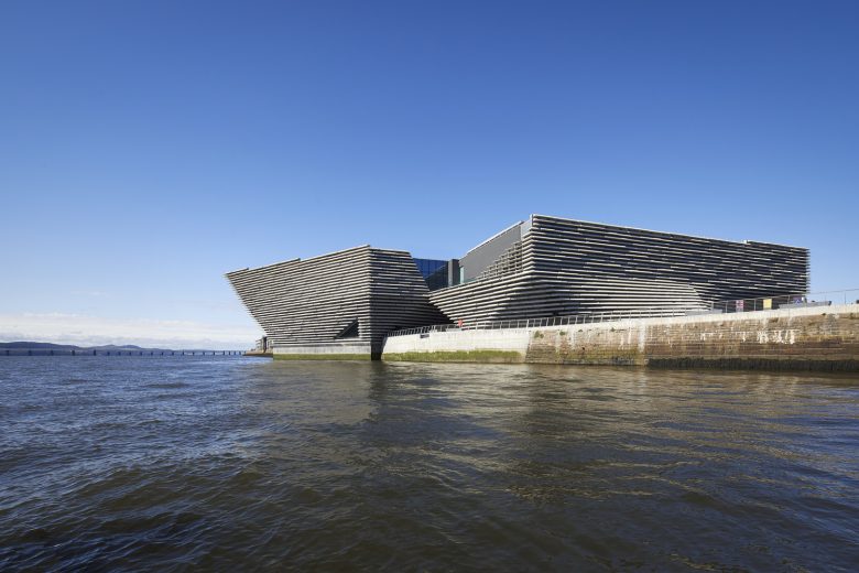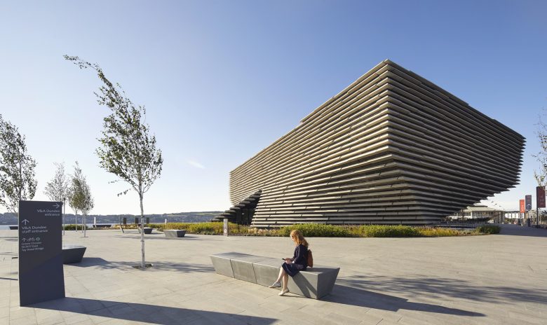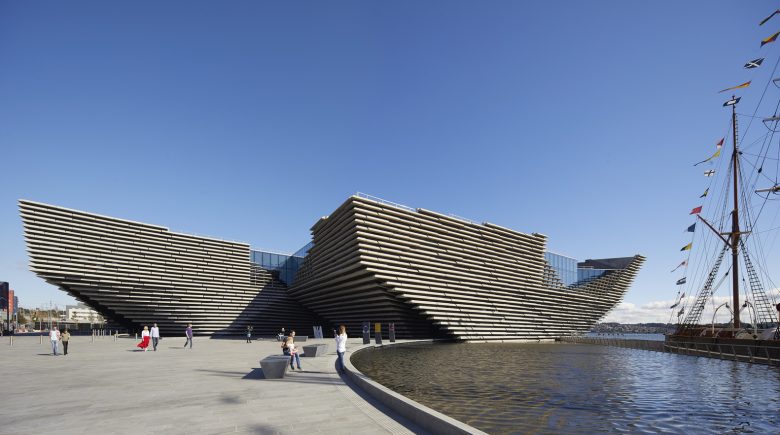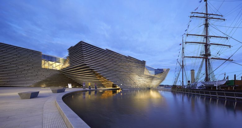
Setting – Dundee sits on the north shore of the Firth of Tay and has a long history as the key entry point to Scotland for shipping from northern Europe. Today, V&A Dundee is the jewel in the crown of a £1 billion transformation of Dundee City Waterfront, which stretches 8km alongside the River Tay and its estuary over an area of 240 hectares, in a 30-year development that began in 2001. The building is positioned at the heart of what was once Dundee’s bustling maritime infrastructure, on the site of the demolished Earl Grey Dock. Its striking form reconnects the heart of Dundee to the Tay, echoing the time when shipbuilding and the trade in textiles were its economic lifeblood. Alongside the museum are Slessor Gardens, a new public park space that hosts live music and events, and RRS Discovery, the exploration ship which was built in Dundee and sailed to Antarctica from 1901-1904 by Scott and Shackleton.
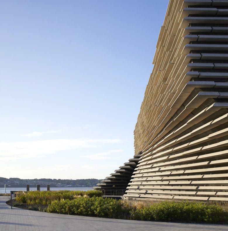
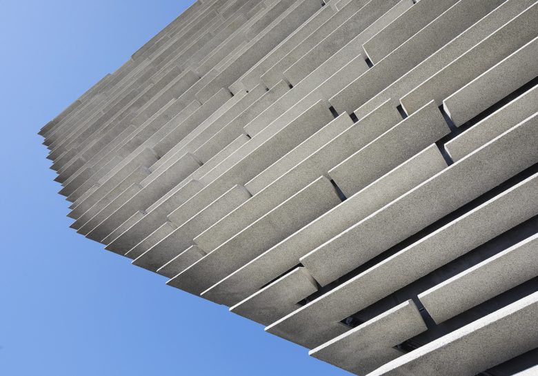
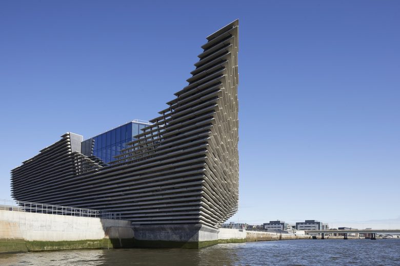
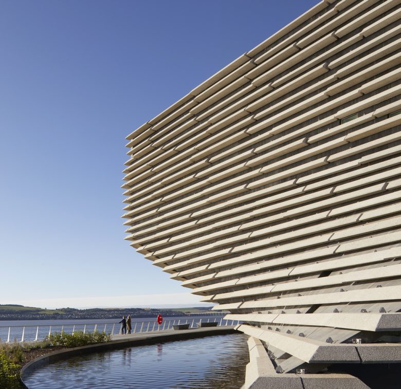
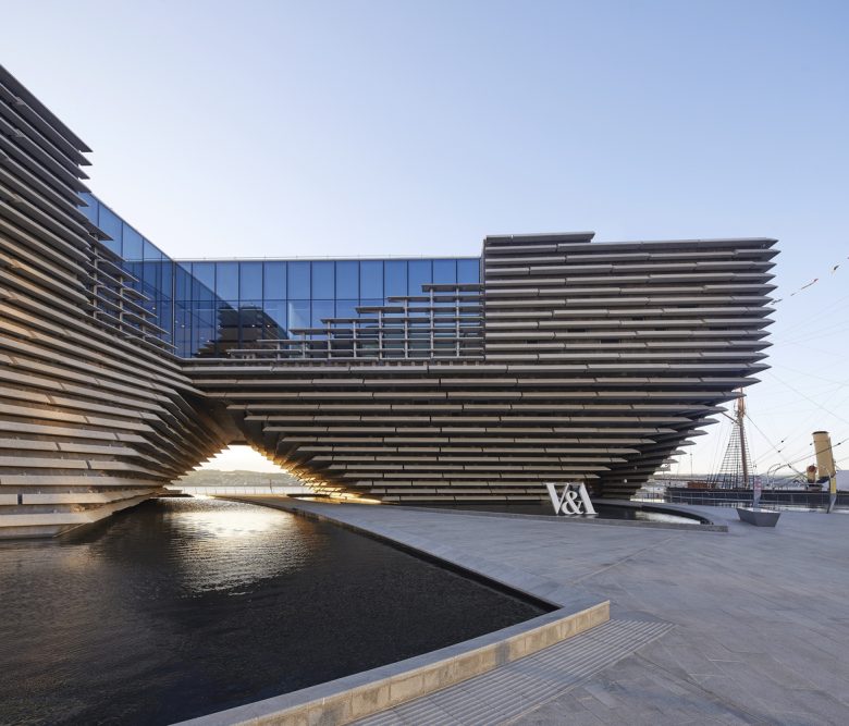
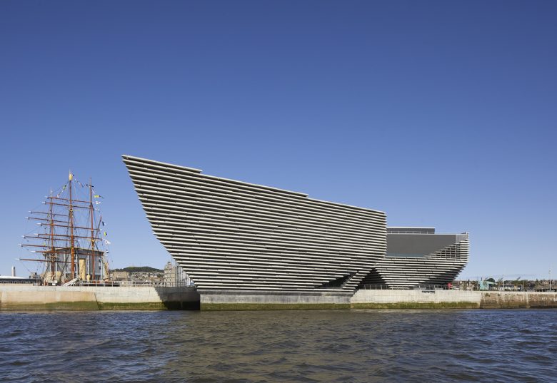
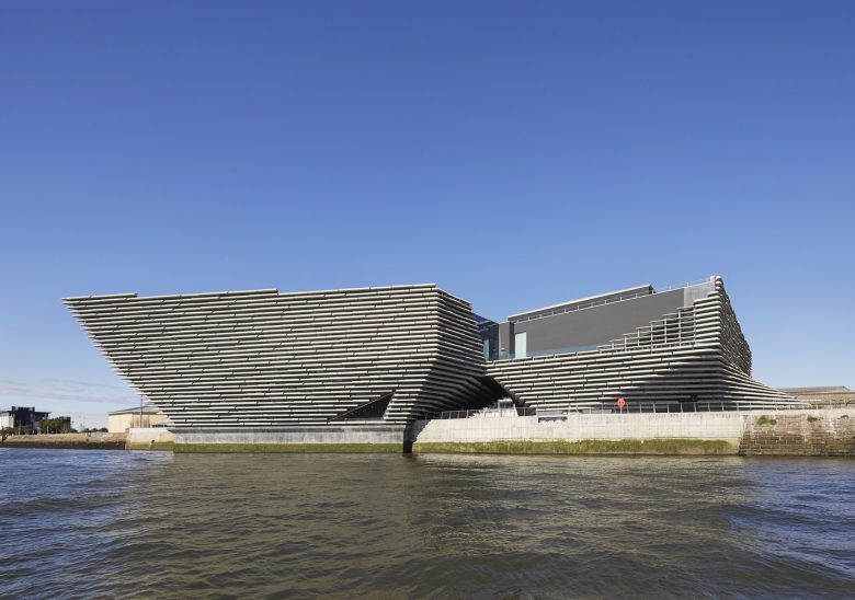
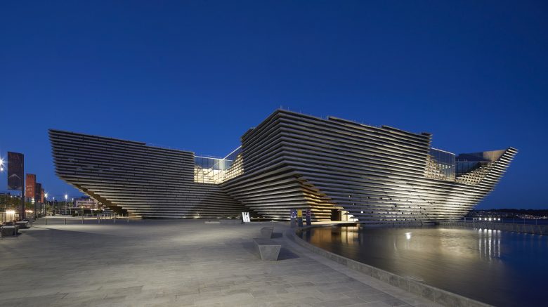
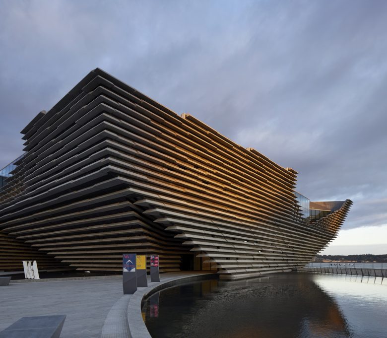
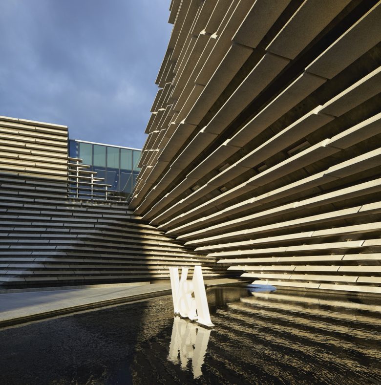
The building – Form – The form of the museum is inspired by the cliffs on Scotland’s north-eastern coastline, with the cladding – dramatic lines of pre-cast concrete that run horizontally around the curving concrete walls – creating patterns of shadows which change with the weather and the time of day. V&A Dundee’s appearance is of two inverted pyramids which are separate at ground floor, and then twist to connect at the upper galleries floor. This creates an open archway through the centre of the museum, reconnecting the city with the river, framing the view of the River Tay, and referencing the commemorative Royal Arch which was built nearby to welcome Queen Victoria and Prince Albert to the city in 1844.
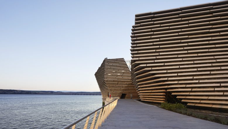
The Royal Arch was demolished when the city’s docks were in-filled to prepare for the construction of the Tay Road Bridge, which was completed in 1966. The brief for V&A Dundee challenged architects to reconnect the city centre with the river, which Kengo Kuma has done through water pools around the museum and by building the museum out into the River Tay. A ‘prow’ leans over the water and recalls the shipbuilding heritage of the city.
Structure – Kengo Kuma’s ambitious design demanded much of both engineers and constructors. It is a unique and complex structure with exterior walls which twist both horizontally and vertically, creating shapes like waves or the hull of a ship. Engineering firm Arup, which had been involved in the project since the competition stage, worked closely with the architects, BAM Construct UK and project managers Turner & Townsend to transform Kengo Kuma’s vision into reality. The original plans devised by the engineers included walls up to 60cm thick with huge pieces of steel embedded inside. By experimenting with the shape of the building using 3D models and analysis tools, the team cut the thickness of the walls by half and replaced the steel skeleton inside with much thinner reinforced bars.
The building functions in a similar way to a shell, in that it is a continuous and interconnected structure. The roof, walls and flooring all work together to make the building stable. While the twists and folds of the walls might have been seen as presenting a problem, the engineers considered how these complexities could help strengthen the building, in the same way origami relies on paper becoming more rigid when folded. To understand what impact these details would have on the overall structure, 3D and analysis models were vital. An integrated 3D model of the entire building was created as a coordination tool, meaning the architects, engineers and contractors involved in the construction could all study a digital version of what they were about to build.
The finished structure remains true to the extraordinary design that won the competition, with the largest overhang seeing the roof extend an impressive 19.8 metres beyond the footprint of the museum. The building consists of two separate parts joined at the upper floor, where huge steel beams connect the exterior walls to two cores, providing support. The largest tension in a single beam is the equivalent of supporting around 40 double-decker buses. While the lower floor is split in two, separating the public areas from object delivery, preparation and staff quarters, the upper second floor provides very large and uninterrupted gallery spaces. The separation of the structure at the lower levels allows for an outside walkway to pass through the middle of the building, an archway joining the river to the city.
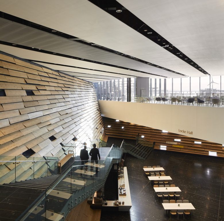
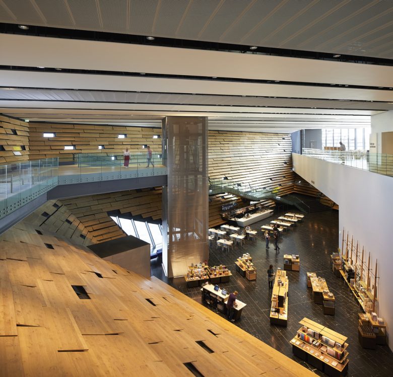
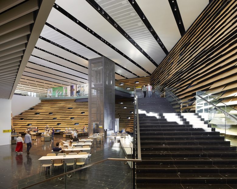
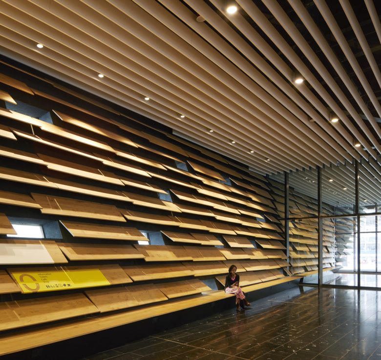
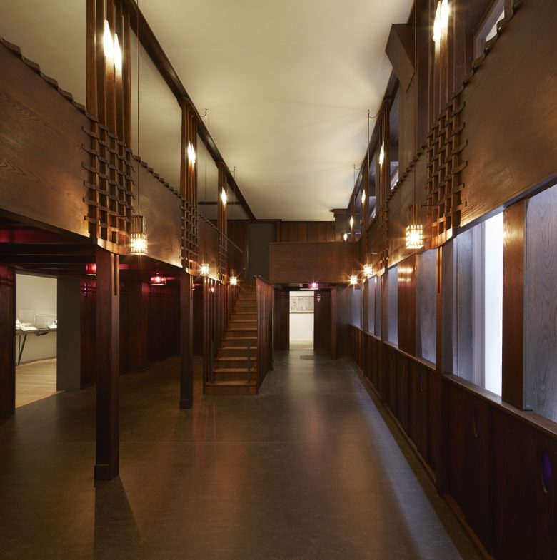
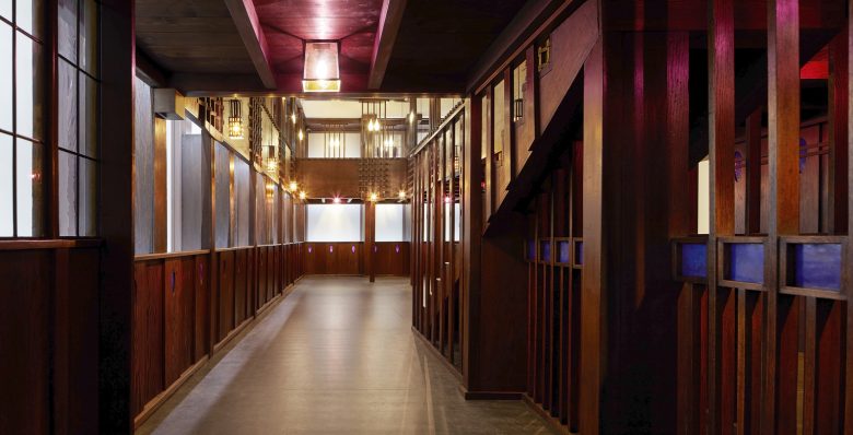
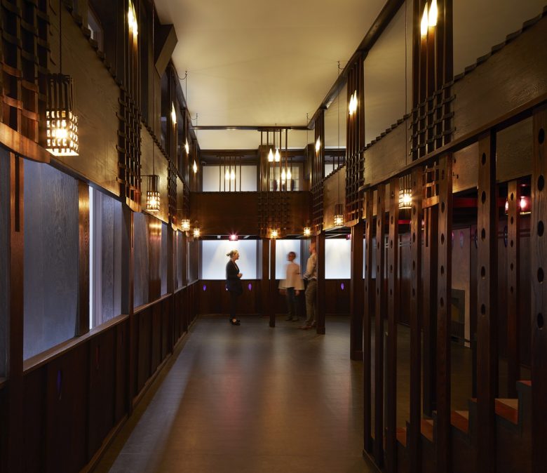
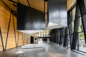
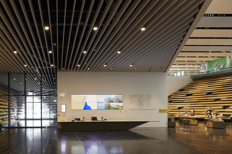
Spaces – V&A Dundee has a floor area of 8,445 square metres and includes a main hall, learning centre, auditorium, exhibition galleries and the permanent Scottish Design Galleries. At the ground floor level, it is arranged as two separate buildings. These join together on the upper second floor. Visitors enter V&A Dundee through a large and beautiful main hall, a light-filled space intended by the architect to be welcoming and accessible, a vibrant place to socialise with a café, shop and other visitor facilities. The stepped interior walls are lined with hanging oak-veneered panels, pierced throughout by slot windows which create a dynamic, warm and playful light, as well as views out to the river.
The floor of the main hall and staircase is set with Carlow Irish Blue limestone, which includes visible fossils of sea creatures and plants, millions of years old. The dark stone with fossil detail was chosen to continue the connection to sea and nature throughout the building. A glass lift offers dramatic views as visitors rise up to the upper second floor. The white concrete used in the café, restaurant and on the shop’s cash desk pays homage to the River Tay’s endangered freshwater pearl mussel. The concrete has been mixed with mussel shells, a sustainably sourced by-product of the local UK food industry and local shores, then cast in bespoke forms and polished to reveal their whites, blacks, greys and blues.
A mezzanine first floor includes a picnic room for schools to book during the week and freely available for families to use at the weekend, as well as a Changing Places facility. The upper second floor has views across the main hall, through the restaurant and out to the River Tay, with visitors welcomed into an open foyer connecting the Michelin Design Gallery, the Thomson Learning Centre and the entrances to both the exhibition galleries and the permanent Scottish Design Galleries. The floors on the upper level and within the galleries are laid with European oak, and bamboo is used for the floor of the restaurant and floor and walls of the picnic room.
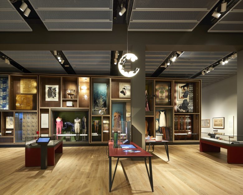
V&A Dundee has the largest museum-standard temporary exhibition space in Scotland, at 1,100 square metres, in addition to the Scottish Design Galleries at 550 square metres. Also on the upper floor is a suite of learning spaces, designed to provide a diverse programme for all to participate in design creativity. Adjacent is a design residency studio where designers can share work in progress with visitors, a multi-purpose auditorium for conferences, design jams and community events, and a restaurant with spectacular views through floor-to-ceiling windows and from its outdoor terrace over RRS Discovery and the River Tay.
Architects: Kengo Kuma & Associates
Photographs: Hufton+Crow
