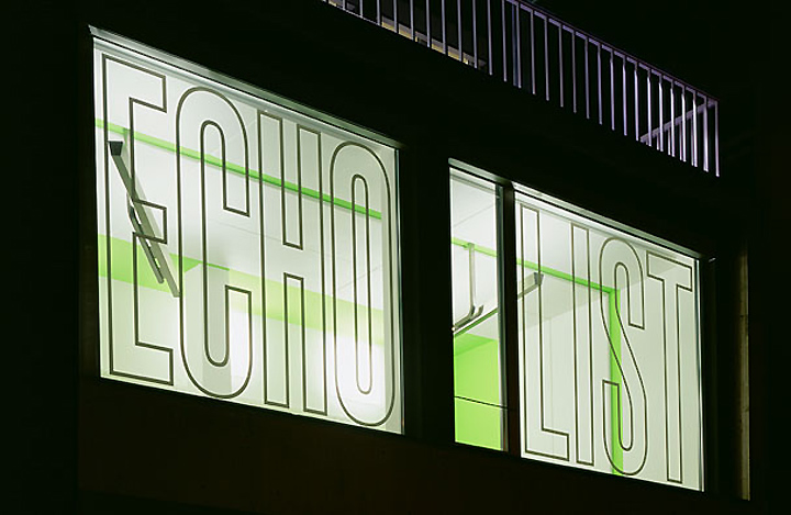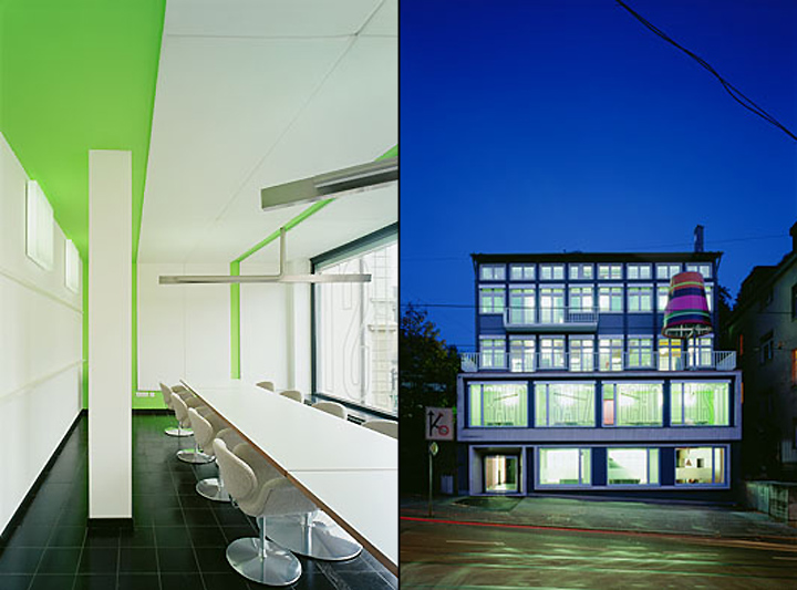


After 12 years, it was time for the Stuttgart advertising agency, Panama, to risk the step out of the second row in a villa quarter and occupy a visible position with its own building. This building achieves this with a first-class address at Eugensplatz 1. At the back, the edifice looks out on the park of the French Institute and towards the square it provides an impressive and unobstructable view of Stuttgart’s valley.

The building itself can be seen from afar. The oversized light on the terrace intensifies Panama’s presence on the square and also shows the self-confidence of an agency that is underscoring its ability to position brands. At night, this gesture creates with the help of an almost intimate illumination an introverted and concentrated atmosphere.

Layering
The construction is divided into two axes from the third to the fifth floor and three axes in the first two floors with all axes perpendicular to the building itself. This structural linearity is transferred to the design and to the organization as well. The interior architecture provides the experience of varied spatial and atmospheric layering.

Colors
The structure was built in the sixties as a dancing school and then used for many years by the State Insurance Institute as offices for doctors. The façade is not prominent, but the unusual side view in the form of a two-story pedestal extended from one axis and the warped compass roof present a striking building. The compactness and the impressive character of the building are reinforced by the color of the façade in the dark gray shade of the agency’s corporate design.

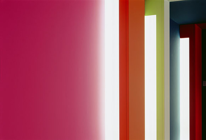
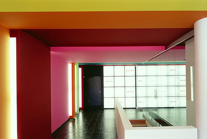
The internal character stands in sharp contrast: the sidewalls and ceilings are dipped in intense strips of color, which envelope the cross layering of the building. The colors create the space as a system and become active, intense and structurally integrated in a varied and direct manner reflecting the spirit of the agency. The visitor enters the creation of a different world as a trip through Panama.

Organization
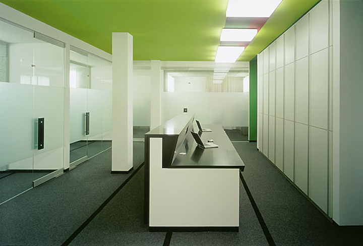
The ground floor is primarily oriented towards the arriving visitor. The reception, secretariat, public relations and a waiting area are located in an open spacious room or in emplaced offices. The colors here are the most intensive and passionate. They represent the initial contact and the compilation of experience that the visitor will find in the upper floors. The act of entering is animated and perceived through the spatial modulation and indirect illumination of the colorful sidewall. The lighting system consisting of 72 square trough light fixtures with a text.
Designed by Ippolito Fleitz Group
Photography by Zooey Braun
