
Cost per Kilo flagship store by CREATIVE STUDIO UNRAVEL
posted by retail design blog on 2025-06-27
Seoul
Add to collection
[Architecture]
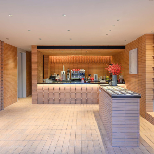
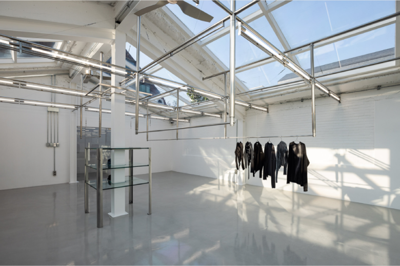
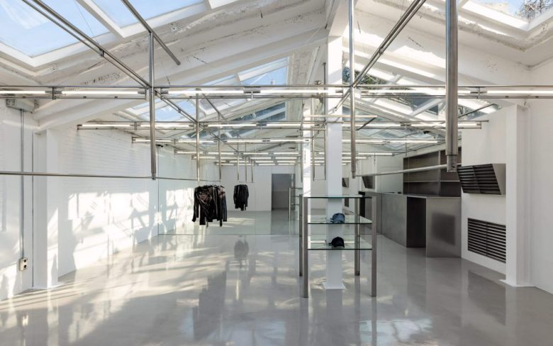
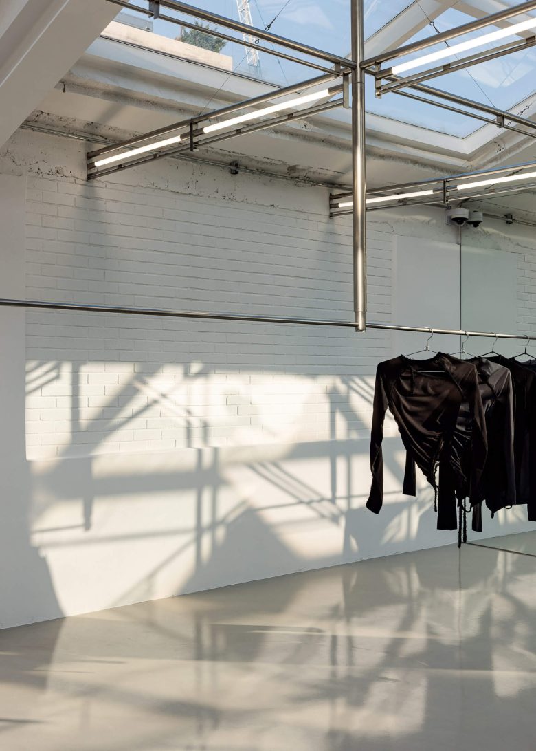
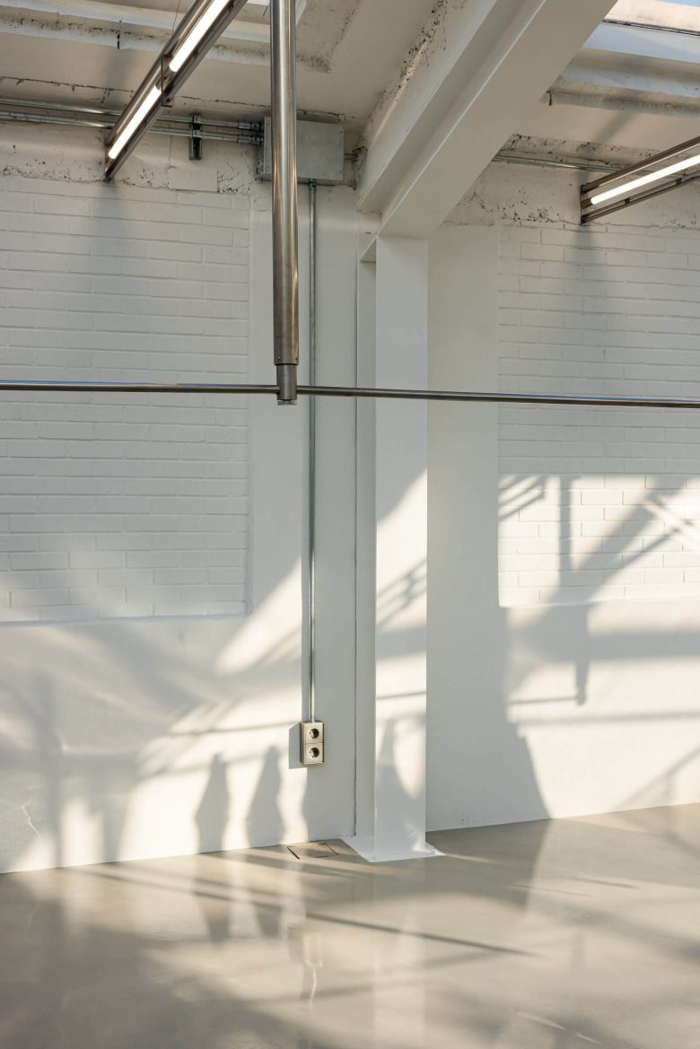
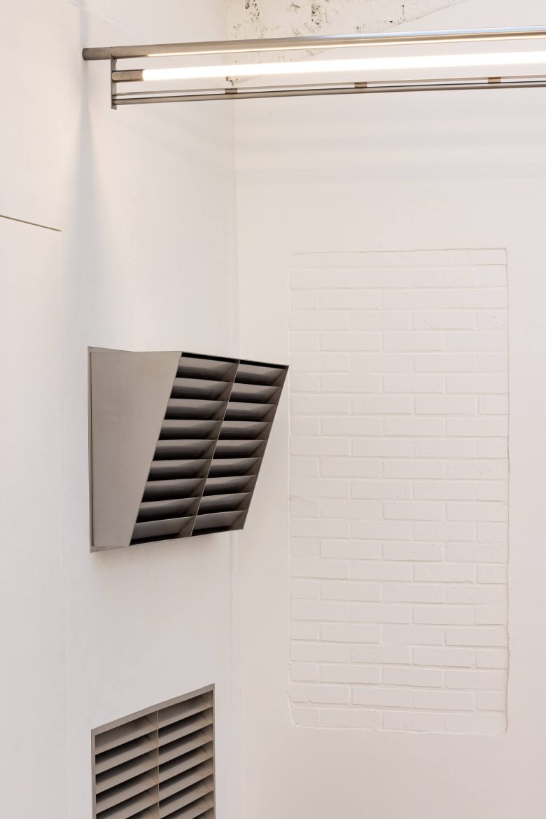
The first offline store of Cost per Kilo was designed according to the principle of conservative regeneration, honoring the history and materiality of the existing building. Exterior and interior brick finishes—considered elements imbued with the timeworn character of this long-licensed structure—were carefully sorted and preserved by wall during demolition. When the original brick texture unexpectedly emerged, the plan was revised to reuse it over a larger area than initially intended, thereby maximizing the building’s inherent vintage charm.
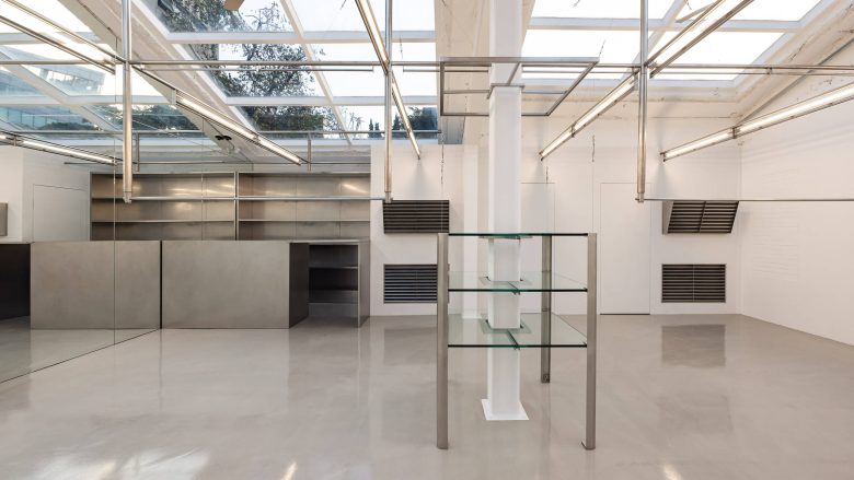
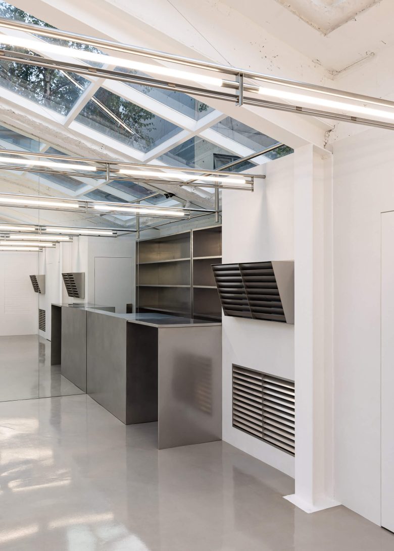
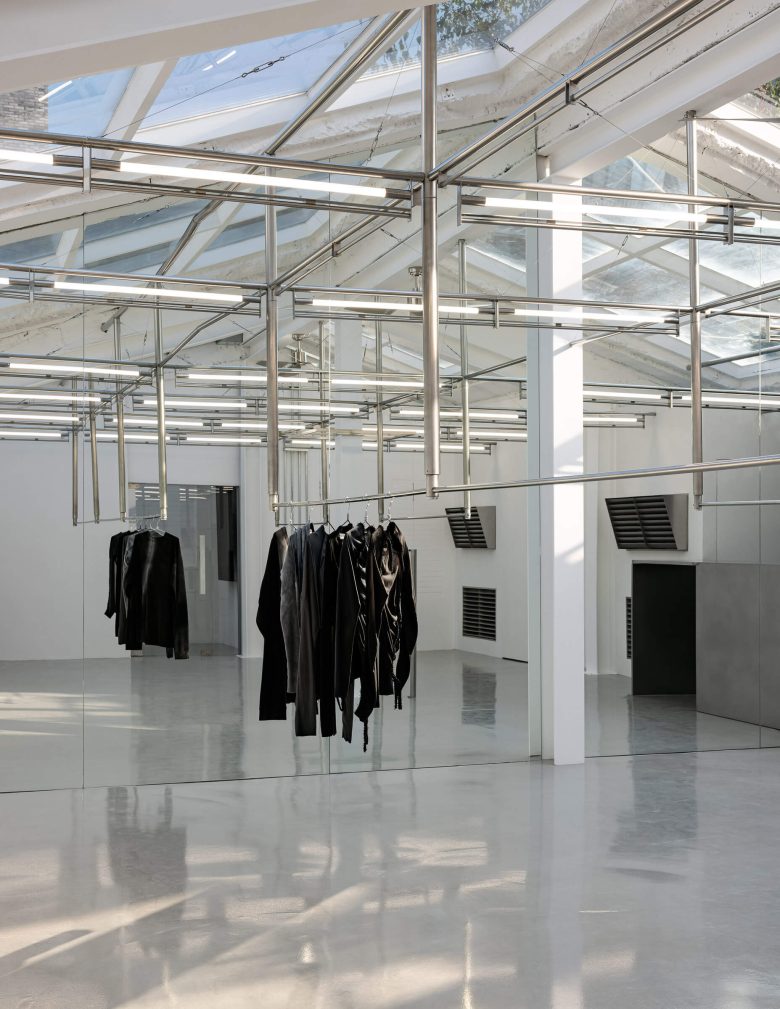
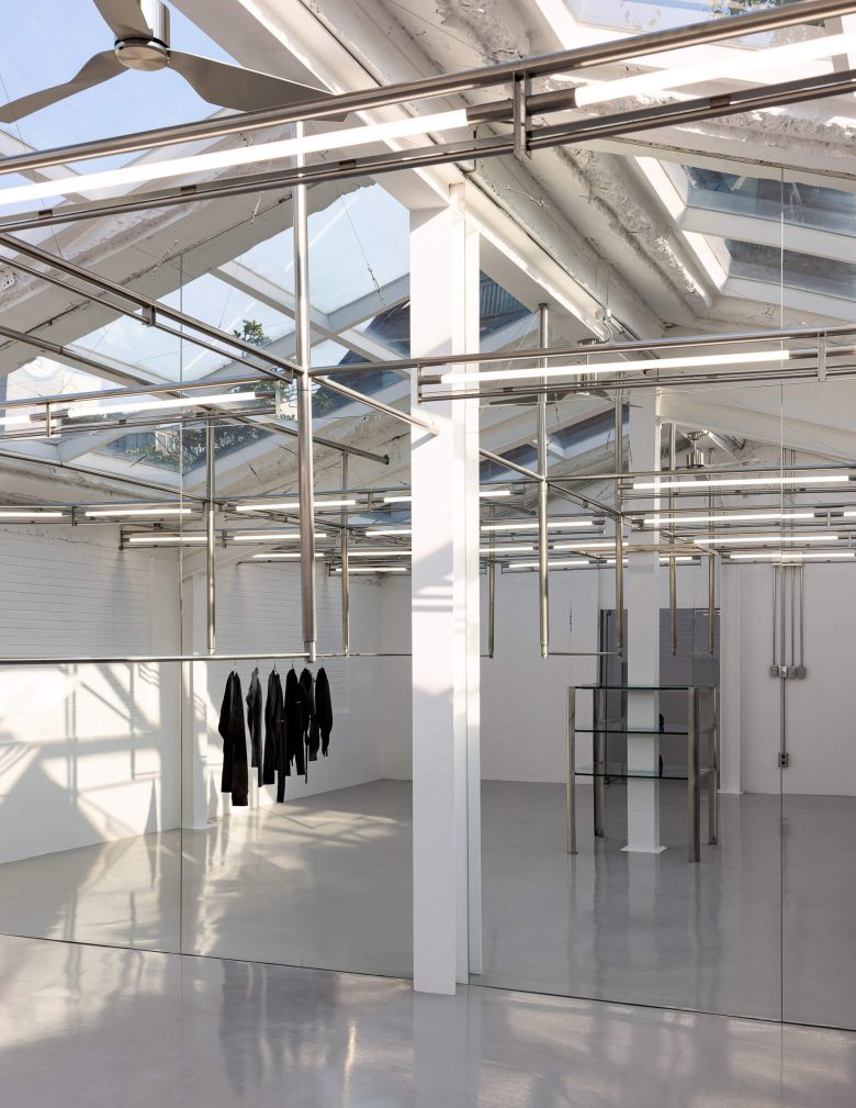
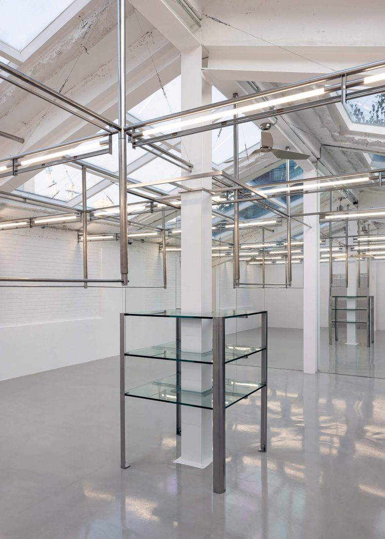
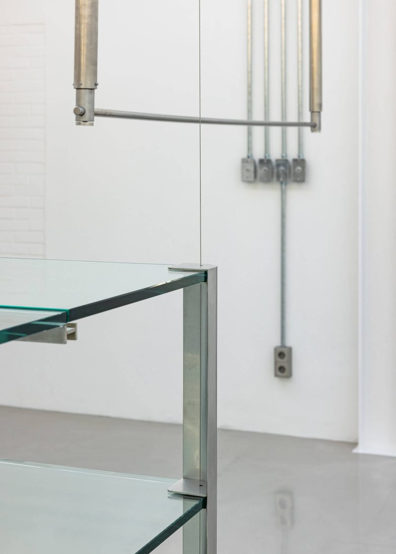
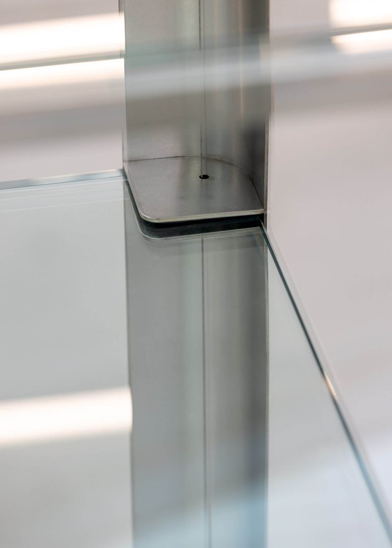
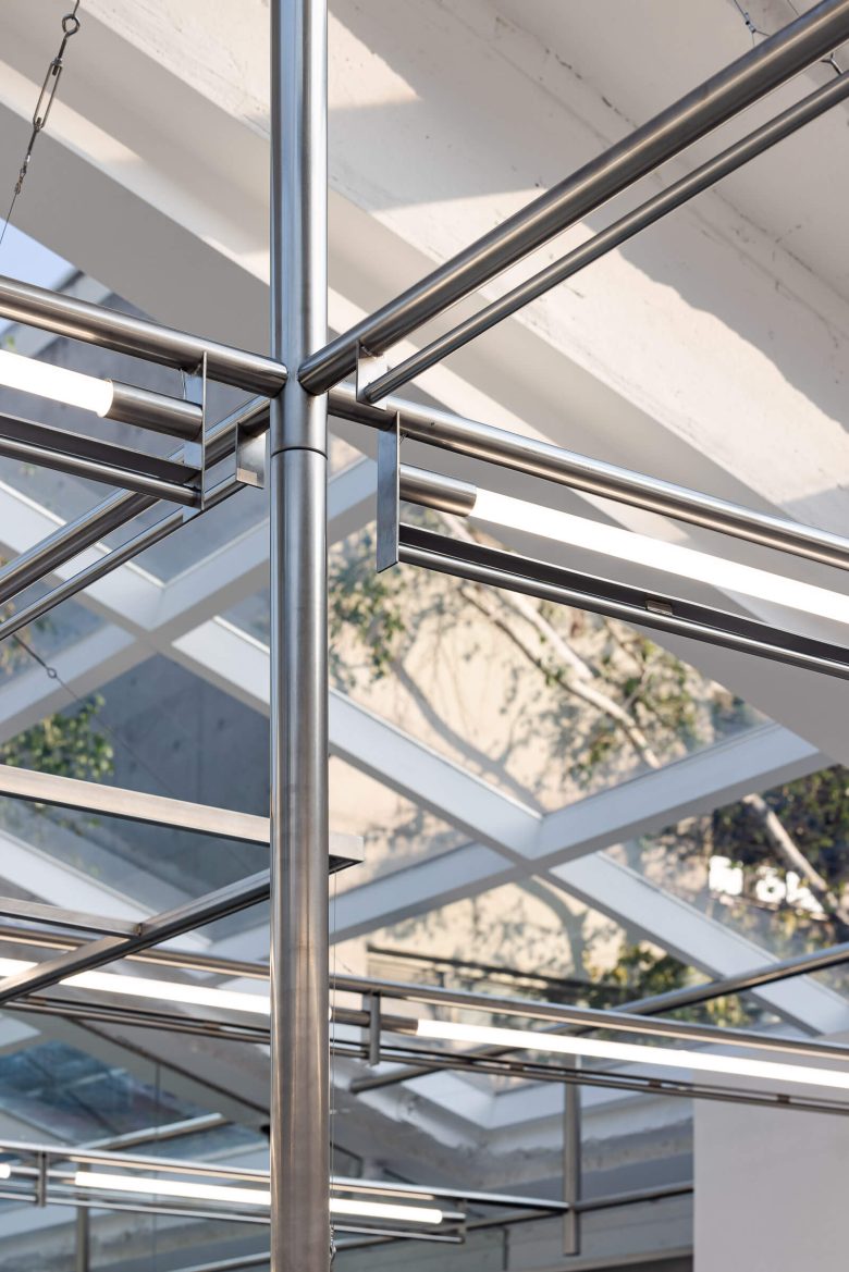
Finishes were minimally restored so as to emphasize the raw qualities of the original materials, and the exposed brick surfaces were harmonized with new materials. Concrete structural elements, steel columns, and glass furnishings were then arranged in measured proportions to visualize the brand’s forward-looking vintage sensibility as a “fundamental harmony of materiality.”
[Space]
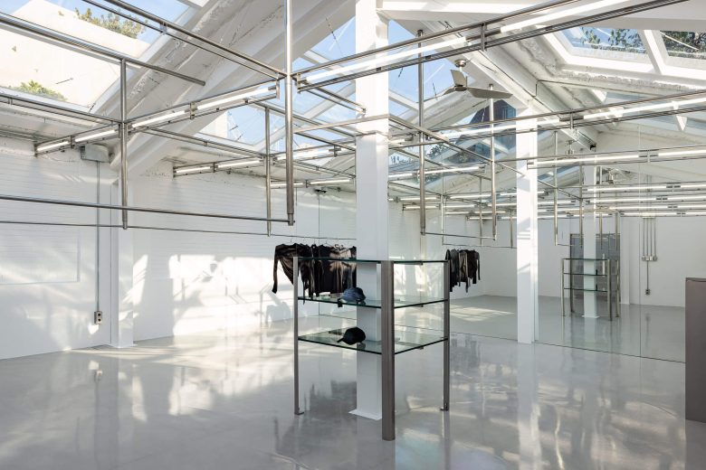
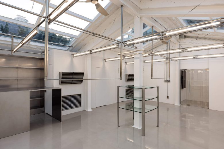
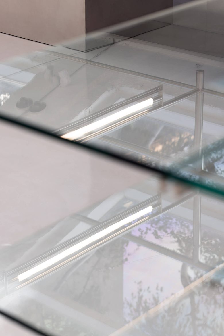
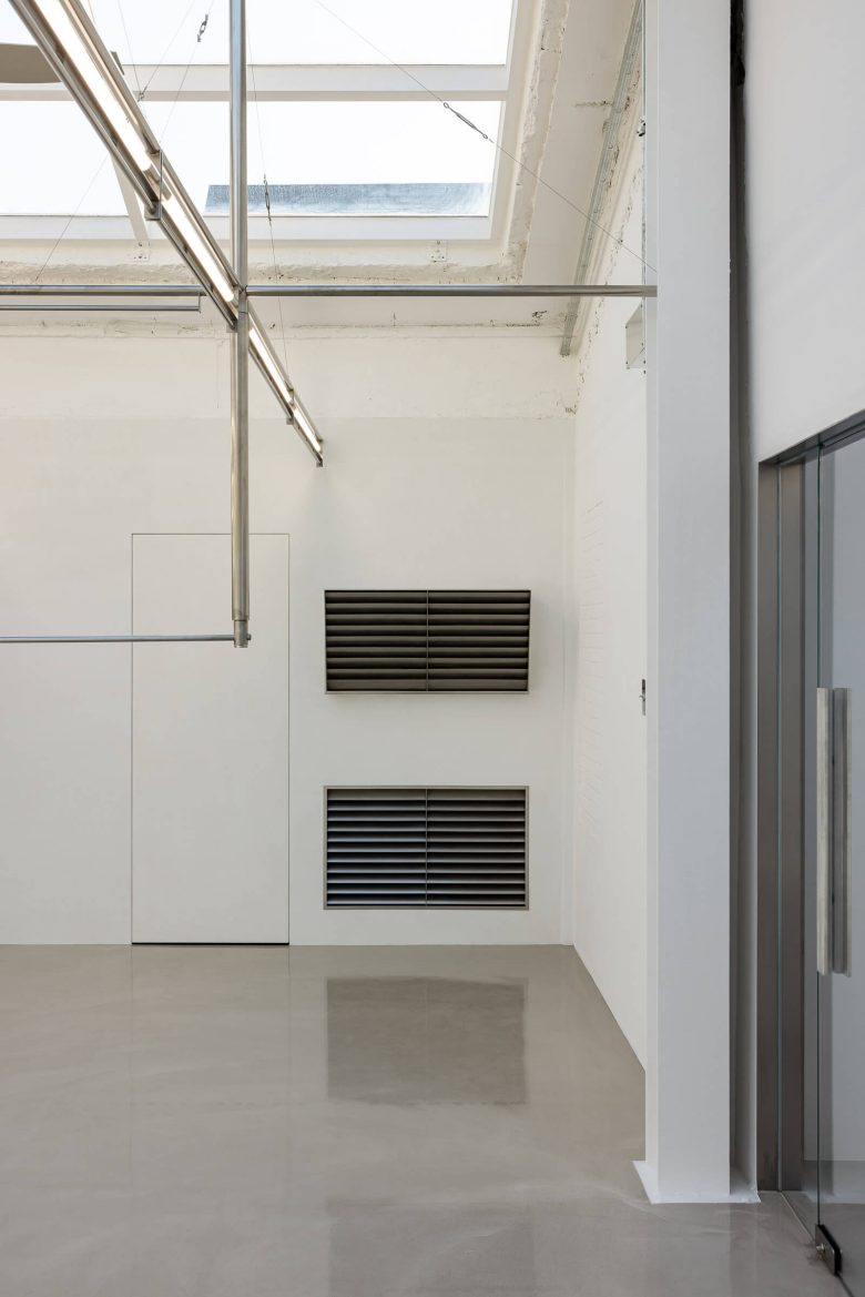
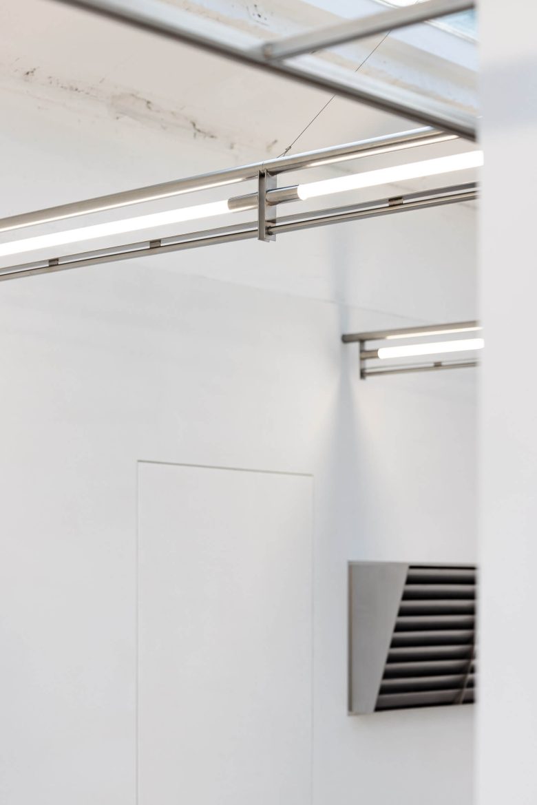
The interior is based on a “white warehouse” concept, with bright natural light gently filtering through the overhead structure. The contrast between the white backdrop and the exposed brick and skylights creates an ideal setting to highlight products and displays.
To ensure efficient customer circulation and flexible use of the space, a grid hanging system was developed: its hardware can be detached and reoriented to accommodate seasonal collections, pop-up events, new promotions, and more. This system is designed not merely for moving fixtures but to allow the very structure of the space to transform, actively supporting the brand’s exhibition and sales strategies.
Cost per Kilo’s store serves as a stage where architecture and spatial design unite to embody the brand identity—a true experience-driven space that respects past materiality while allowing for flexible adaptations toward the future.
Designed by CREATIVE STUDIO UNRAVEL
Photography: Han Sunghoon
Add to collection