

Add to collection
Energizing Design for a New Coffee Ritual
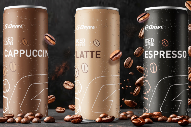
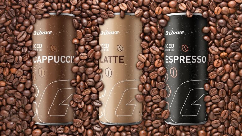
For G-Drive Iced Coffee, we set out to capture the essence of performance, energy, and urban lifestyle—core values of the G-Drive brand—within a sleek, contemporary can design. The result is a visual identity that speaks directly to consumers seeking more than just a caffeine boost: it offers a sense of momentum, dynamism, and cool sophistication.
Color System & Flavor Navigation
The packaging system is defined by a bold and purposeful color palette, ensuring instant differentiation between the three variants:
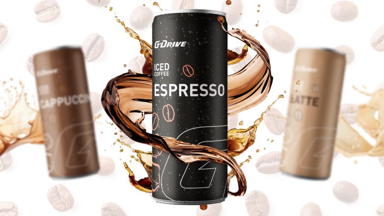
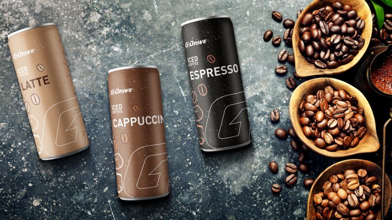
Cappuccino: Rich mocha brown, evoking warmth, creaminess, and approachability.
Latte: Soft beige, signaling smoothness and balanced flavor.
Espresso: Deep matte black, referencing intensity, depth, and classic coffee culture.
Each color not only serves as a taste cue but also enhances shelf standout and on-the-go recognizability—key in the competitive RTD coffee segment.
Typography & Branding
A custom typographic approach places the G-Drive wordmark front and center, leveraging its established brand equity from the energy and automotive sectors. The bold, uppercase sans-serif font used for the variant names (“CAPPUCCINO”, “LATTE”, “ESPRESSO”) communicates clarity, strength, and modernity. The layout is minimalistic, with careful hierarchy that guides the eye from brand to flavor to product type (“ICED COFFEE”), ensuring instant comprehension even in high-traffic retail settings.
Signature Graphic Language
The large, stylized “G” element—distinctive to G-Drive—serves as both a background graphic and a unifying visual device across the range. Subtle linework and ice cube icons echo the refreshment and coolness of the product, while delicately placed coffee beans emphasize authenticity and premium quality. Fine water droplets rendered on the can reinforce the ice-cold, refreshing character.
Materiality & Finish
A matte finish gives the cans a contemporary, tactile feel, avoiding the generic “gloss” of many competitors and underlining the premium positioning. The condensation effect visually amplifies the sensory appeal and thirst-quenching promise.
Brand Strategy & Shelf Impact
This packaging project is a direct extension of G-Drive’s brand DNA: speed, energy, and innovation. The dynamic interplay of color, graphic elements, and clean typography creates instant shelf impact while enabling effortless variant navigation. The design is engineered for visibility in both retail coolers and impulse channels—perfect for consumers who value both style and substance.
Flavor Experience
Cappuccino: Smooth, creamy, lightly sweet—crafted for indulgence.
Latte: Balanced, mellow, perfect for all-day refreshment.
Espresso: Bold, intense, for true coffee purists and energy seekers.
Each variant is visually and sensorially differentiated, making the range as clear and inviting as it is energizing.
Designed by Titan Design

Add to collection