



ZHEST by Max Lippolis
posted by retail design blog on 2026-07-23
Add to collection

ZHEST — Isotonic Drink Branding for a New Hydration Experience
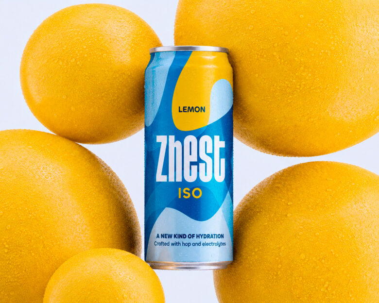
Zhest is a barley-based isotonic drink with hops and electrolytes, created to offer a new everyday hydration experience. The project explores hydration not only as a functional benefit, but as a visual language made of movement, freshness and balance.
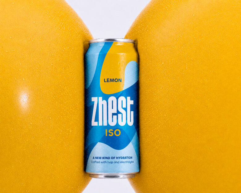
The identity is inspired by the idea of flow: soft lines and overlapping shapes move across the can like currents of water, generating depth, rhythm and continuity. Shades of blue communicate clarity, trust and refreshment, while the yellow accent evokes lemon and adds a vivid burst of energy.
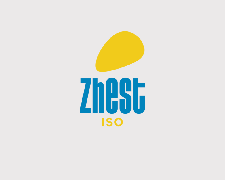
The condensed, vertically structured logotype becomes the focal point of the packaging, giving the brand a bold and recognizable presence. Through light, colour and fluid composition, Zhest transforms a simple daily gesture into a vibrant, instinctive and unexpected experience, positioned between sports drinks, functional beverages and contemporary lifestyle refreshment for an active generation seeking taste, wellbeing and effortless energy every day with clarity.
Art Direction / Graphic Design: Max Lippolis




Add to collection