




TURAB Body Care by Amjad Battal
posted by retail design blog on 2026-11-12
Add to collection
TURAB — Body Care | Brand Identity
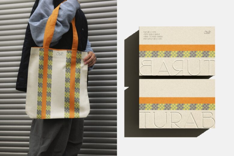
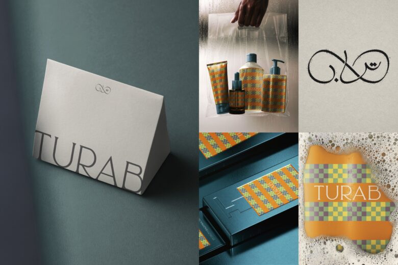
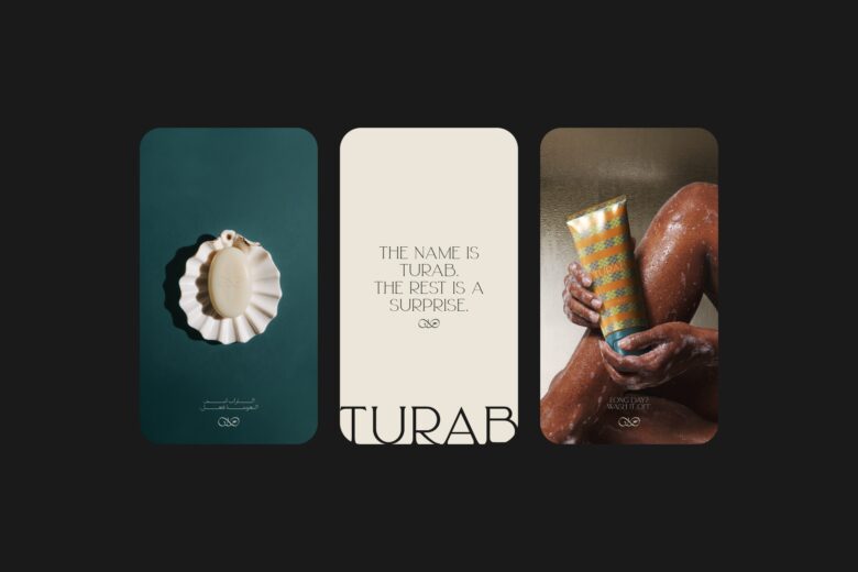
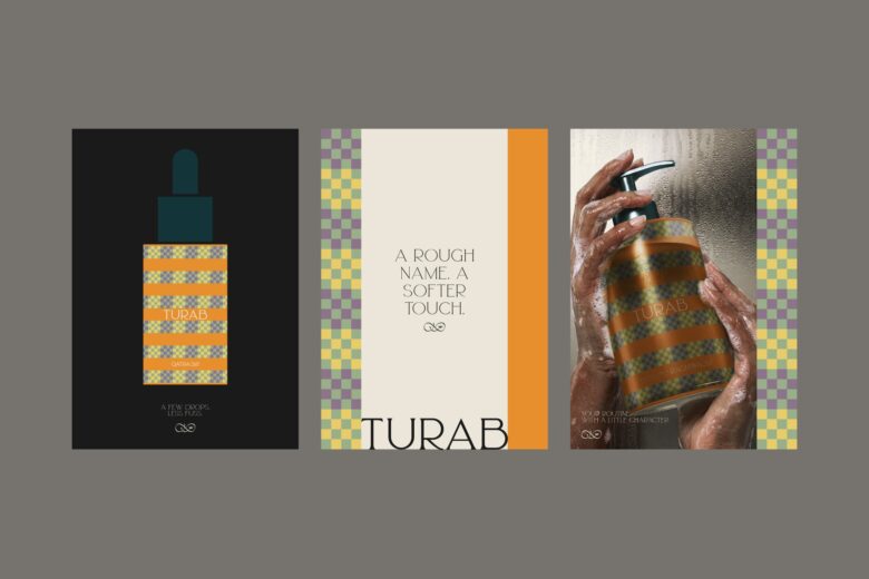
TURAB takes its name from the Arabic word for soil — an unexpected starting point for a body-care brand. This contrast became the foundation of the identity, bringing together two seemingly different worlds: the earth and the skin.
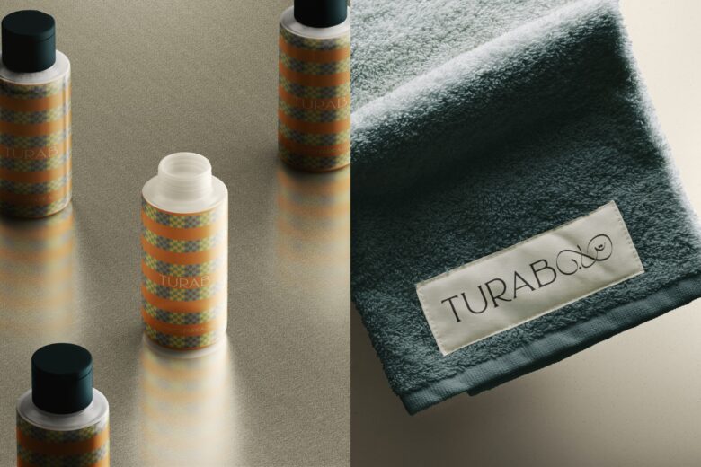
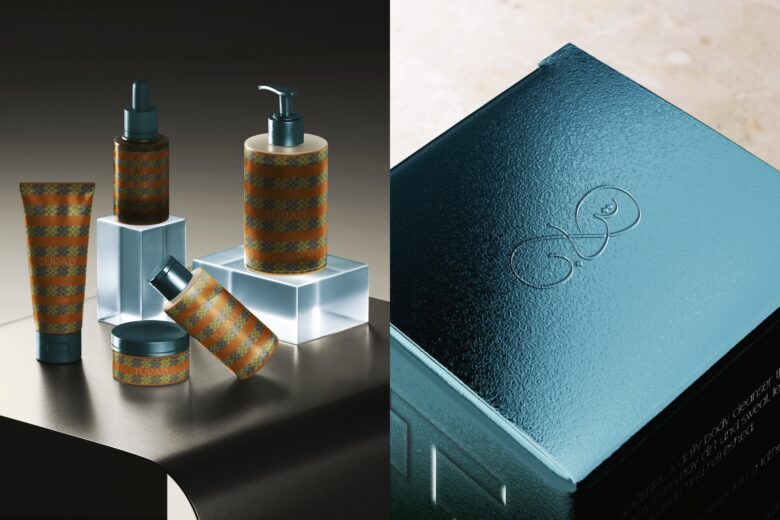
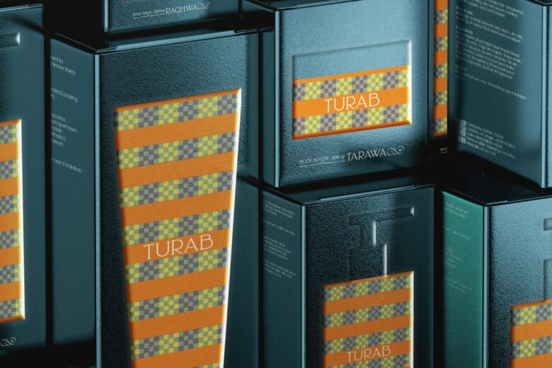
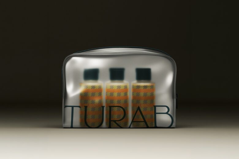
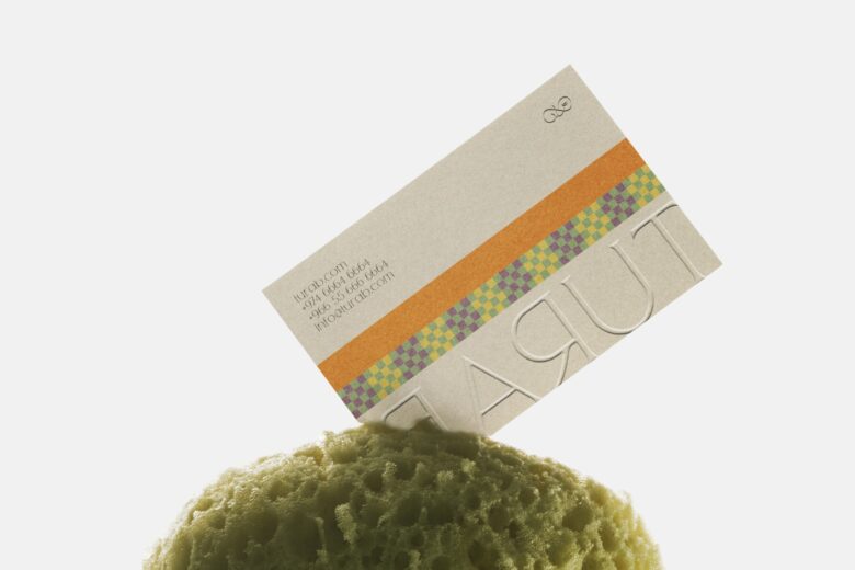
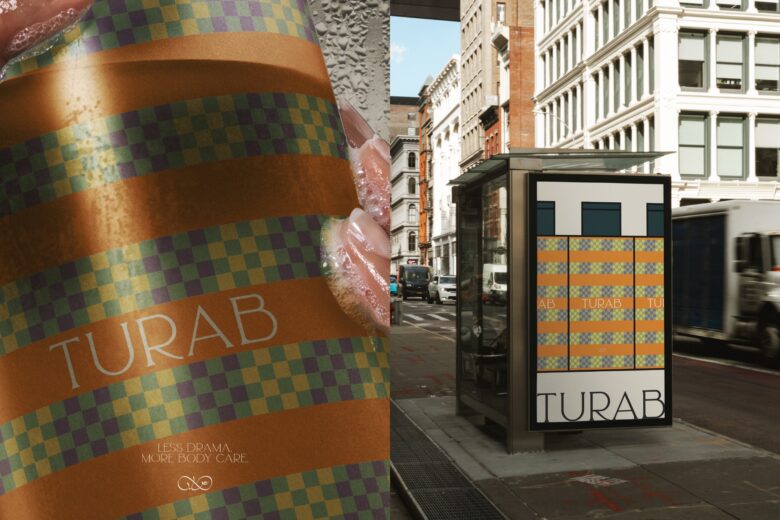
The visual concept draws on the resemblance between the layers of the earth and those of the skin, translating their layered structures and natural textures into a distinctive graphic language. A multicolored checkerboard pattern, inspired by the granular texture of soil, works alongside burnt-orange stripes and deep teal accents to create a bold, playful visual system.
Across the packaging and brand applications, expressive typography and contrasting elements give TURAB a character of its own. The result is an identity built around the unexpected, where the natural world meets body care in a way that feels unconventional yet cohesive.
Designed by Amjad Battal
Add to collection