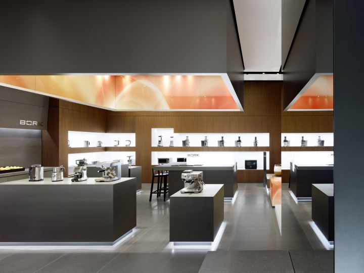

Bork produces high-end domestic appliances for the Russian market. Our brief was to design an exclusive flagship store for a prime retail site in Moscow, in which to display the brand’s premium segment product palette in a commensurate manner. The flagship store design is to be part of an overall Corporate Architecture, designed to be rolled out across all new retail outlets. The goal was to come up with a store design that has an explicit appeal to the Russian market, thus positioning Bork as a clearly identifiable premium brand in this market.
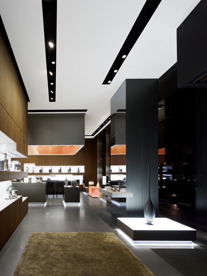
Bork products are designed to be noticed. Their shiny, metallic surfaces and technical appearance make them real eye-catchers in their respective fields of use. Coupled with an aura of indestructability and a reputation for high quality and precision, they are an object of desire for male customers, in particular – in a similar way to luxury watches or motorcycles. The store design is a consistent realisation of this approach to target group communication.
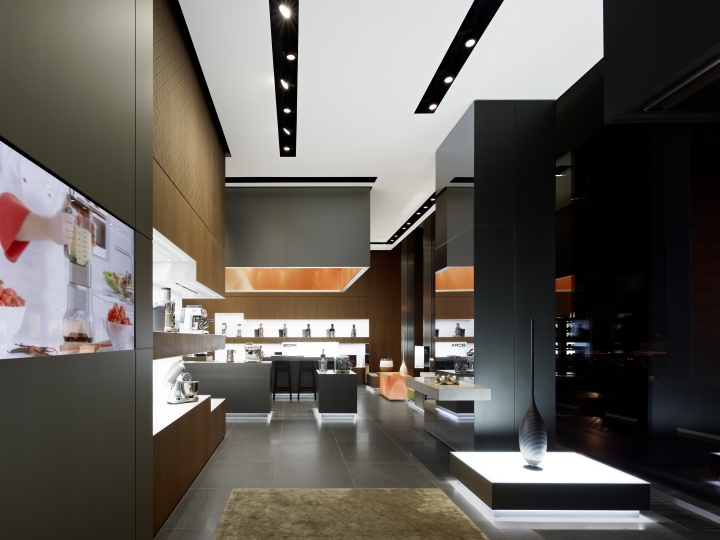
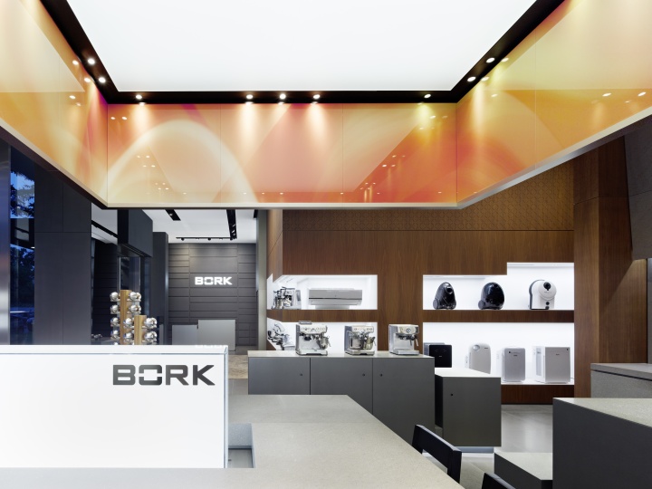
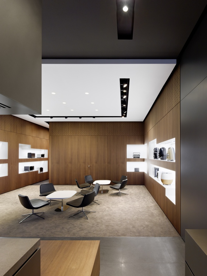
Bork pursues a boutique concept borrowed from the fashion industry, in which spacious presentation areas are used to underscore the quality and individuality of the products. Other elements, such as a testing counter, home accessories in floor-to-ceiling shelves and incised patterns in the wooden panelling create a cosy, home-like feel, thereby pushing the sales situation into the background and making Bork appliances the natural companions of an upmarket lifestyle.
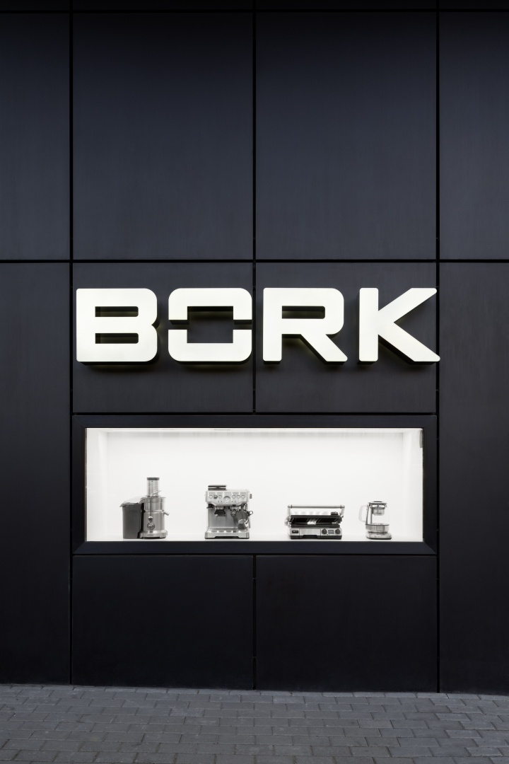
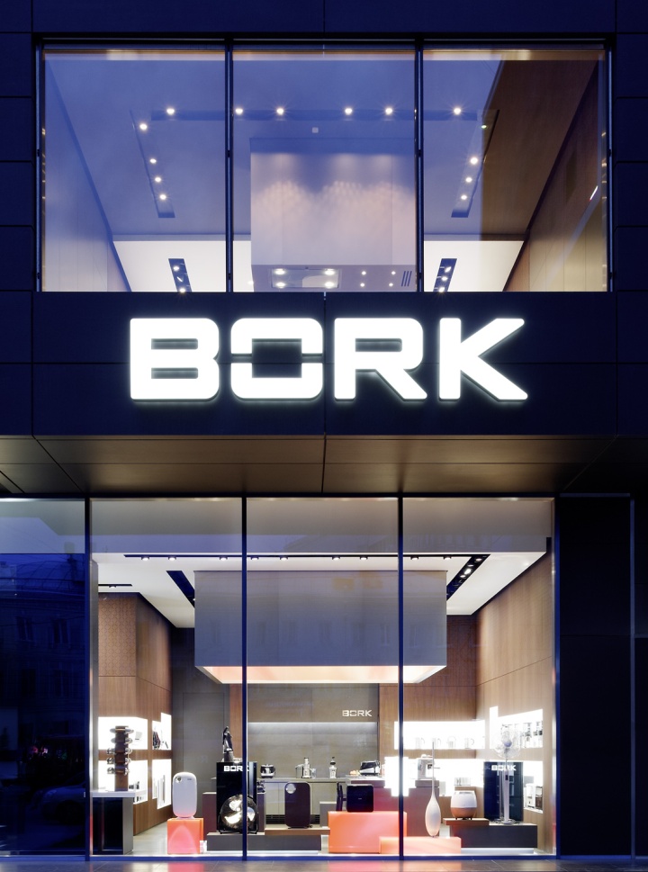
The shop façade makes a confident opening statement. Varnished, anthracite metal panels, glass stretching from floor to ceiling contained within delicate frames, and the projecting space on the upper floor push the prefabricated nature of the existing building firmly into the background. The generous view into the illuminated space creates a stunning showcase, in which selected products are highlighted in an illuminated niche running down the side walls.
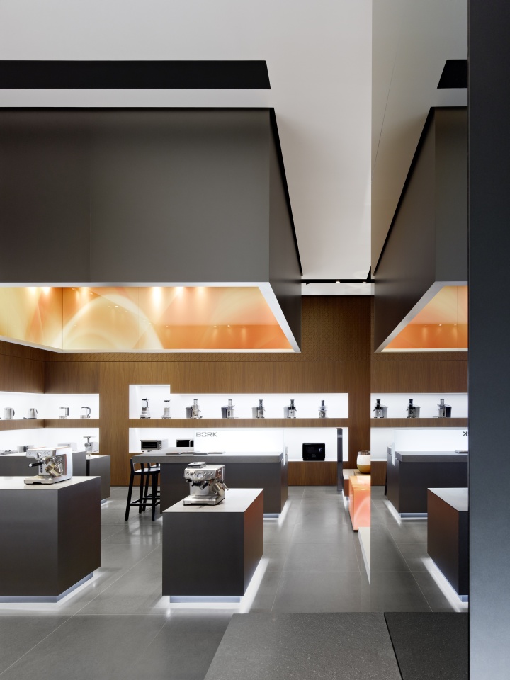
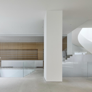
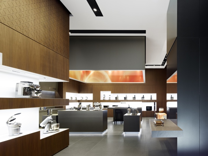
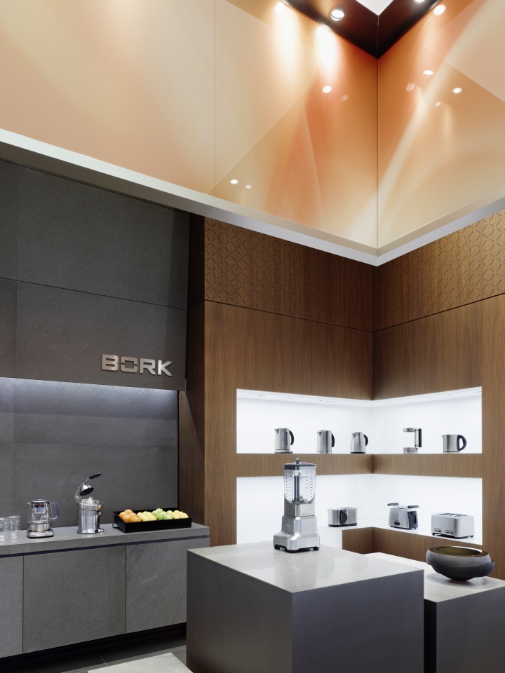
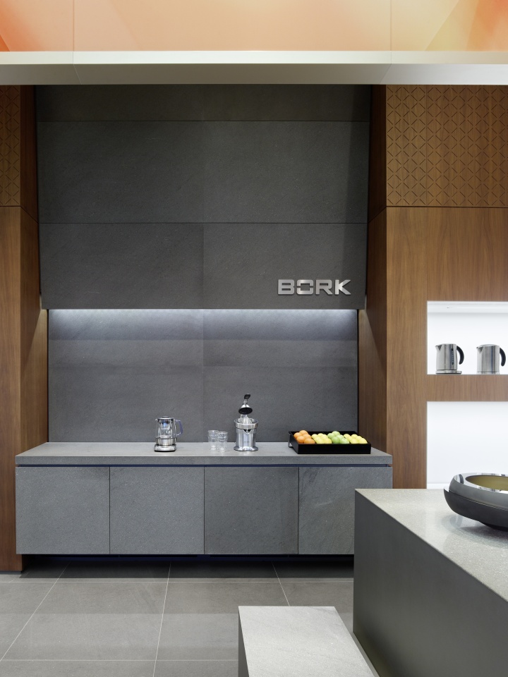
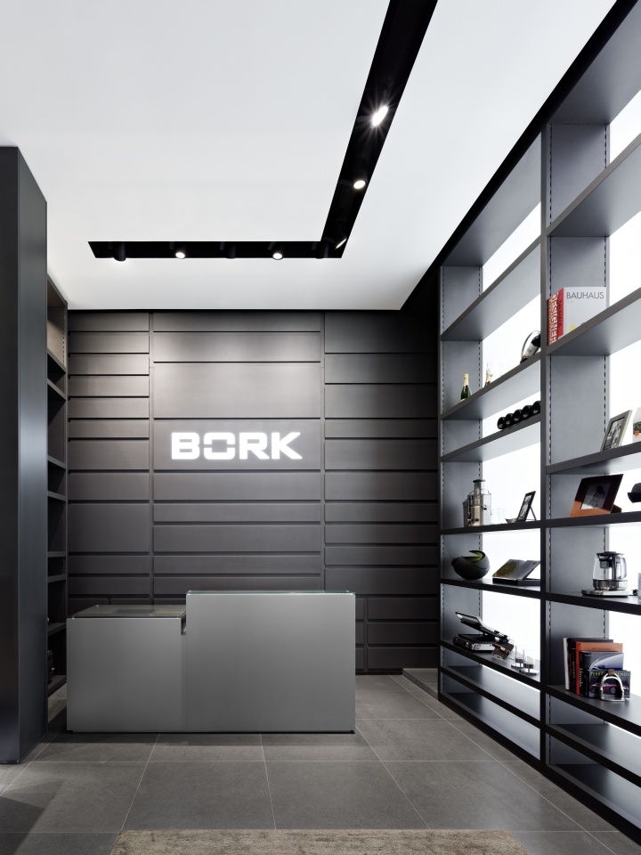
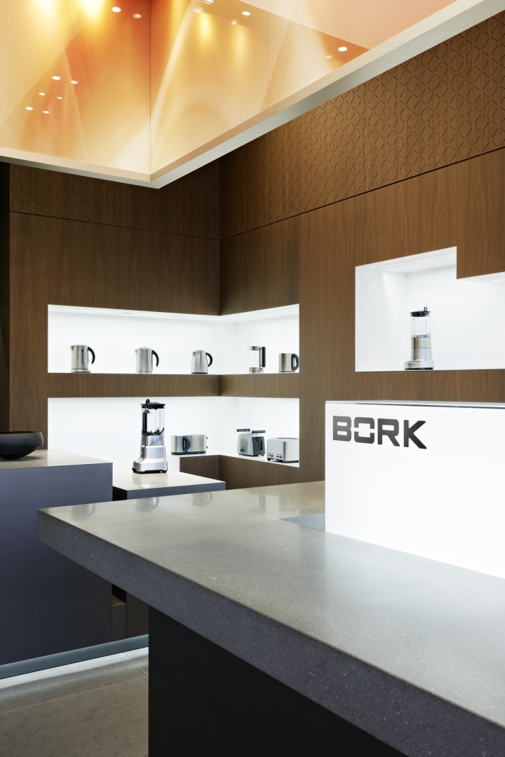
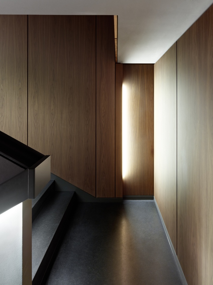
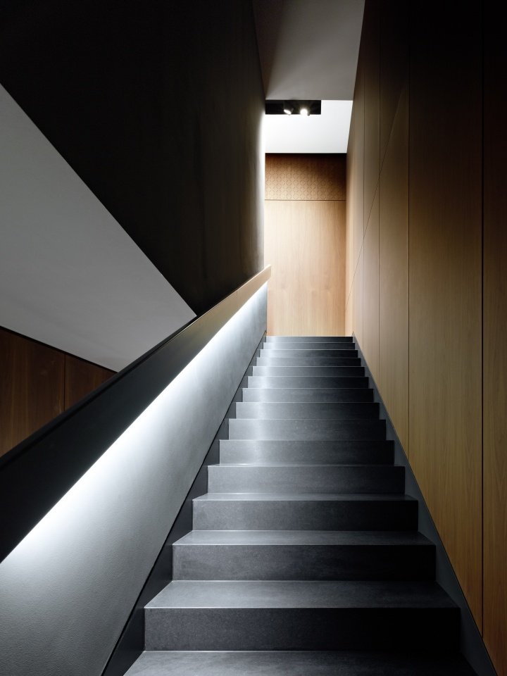
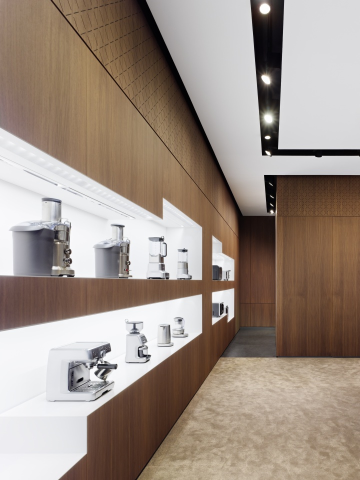
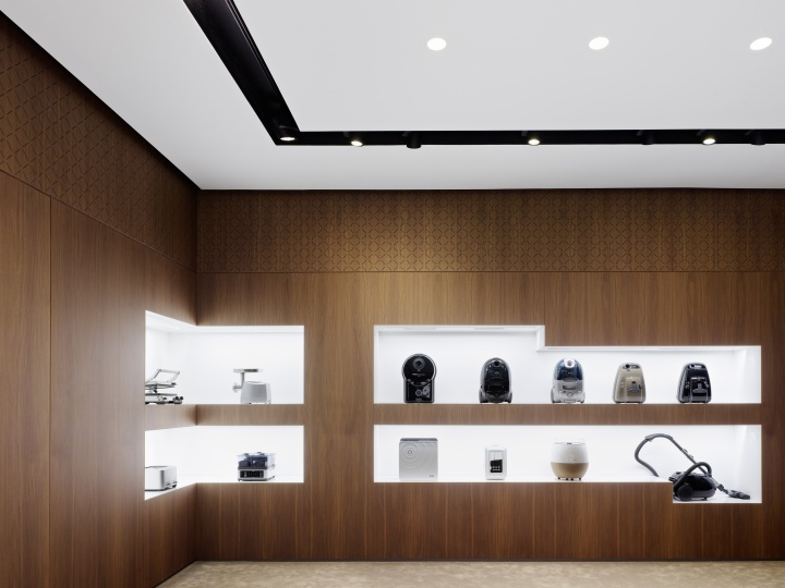
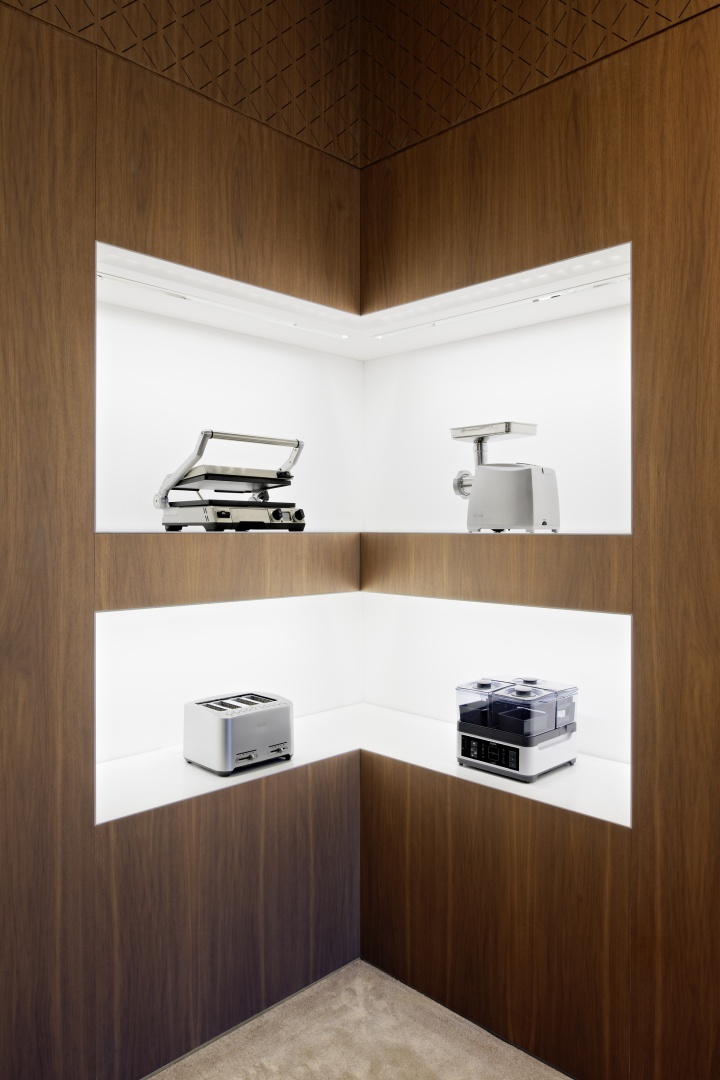
The interior of the flagship store is remarkable for its use of natural materials. All the fittings and units are strictly geometrical, offering a fascinating contrast to the naturalness of the materials themselves. The flooring, anthracite display units and stone-clad testing niche are all made of natural stone. The checkout counter is crafted from brushed metal panels. The ceiling-high wall fronts are made from walnut with a geometrical pattern executed along the top, giving the space a home-like feel.
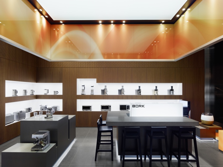
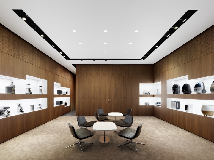
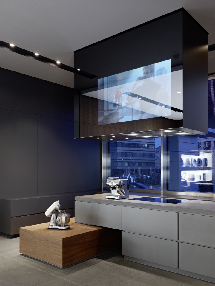
Home accessories intermixed with everyday objects are on display on tall shelves in the checkout area. The upper floor houses an additional room for VIP and training events. This space is dominated by a large panoramic window that fills the entire end wall. A free-standing kitchen caters for cookery events.
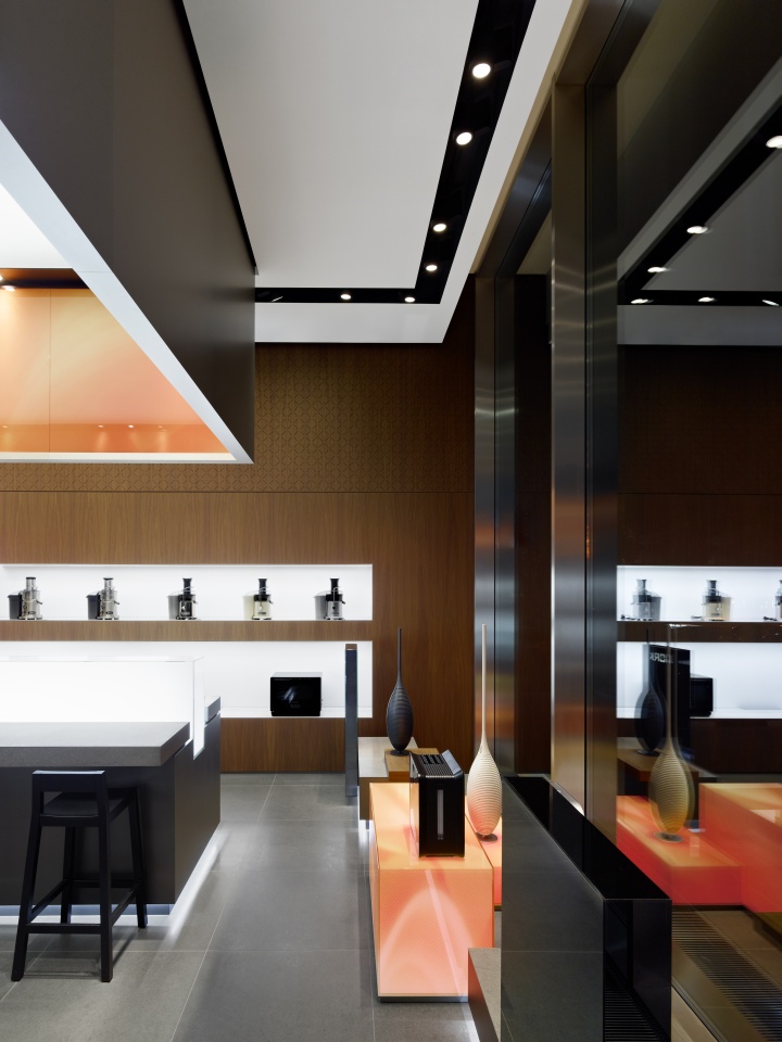
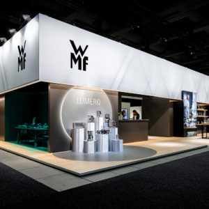
The product display presents each product in such a way as to emphasise its form in space. The dark wood grain surrounds perfectly lit niches in which individual products are presented against a glistening, white backdrop. In the centre of the space, further products are presented on anthracite pedestals. These are lit from beneath by an LED band, so they appear to float. An additional focal point is the light cube on the ceiling, which is encased within metal panels.
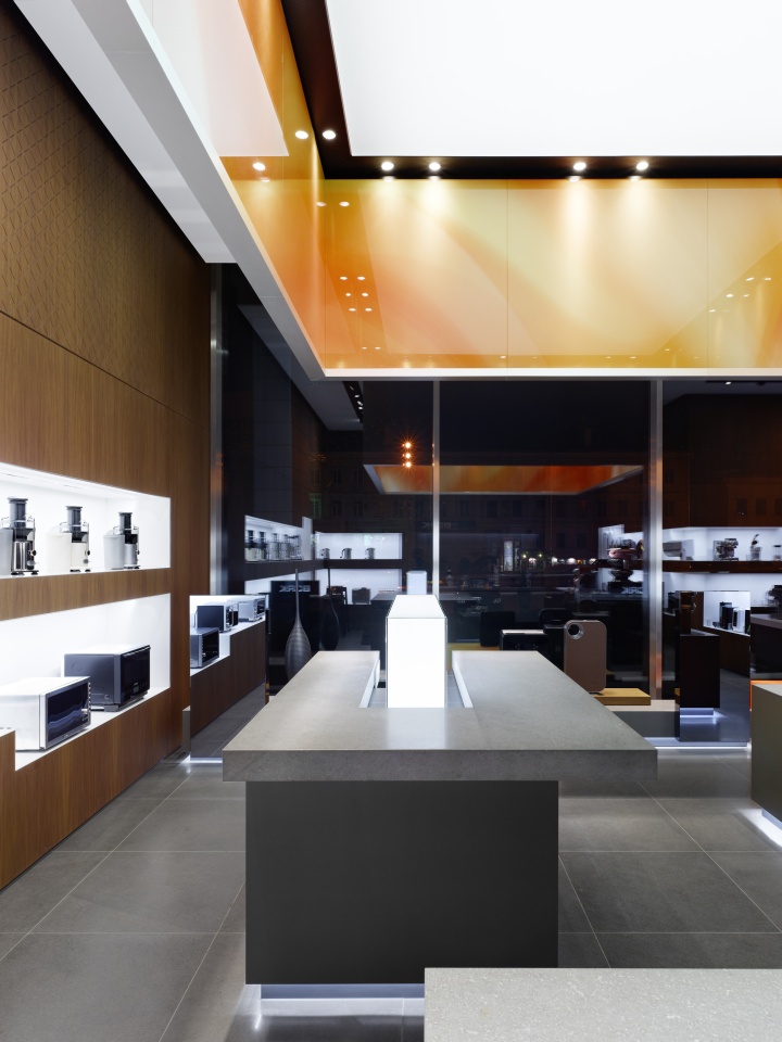
A dynamic colour gradient printed on glass in its interior expresses the brand’s Corporate Colour. The intense orange hue defines the emotional centre of the space and functions as a strong key visual, visible from the outside. The colour is additionally reflected in illuminated light cubes, which provide a complementary contrast to the display units.

The Moscow flagship store displays BORK products with a ‘must-have effect’. Featuring a fascinating interplay of boutique and living room, shiny and matte surfaces, natural materials and linear forms, the flagship store is the essence of the premium brand distilled in space. The different elements of the interior design represent the brand values reliability and longevity, while the boutique-like setting places the products within a lifestyle context and promotes consumer desire.
Designed by Ippolito Fleitz Group
Photographer: Zooey Braun


Add to collection
