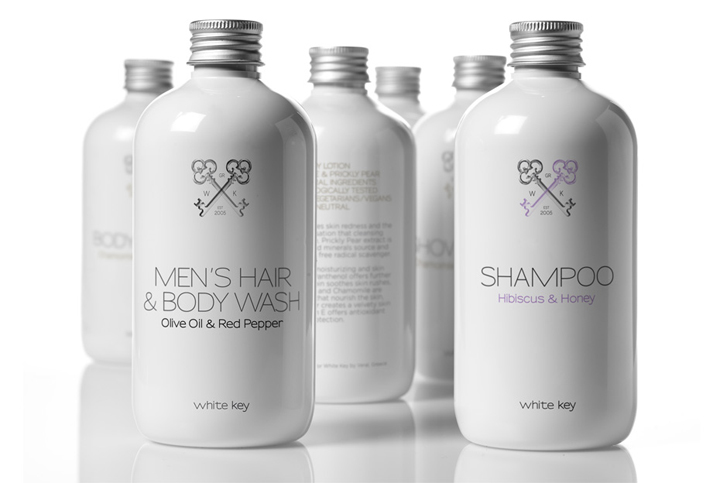

The briefing (in brief): “We want a packaging design that will communicate our quality difference, product sophistication and exceptional origin”. The target consumer: travelers who appreciate quality, style and fine services. The design: our client provided us with his logo, which included simple, elegant writing and an old-fashioned key.
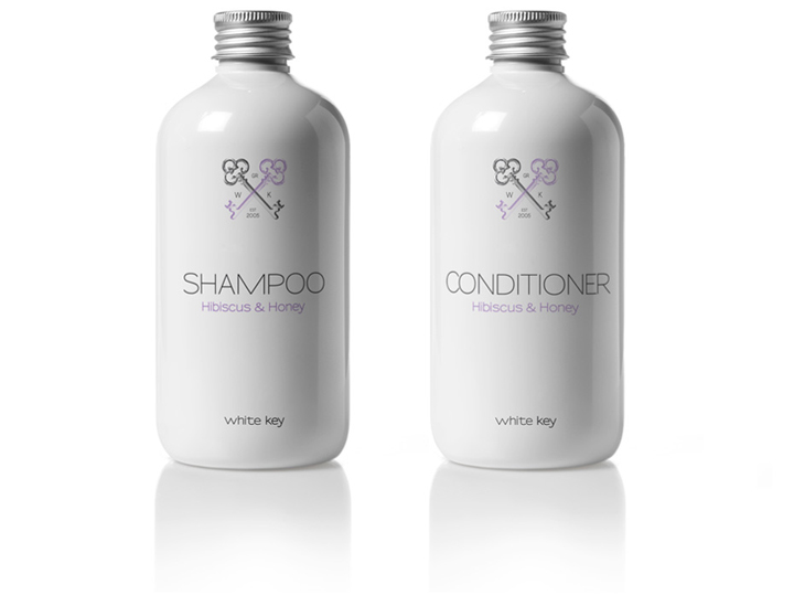
We decided to build on it: for the series of the “White Key” cosmetics we created a coat of arms with two keys, the company initials, place and year of company origin. Modern writing specified the use of each product and balanced atmosphere with practicality. The white bottles we chose for the whole line are referencing the old, precious, porcelain containers, which were used in pharmacies and exclusive beauty parlors during late 19th and early 20th c.
Designed by mousegraphics
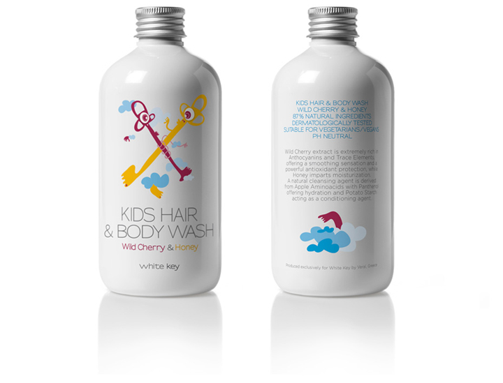
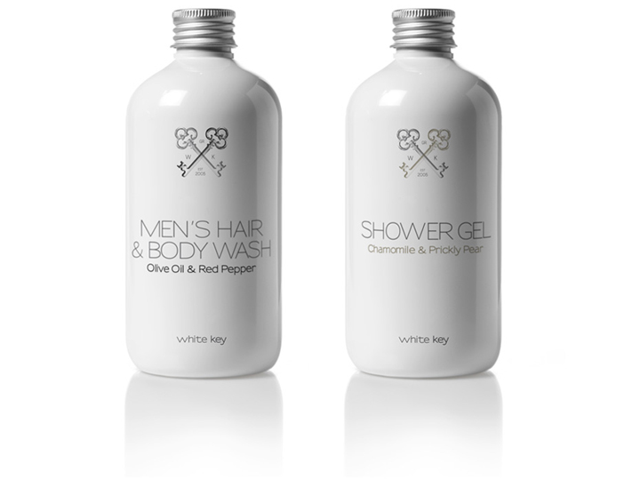
Products include shampoos and conditioners, body wash and body cream and a special men’s and children’s line. A colorful, funky coat of arms along the same principles, was created for the kids line, so as to accentuate the particular care provided to each and every company client.


Add to collection
