

The project is developed from the base of an old Italian restaurant. Its main spatial structure is kept, focusing the activity on the treatment of the inner surrounding. The main objective of the project is creating a warm and intimate atmosphere that provides a certain cosy environment. Colour invades the furniture and the ash wood is the backdrop that surrounds the whole space.
Architecture
The site plan consists of access, bar and restaurant. The main space proposes a sequence of rhythmically organized elements. All the areas of the project are closely connected, having permeability always in mind. The only elements of division: the outside gate and the main door which can be completely opened, creating a single open space, allowing the outside get into the inside.
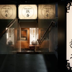
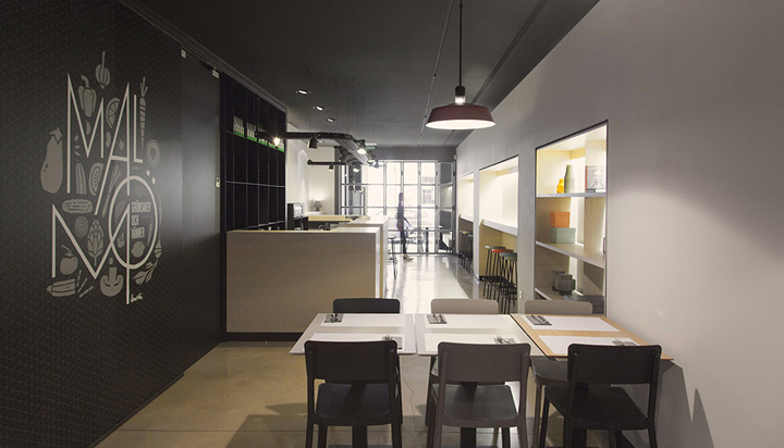
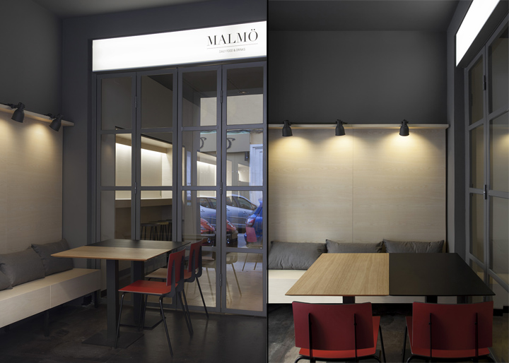
The access, delimited by both woodworks, is a black box made of hard and industrial urban style materials, acting as a transition area between the outside and the restaurant.
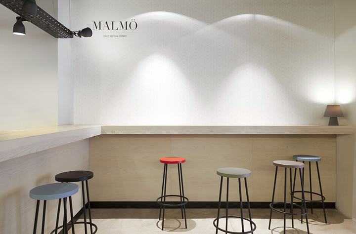
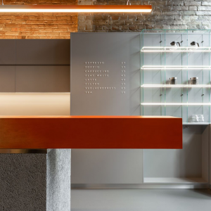
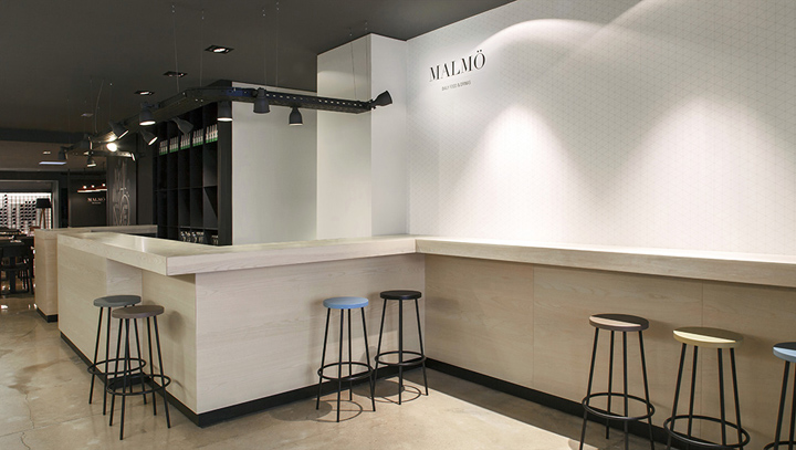
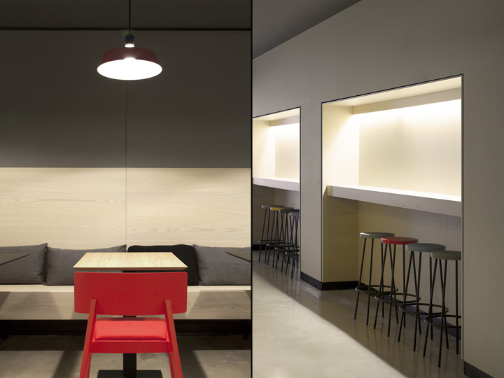
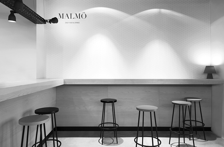
Once the access is crossed, the bar area begins: a space where a set of shafts that frames bars and stools give rhythm to this area destined to appetizers, light dinners or cocktails. A wooden shelf acts as the dividing element between the bar and the restaurant area, continuing with the previous rhythm. The dining room is dominated by a big round oak wood table that is combined with rectangular tables and a long bench, being able to be appropriate for a wide variety of purposes.
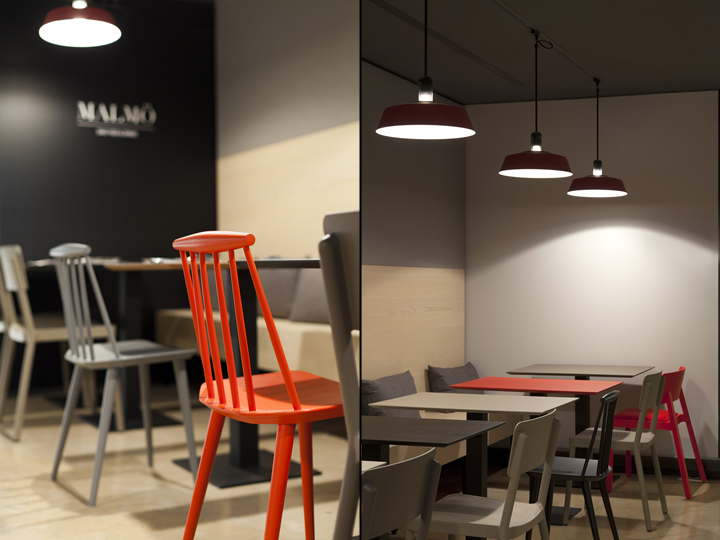
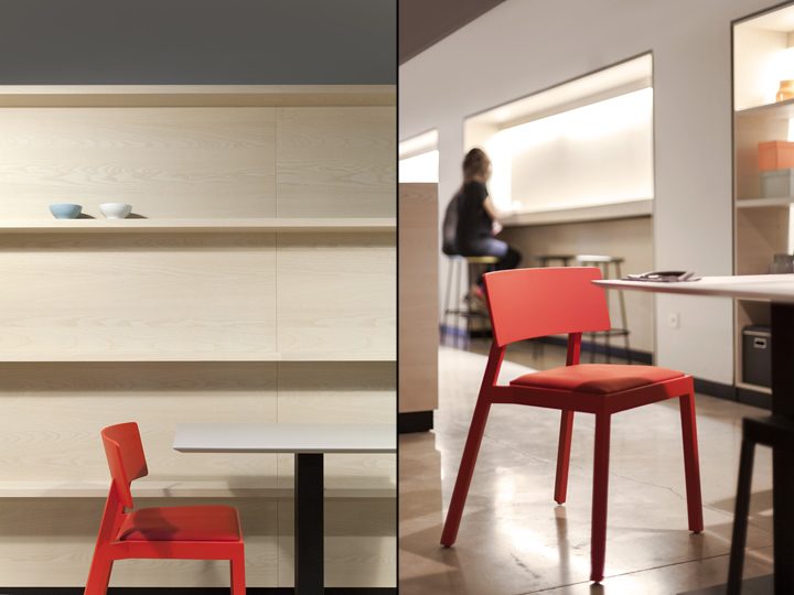
An intimate and warm image has been sought, both when designing the elements as when choosing the materials. All the surrounding, as well as the fix elements, have been treated with light materials and neutral colours; while all the mobile elements and furniture play with a wide range of bright colours.
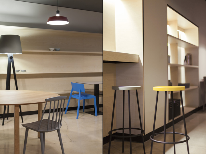
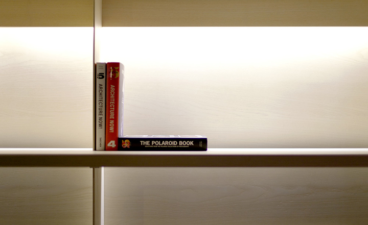
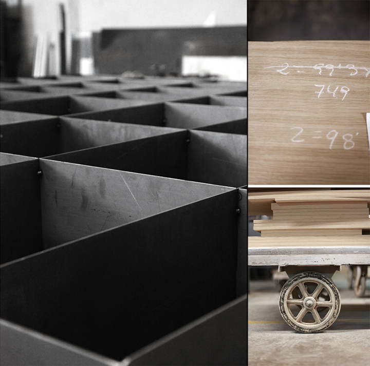
For all the bars and fix furniture, an ash wood with has been chosen. This ash wood includes an almost imperceptible matte treatment, in order to keep all the sensorial properties of the material, avoiding gloss and polishers that may pollute the desired image.
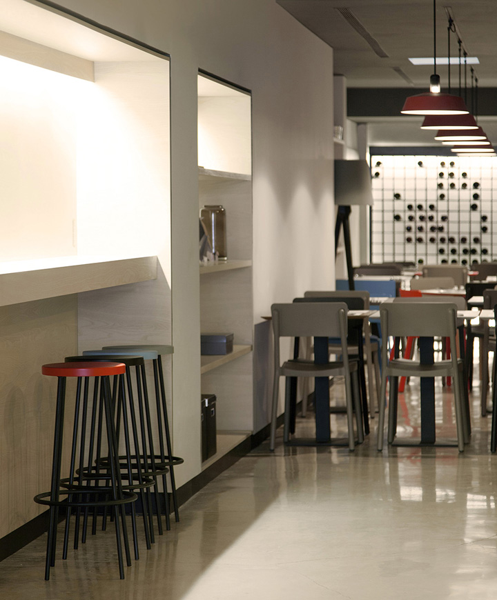
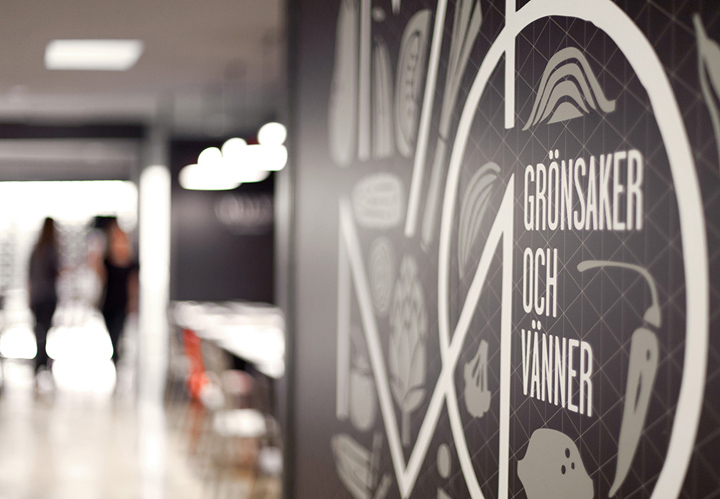
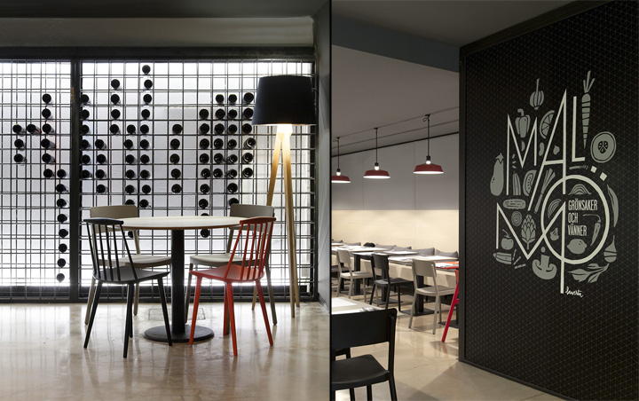
In the heart of the space, the “Malmö, grönsaker och vänner” illustration of the Valencian artist Lawerta, adds intimacy through a typographic game that dances between vegetables and fruits. The handmade stroke of the illustrator acts as counterpoint of the brand and the graphic materials of the Project, which have bet on an hexagonal motif texture that connects them to the powerful geometrical accuracy of the space.
Furniture and Lighting
Colour is the focus, expressing itself through the furniture. The piece set has been chosen or designed following the original premises of the project: achieve an intimate and warm atmosphere. Therefore, different pieces as Hay’s J77 chair or Punt’s Whiskey chair in pure bright colours have been mixed with other pieces designed on purpose for the space, as the stools of the bar area and the tables of all the project, which have bet on an open and fresh mosaic of colours.
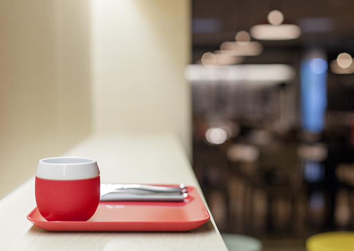
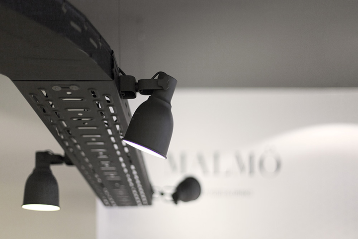
The lighting, different for every situation, connects with the global philosophy of the whole design, expecting to provide personality and intimacy to the spaces, combining pendant lights with indirect lighting. The industrial style lampshades used in the dining room have been created for the Project and the main bar is dominated by a great lamp of scenographic inspiration, designed by the architects from industrial pieces. The result is a global project where space, product and graphics join forces to produce a complete and coherent result.
Designed by Borja Garcia Studio
Photography by Borja Garcia Studio


Add to collection
