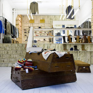


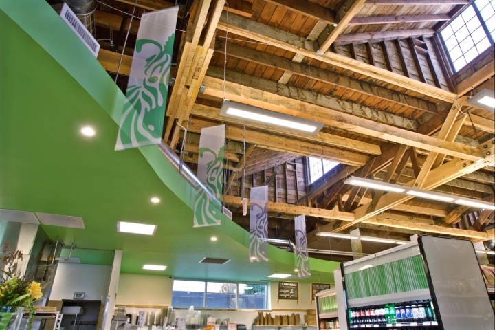
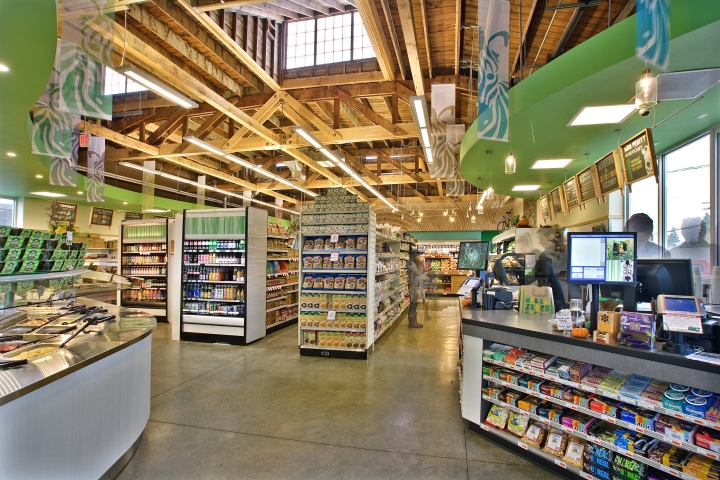
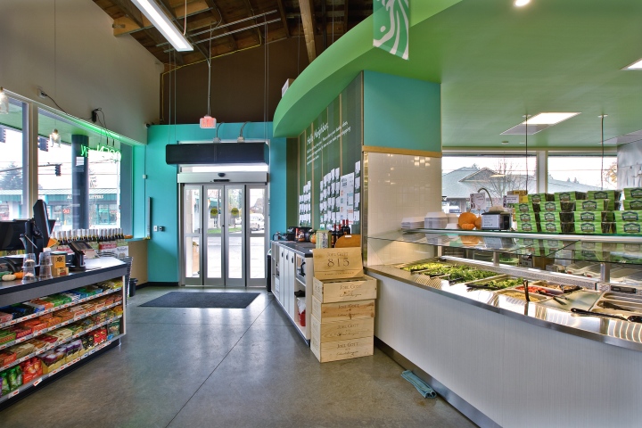
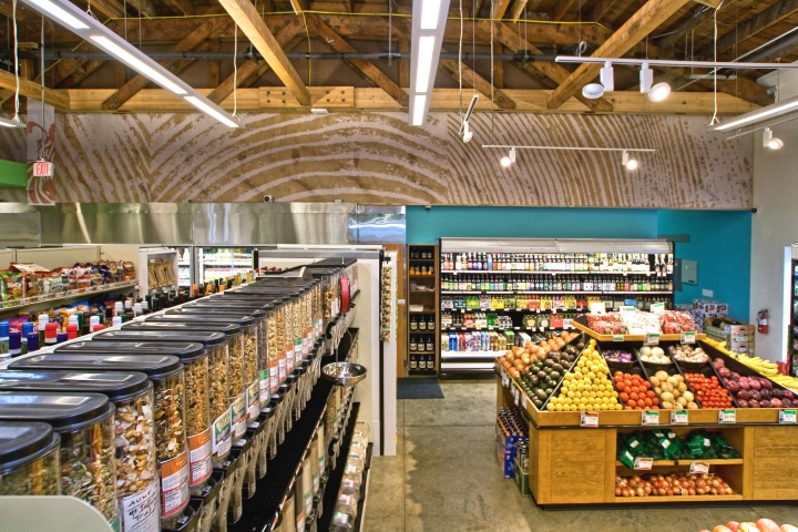
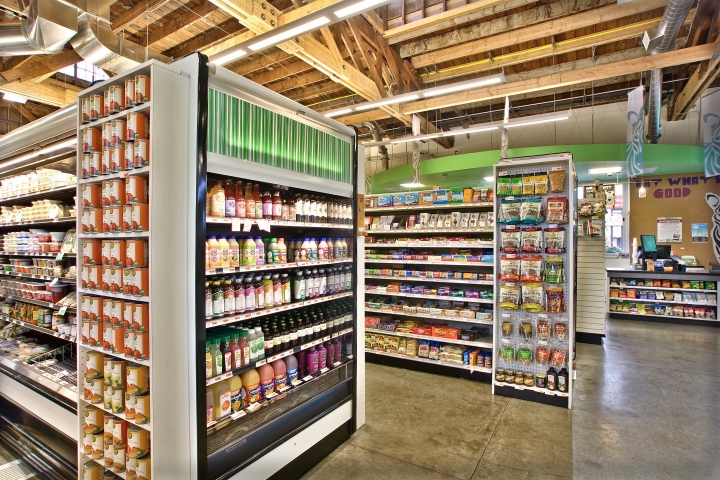
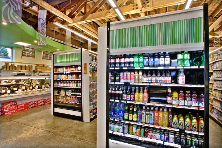
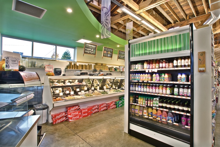
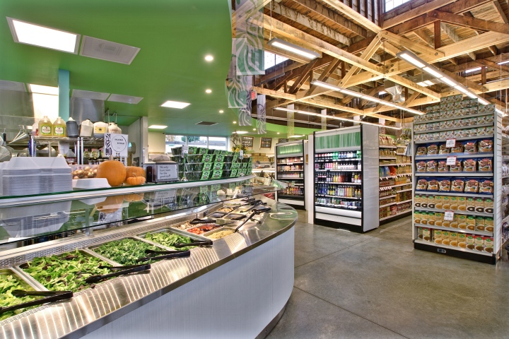
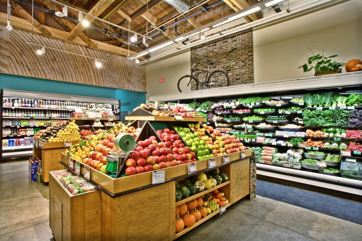
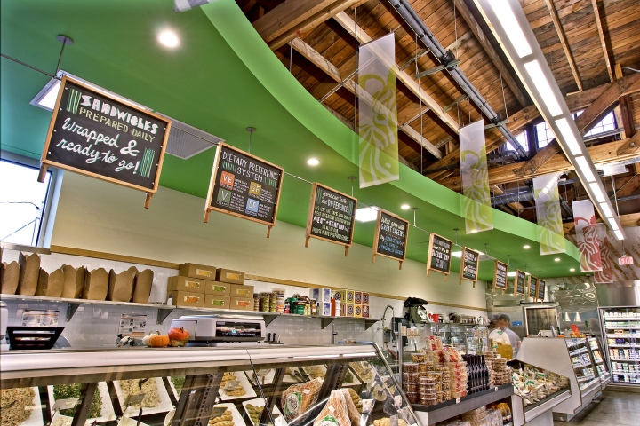
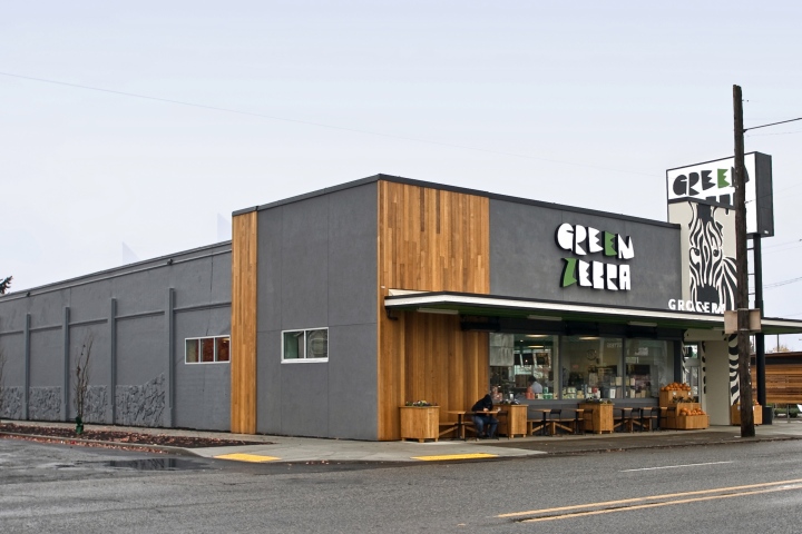
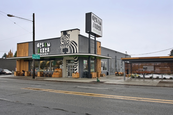
Green Zebra is the newest addition to Portland’s cutting-edge food scene and the store is setting out to redefine the urban market with a c-store sized format that focuses largely on fresh, local, organic fare, right down to the beer in the fill-your-own growler bar. In designing the space, KRS repurposed original materials from the gutted building, including exterior brick brought inside and exposed clerestory along with douglas fir planks in the previously covered ceiling. An homage to the store’s Green Zebra namesake (a type of tomato) non-overt striping is incorporated throughout, including white-on-white randomly arranged subway tiles and striated formica case fronts.
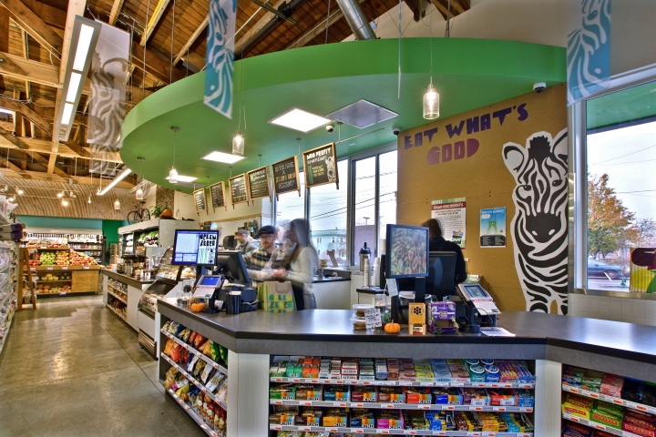
It was important to the owner to waste not, and that meant repurposing existing materials to the greatest extent possible in a way that still worked within and added to the overall design AND worked within building codes (certain materials aren’t permitted in food areas). This required both research & creative execution, bringing outside elements in, marrying new construction with the space’s skeletal elements. It ended up a visual marriage of new store/brand with old space/history.
With its ever-evolving, fresh from the fields menu, Green Zebra required a modular signage system that could be quickly updated on a daily basis to highlight seasonal offerings. KRS developed and then custom-built this one-of-a-kind, moveable and changeable signage display system. Plaques are hand-rusticated cold rolled steel metal sheets, stained with a process developed just for this project by the designer. Faux-aged to the desired effect (using coffee, sunlight, dirt, and other elements) the plaques are then sealed with clear coat and mounted in solid wood. The functional duo handles at the bottom of each piece are modeled after industrial peel tools such as those used in wood-fired pizza ovens.
Store design and build by King Retail Solutions, Eugene OR









Add to collection
