

The project is a new flagship retail building located in Tokyo’s Aoyama shopping district, just off Omotesando Street. The design is a diagrammatic response to strict local codes, the immediate surrounding context (bordered by world-renowned architecture and a quiet residential neighborhood), and the desire to represent the material craft that is inherent in the tradition of Japanese construction. The building is designed to meet regulated energy efficiency standards and use local/regional materials.
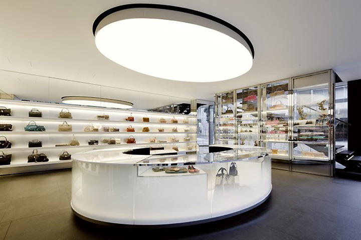
The three-story building is approximately 2,800-square-feet including two main sales floors and a small sales area and storage in the basement. Zoning requirements limited the occupiable building height to two above-grade floors. However, a common building element known as the kosakubutsu, which is used to conceal rooftop equipment, was employed to double the visible height of the building.

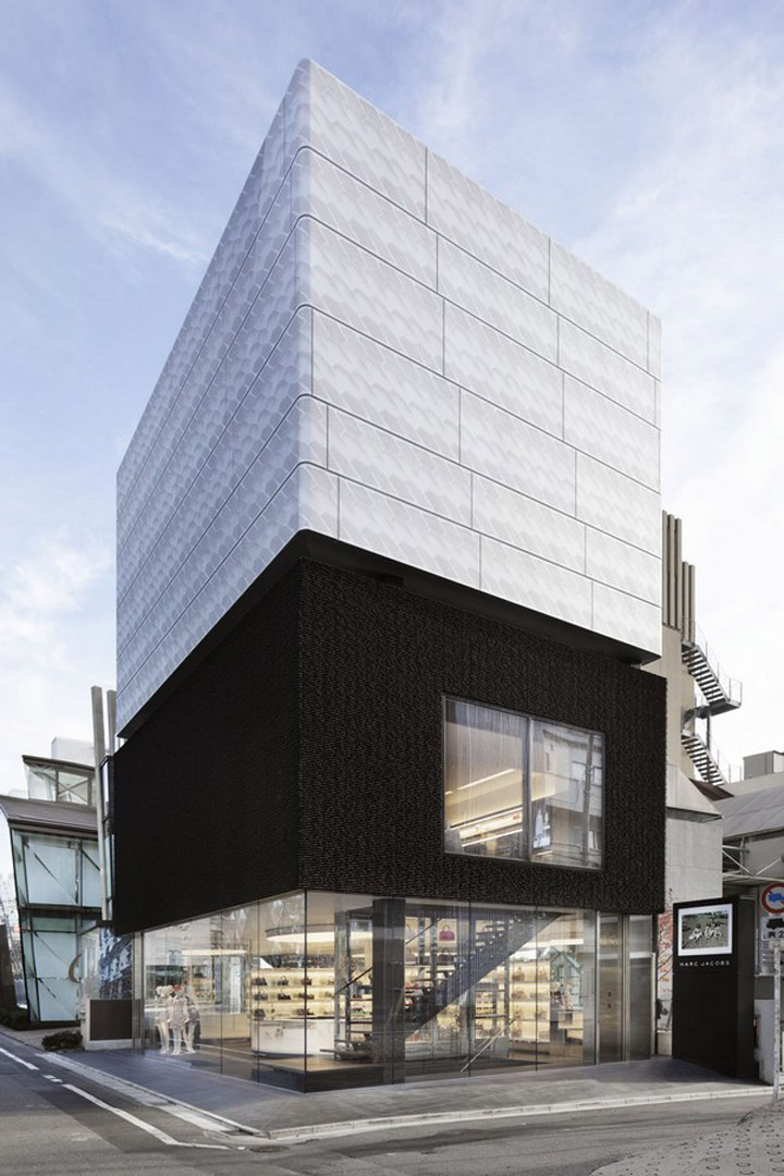
The kosakubutsu sits above the official “shadow line” – an occupiable building height that is determined by the setback of the building on the site and a pre-determined angle of incidence setback from the opposite curb. The shadow line is required to be a distinct and continuous break. Early studies for the façade envisioned three horizontal zones: a minimalist open ground floor, a dark and heavy middle floor, and above the shadow line, a custom perforated paneled beacon.

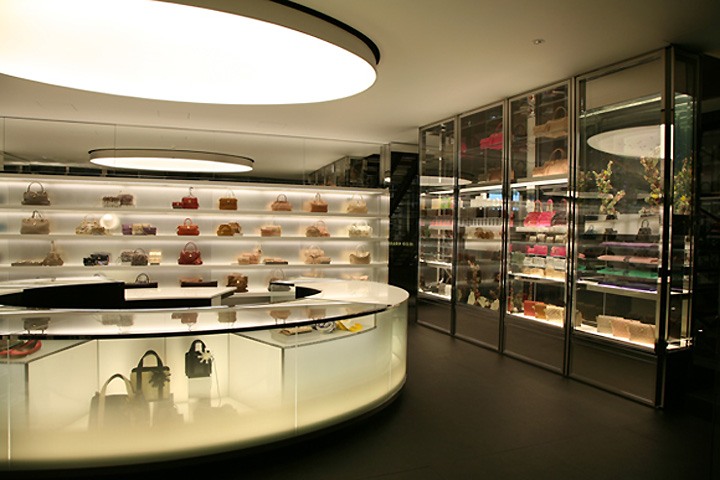
To unify the building, the proportions of each level were carefully studied to create balance between the three zones. The ground floor is sheathed in contiguous glass. The transparent skin has no mullions, which combined with high ceilings and an open plan, gives the impression that the space flows freely onto the street. The openness is further exaggerated by the dark and heavy mass of the second floor hovering overhead.

The intention for the second floor was to create an intimate experience for customers to shop unexposed as if they were in the comfort of their own home. The exterior walls are clad with a blade-shaped porcelain tile that was developed specifically for the project. The blade tile manufacturer had previously only manufactured an interior tile product, but was challenged with a change in scale and fixing methods.

The dark brown, almost black, tiles are literally broken at the edge and at closer inspection, are jagged. As the field of tiles wraps around the façade they appear more reminiscent of weather-worn sedimentary earth. The third level – the kosakubutsu – was rendered as an enormous lantern consisting of perforated aluminum panels and LED illuminated tensile fabric. The pattern of the perforated aluminum, which was inspired by traditional forms found in lanterns and nature, was designed to imply a billowy quality and creates the illusion of a deep textural field.
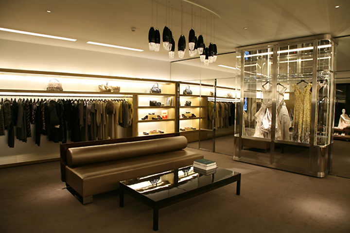
Through these shifts in materiality, the building’s surface is treated as a striated texture that suggests the shift in privacy between the ground and upper levels and emphasizes the function of the kosakubutsu. Seating and tables designed by Christian Liaigre.




http://www.superfuture.com/supernews/?p=44785
http://www10.aeccafe.com/blogs/arch-showcase/2011/02/15/award-winning-marc-jacobs-tokyo-flagship-building-opens-in-aoyama-shopping-district-japan-by-stephan-jaklitsch/
http://www.archdaily.com/110575/marc-jacobs-flagship-building-jaklitschgardner-architects/
http://jaklitschgardner.com/


Add to collection
