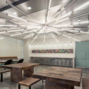


The Wellworth Department Store has opened in Manila. Architecture and interior design by Blocher Blocher Partners. With corporate design, guidance system, visual merchandising and decoration by Blocher Blocher View. A new flagship store for Rustan’s. The Rustan’s Group in the Philippines has a new department store concept – developed by the architects and interior designers at Blocher Blocher Partners of Stuttgart – that specifically courts middle-class customers. The interior design incorporates traditional Asian and modern western influences. The first branch, with over 14,000 square metres, has opened in the new Fairview Terraces Mall in Manila. Other sites will follow.

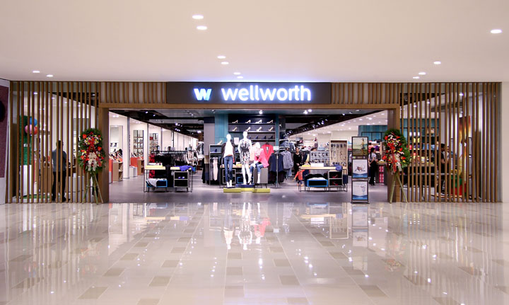
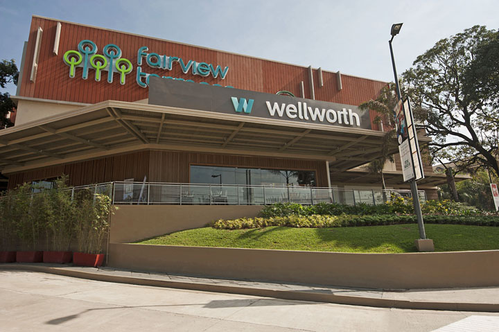
The concept celebrated its premiere at the Fairview Terraces Mall, where the department store now has its own facade. Wooden slats around the circumference make the store’s impressive dimensions – over 14,000 square metres over four floors – visible from afar. At any given spot, the wooden elements may offer distant or close-up views: Translucent surfaces alternate with opaque ones, punctuated by display windows and entrances. Inside, the slats are carried forward as a multi-story design element in the central atrium. The interior design also provides a unifying theme for the sales areas, despite their huge and colorful assortment. The challenge was to ensure the best orientation throughout all those product worlds and at the same time to do justice to each department’s special identity.

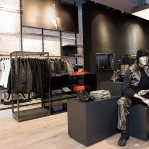
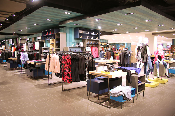
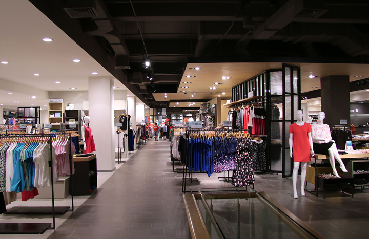
Clear lines of orientation. The basement is home to the children’s department, with its multi-colored decor; above it is the floor for beauty and menswear, done in contrasting black and white. Sports and women’s fashion are located on the first floor above ground, and on the next floor up one finds the home department – with everything from décor to furniture to household electronics. Clear lines of orientation were created by so-called boulevards that run the entire length of each floor, functioning as a main axis. This is also where one finds the building’s escalators. With their dark tiles and open, dark ceilings, the boulevards stand out from the rest of the floor, which is done in light gray.
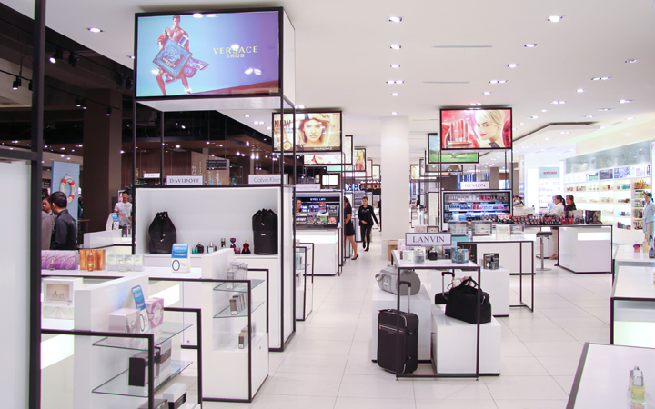
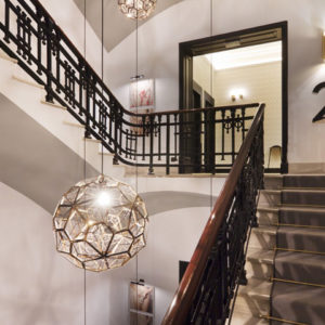
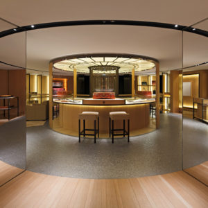
Decorative floor to ceiling elements, which also serve as product presentation structures, punctuate the boulevard. Sometimes angular, sometimes cube-like, they invite customers to stroll and explore. These are supplemented by semi-transparent, decorative metal elements with glass inserts, reminiscent of 19th century winter gardens. In the home department, the boulevard’s dark tiles are varied with antique Spanish mosaic tiles, which lend a homey atmosphere. Pulling it all together is the wooden slat structure, the unifying design element.

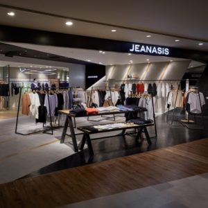
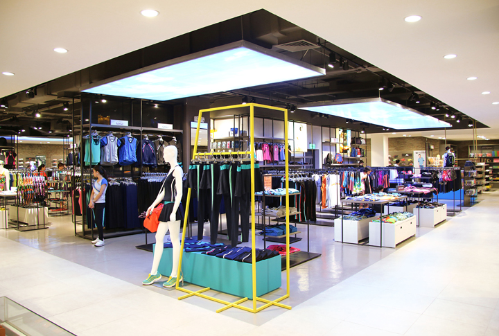
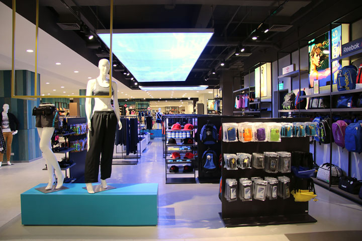
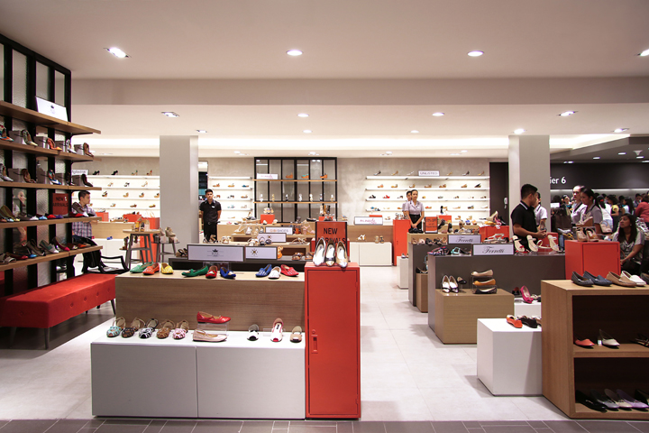
Worlds of discovery. More sales areas are located at right angles to the boulevard, on both sides. In addition, each floor has a unique “world” distinguished by eye-catching design elements, like the sports department on the first floor above ground, with its screed floor covering, its brick walls and its ceiling light boxes with nature motifs. Enhancing these stylistic variations are unique design themes that characterize each individual department, such as the curtains, padded walls and pastel wallpaper that set a feminine accent in the lingerie department.
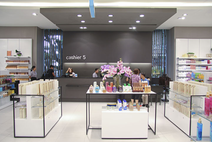
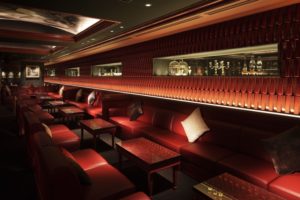
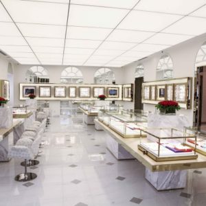
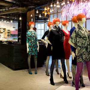
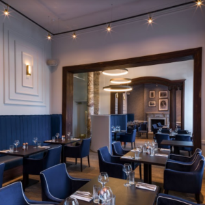
Or the colorful lanterns that delight the eye in the children’s department. In their geometric simplicity, the cashier stations positioned at strategic points throughout the store form oases of tranquility amidst the colorful variety of goods. Linked to info desks, bag-check and packing services, these stations are just as much representative of high customer service standards as are the cafes on every floor or the VIP lounge on the upper level.



Add to collection
