

Joto Sake packaging by Parallax
posted by retail design blog on 2012-11-13
Add to collection
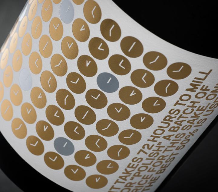

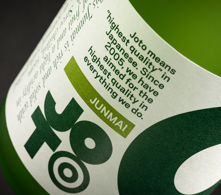
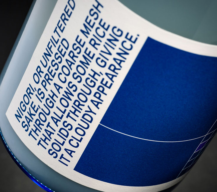
Joto is a range of artisanal Japanese sakes developed for the North American market. To Western consumers, traditional Japanese sake labelling is indecipherable and largely indistinguishable. Joto’s packaging opts for bold colour and infographics describing each sake’s brewing process and tasting notes.

The logo developed for the company was inspired by the geometrical minimalism of Japanese design, but contains a visual delight for the sake aficionado. Sake is traditionally drunk from a snake’s eye cup—a white porcelain vessel with two blue rings printed on the inside that allows the drinker to judge the sake’s clarity and purity.
Designed by Parallax


Add to collection