
Fresh St. Farms store by King Retail Solutions, Surrey – Canada
posted by retail design blog on 2014-07-17
Add to collection


The design for Fresh St. Farms by retail design firm King Retail Solutions (“KRS”) purposely avoids perfection in order to complement the store’s local, fresh, affordable food offering for urban shoppers. With that in mind, KRS designed in “mistakes” (moments of imperfection, homespun twists in merchandising and layout) that give the entire space a character that is a little bit farmer’s market, a little bit street market, and very much authentic.
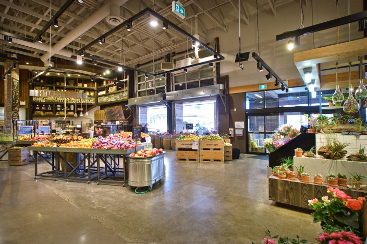
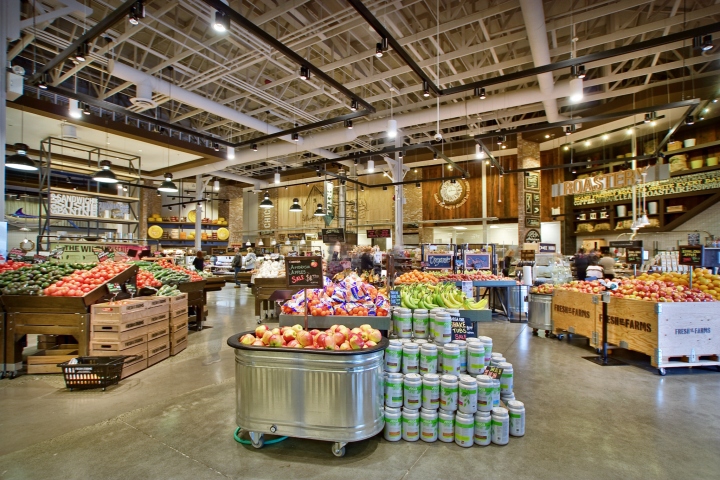
Flipping the normal grocery store ratio of fresh-to-everything else on its head. This store is small, about 1/3 the size of an average grocery store, and we knew we needed it to have just as much product as a big store, but with loads of fresh produce, loads of cheese and meat and dairy, multiple fresh prepared options, and we needed to pack it in, in a way that was easy for the retailer to operate. The goal here was to create a modern farmers market experience and marry in all the essentials shoppers look for in their local grocery store.
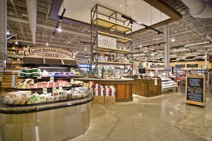
Décor and imagery are harnessed to serve as directional signage often in the place of large text signs. For example, impact pieces such as massive cheese wheels and a hand-painted trophy marlin add to the store’s charm and intuitively guide shoppers’ to these cases.

The perimeter shops each feel separate, with different casework by section, but use the same language (a common tone). Behind the scenes, though, Fresh St. Farms’ staff is able to flex from one area to the other quickly and easily, as there is open flow through from “shop” to “shop”.

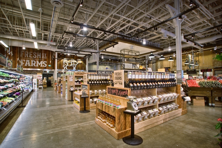
The store plan is open such that from any spot within the store there is a clear field of vision and easy footpath to all other departments. No walking up and down aisles, craning your neck, hunting for pasta (for example). Low-profile displays, large ceilings, and grand-gesture departmental signage allow the shopper to know exactly where they are and how to get to everything else they need throughout the path to purchase.
Theatrics also play a unique role in the unique store culture. An actual short-order chef mans the burger grill which is gaining a reputation as one of the best burgers in town. A working fireplace adds warmth to the café seating area. And rather than light up available check-out stands, big, beautiful cowbells are hand-rung.
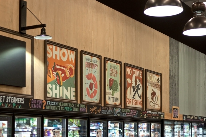
The store uses classic urban materials: real sliced brick, subway tile, reclaimed local wood, a small boutique coffee roaster that roasts, in-store, over 50 pounds of coffee a week, décor touches such as paper-thin mottled copper siding, and concrete floors that are dug through, trenched, filled, cracked, polished and sealed. Savvy use of fauxed materials include buck-shot and burnt directional posters in Frozen foods department as well as wide-rib exterior siding (galvanized and fauxed with tracking numbers to appear as repurposed shipping crate walls when it became apparent the weight of actually repurposed shipping crate walls would be prohibitive).


Add to collection