Iron Grill Restaurant Brand Identity by End of Work, Sydney – Australia
posted by retail design blog on 2015-08-27
Sydney
Add to collection
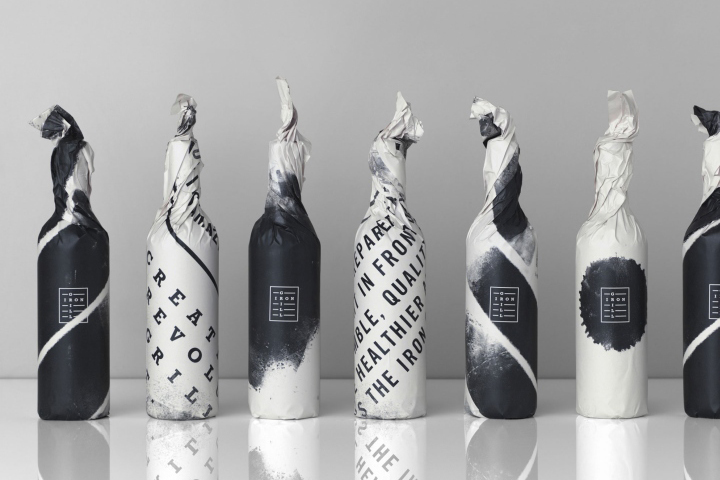

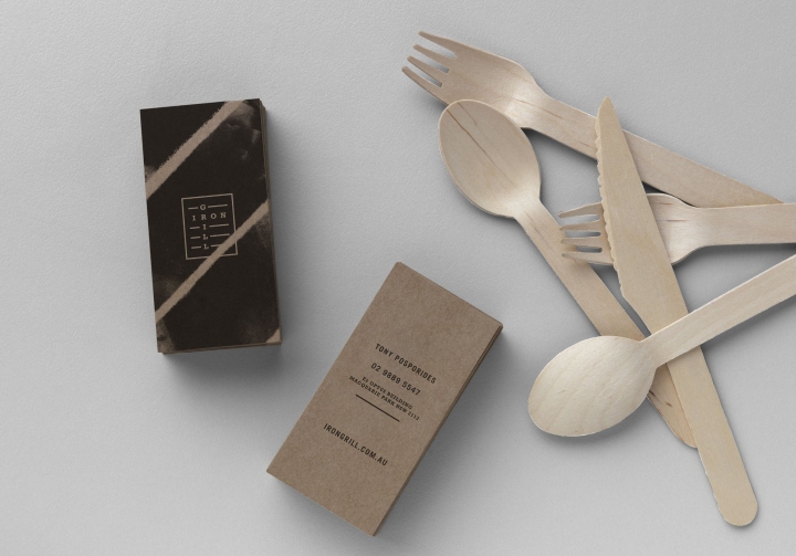
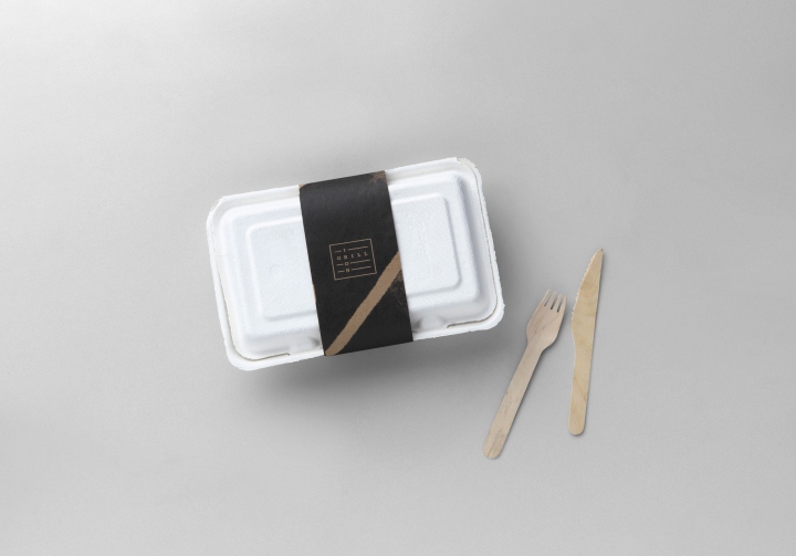
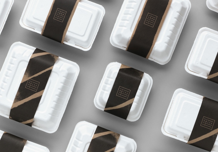
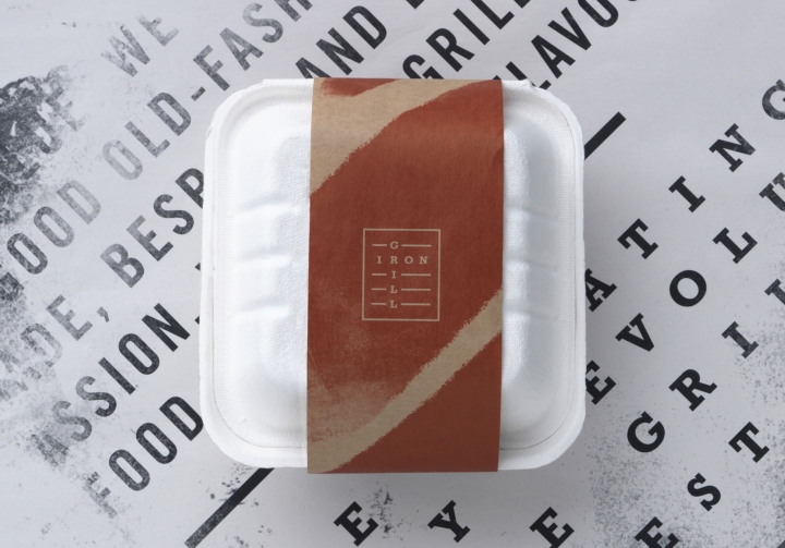
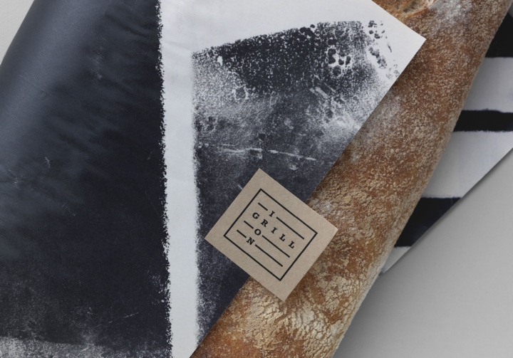
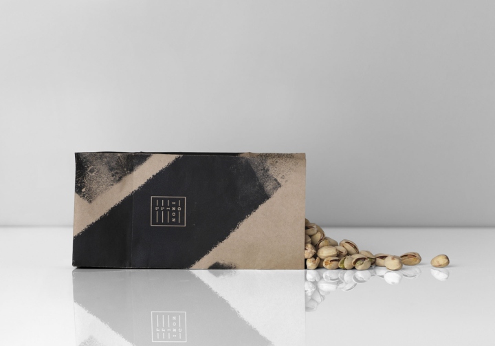
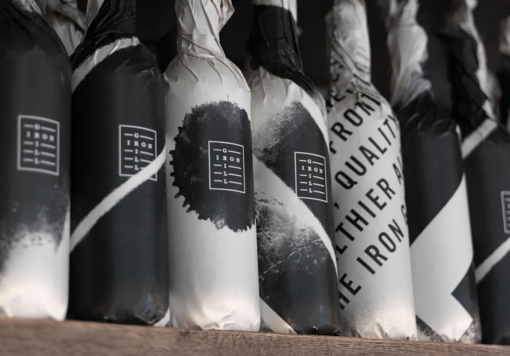
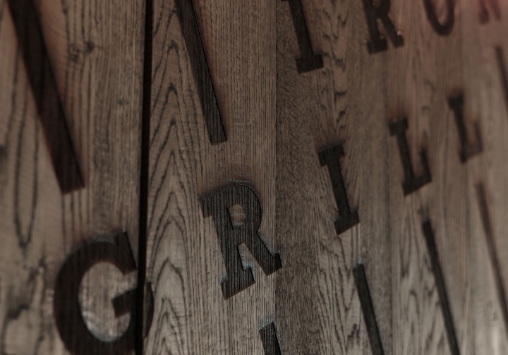
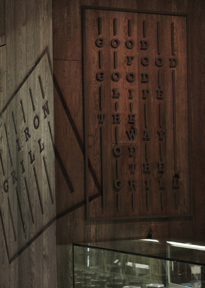
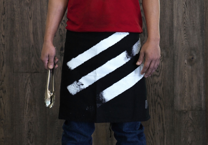
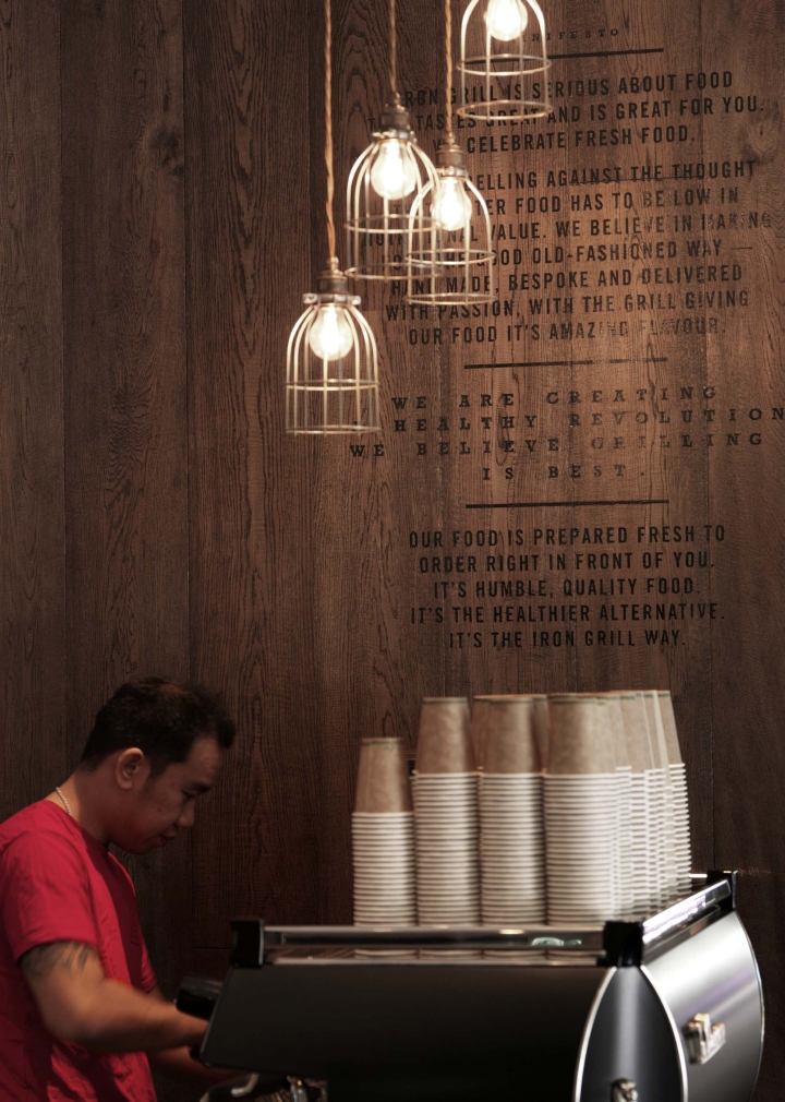
A spirited new brand identity with a healthy attitude and an appetite for opinion. The grill is king. The logo is quite literally type on a grill and by using a graphic inspired by the grill, the visual identity has an impactful, almost militant quality with thick black scorch marks burned into key pieces. The packaging was designed to be as visible as possible on the super-lean budget. The interiors, signage, uniforms, point of sale and packaging all reflect this natural, clean ethos, using raw materials and earthy finishes, we paid homage to the handmade and bespoke offer that is the Iron Grill way. This idea drove the identity, which in turn drove the direction of the interior, the textures, the materials, the uniforms. All these elements build a engaging and memorable experience.

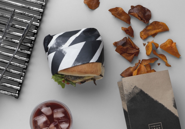
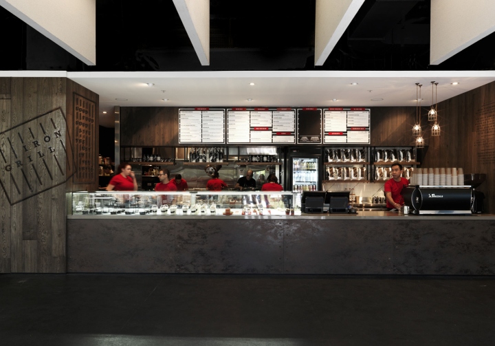
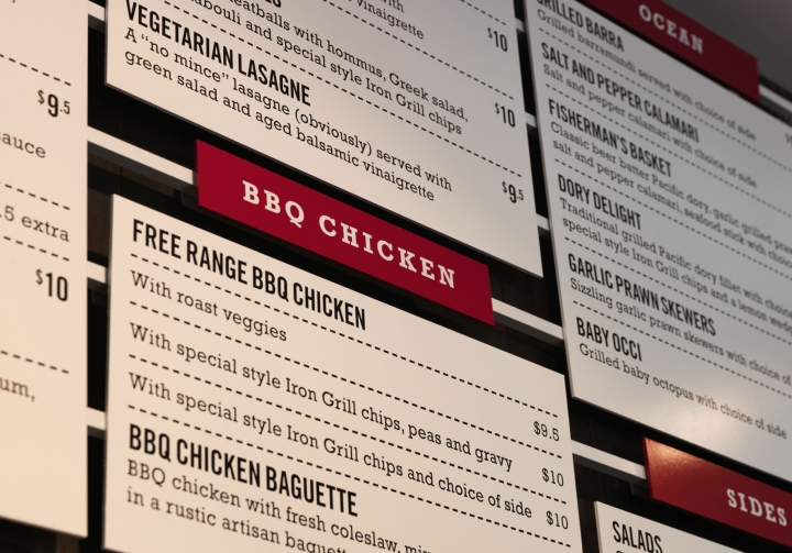
Iron Grill is a busy food offering located in the headquarters of a large telco at Macquarie Park in Sydney’s North West. Home to 6,500 staff the site has a relatively captive clientele with any new offering vying for attention from an number of tried and tested favourites. Serving up healthy food cooked the old-fashioned way, Iron Grill is not your typical mass-produced fast food. They produce a mouth-watering selection of wraps and burgers made fresh to order right in front of you, on a flame grill with no hidden secrets.
Here we imagined a whole story complete with a powerful manifesto. It’s a gutsy, clean-living, Ché Guevara-style flavour-first mantra which has customers queuing up at lunch time. The food offer is a rebellion against the perception that fast food is low in nutritional value. At Iron Grill they are passionate about fresh produce. The food’s natural flavours are made to be the hero so we created a brand identity true to this ethos.
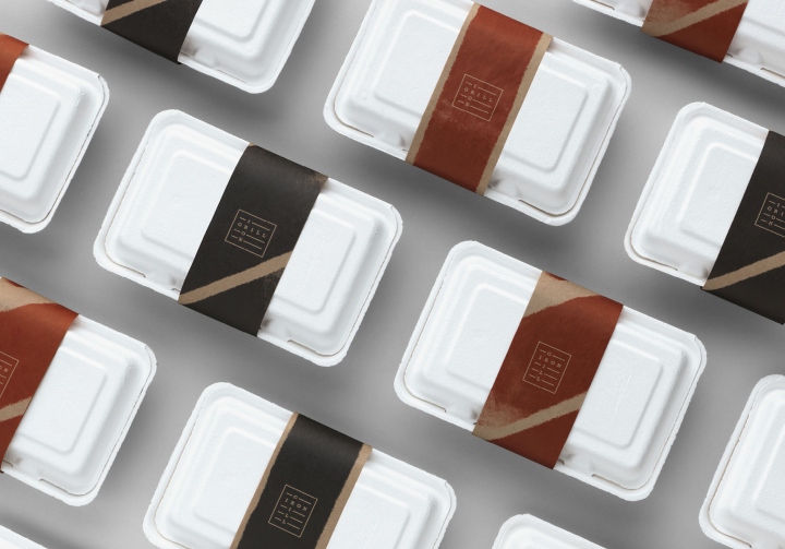
A spirited brand with a healthy attitude and an appetite for opinion. The grill is king. The logo is quite literally type on a grill and by using a graphic inspired by the grill, the visual identity has an impactful, almost militant quality with thick black scorch marks burned into key pieces. The packaging was designed to be as visible as possible on the super-lean budget. The interiors, signage, uniforms, point of sale and packaging all reflect this natural, clean ethos, using raw materials and earthy finishes, we paid homage to the handmade and bespoke offer that is the Iron Grill way. This idea drove the identity, which in turn drove the direction of the interior, the textures, the materials, the uniforms. All these elements build a engaging and memorable experience.
Design: End of Work
Photography: Jason Loucas


Add to collection