The Market by Longo’s by Ampersand Studio, Toronto – Canada
posted by retail design blog on 2016-06-21
Add to collection


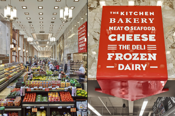
Ampersand Studio Inc., a retail strategy and design firm has spearheaded the brand transformation of “The Market by Longo’s”. This included a go-to-market strategy, redesign of brand identity, store experience and marketing campaign. Downtown Toronto is going through a massive urban densification which Longo’s recognized as a signal to refresh their small urban-format store. “The Market by Longo’s” (which has operated five stores under this banner since 2006) aligns with the urban shopper’s needs — fresh, quality, convenient food.

Ampersand Studio evolved the well-known Longo’s brand to give it a twist for an urban audience. This included a refresh of the logo that incorporates capital letters, a modern font and the iconic Longo’s leaf. “It was important to reflect Longo’s tradition for great food. We stayed true to Longo’s existing brand while creating a unique experience for the urban foodie,” said Glen Kerr, Principal of Ampersand Studio. Glen Kerr led the design team on the rebranding of Longo’s “a fresh tradition” in 2011 and a number of award-winning Longo’s stores such as Maple Leaf Square and Leaside in Toronto.

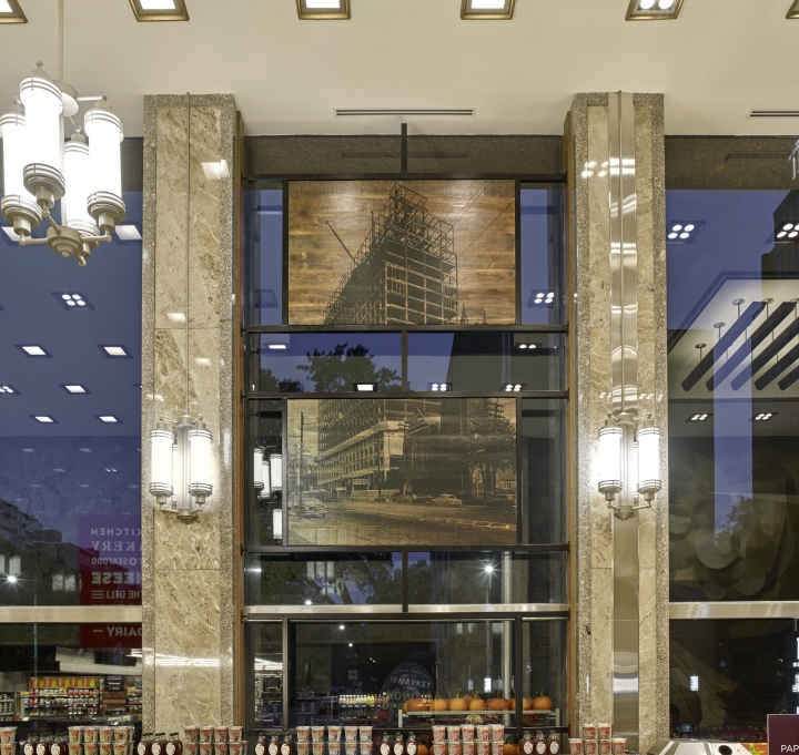
Imperial Plaza was built in the mid 1950s and is a masterpiece of mid-century International Style modernism that has been recently converted to condominiums. The store design is respectful of this heritage and incorporates existing finishes of marble and granite as features of the store. “It was very important for us to convey the original character of this magnificent space by ensuring these details became features of the store,” said Ferial Rahbari, Principal of Ampersand Studio.

The 8,500 square foot space was planned to encourage the discovery of food and to create a market feel. This was done with a simple and authentic collection of materials, custom design fixtures, simple and effective way finding with a narrow palette of colours and materials to support the positioning of the market brand and to stay true to the era and existing architecture.
The most prominent detail is the “The Story of Oil” mural by R. York Wilson located at the checkouts. Ampersand Studio designed chandeliers and wall sconces that emulate the era. The original floor pattern was used to inspire a framed window feature with historical images of the neighbourhood. “It’s exciting to be able to influence a neighbourhood that is evolving to deliver an exciting food shopping experience,” said Ferial Rahbari.
Photography by Michael Mahovlich


Add to collection