Madelo frozen yogurt shop by Blaster, Medellín – Colombia
posted by retail design blog on 2016-07-15
Add to collection
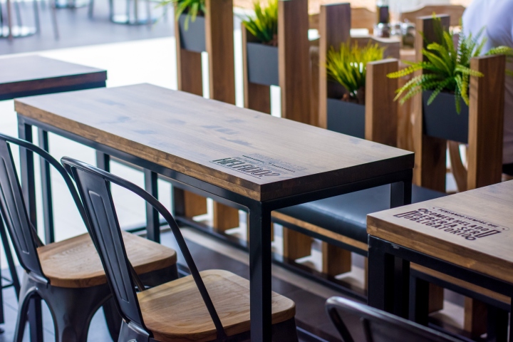

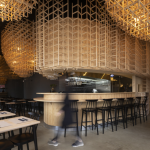
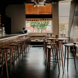
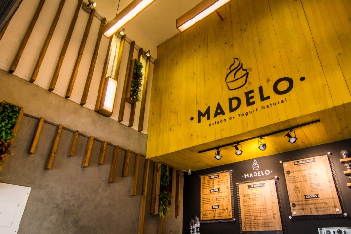
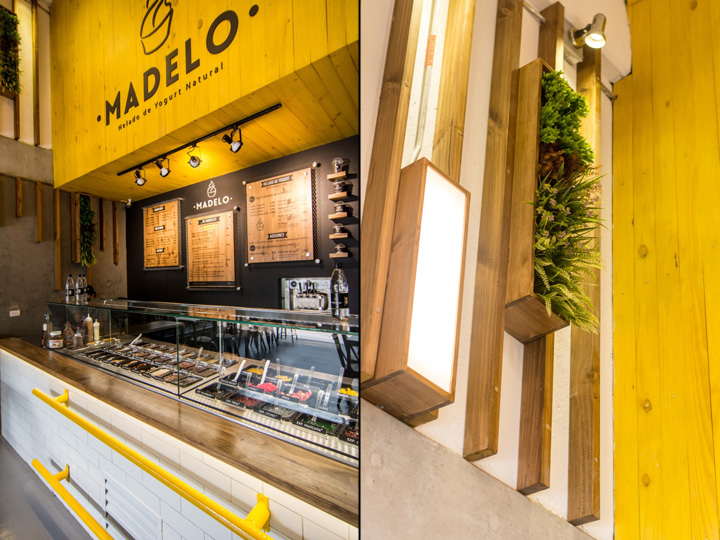
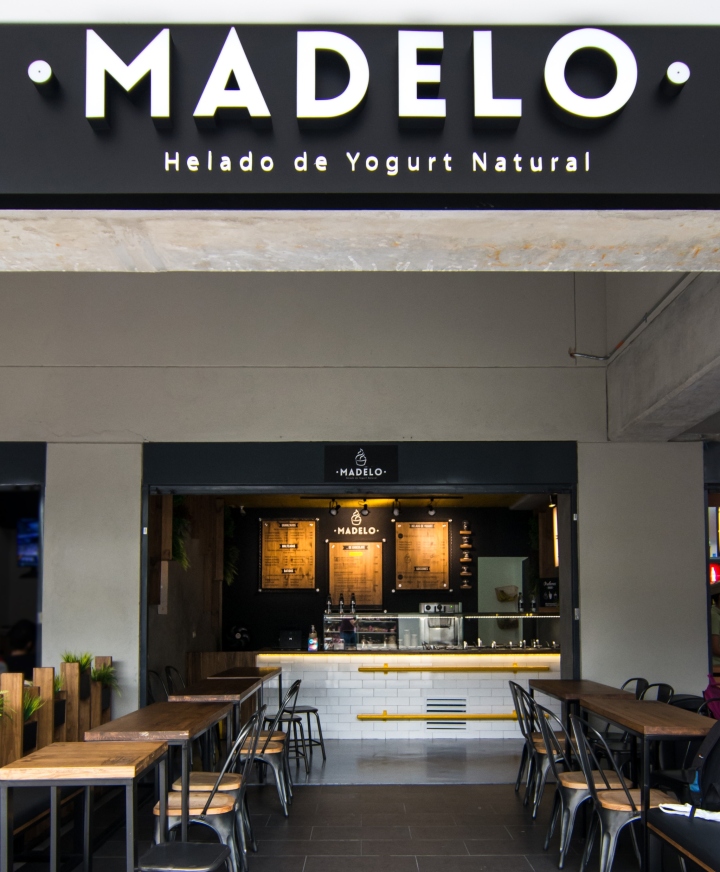
Our main design intention was to differentiate the brand and shop from its category, where most brands have a very similar aesthetic; light, white, pink and green. People associate frozen yogurt with a lighter version of ice cream, but Madelo is far from the concept of “light food”, its use of chocolate, candy and other toppings make it a full treat, an enjoyable sin. We decided to give Madelo the look and atmosphere of a café, a place to sit and relax and enjoy a nice treat. The use of wood and plants give it a warm and welcoming aesthetic, which combined with modern lines and graphics provide the perfect scenario for an enjoyable experience.
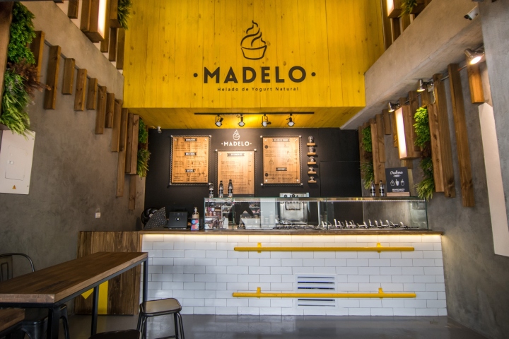
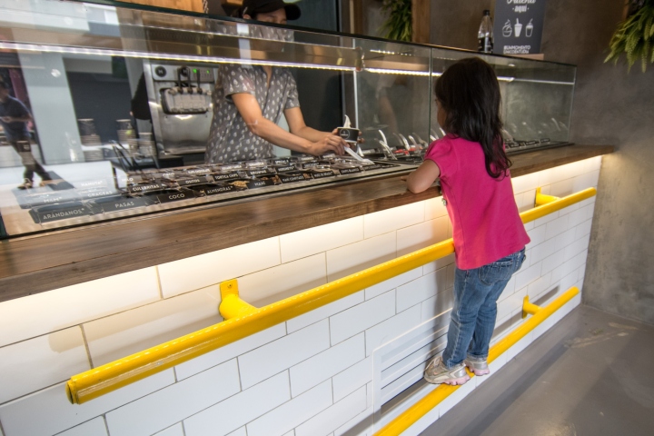
The project was conducted with our “Experience-Driven Design” methodology, which uses an in-depth evaluation of the customer experience, and the opportunities that can be offered through interior design to improve it. This provided valuable insights such as the fact that children don’t have the enough height to view the toppings exhibited in most commercial fridges, so they have to be lifted by their parents. We decided to solve this problem by including bars in the counter, which give them independence.
Interior by Blaster
Logo and brand by CBW
Photography by Simón Parra


Add to collection