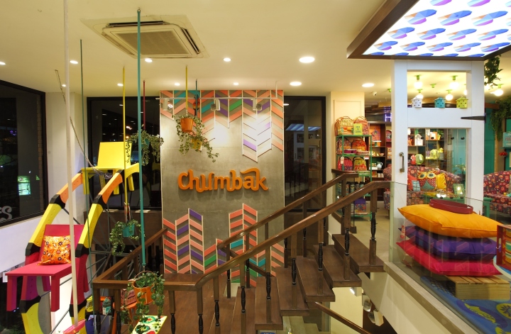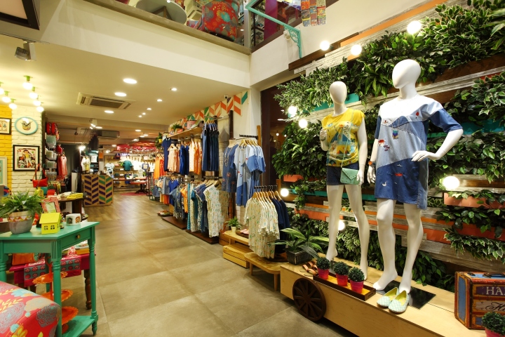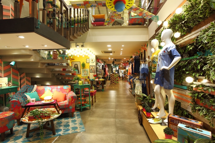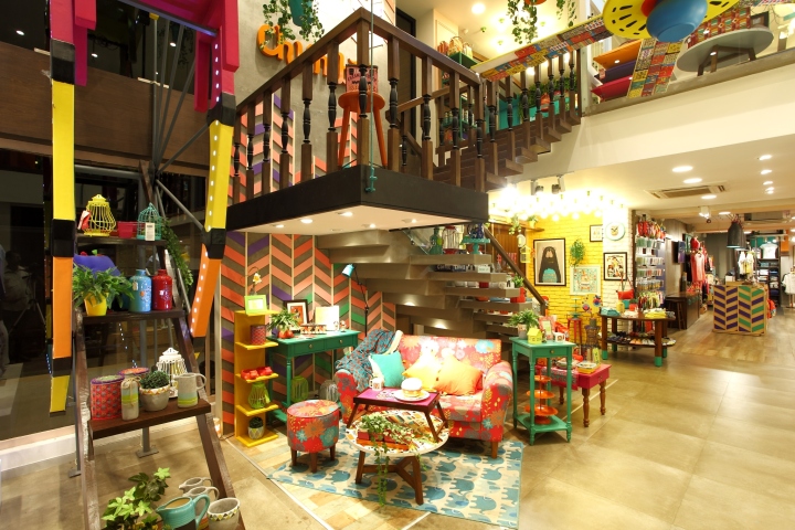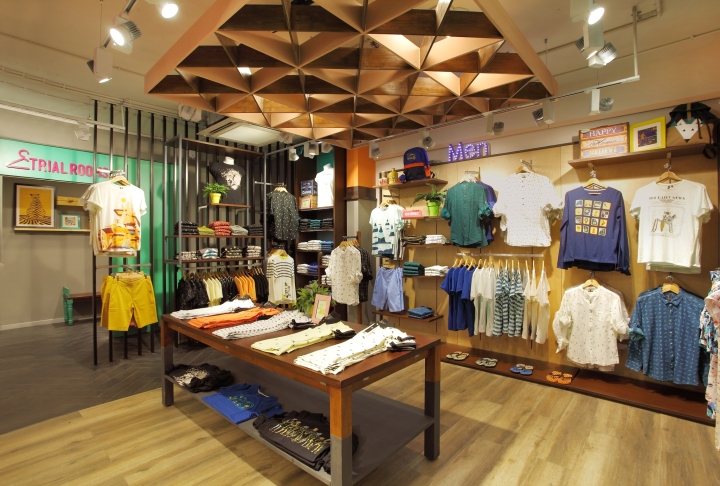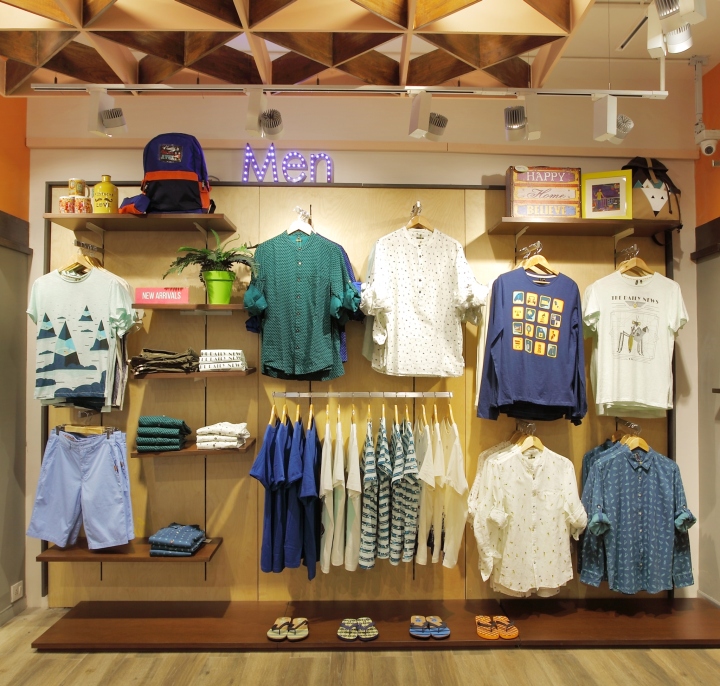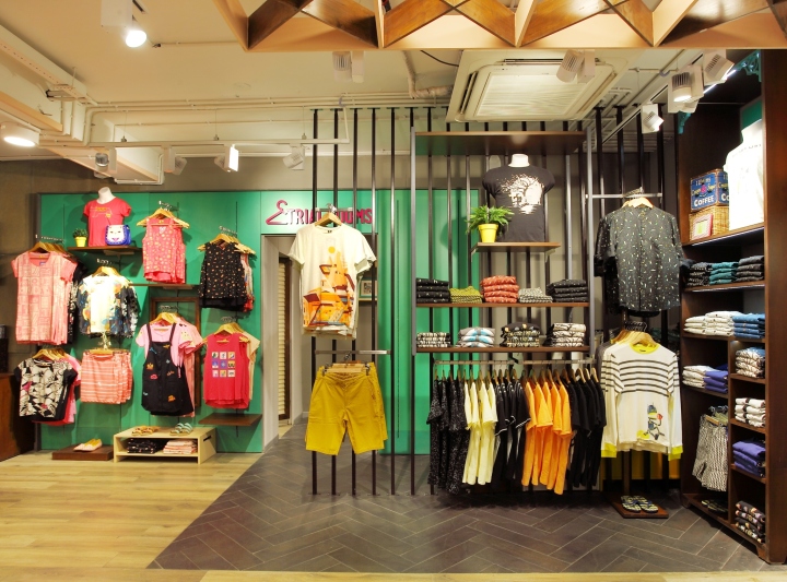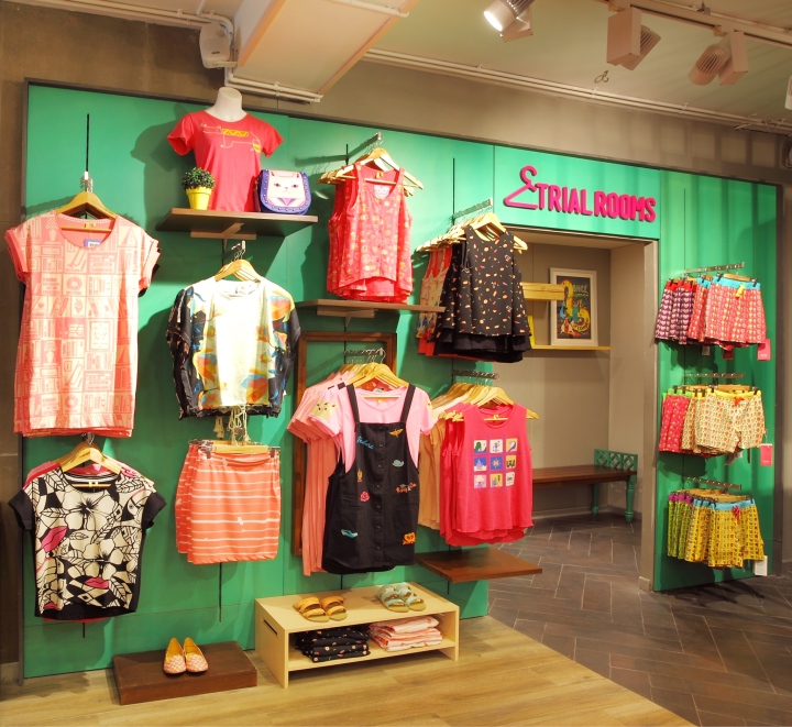

Chumbak is a vibrant & cheerful brand. The myriad of products on offer not only tickles the humor of the customer but at the same time adds vivacity & positive vibes to his living environment. ‘Make it a happy place!’ is what came from the client as a brief. Although that single line brief was loaded with ideas!

The eclectic mix of products ranges from small to big in size, from being useful to being decorative, something to be found in the traveller’s bag to something that keeps you cozy at home! So essentially the task was to house these assorted offers in a space that is articulate enough to give them an apt backdrop. A backdrop that’s equally a mix on its own way! The brand had to be re-positioned from being a gifting brand to more an evolved and serious fashion brand for the young customer, vibrant, eclectic and fashion conscious.

Design Strategy: Further from start, the brand’s vision was to elevate the perception of CHUMBAK from being an accessory to a lifestyle brand evolving more seriously into young fashion from 18yrs to 27yrs. These new born categories had to be introduced in a space that’s synonymous to nothing less than celebration and something bigger than just a store! Inspirations were drawn from happy elements, quirky colours, play of textures and even few things very stupid. We aimed at elements that could leave the customers enthralled and keep their clock from ticking for a while.

To portray the versatile & creative facets of the brand we extended our ideas of highlighting the products in a rare manner. Thus few eccentric sculptures were crafted out of the damaged products of the brand itself which never fail to command an awestruck gaze from the customer’s time and again. A diverse fixture type is designed for product display which helps in building up the eclectic character within the space. The design strategy therefore was simple! A visual engagement that makes you return to the store for more.

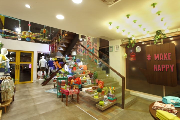
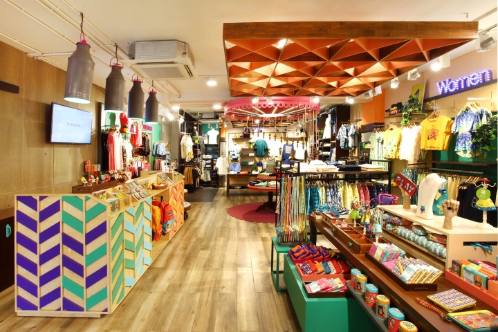
Design Concept: The store design concept lies in its eclectic nature with vivid hues and interpretations for a core ideology “Make Happy”. The hues, textures, patterns, materials all retain their own personality while building up the atmosphere of the store in harmony. We let ourselves the liberty of creating a diverse range of fixtures that keeps the eye hopping from one place to another making monotony redundant. To uphold the diversity of the product range on offer, the store had to be boisterous about the happy nature of the brand which we chose to do with finishes and furniture style

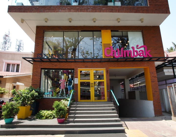
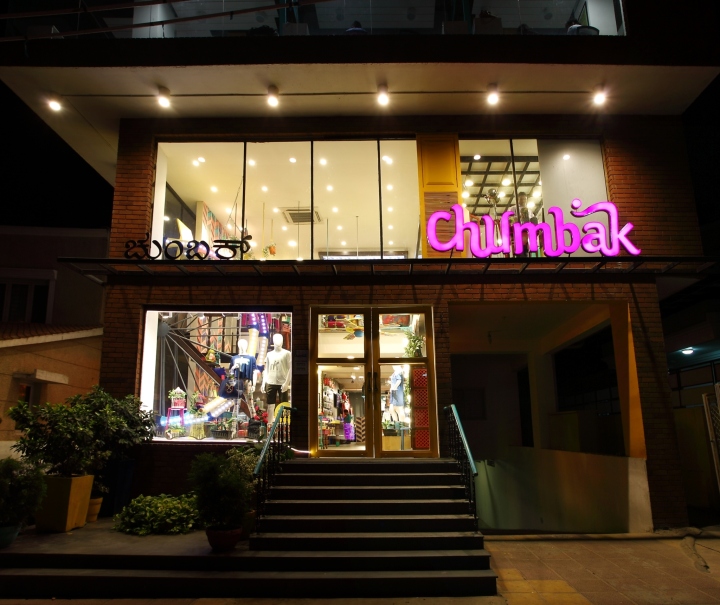
Store Front: The intention was to make the store a landmark in this high street. The brand’s office being housed in the upper floor gave us the opportunity to do so. We united all the floors to give it volume and wrapped it with an authentic architectural material – the brick to emphasize on the genuineness of the brand. We identified spots on the brick canvas and splashed some brand home colours to bring the whole facade to life.

Dummy window shutters in bright yellow were created to frame the window display at the mezzanine floor. The elevated entrance to the store is planned through a huge glass door with yellow frames led by the teal cast iron railing from the road. On the left is the window display that showcases the “The Giant Wheel or the Ferris Wheel” with LED Lights installation, re-enforcing the idea of “Make Happy” allowing a sneak peak of the store from the road. The Window Display specially crafted for the New Category and collection of Fashion took the highlight space keeping the conversation with the prospective customers.

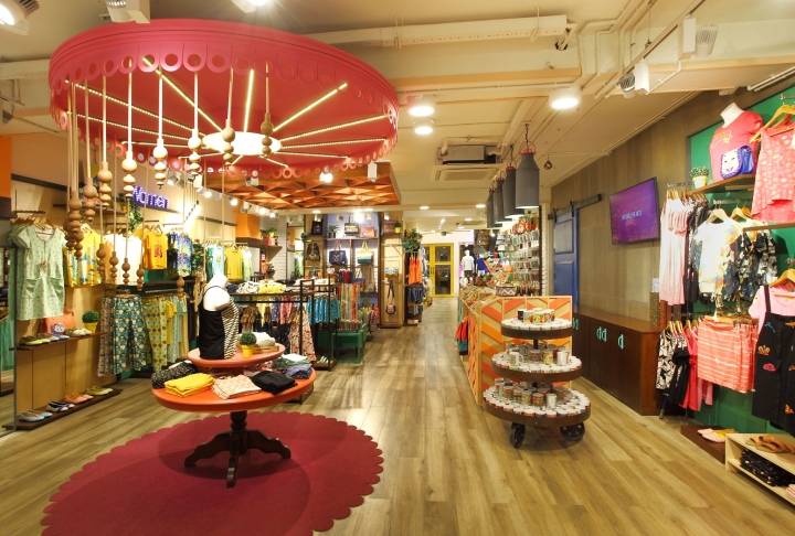
Store Interiors special features: The store is completely reinforced with the idea of “#Make Happy” with in its DNA with vibrant yet pleasant juxtaposition of various fun elements and merchandise. The store is hyphented with WOW elements, drawing and engaging with the customer creating a wonderful experience. Some of the key elements/special features include:
a. The Giant Wheel/ Ferris Wheel: Built in the window display and the customer entry zone.
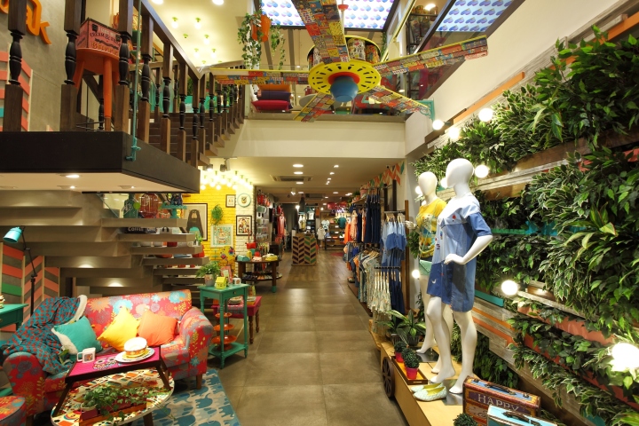
b. The Chumbak damaged merchandise “Fan Installation” and the Impact Green Wall
c. Make Happy Corner
d. Cash Counter with Milk Can lights.
e. Merry-go-Round Hotspot
f. The Home Wall in the Mezzanine Floor
g. The In-lit Chumbak Heart Ceiling in the Mez Floor balcony.
h. The Double Height Zone of the Store Entrance.

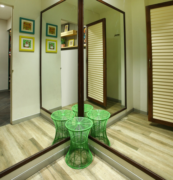
Service areas (trial room etc.): Trail Rooms available only on Ground Floor, have been more an elevated brand experience zone with wide spaces and eclectic mix of furniture, Green plants and the Brand elements with functional aspects for customer trail taken care.

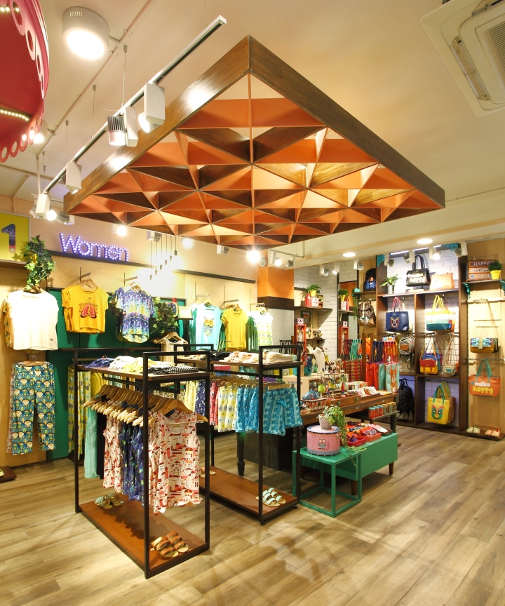
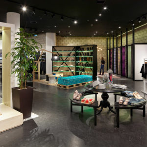
Visual Merchandising: VM has been an important medium to help the store voice its character. Elements have been collected and coloured in hues of the brand that distinctively gave them Chumbak’s character no matter where they came from. Cane baskets, ice buckets, photo frames, wooden crated, antique frames, flower and most importantly living plants planted on colourful earthen pots are dispersed throughout the store to support the product display. The VM fuses itself seamlessly in the store. The furniture is also conceptualized in a way that it forms a part of the VM adding visual appeal throughout.

Lighting: Lighting is a major element used in the Brand DNA of “Make Happy”. The Lighting is a virtuous blend of Generic functional store lighting and Highlight architectural customized lighting elements giving the store a beautiful and a joyous look.

Furniture/Fixtures: None of the furniture/ fixture look alike in the store. The concept was derived from being eclectic and varied. So we conceptualized designs that would be varied in nature but display efficient & flexible. Few styles were borrowed from colonial designs with modern tables, display shelves were made quirky with articulate brackets, cabinets & chest of drawers were immersed in bright colours, simple chest of drawers were given shutters on hinges. The materials used are wood & metal but in forms of polished, antique, rustic & painted.
