
YORK design+digital headquarter by studio NID, Uberlândia – Brazil
posted by retail design blog on 2018-03-21
Add to collection
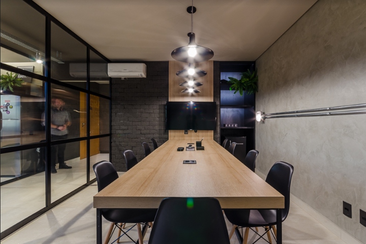

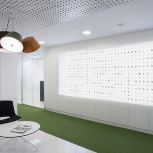
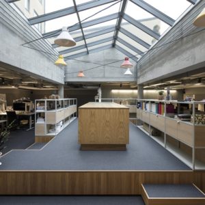
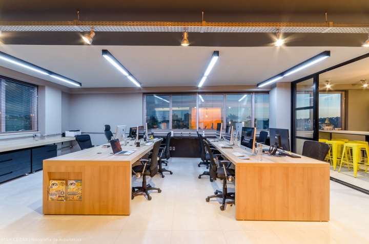
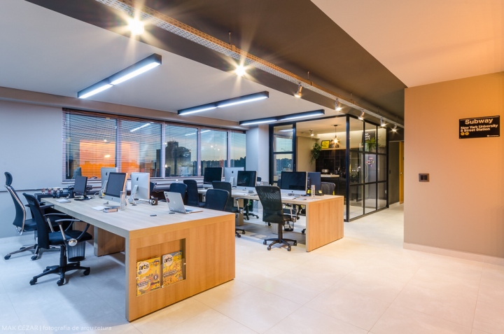
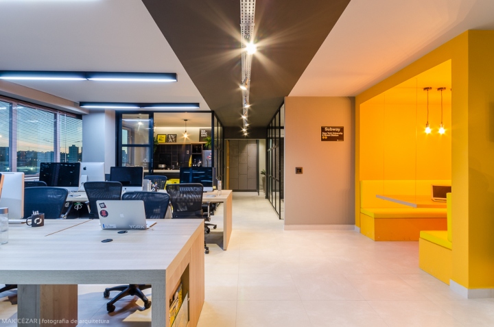
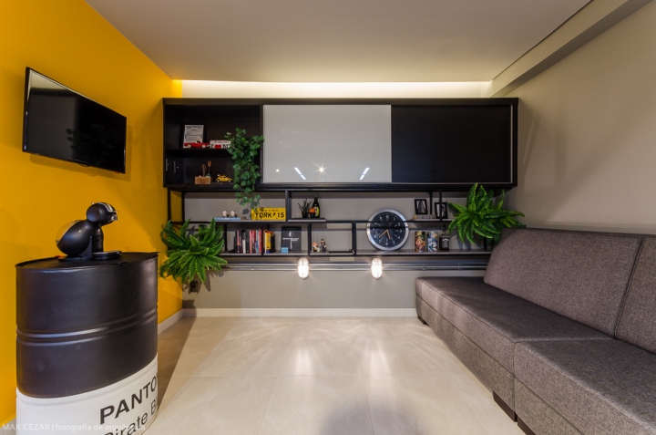
The design studio YORK design+digital changed from a small place to a biggest one, a headquarter. Its name already has given us the reference we needed: NY urban language with industrial aesthetics. We limited the color palette to black, concrete, gray and natural wood which was used in the workspace.
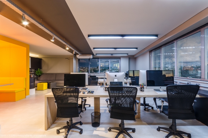
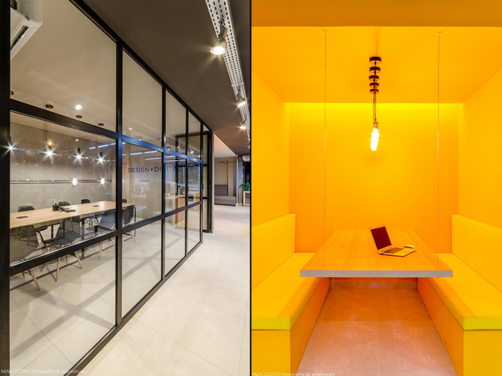
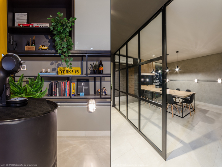
Despite of the traditional layout, we are able to use materials, textures and elements that help us “to break them up” as the “conduletes” in external metals that surround the work benches. The shelf in painted iron is the highlight of the environment, in black it keeps the work books that are used in day-by- day routine, collection objects and products made by YORK. On the other hand, the closed shelf engages all the other work objects that do not need to be exposed and the closing door still serves as a message board. The working environment and the reception in all linked, there are some divisions only to sectorize spaces. The conference room stays apart but it follows the same design language and color patterns, and for this new place was created a yellow box to internal brainstormings.
Designed by studio NID – Nada Igual Design
Photography by Mak Cezar


Add to collection