
Add to collection
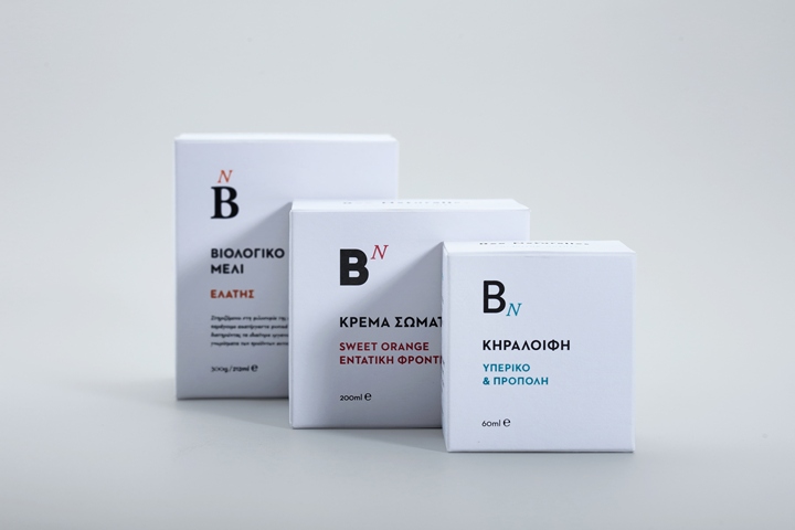

Bee Naturalles was founded by Giorgos Athanassiadis and Chara Mangana, in Euboea island, with the mission to combine traditional knowledge with scientific methods and put into practice their motto ‘enclosing nature’. The product portfolio of the company comprises of more than 20 products using only unprocessed natural ingredients, such as organic apiculture products, plant extracts and essential oils. When they came to our first meeting they had already been in business for more than three years, yet felt the need to rebrand and reposition Bee Naturalles as a natural laboratory brand, rather than a handmade business.
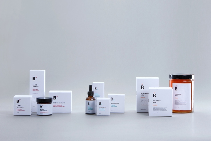
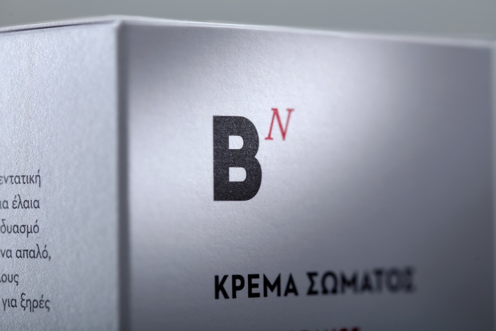
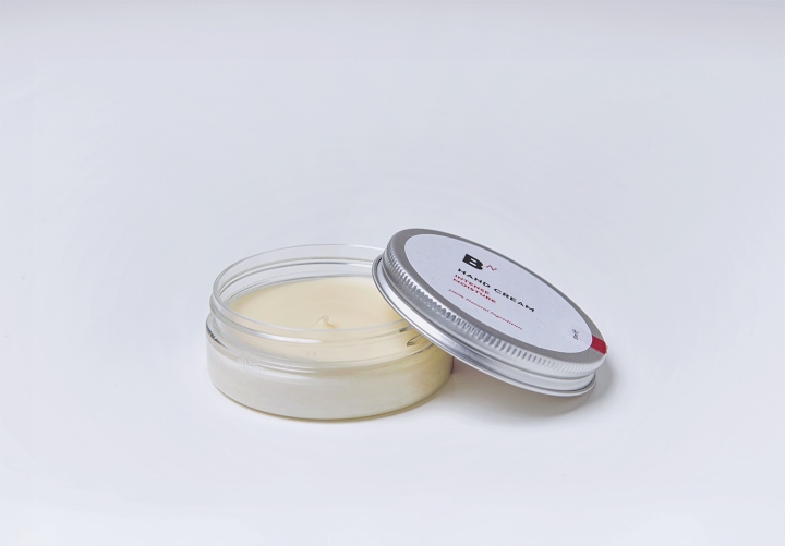
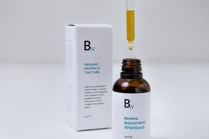
One of the ‘weak spots’ of Bee Naturalles’ brand was that all products had the same package design although they had different uses, resulting in consumer confusion. So we suggested dividing the product line into three sub-product lines; skin care, healing and edible respectively. To make this distinction visually apparent to customers, a set of three signs has been introduced into the packages’ (re)branding. These signs are inspired by Bee Naturalles’ motto ‘enclosing nature’. More specifically, they comprise of three B’s written in different fonts based on the category they represent.
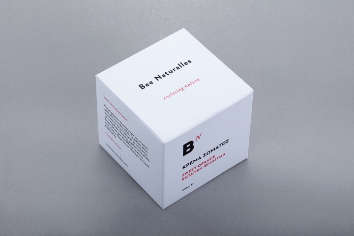
The letter N, which represents Nature, moves into different positions around letter B to further underline the distinction between the categories. The positions of N are not arbitrary; they are placed on the corners of a hypothetical hexagon as a reference to bees’ hexagonal-shaped wax shells. Also each category is indicated by the use of different colors; that is blue-green for healing, orange for edible and warm red for cosmetics. Apart from some pieces of information, such as products’ ingredients or effect, that has been highlighted in color, the dominant color of the package design is white, to create the impression of laboratory cleanliness and purity.
Designed by S & Team
https://www.packagingoftheworld.com/2018/05/bee-naturalles-packaging-redesign.html


Add to collection