typeface
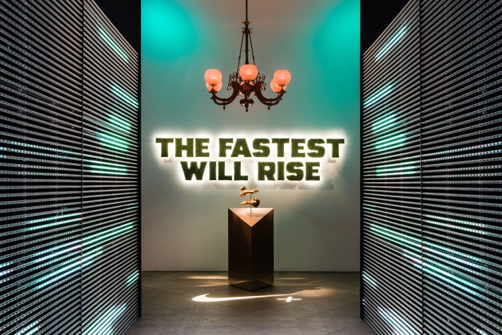
Nike Football Typeface by Paul Hutchison
posted by retail design blog on 2016-06-01
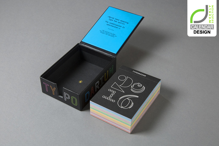
CALENDAR DESIGN! Typodarium 2016
posted by retail design blog on 2016-01-09
Add to collection
CALENDAR DESIGN! Typodarium 2016
posted by retail design blog on 2016-01-05
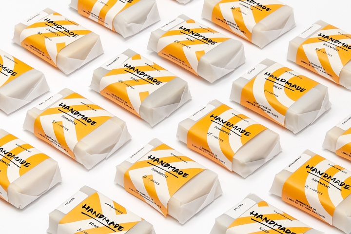
Rawganique Packaging by Peltan-Brosz
posted by retail design blog on 2015-09-04
Add to collection
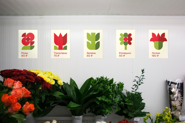
Mostsvettorg Branding by Fiodor Aleksson
posted by retail design blog on 2015-06-29
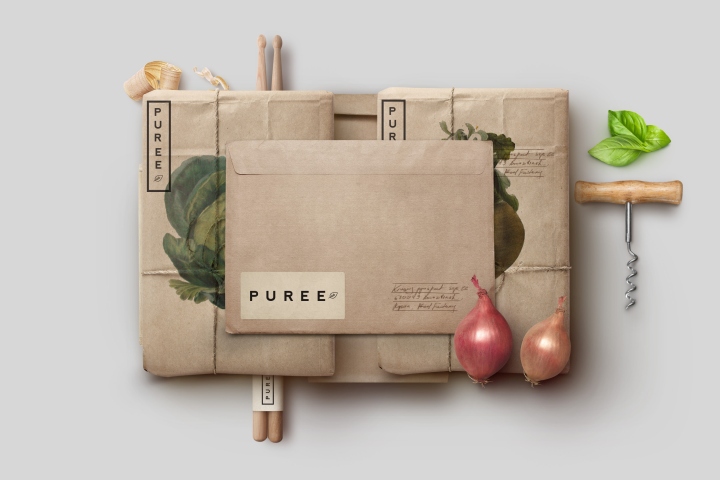
Puree branding & packaging by Studio Ahamed
posted by retail design blog on 2015-02-12
Add to collection
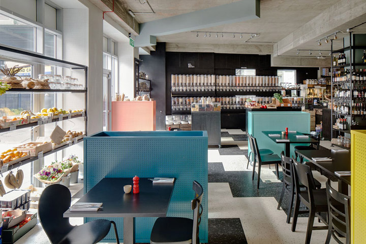
Unpackaged grocery & café by Multistorey, London
posted by retail design blog on 2013-07-19
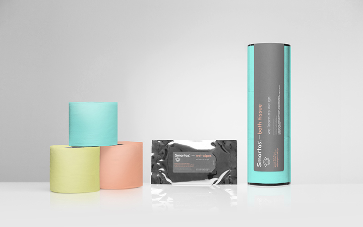
Smartas branding by Anagrama
posted by retail design blog on 2013-06-16