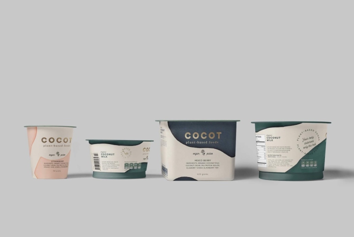
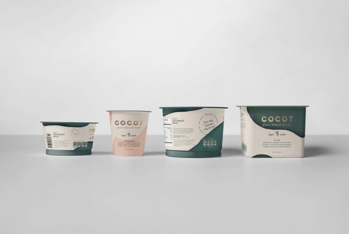
![](https://retaildesignblog.net/wp-content/uploads/2012/09/Theo-Fennell-jewelry-by-gpstudio-London-300x300.jpg)
![](https://retaildesignblog.net/wp-content/uploads/2018/06/cocot-packaging-by-mamba-studio.jpg)
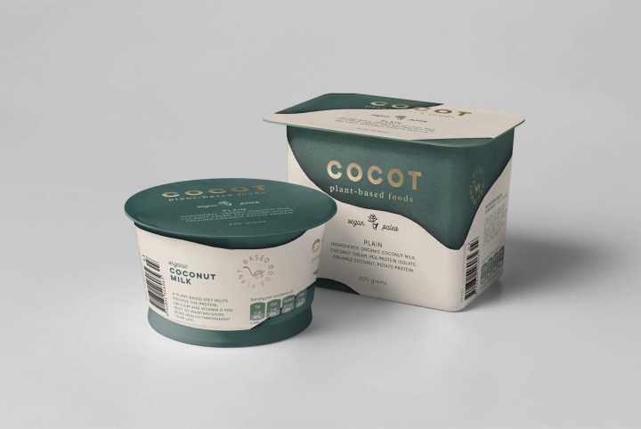
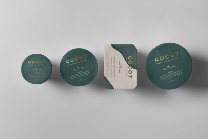
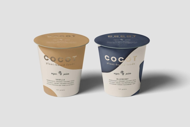
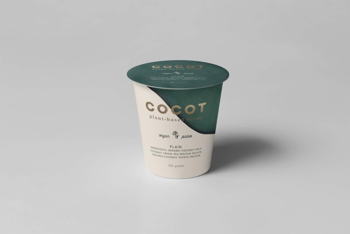
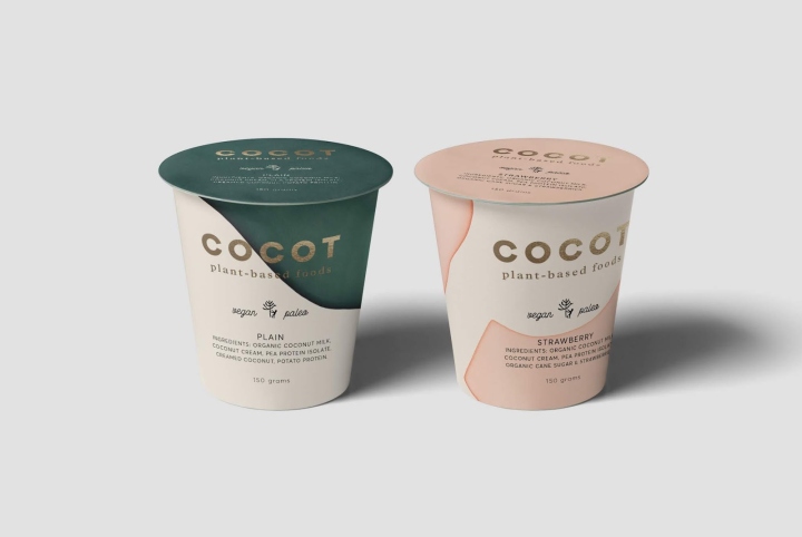
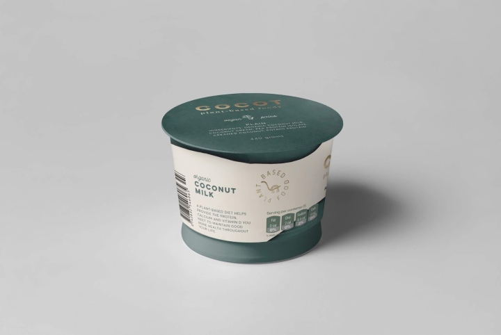
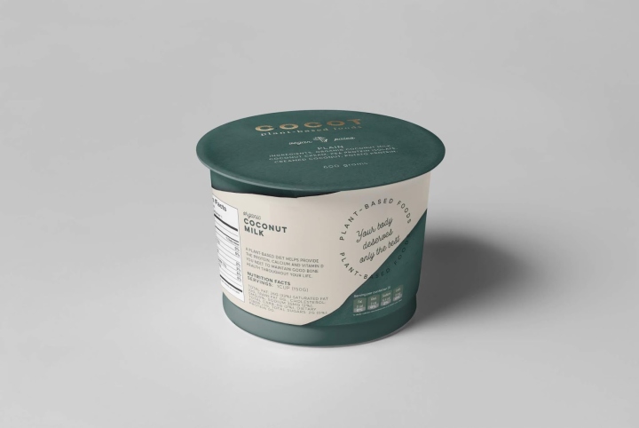
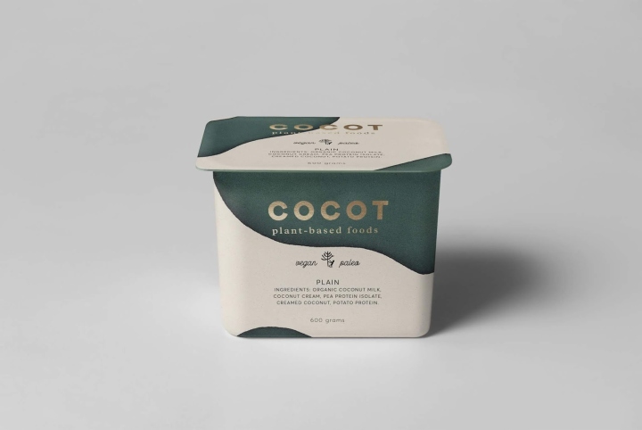
Product aimed at a select audience of vegans who take care of the environment and their health. For the logo, a simple and geometric typeface was selected that made a contrast with the rustic nature of the spots. Our approach with clean, sans-serif typography gives Cocot a luxurious feel mostly associated with high-end fashion brands. The gold foil stamp and clean type directly contrasts and at the same time elevates the would-be informal paint marks.
What’s Unique?
Inspired by cow blotches that have been transferred into to textures and colors of the earth and nature.
Designed by mamba studio
https://www.packagingoftheworld.com/2018/06/cocot.html
![](https://retaildesignblog.net/wp-content/uploads/2018/06/cocot-packaging-by-mamba-studio-11.jpg)
![](https://retaildesignblog.net/wp-content/uploads/2018/06/cocot-packaging-by-mamba-studio-10.jpg)
![](https://retaildesignblog.net/wp-content/uploads/2018/06/cocot-packaging-by-mamba-studio-09.jpg)
![](https://retaildesignblog.net/wp-content/uploads/2018/06/cocot-packaging-by-mamba-studio-08.jpg)
![](https://retaildesignblog.net/wp-content/uploads/2018/06/cocot-packaging-by-mamba-studio-07.jpg)
![](https://retaildesignblog.net/wp-content/uploads/2018/06/cocot-packaging-by-mamba-studio-06.jpg)
![](https://retaildesignblog.net/wp-content/uploads/2018/06/cocot-packaging-by-mamba-studio-05.jpg)
![](https://retaildesignblog.net/wp-content/uploads/2018/06/cocot-packaging-by-mamba-studio-04.jpg)
![](https://retaildesignblog.net/wp-content/uploads/2018/06/cocot-packaging-by-mamba-studio-03.jpg)
![](https://retaildesignblog.net/wp-content/uploads/2018/06/cocot-packaging-by-mamba-studio-02.jpg)