Add to collection

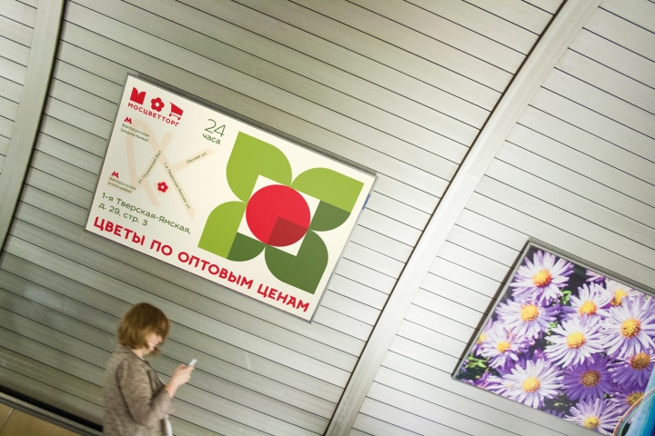
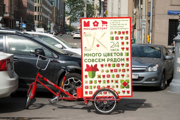
Mostsvettorg is a developed chain of 71 flower shops in Moscow. The company was established in 2009. It keeps leadership on market, but current target audience is limited only by one category. Yet competition in this sphere is quite high. Nowadays not only Mostsvettorg can attract customers with low prices. Current identity doesn’t reflect all benefits of the company. New identity sets the goal to increase the amount of customers. Mostsvettorg must be not only comprehensible for elder audience and attract them by low prices, but also not frighten off younger generation by agressive annoying design. It should tell them that Mostsvettorg flowers are not just cheap but also of high-quality.
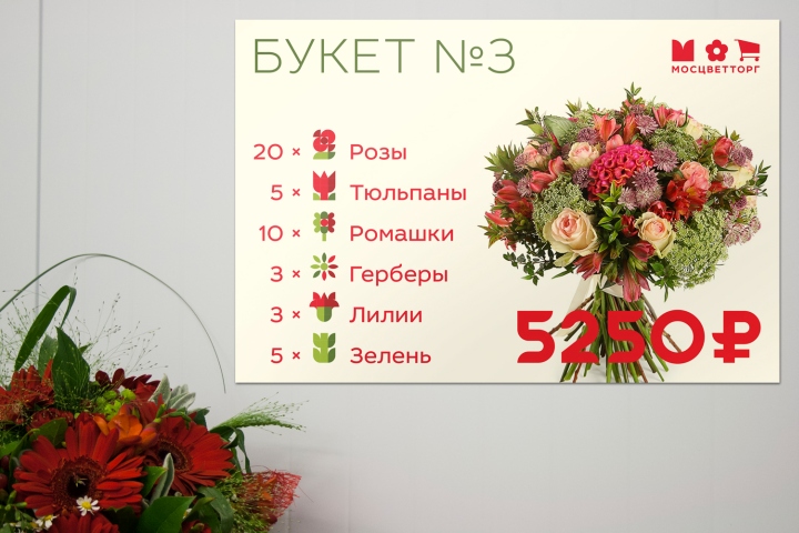
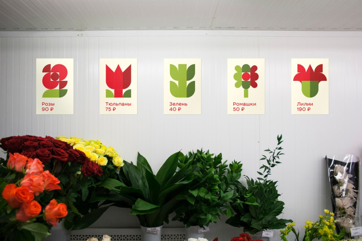
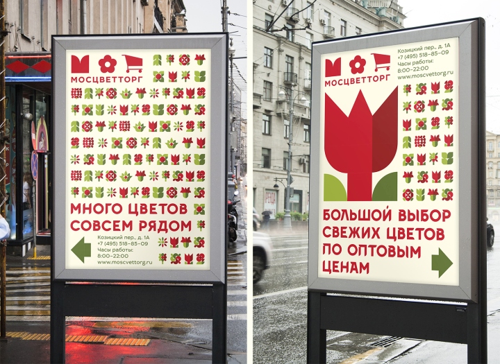
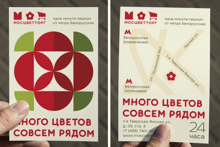
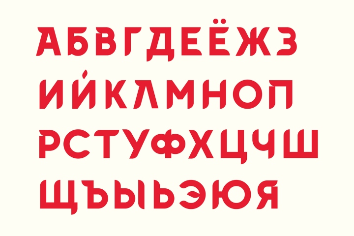
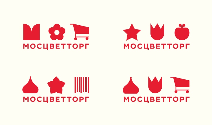
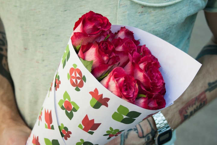
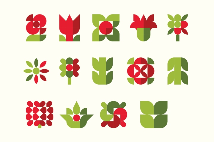
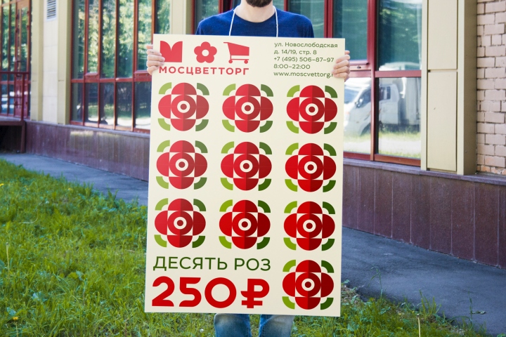
The idea of new brand identity is based on constructor. Flowers are put together in a bunch like blocks in a constructor. Simple pictograms consisting of geometrical figures were developed as well as a typeface which has floral and mechanical character at the same time. The logotype is rebus-like. Three parts of it are represented by three symbols. There are several ways of combining the symbols, so we get a dynamic logo which supports the idea of diversity and varied assortment.
Design: Fiodor Aleksson


Add to collection