Add to collection


A project for a very special cooperative, winner of the National Award for Craftwork 2008, that is committed to the legitimacy of being different. The refined simplicity of the products provided the inspiration for our approach to the design. Clear forms, warm and simple colours and a very clean and fine typeface. The logotype, formed of an underscored x shape which refers to the basic component of weaving and also accents the most notable letter in the company’s name.

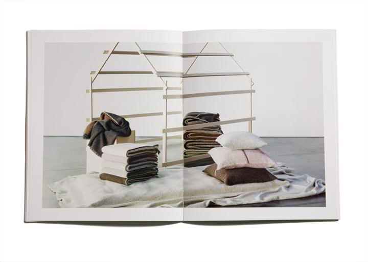
The art direction of the photographs show a wooden house which represents the house of Teixidors and the idea of Teixidors’s products in a very abstract way: natural light, clean images and a very simple and abstract way of a house.We were searching for a different way to show the range of handwoven blankets, pillows, courtains without using the common language that we are all used to see in decoration magazines etc. We wanted everything to be very simple but at the same time unique.


Photography: Daniel Riera
Set design: Koen Meersman
By Cla Se


Add to collection